The ART Book
Contributed by Peter Bereczky
NOTE: The book was originally written in Hungarian, and it has been translated into English automatically. If you spot errors, inconsistencies, unclear sentences, and so on, consider reporting them as issues on GitHub. The more people will contribute and proof-read the material, the more useful it will become for the community!
The original Hungarian version of the book can be found here.
Table of Contents
Legal information
Sources
Recommendation
1. Introduction
2. Basic knowledge
2.1 The raw file
2.2 Demosaicing
2.3 Raw black level, Raw white level
2.4 Color management, color systems
2.4.1 Two types of frameworks
2.4.2 The CIE XYZ 1931 color system
2.4.3 RGB color system
2.4.4 CYMK color system
2.4.5 HSV color system
2.4.6 LCH Color System
2.4.7 CIELAB or L*a*b*
2.4.8 Hue, color wheel
2.4.9 Terms used when describing and modifying colors
2.5 Tones
2.6 Dynamic range (tonal range), contrast
2.7 Opacity
2.8 Feather
2.9 Wavelet decomposition
2.10 Capture sharpening procedures
2.11 Noisy images
2.12 Artifacts in the image
2.13 The mid.tif image
2.14 Recommended computer configuration
2.15 What monitor should we use?
2.16 How do we get lens profiles and camera profiles?
3. The ART raw file processing program
3.1 Overview
3.2 ART website
3.3 Installing ART
3.4 Non-destructive processing
3.5 Sidecar files
3.6 The ART’s pipeline
3.7 Three basic views of ART
3.8 File browser
3.8.1 File browser user interface
3.8.2 Thumbnails
3.8.3 Update thumbnails
3.8.4 Context menu
3.8.5 Processing profile operations
3.8.6 Sessions
3.9 Inspect
3.10 Editor
3.10.1 Preview
3.10.2 Navigator
3.10.3 Top toolbar
3.10.4 Histogram
3.10.4.1 Main histogram
3.10.4.2 The image and its histogram
3.10.4.3 Interaction between preview, navigator, and histogram
3.10.4.4 Determining the reason for the cut
3.10.4.5 Waveform
3.10.4.6 Vectorscopes
3.10.5 Processing profiles panel
3.10.6 Editing tool groups
3.10.7 Editing tool header
3.10.8 History
3.10.9 Snapshots
3.10.10 Filmstrip
3.10.11 Bottom toolbar
3.11 Queue view
3.12 Processing profiles
3.13 Creating processing profiles
3.13.1 Create a default processing profile
3.13.2 Resizing images
3.13.3 Apply processing profile saved with image file
3.14 Sliders, curve editors
3.14.1 Sliders
3.14.2 Curve editors
3.14.2.1 Tone curve editor
3.14.2.2 S-curve
3.14.2.3 Flat curve editor
3.14.2.4 Threshold curve editor
3.15 CTL scripts in ART
3.16 Basic ART workflow
3.17 Editor shortcuts
4. ART editing tools by tool group
4.1 Exposure group
4.1.1 Exposure
4.1.1.1 Covering burned area with Color Propagation
4.1.2 Tone Equalizer
4.1.3 Tone Curves
4.1.4 Dynamic Range Compression
4.1.5 Log Tone Mapping
4.2 Details group
4.2.1 Spot Removal
4.2.2 Capture Sharpening
4.2.2.1 Unsharp Mask
4.2.2.2 RL Deconvolution
4.2.2.3 Custom RL Deconvolution
4.2.3 Noise Reduction
4.2.3.1 Luminance
4.2.3.2 Chrominance
4.2.3.3 Final smoothing
4.2.4 Impulse Noise Reduction
4.2.5 Defringe
4.3 Colors group
4.3.1 White Balance
4.3.2 Saturation/Vibrance
4.3.3 Channel Mixer
4.3.3.1 RGB Matrix
4.3.3.2 Primaries Correction
4.3.4 Color Equalizer
4.3.5 RGB Curves
4.3.6 L*a*b* Adjustments
4.3.7 Color Management
4.4 Local editing group
4.4.1 Masks overview
4.4.1.1 Adjustment layers
4.4.1.2 Masks
4.4.1.3 Parametric mask
4.4.1.4 Color similarity mask
4.4.1.5 Area mask
4.4.1.5.1 Add, edit rectangle
4.4.1.5.2 Add, edit polygon
4.4.1.5.3 Add, edit gradient
4.4.1.5.4 Area mask outside image borders
4.4.1.5.5 Excluding the area outside the area mask from the mask
4.4.1.6 Brush mask
4.4.1.6.1 Removing unnecessary mask parts from inverted mask
4.4.1.7 Mask post-processing
4.4.1.8 Operations with masks
4.4.1.9 Creating the resultant mask
4.4.1.10 Mask precautions
4.4.1.11 Pipeline effect on masks
4.4.1.11.1 Different masks within the same editing tool
4.4.1.11.2 Copy masks between Local editing tools
4.4.2 Color/Tone Correction
4.4.2.1 Standard and Perceptual
4.4.2.2 Separate RGB channels
4.4.2.3 HSL factors
4.4.2.4 LUT
4.4.2.7 ART output transform CTL script
4.4.2.12 B&W mixer CTL script
4.4.2.8 Channel mixer CTL script
4.4.2.20 Color balance RGB CTL script
4.4.2.21 Color mixing CTL script
4.4.2.15 Equalizer CTL scripts
4.4.2.10 Exposure compensation CTL script
4.4.2.13 Film density CTL script
4.4.2.14 Gamma/slope CTL script
4.4.2.22 Gamut compression CTL script
4.4.2.5 Generalised hyperbolic stretch CTL script
4.4.2.18 Posterization CTL script
4.4.2.6 Shadows lifting CTL script
4.4.2.9 Simple split toning CTL script
4.4.2.17 Softlight CTL script
4.4.2.16 Subtractive color mixing CTL script
4.4.2.23 Tetrahedral color warping (HSL) CTL script
4.4.2.24 Tetrahedral color warping (RGB) CTL script
4.4.2.19 Tint by luminance CTL script
4.4.2.25 Tone curve CTL script
4.4.2.11 WB and primaries correction CTL script
4.4.3 Smoothing
4.4.3.1 Guided
4.4.3.2 Gaussian
4.4.3.3 Glow
4.4.3.4 Non-local means
4.4.3.5 Wavelets
4.4.3.6 Motion blur
4.4.3.7 Lens blur
4.4.3.8 Add noise
4.4.3.9 Halation
4.4.4 Local Contrast
4.4.5 Texture Boost/Sharpening
4.5 Special effects group
4.5.1 Black-and-White
4.5.2 Film Simulation
4.5.2.1 Sigmoid tone mapper
4.5.3 Soft Light
4.5.4 Vignette Filter
4.5.5 Graduated Filter
4.5.6 Haze Removal
4.5.7 Film Grain
4.5.8 Film Negative
4.6 Transform group
4.6.1 Crop
4.6.2 Resize
4.6.3 Output Sharpening
4.6.4 Geometry subgroup
4.6.4.1 Rotate
4.6.4.2 Perspective Correction
4.6.5 Lens subgroup
4.6.5.1 Profiled Lens Correction
4.6.5.2 Distortion Correction
4.6.5.3 Chromatic Aberration Correction
4.6.5.4 Vignetting Correction
4.7 Raw group
4.7.1 Sensor with Bayer Matrix subgroup
4.7.1.1 Demosaicing
4.7.1.2 Raw Black Points
4.7.1.3 Preprocessing
4.7.1.4 Chromatic Aberration Correction
4.7.2 Sensor with X-Trans Matrix subgroup
4.7.2.1 Demosaicing
4.7.2.2 Raw Black Points
4.7.3 Raw Gain/White Point
4.7.4 Preprocessing
4.7.5 Dark-Frame
4.7.6 Flat-Field
4.8 Metadata group
5. Final words
Legal information

This book is copyrighted. Its use is permitted only under the terms of the Creative Commons CC BY-NC-SA 4.0 (Creative Commons Attribution-ShareAlike 4.0 International License).
https://creativecommons.org/licenses/by-nc-sa/4.0/deed.hu
Creative Commons CC BY-NC-SA 4.0
Book Title: The ART Raw File Processing Program
Copyright Peter Bereczky, 2025
Second revised and expanded edition, 2025
Cover photo: Photo by Jit Roy from Pexels
This book is based on ART 1.25.3 and CTL scripts version 1.2.
The source of the raw files (“images”) shown in the book (which can be downloaded from here): signatureedits.com. Where I deviate from this, I will indicate it separately.
Sources
Recommendation
I dedicate this book to my partner, Katalin Nánási,
and I recommend it to our children, Eszter and Gábor.
1. Introduction
Anyone who wants to take photos more seriously is faced with the need to post-process their images. Without this, there is no way the image will be one that the creator would be satisfied with. We want to create images that have an emotional impact, and we can achieve this through post-processing, among other things. The need for post-processing also entails shooting in raw format. This is the only way we will be able to make significant changes to our image, which is not possible in JPEG format.
This book is about the ART raw file processing program, which was created by programmer Alberto Griggio based on the code of RawTherapee. ART is a free, open-source program that runs on Windows, Linux, and macOS platforms and has a user interface in several languages. Its main purpose is to produce high-quality image files by processing raw files. Image files (e.g. JPEG, PNG, TIFF, etc.) can also be modified with it.
ART is the easiest program to learn among the other powerful, free programs for similar purposes (ART, darktable, RawTherapee). It contains very powerful editing tools with great possibilities. By using masks, we can modify certain areas of the image, not just the entire image. We can also use CTL scripts, which greatly increase the functionality of ART. With ART, we can create high-quality images. ART is able to fully satisfy the needs of most photographers.
ART and other similar programs are very complex, so learning them is not easy. Processing raw data is not easy. We can only be successful if we devote the right amount of work and time to it.
I hope my book will help beginners get started, and will also be a useful read for advanced users, who will experience success using ART.
I owe a great debt of gratitude to my partner, Katalin Nánási, who was my companion throughout my adult life and who provided significant support in the completion of this book.
The writings and images in this book are protected by copyright, please read the license terms above before using them.
I wrote this book because I wanted to leave something behind for the people from whom I received so many beautiful and good things.
I have tried to act with the greatest possible care, but errors may still occur. For this reason, I ask for the forgiveness of my readers.
The author
2. Basics
To process raw files, you need to understand the basic concepts. You can’t edit effectively if you don’t know what you’re doing. This chapter is about the basic concepts.
Post-processing is not always necessary. If you don’t have high expectations for the image, it may be unnecessary. For example, in the case of memorial picture or family photos, it is not necessarily necessary, and a JPEG image taken by the camera may be sufficient. To some extent, the camera also provides the ability to influence certain properties of the image by setting the appropriate picture style.
A computer program is not a panacea. Good results can only be achieved with precise work.
The raw data file is not an image, but a set of data, but for the sake of simplicity I (like others) will use the term “image” instead. But we should know that this is not an exact definition. I will not always emphasize that we open the image file or the raw file for editing, for example. Instead, I will write that we open the image for editing.
It is important to understand that ART is not a general image editing program like GIMP or Photoshop, but has a completely different function. It is designed to process files containing raw data (and not primarily image files such as JPEG, PNG, TIFF). However, it can also process image files.
2.1 The raw file
Raw is not an acronym, so it not need be written in all capital letters. The correct spelling would be raw. However, most often we see it written as RAW.
All cameras are capable of shooting in JPEG format, and it is the most common image format today. You can shoot in raw format with a wide variety of cameras, including virtually all interchangeable lens cameras and many others. Check your camera’s user manual for the options. You can select to shoot in raw format in the menu of cameras that support it, usually under the image quality menu. You can choose RAW, which means the camera will only create a raw file on the memory card and not create a JPEG image. The other option is to choose RAW + JPEG, which means the camera will also create a JPEG image, which is usually the highest quality, in addition to the raw file.
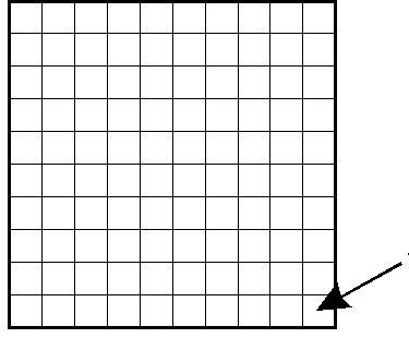
In a digital camera, the image sensor is a light-sensitive component, onto which the lens projects the image. The image sensor divides the projected image into tiny dots, called pixels. The set of pixels forms the digital image. In order to divide the image into pixels, small elementary sensors are arranged on the surface of the image sensor (in most cases) in a square grid. It is as if we were looking at a school “checkered” notebook, and each square would have an elementary sensor. The elementary sensors are arranged in rows and columns. In the figure above, the arrow points to an elementary sensor. In reality, elementary sensors are very small, they are not even visible to the naked eye, their number is in the millions. We can say that the number of millions of elementary sensors on the image sensor is the number of megapixels (MP) the maximum resolution of the image sensor (and therefore the camera).
The part of the image above in the yellow frame is shown enlarged in the figure below.
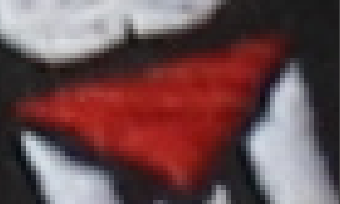
A digital image is made up of pixels. The individual pixels are clearly visible in the figure. A pixel is the smallest, distinguishable part of a digital image. The entire surface of each pixel is a certain color.
The elemental sensors detect light, not color. The part of the image sensor where the lens projects the darker part of the subject receives less light. The sensor receives more light in the lighter parts of the subject. After exposure, the data is read from each elemental sensor and converted into numbers. This conversion into numbers is called digitization.

The figure above shows a tonal scale, from the darkest to the lightest tone, with a seemingly gradual transition. For the sake of the example, let’s imagine that our digital camera is able to process this tonal range. From each elemental sensor can read out a signal proportional to the amount of light it receives, and this signal must be converted into a number when digitizing. The resolution of the raw file is characterized by the bit depth. The camera’s specification shows how many bits the raw file produces. In practice, the resolution of the raw file is usually 12 or 14 bits. I will not go into detail about digitization, but I will only mention that the 12-bit raw file can store tones in extremely fine steps by dividing the entire tonal range into 4096 parts, and the 14-bit file can store tones in extremely fine steps by dividing the tonal range into 16384 parts, and extremely fine differences in tones will be distinguishable. This is one of the great advantages of raw files. The term “resolution” here should be distinguished from the resolution of the image sensor mentioned above. This refers to the finer increments in which the raw file can store tones, while the resolution of the image sensor refers to the number of elementary sensors on it.
The overflow of elementary sensors is often illustrated with the example of a bucket and rain. The bucket represents the elementary sensor, the rain represents the photons, and the time the bucket is exposed to the rain represents the shutter speed. There is a similarity between a bucket exposed to rain and an elementary sensor that collects an electric charge proportional to the amount of light falling on it. If we expose the empty bucket to the rain and leave it there for a certain time, we can measure how many liters of water have fallen into the bucket during that time. If we leave the bucket in the rain for a long time, after a while the bucket will be full, that is, it will become saturated, and the water that falls into it will flow out. After this, we can no longer measure how much water actually fell into the bucket, because we only find water corresponding to its entire volume in it, we have no information about how much water fell into it after saturation, which immediately flowed out. The elementary sensor behaves in the same way. If it is hit by too much light, it saturates, and even if there were more charges, only the signal corresponding to the maximum amount of charge it can absorb is read from it, the effect of the other charges is lost, not utilized, and thus clipping occurs. An elementary sensor with a larger surface area can usually store more photons, a sensor with a smaller surface area can store fewer.
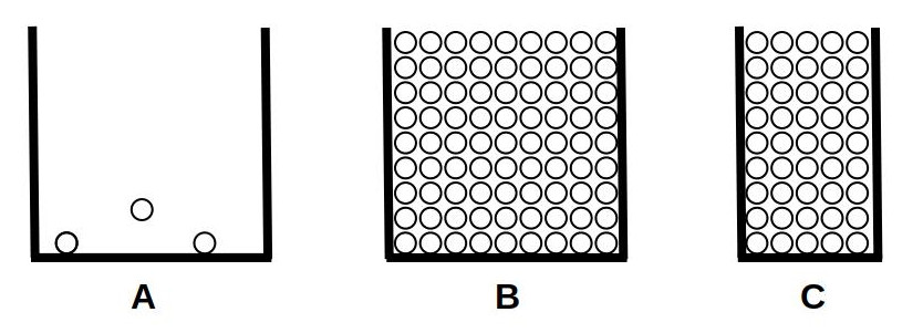
In the figure above we can see three elementary sensors, which are illuminated by photons from above. The elementary sensor shown in figure “A” is not illuminated, so only some image noise can be read from it. In figure “B” we can see a larger elementary sensor saturated, and in figure “C” we can see a smaller one, also saturated. We can see that the elementary sensor with a larger surface area can store much more charge.
Clipping is caused by the overflow of the elementary sensors. The main source of image noise is thermal noise produced by the image sensor and its associated components (signal amplification circuitry, etc.), which is caused by the thermal motion of molecules in the components.
It is useful to know that the sensitivity of the image sensor is constant and cannot be changed. If we shoot with twice the sensitivity (e.g. ISO 200 instead of 100), then half the amount of light reaches the image sensor, because we have to take the picture with either half the shutter speed or one value narrower aperture in order to get the correct exposure.
A: low sensitivity (ISO 100)
- Dark areas
- Midtones
- Highlights
B: twice the sensitivity (ISO 200)
- Dark areas
- Midtones
- Highlights
The red circles represent image noise, the white ones represent the amount of charge caused by useful image information. In the top row of the figure, we photographed with low sensitivity (ISO 100). We can see three elementary sensors, the one on the left received little light from the dark subject, the one in the middle received more from the midtones, and the one on the right received the most from the brightest tones. Below we can see the case of double sensitivity (ISO 200). Due to the twice as high sensitivity, half the amount of light reached the sensor, therefore half the amount of useful charge was generated. However, the image noise did not decrease.
Due to the halving of the amount of light, the signal that can be read from the image sensor will also be half the size, which is compensated by doubling the gain of the circuit that amplifies the signal by setting ISO 200. Then, our signal in front of the signal digitizing circuit will be the same as when setting ISO 100, the huge difference will be that by increasing the gain, we also double the image noise. If we double the ISO sensitivity, we actually always double the gain of the amplifier. If we reduce the ISO sensitivity by half, we actually always reduce the gain of the amplifier by half. Despite this, we usually say that we are adjusting the sensitivity of the sensor.
Noise can still be seen when using a slow shutter speed, even at a low ISO setting. In this regard, a shutter speed of at least 1 second is considered slow.
The raw file is created as a result of processing in the camera. The main steps of processing are as follows:
- After exposure, a signal proportional to the amount of light is read from each elementary sensor, and the read values are digitized.
- The JPEG image is produced using the digitized data according to the camera’s set parameters (such as picture styles).
- If raw shooting is enabled, it creates the raw file by embedding the created JPEG image, using the unprocessed raw data, as well as metadata.
- Finally, the raw file is saved to the memory card and, if enabled, the JPEG image is saved.
The JPEG image embedded in the raw file is used by various software programs to display the image whose raw data is contained in the given raw file. The metadata embedded in the raw file and the JPEG image is information related to the creation of the image (e.g. camera type, lens type, ISO value, shutter speed, aperture value, etc.), which can be read and viewed at any time with a suitable program.
So, the raw file contains the unprocessed data read from the image sensor, digitized with high bit depth, the metadata, and the embedded JPEG image.
2.2 Demosaicing
The image sensor does not see colors, it only detects the amount of light. In order for us to see colors in the image, each element of the sensor (“pixel”) has a red, green, or blue filter in front of it, which only allows light rays of the color corresponding to its color to pass through.
Bayer color filter on the left, X-Trans color filter on the right. Image source: Wikipedia
In the figure, a small square corresponds to a pixel (an elementary sensor) of the image sensor. We can see the color filters arranged in a strict order in front of the elementary sensors. A pixel detects only the intensity of one color. The color of a pixel in a photograph is determined by calculation by taking into account the data of the elementary sensors located around it, under different colored filters, and the characteristics of our vision. This process is called demosaicing. So the color data of each pixel is created during the demosaicing.
On the right side of the figure you can see a small detail of the X-Trans matrix color filter developed by Fujifilm, which is significantly different from the Bayer color filter shown on the left. Fujifilm cameras use the X-Trans matrix color filter, while other manufacturers use Bayer color filters. The same demosaicing algorithm cannot be used for the Bayer and X-Trans filters. Several demosaicing methods have been developed for both types of sensors, from which we can choose during processing.
2.3 Raw black level, Raw white level
Raw files contain data captured by the sensor and quantified during digitization. The lowest brightness values are assigned to the lowest numbers, and the highest brightness values are assigned to the highest numbers. One of the key pieces of information needed to properly process the data from a raw file and display it as an image is the raw black level and raw white level.
The raw black level determines the lowest brightness value from which the data in the raw file can be used. Values below this are not used during processing, they are considered the same as the raw black level value. For example, in the case of a 14-bit raw file, the raw black level is not necessarily 0, but the usable range can start with a value of 512, for example. The reason for this is that the image sensor and the camera electronics also produce noise. It is only worth using the signal when the useful image information dominates over the noise. If the detail of the subject in question is very dark, so little light may reach the elementary sensor that the noise, not the useful signal, may dominate.
The raw white level determines the lightest shade value that can still be used. The white level of a raw file containing 14-bit data is not necessarily 16383, its value depends on several factors (e.g. overflow of the elementary sensors), and can be, for example, 16300 in reality.
2.4 Color management, color systems
We need some basic knowledge of color management when processing raw files. This is a complex, multifaceted topic that could fill books. However, we don’t need such detailed knowledge, just enough to understand what we are doing when processing a raw file. In this section, I will briefly cover the most basic knowledge that can help you get started.
Human vision is a very complex thing, very difficult to describe mathematically. Several color models with different approaches have been created. In the case of different color systems (color spaces) used in certain imaging (scanner, camera, etc.) and display (monitor, printing press, printer, etc.) units, it would be necessary to ensure that an image appears the same on all of them and that they can be converted into each other. This is a difficult problem to achieve. The individual display units and color system models are not able to transfer, map, return, or depict the entire range of colors visible to humans, but only a larger or smaller part of it. Here, without claiming to be complete, I will describe the most important basic concepts related to color systems and color representation that also occur in programs used to process raw data.
I will not go into detail about our vision, because it is not needed to process images. However, I will mention that our vision has two stages. On the one hand, there are the light-sensitive cells and their properties, and on the other hand, the colors that are created by the complex processing of the information obtained from them, and the resulting image. The colors that we perceive are actually not created on the retina, but in our brain, during the processing of information. The processing of information obtained from our eyes is very complex, and at least 30 different areas of our brain are involved.
The colors of objects are not physical properties of objects, they are created in our brains and exist only for us. For example, animals perceive colors completely differently. It is difficult to believe that the color of an animal that stands out from its environment is a camouflage color. However, if we learn about the vision of the animal’s enemies, we can see that for them an animal with camouflage color blends well into its environment. So colors are created in our brain, but other conditions also affect it. Our color perception also depends on the circumstances. Optical illusions exploit this. In the simplest case, for example, we can see a surface of the same color as having different tones depending on the color of the background. Or consider that we perceive a white sheet of paper as white even under the light of a traditional incandescent lamp, although in reality it looks yellow. We can verify this by photographing it with a daylight white balance. Our brain “knows” that in reality the sheet of paper is white, so we see it as white.
The wavelength range (spectrum) of sunlight that a person with average vision can see is 380-750 nm (nanometers). The color that is perceived depends on the wavelength of the light. The diagram below shows the part of the sunlight spectrum that we can see.
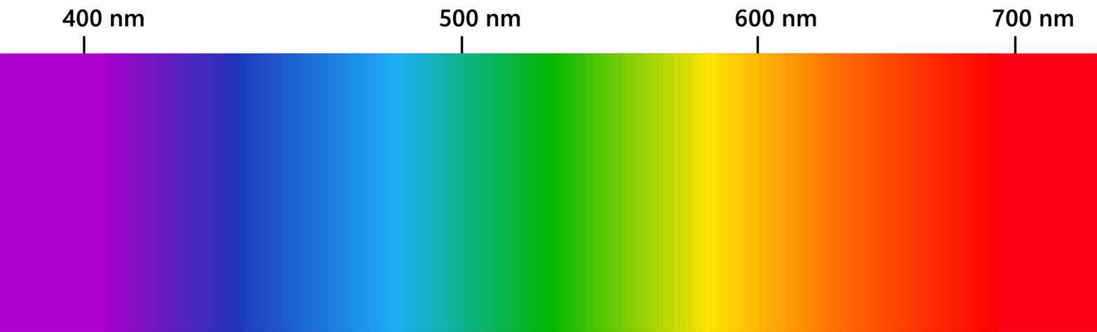
The wavelength values are shown above, and the corresponding color below. In fact, we see the colors of the rainbow, from violet to red. In a rainbow, the components of visible light with different wavelengths appear shifted relative to each other, which is why we can see the color shades that make up the rainbow next to each other. We saw the same thing in the school experiment when we used a glass prism to break sunlight into components, and we got a result similar to the rainbow. This is possible because the refractive index of glass depends on the wavelength of light, it deflects electromagnetic radiation with different wavelengths to different degrees, which is why colors with different wavelengths will be visible next to each other.
When sunlight is broken down into components using a prism, we get a series of monochrome (single-color, single-wavelength) components. So the spectrum shown in the figure above consists of a succession of monochrome components. The spectrum of sunlight is continuous, meaning that it contains components of all wavelengths within the entire wavelength range. The result of these monochrome components of different wavelengths and intensities is perceived as “white” light.
Color spaces are about the mathematical modeling of colors that humans can perceive, or a subset of them. By colors here I mean “everything” that we can perceive. This includes gray, black, white, pastel colors, strong colors, in short, everything. The description in the language of mathematics is necessary for the applicability on the computer. For each color space, there are parameters whose values determine the given color. Changing a given parameter changes some characteristic of the given color. In image editing programs (among others), we can directly or indirectly change these parameters, which result in changes in the image. Therefore, it is important to have at least a basic understanding of color systems. We need to understand what we actually change when we change something in the program.
A concept also related to color spaces is side effects. It would be good if, during editing, only the desired characteristic (for example, contrast) changed, and everything else (for example, hue, saturation) remained unchanged, but this is not always possible. It may happen that if we change something, other characteristics also change as a side effect. For example, if we adjust the brightness of the image, the colors would also change slightly as a side effect. This is not good, because if everything changed at the same time, the whole thing would be unmanageable. That is why we need multiple color spaces, multiple methods (procedures) during image editing and raw file processing. One is more suitable for this purpose, the other for another purpose. By using multiple color spaces and multiple methods, it is possible to create a work environment that is easy to use, has as few side effects as possible, and gives good results.
Making too drastic a change can have side effects. This can be avoided by using editing tools in a way that doesn’t overdo it.
2.4.1 Two types of frameworks
There are two frameworks within which color properties can be analyzed and described:
- A physiological framework that is proportional to the brightness of the subject (linear), focusing mostly on the response of the cones on the retina, using color spaces such as CIE XYZ 1931 or CIE LMS 2006.
- A perceptual, psychological framework that also takes into account brain corrections, for example using the CIE Lab 1976, CIE Luv 1976, CIE CAM 2016 and JzAzBz (2017) color spaces.
These two frameworks provide us with the ability to describe colors and allow us to change certain properties of colors without changing other properties (much).
Colors can be described in many different color spaces, but regardless of the color space, at least three characteristics are required to describe every color: a measure of brightness (lightness), and two measures that describe the color in some way (in the form of hue and saturation, or using color coordinates).
2.4.2 The CIE XYZ 1931 color system
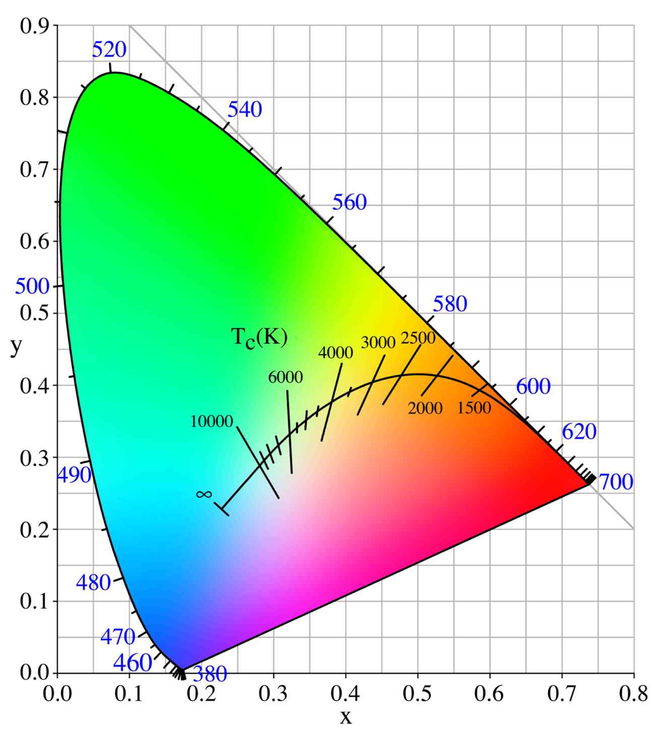
Because of these three characteristics, the range of perceptible colors can be described by a three-dimensional shape. The figure above shows a projection of the CIE 1931 XYZ color system (the three-dimensional shape). This projection shows most of the color shades that humans can perceive. This is the largest range of colors that humans can perceive. Colors that are no longer perceptible lie outside the color space shown in the figure.
In the diagram above, we can theoretically see all the colors that humans can perceive at a certain brightness (“lightness”). However, this is only theoretically the case. In reality, the image shown here is a JPEG image that is only suitable for displaying a smaller range of colors that humans can perceive, and therefore cannot realistically contain all the colors that can be perceived. The other problem is the color range that a monitor can display. A monitor whose color range can approach the full color range that humans can perceive is very, very expensive. Cheaper monitors fall far short of this, so we can’t realistically see the colors of the projection of the CIE 1931 XYZ color system shown in the diagram above.
In the figure, the wavelength values of the monochromatic light obtained by breaking down sunlight into its components are indicated at the edge of the colored area. These are the monochromatic components also shown in the figure above (sunlight spectrum). The exception to this is the straight part shown at the bottom edge of the diagram.
We can produce mixed colors by mixing two or more monochrome components (with a certain intensity ratio). If we connect any two monochrome colors located at the edge of the colored area of the above figure with a segment (a straight line), then along the segment we can see what mixed colors we can produce by mixing those two monochrome colors in different proportions. If the intensity of the two monochrome colors is the same, then the mixed color is located at the midpoint of the segment. We can conclude that the mixture color obtained by mixing two or more visible monochrome colors in different proportions is perceived as a different color.
Similarly, any two points inside the colored area can be connected with a segment. At both endpoints of the segment there is a mixed color. Along the segment we can see what colors can be produced by mixing those two colors in different proportions. In the case of the same intensity, we get the color visible at the midpoint of the segment.
The colors located along the line visible at the lower edge of the color space are mixed colors, and are created by mixing the colors with wavelengths of 380 and 700 nm visible at the two ends in different intensity ratios.
So, the colors located at the edge of the horseshoe-shaped part of the diagram represent spectral (found in the daylight spectrum) monochrome colors, which can be characterized by a single wavelength. The colors located inside the horseshoe-shaped part and along the bottom straight line can only be produced as mixtures of spectral monochrome components, or two mixed colors in different proportions, which means that there is no single wavelength of light that we would see as the same color.
The figure also shows that a certain mixed color can be produced in more than one way. Let us mentally connect a left and a right extreme point of the horseshoe-shaped part with a segment. Let us mentally select an intermediate point around the middle of the segment. At this point we see a certain mixed color. Now we can see that there are countless ways to connect the extreme points of the horseshoe-shaped part with a segment so that the segment passes through the point selected in the mind, i.e. results in the same mixed color. Similarly, there are countless ways to select two points inside the horseshoe-shaped part that, if connected with a line, pass through the selected point. So, a mixed color can be produced in countless ways from monochrome colors or mixed colors.
In the figure, we can read the x and y color coordinates of the hues, but we must also imagine a third (z) axis perpendicular to the plane of the monitor (on which we are looking at the figure), on which the lightness values are depicted. If we were to look at a section of this color space with higher brightness, the gamut (range of perceptible colors) would be smaller than shown in the figure above. This means that we no longer perceive lighter versions of certain hues. So a color can be described with the x, y, z coordinates. In this color system, lightness is theoretically independent of hue. This means that when the lightness is changed, the color does not change in principle.
So, looking at the above diagram of hues for a given lightness, a hue can be described by the x and y color coordinates. We do not perceive “colors” outside the color space.
On the color chart, the point with coordinates x=1/3 and y=1/3 is the white point, and the small area surrounding it represents the color white. If we draw straight lines from the white point to different points on the edge of the colored area, the color is determined by which extreme point of the colored area the given line reaches. From the white point to the extreme point of the colored area (along the line), the saturation increases. At the white point, the saturation is zero.
In the figure, the curved line actually represents the color temperature of daylight illumination. Along this curve, the color temperature (color) of the light illuminating the subject changes under daylight conditions depending on geographical location, time of day, and other factors (e.g. weather, shade, etc.). Some color temperature values are also marked in the figure. We may also encounter other notations of the more important color temperature points, in which the 6000 K color temperature point is marked as D60, 5000 Kt as D50, 6500 Kt as D65, etc. in a figure similar to this one.
Our central visual field, which we use for the most detailed, sharpest vision, has a visual angle of about two degrees. Like when we focus on a circle visible under a visual angle of two degrees. The CIE 1931 XYZ color system deals with perception at a visual angle of two degrees and does not take into account our peripheral vision. There is also a color system that examines a visual angle of 10 degrees, i.e. it partially takes into account our peripheral vision.
2.4.3 RGB color system
The RGB color system is a collective term, as there are several different RGB color systems. The common feature of the various RGB color systems is that colors are produced from three primary colors, namely by additively mixing the primary colors of the appropriate intensity (as if we were projecting the three primary colors of different intensities on top of each other).
In all RGB color systems, colors are created by mixing three primary colors (color components) in a certain ratio. The three primary colors are red (Red - R), green (Green - G), and blue (Blue - B). We also say that there are three color channels in the RGB color system, red (R), green (G), and blue (B). A given color can be characterized by a triplet of numbers that gives the intensity values of the three primary colors in the order R, G, and B that result in the given color.
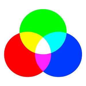
In the figure we can see that if we projecting the three primary colors on each other with maximum intensity, we get white. Therefore, due to this property, this method of color mixing is called additive color mixing.
There are RGB color systems that cover a significant part of the full range that humans can perceive, and there are those that cover only a small part of it. There are those in which the lightness values are linear, and there are those in which they are not. The former are mostly used for image processing purposes, while the latter are used for display (for example on a monitor), because this requires nonlinear characteristics.
Let’s take a brief look at the sRGB color space. JPEG images most often contain information in the sRGB color space. The figure below also shows the CIE 1931 YXZ color space. It shows the colors and color range of the sRGB color space, which is the most common color space today.
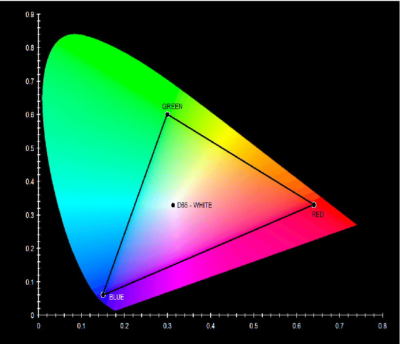
The color tones that can be displayed in the sRGB color system can be seen inside the triangle. At the vertices of the triangle we find the three primary colors of the sRGB color system (red, green, and blue). The colors seen inside the triangle are created by mixing the three primary colors at different intensities. The colors created by mixing the primary colors cannot be outside the area bounded by the lines connecting the three primary colors (outside the triangle in the figure). We can also see the point D65 (6500 K) in the figure.
In the case of sRGB, each of the three color channels has an 8-bit resolution, meaning that 256 different lightness values (intensity values) are possible. The ratio of the intensity values of each color channel determines the ratio of the individual components. A given color is therefore defined by a combination of three values: the intensity values of the red, green, and blue channels. In this color system, a total of 256x256x256=16777216 color shades are theoretically possible.
The primary colors are chosen so that if all three color channels are at maximum intensity, their mixture gives the maximum brightness white. If all three color channels are the same, but not at maximum value, then we get a neutral gray. If all three color channels have a value of zero, then we get the darkest shade, black. Colors can be specified with a triplet of numbers, namely by specifying the intensity values of the primary colors that result in a given color in the order red (R), green (G), and blue (B). For example, [0,0,0] denotes black, [255,255,255] denotes white, [240,240,240] denotes light gray, and [230,200,50] denotes ochre yellow. For example, if only the R channel has a value other than 0, then we get a red color, the smaller the numerical value, the darker it is. Due to the 8-bit resolution per color channel (“color depth”), we can only get 255 different shades of red ([1,0,0,] - [255,0,0]).
The concept of a color channel can mean, on the one hand, the intensity value of a color component of a given pixel, for example, in the case of [100,200,150], the value of the R color channel is 100, and on the other hand, it can also mean the ordered set of intensity values of a given color component belonging to all pixels of a given image. In the latter sense, for example, the green color channel of an image means the ordered set of intensity values of all pixels of the image belonging to the green base color. It is ordered because we know which value applies to which pixel, the values are not in a jumble.
The situation is complicated by the fact that the sRGB color system is also called 24-bit. They say that to describe a color, three eight-bit numbers are required, corresponding to the three color channels, i.e. a given color can be described in this color system with a total of (3x8=) 24 bits. So when we talk about the bit depth of a color system, we need to say how many color channels there are, how many bits they are, and whether we are talking about the bit depth per color channel or the combined (added) bit depth of all color channels.
We can see how small a range of all visible colors can be displayed in the most commonly used sRGB color system. Our monitors, phones, tablets, and televisions use this color system, and we also use this color system to create JPEG images with our cameras. This is useful because we can display this well on our monitors, televisions, and such images are also displayed on the Internet with correct colors and tones.
We might think that the sRGB color system is great because it can distinguish over 16 million shades of color, and our vision is nowhere near that. The problem is that all 16 million shades of color are within the triangle, and colors outside of it cannot be represented or displayed.
An average, not very expensive monitor is not nearly capable of displaying all the shades perceived by humans, but it may be capable of displaying (almost) the entire sRGB color space.
Let’s look at the figure below, which also shows the CIE XYZ 1931 color space, with the color ranges of some other color spaces also marked:
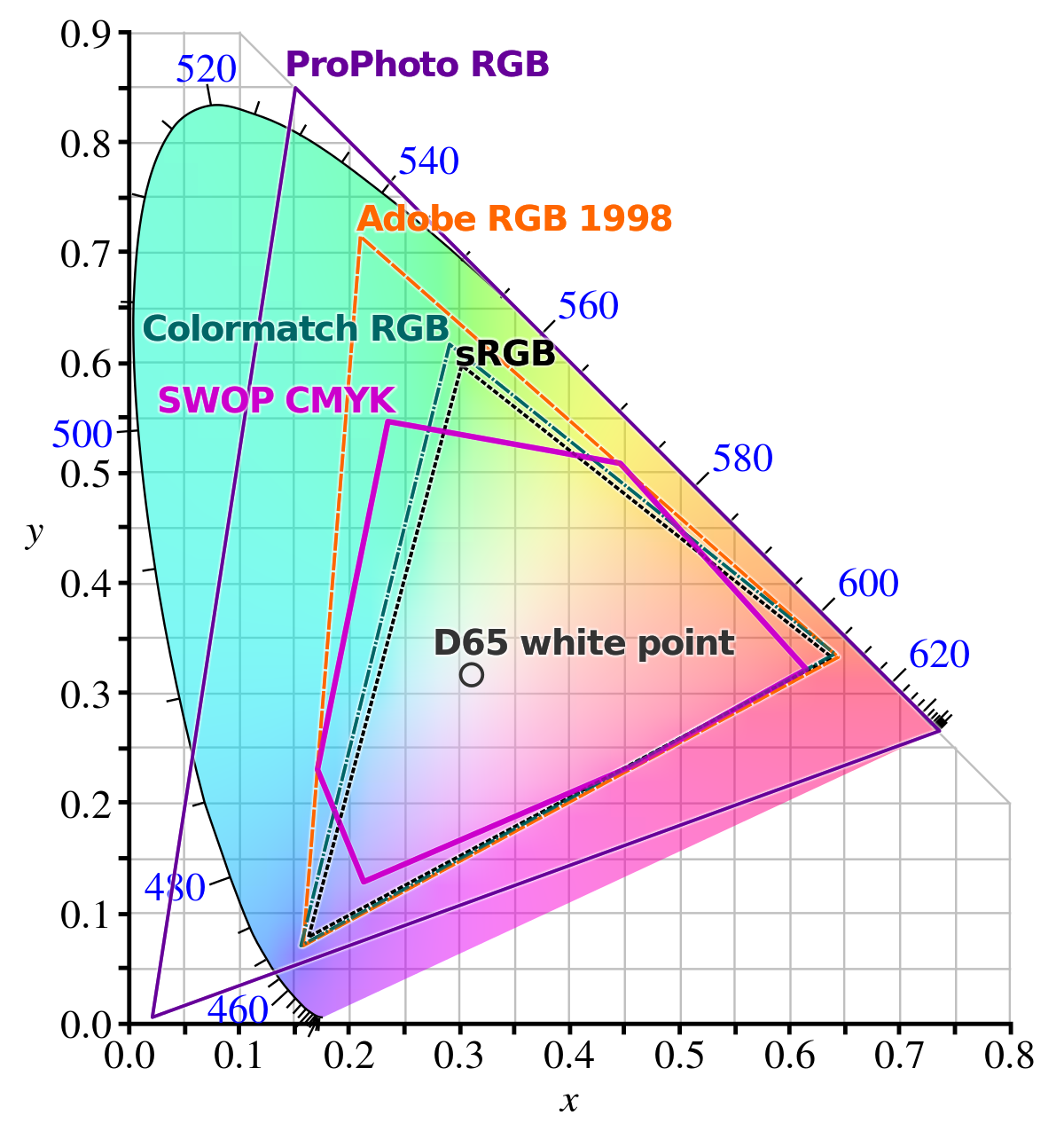
The Adobe RGB 1998 color space is much larger than the sRGB color space. To achieve a larger color space, at least one of the primary colors must differ from the sRGB primary colors. This is exactly what happens, as you can see that the green primary color (the green vertex of the Adobe RGB triangle) is much higher in the figure than the green vertex of the sRGB, resulting in a larger color space. Finally, let’s look at the ProPhoto RGB color space, which covers almost the entire spectrum and is even suitable for representing “colors” that are not perceptible to humans, for example at the lower left vertex. This is a linear color space that can represent colors at high resolution (with a high bit depth). It is also used, for example, as a so-called working color profile in raw file processing programs (in many cases, changes are made in this color space during processing).
2.4.4 CYMK color system
The CYMK color system is used in printing, and its color rendering ability is quite limited compared to human color vision. In the CYMK system, colors are produced using cyan (C), magenta (M), yellow (Y), and black (K - Key, key color), i.e., these colors are used for printing. Today, this is not entirely true, because more colors can be used for better results. This model is based on the color absorption of dyes. If we illuminate the dye with white light, certain wavelengths of light are absorbed, others are reflected, reach our eyes, and we see the dye as the color corresponding to the reflected light. A mixture of C, M, and Y dyes in the appropriate ratio is theoretically capable of absorbing the entire visible spectrum, i.e., we get black as a result. Because of this property, this color mixing method is called subtractive color mixing. In practice, however, mixing the three colors does not produce black (the result will be a brownish color), so black ink is also used for printing. If we want to print an image in the sRGB color system in a printing house, for example for publication in a magazine, then in theory only the color points that fall exactly within the common area of the two color systems can appear on the printout, and the color of the sRGB pixels that fall outside of that area will be converted in some way to a similar color that can be displayed in the CYMK system.
2.4.5 HSV color system
This is actually a different modeling of the RGB color system, closer to the concepts used in everyday life. Using the three color channels of the RGB color system, it is not easy to mix a given color, because this model is far from human thinking and concepts about colors. The HSV color system describes colors with hue (H) (in other words, hue: color character, color type), saturation (S), and value (V, lightness). Its usual name is even HSB, in which case the name Brightness (B) is used instead of Value. This model is usually represented by a cone turned upside down.
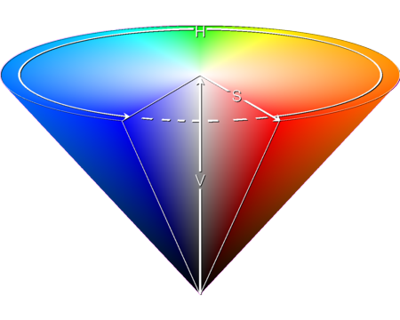
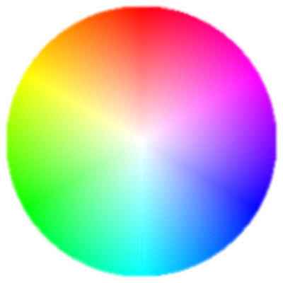
In the figure above, we can see the HSV color cone, with an article cut out of it on the side facing us. We can also observe the meaning of the H, S, and V parameters. In the middle, along the section from the tip of the cone to the middle of its base (the “V” in the figure), the shades of gray are located. The darkest (black) is at the tip, and the lightest (white) is in the middle of the base circle. The “V” value shows the lightness value in percentage, 0% is black, 100% is the lightest. The “H” value is given in degrees, and we can select the color using it. Its value can be between 0-360 degrees, with 0 degrees being red, 60 degrees being yellow, 120 degrees being green, 180 degrees being greenish-blue (cyan), 240 degrees being blue, and 300 degrees being magenta (the color between red and violet). The saturation “S” increases from the cone’s altitude line towards its surface along the radius of the circle, including any section circle of the cone parallel to its base circle. There is no saturation in the center (0%), so we get gray, and at the surface the saturation is 100%, where the most saturated colors are located.
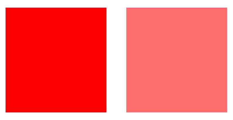
On the left is the more saturated version of the same color, on the right is the less saturated version
We see slightly saturated (1-10%) colors as gray, but we can already distinguish whether we see “warm” (reddish, yellowish) or “cold” (“bluish”) gray. Pastel colors have a saturation of 10-30%, in practice, the saturation of stronger colors experienced in our environment is usually 30-65%. 65-90% saturation characterizes saturated colors. 90-100% saturation belongs to oversaturated colors, which must be treated with caution, because color corrections change these colors little, so it is not possible to work well with them. In the figure below, we can see the basic circle of the cone in a top view, which is also called the color circle. The color changes along the outline. In the center of the circle, the saturation is 0%, it increases along the radius of the circle, reaching 100% at the outline.
We can also say that we select the “pure” color with the H value, increase or decrease the white content with the S value, and increase or decrease the black content with the V value. When the V value is 0, we get black regardless of the other two values. If the V value is 100%, then the color has the lowest black content. If we then select a color with the H value, the white content of the image is the highest at the S value of 0%, and therefore we get a white color. If we increase the S value, the selected color appears in pastel shades, and at the 100% value we get the most saturated color. If we now start to decrease the V value, we get a darker and darker color, and finally black.
2.4.6 LCH color system
This is a perceptual color system that is somewhat similar to the HSV color system. Its name comes from the initial letters of the English words Lightness, Chroma, Hue. Lightness and Hue are similar to the Value and Hue properties of the HSV color system, and Chroma is a color saturation-like characteristic, just like Saturation. So colors in this color system are described by three properties similar to those used in the HSV color system.
2.4.6 HSL color system
Hue, Saturation, and Lightness are the three characteristics. Colors are described in this color system using three properties similar to those used in the HSV color system.
2.4.7 CIELAB or L*a*b*
The term “L*a*b*” should be distinguished from Lab without the asterisk, because it means something different. Nevertheless, it is also common to write it without the asterisk. The problem is that due to the complexity of our vision, mixing two colors selected in the RGB (or HSV) system cannot be described mathematically. The color calculated and displayed by the computer does not match what we would experience in practice if we mixed those colors. Unfortunately, not all problems can be solved at once. Either the lightness value of the result is good, and the hue is distorted, or the hue is accurate, but the lightness value is not accurate. In the L*a*b* model, the hue is accurate, and the lightness values are distorted.
The L*a*b* color space is based on the difference of opposing color pairs. It uses the four unique colors of human vision: red, green, blue, and yellow. The channels of the L*a*b* color space are: “L*”, as the perceptual lightness value, “a*”, as the difference value of green and red, and “b*”, as the difference value of blue and yellow. The values of the “a*” and “b*” color channels can be negative or positive. In the diagram of the CIE XYZ 1931 color space above, we can see that these color pairs are located opposite each other, which is why we can express with a single numerical value how green or how red, or how yellow or how blue a color is. If the values of the channels “a*” and “b*” are equal to 0, then L*=0 stands for black, L*=100 stands for white, and the intermediate values of L* produce shades of gray. Regarding L*, the value of 100 is usually considered the maximum. If we change the “a*” channel value in a negative direction, we get an increasingly greenish shade. If we change the “a*” channel value in a positive direction, we get an increasingly redder shade. With negative values of the “b*” channel, the color becomes increasingly blue, and with positive values, it becomes increasingly yellow. By using L*a*b*, the colors seen on the screen will be accurate, but the distortion of the brightness values can be easily corrected with the help of the histogram.
In connection with the L*a*b* color space, we can encounter the so-called Munsell correction in processing programs, which can be used to minimize any color shift that may appear. This may not be named in the programs, but we can simply turn on the Prevent color shift option.
2.4.8 Hue, color wheel
Let’s look at the spectrum of sunlight again. When sunlight is broken down into components using a prism, we get a series of monochromatic (single-color, single-wavelength) components. So the spectrum shown in the figure above consists of a succession of monochromatic components. The spectrum of sunlight is continuous, meaning that it contains components of all wavelengths within the entire wavelength range.
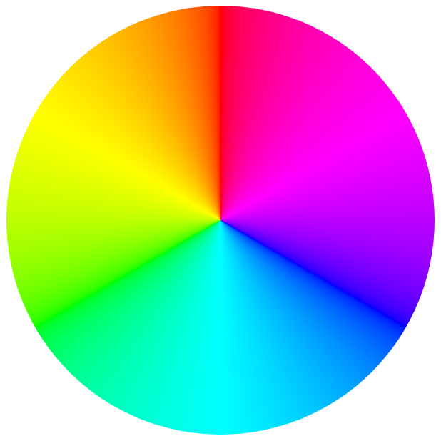
Color wheel
In the color wheel, this spectrum containing only monochrome colors is represented in the form of a circle or ring, and for the sake of continuity between red and violet, we supplement it with the color magenta (and its transitions towards red and violet). In fact, we supplement it with the secondary colors shown along the straight part at the bottom of the CIE XYZ 1931 color space diagram. This way, the transition will be continuous without any jumps. Magenta is not a monochrome color, but a mixed color. If we look at the diagram above as a clock face, we can see the color magenta at about 2 o’clock.
The monochrome colors of the sunlight spectrum, supplemented with the color magenta, are called hue. So, on the color wheel above, we can see hue. Notice that on this color wheel we only see hue, there is no white in the center, and the saturation of the colors does not change along the radius of the circle (if this were not the case, we would see not only hue, but also shades of color in the color wheel). The colors of hue are called pure colors. All colors are equal in the color wheel.
Hue: the pure colors red, orange, yellow, green, cyan, blue, purple, and magenta, and the continuous transitions between adjacent colors; but only the pure colors. These can be seen in the color wheel above.
If we lighten the red color, we get a pink color, which has a red hue. If we darken it, we get a dark red color, which also has a red hue. Mixed colors can have multiple hues, for example, brown can have different shades, and its hue can also be orange or red.
2.4.9 Terms used when describing and modifying colors
Different color systems use different concepts to accurately describe colors and their lightness. These are the following:
Hue: These are pure colors with a continuous gradient, depicted in a color wheel. A hue is a color in this color wheel.
Chromaticity, Chroma: An objective measure of the quality of a color, independent of its lightness. Similar to saturation.
Saturation: The color of an area, taking into account its lightness.
Luminance: Luminance is a property of visual frameworks, and in colloquial terms, it is a concept similar to lightness.
Brightness: This is a concept similar to lightness.
Lightness: Lightness is the perceptual, non-linear equivalent of brightness.
Brilliance: The brightness of an area relative to the brightness of its surroundings.
The exact scientific definition of each concept contains significant differences, but my book is intended for photographers and not physicists, and therefore generally contains significant simplifications and inaccuracies. Here too, I will make a major simplification. Brightness, luminosity, clarity, radiance are approximately what we call simply lightness in common parlance, and I will often use this. Brightness is a characteristic value of how much a given subject rises and shines from its environment. Hue is the pure colors red, orange, yellow, green, teal, blue, violet and magenta, and their transitions on the color wheel. Saturation and chromaticity are somewhat similar concepts, we can use the concept of saturation as a simplification. The point is to have a general understanding of these concepts and how they resemble our everyday concepts of color, because then, when processing the raw image, we will know what property of the image a given control changes. The goal is not scientific accuracy, but rather general understanding.
For better understanding, let’s look at the figure below.
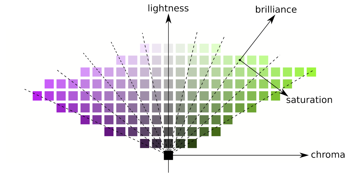
In the figure, lightness, chroma, saturation, and brilliance are depicted in the JzAzBz color space, which is a perceptual color space suitable for high dynamic range (HDR) image information.
In the figure, a black square is shown in the bottom center. The upward arrow indicates that the lightness increases from the black square upwards, i.e. above the black square we can see an increasingly brighter neutral gray square (free of discoloration). The lightness value increases from bottom to top for each column in the figure.
The more we increase the chroma, the further away from the center column the result will be, no matter which row we look at. Squares within a column are of the same chroma (but of different lightness).
The lines connecting points of equal saturation are slanted, and some are drawn with dashed lines. The brillance increases along the slanted dashed lines. Changing the saturation changes the angle of these slanted lines. Moving them in the direction of the arrow in the figure increases the saturation.
Lightness and brilliance are similar characteristics, both of which are about lightness in some sense.
Lightness and chroma together describe the same reality as brilliance/brightness and saturation together. Chroma varies along a constant lightness, saturation along a constant brightness/brillance. The reverse is also true: lightness varies along the same chroma, brightness/brilliance along the same saturation.
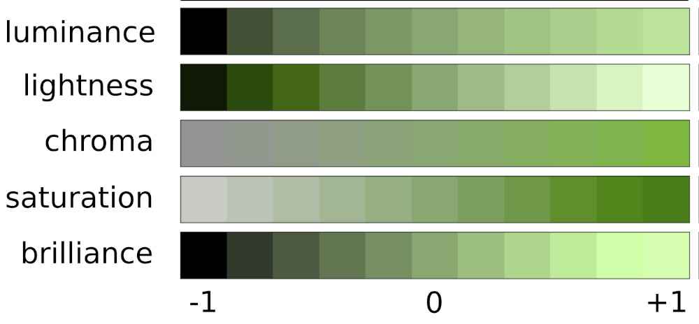
Let’s look at the figure above, where we can observe the changes in luminance, lightness, chroma, saturation, and brilliance. Notice how similar the changes in luminance, lightness, and brilliance are, and how similar the nature of the changes in chroma and saturation are.
2.5 Tones
The tones of an image are about lightness values, not colors. Colors (including gray) also have lightness values, lighter and darker tones. These lightness values are called tones.
The full tonal range from the darkest to the lightest tone
In photography (image processing), the entire tonal range is usually divided into five parts:
- Shadows: the darkest tones. This is what we call the darkest parts even if they are not actually shadows.
- Dark tones: the range between shadows and midtones.
- Midtones: the middle tonal range.
- Light tones: the range between midtones and highlights.
- Highlights: the lightest tones.
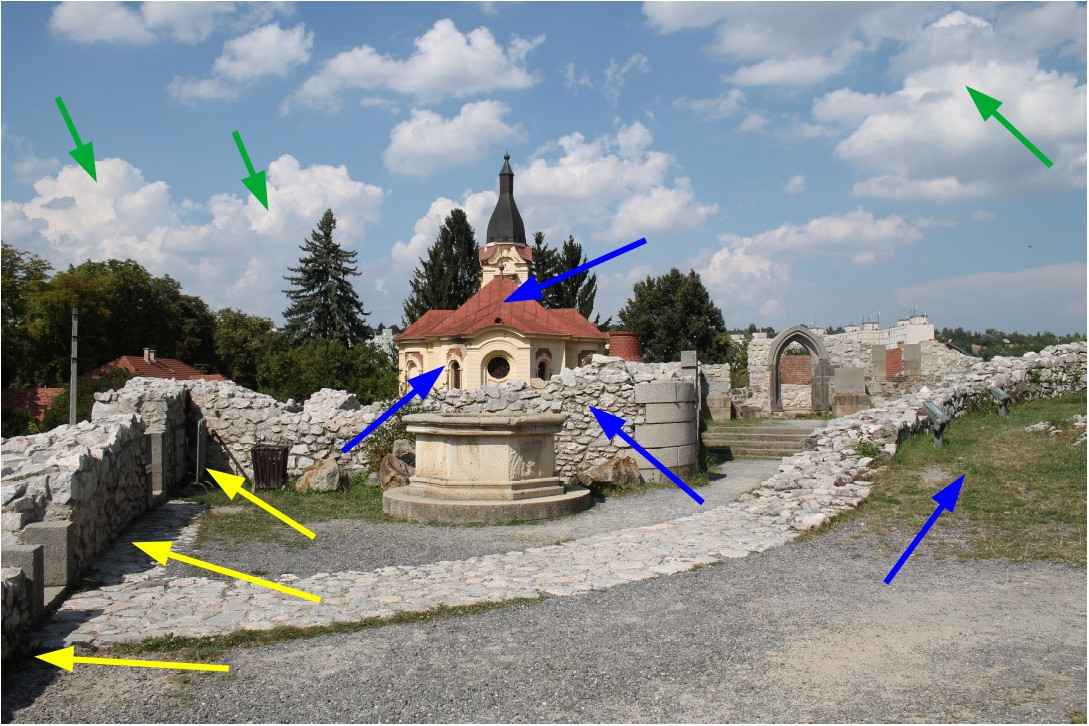
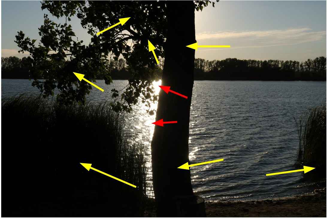
Highlights, midtones, shadows
In the image above, I’ve marked some areas with arrows. Green arrows indicate highlights, blue arrows indicate midtones, and yellow arrows indicate shadows.
2.6 Dynamic range (tonal range), contrast
Dynamic range (tonal range) is very important for editing raw files, so we need to deal with it in more detail. A significant part of our interventions are related to tones, aimed at modifying, compressing, and stretching tones.
The dynamic range
- the photo subject, or
- data recorded by the camera in raw format, or
- the resulting photo
the difference in brightness between the lightest and darkest parts, expressed in exposure value.
Maximum dynamic range is the maximum possible difference in brightness between the brightest and darkest parts, expressed in exposure value.
In essence, a concept similar to dynamic range (tone range) is contrast, which is the difference in brightness between the lightest and darkest parts of a certain part of the image, or of the entire image. If the difference in brightness is large, then the contrast in that part of the image, or of the entire image, is high; otherwise, it is low.
The maximum dynamic range of the landscape being photographed can reach 20 stops. The maximum dynamic range that cameras can record in raw format is technically 12-14 stops. The maximum dynamic range that can be recorded in a commonly used 8-bit per color channel JPEG image file is technically about 9 stops.
The dynamic range of real-world photographic subjects is often not very large, but in many cases it is very large. A low dynamic range is not a technical problem, but a high dynamic range can far exceed the dynamic range that our camera can capture.
An 8-bit JPEG image per color channel can in practice transmit a smaller dynamic range (about 9 exposure values), the dynamic range of the raw file can theoretically be larger, with a much higher resolution (12 or 14 bits), i.e. even very small differences in brightness can be distinguished. This means that the raw file is capable of storing much more information than the JPEG image. It is important to understand that the larger dynamic range that can be stored in the raw file is only a theoretical possibility. If the dynamic range of the subject is small, then only a small dynamic range will be stored in the raw file, but it will also be stored in very small steps, at high resolution.
In the table below, we look at the maximum dynamic range of the Canon EOS 5D Mk IV (full-frame) and the Canon EOS 750D (APS-C) body, based on measurements by dxomark.com, as a function of the nominal ISO sensitivity, expressed in exposure value:
| ISO | Canon EOS 5D Mk IV | Canon EOS 750D |
|---|---|---|
| 100 | 13.59 | 11.96 |
| 200 | 13.41 | 11.8 |
| 400 | 12.84 | 11.5 |
| 800 | 12.18 | 10.9 |
| 1600 | 11.46 | 10.24 |
| 3200 | 10.66 | 9.38 |
| 6400 | 9.82 | 8.49 |
| 12800 | 8.85 | 7.23 |
| 25600 | 7.83 | 6.62 |
| 51200 | 7.03 | - |
| 102400 | 6.18 | - |
At a nominal ISO 100 sensitivity, the Canon EOS 5D Mk IV camera has a maximum dynamic range of 13.59 stops, which drops to 7.83 stops at ISO 25600, and finally to 6.18 stops at ISO 102400. The Canon EOS 750D camera has a maximum dynamic range of 11.96 stops at ISO 100 and 6.62 stops at ISO 25600. We can see that at the same nominal sensitivity, the full-frame camera has a higher maximum dynamic range. The dynamic range decreases significantly as the ISO sensitivity increases.
Now let’s look at the camera’s real dynamic range.
The dynamic ranges measured by DxOmark look very nice. Unfortunately, however, these are some kind of absolute maximums that are technically possible. However, the photographer is interested in a practical, real dynamic range, not a theoretical value.
The camera’s truly usable dynamic range is limited by clipping in the brightest tones and noise in the darkest tones.
Determining the practical dynamic range of a camera is subjective because it also depends on how much image noise is allowed in the darkest tones, how much clipping is allowed in the lightest tones, and how much discoloration is allowed due to clipping of a color channel.
Also very interesting in terms of real dynamic range is the website https://www.photonstophotos.net, where we can see the maximum usable dynamic range of many camera types as a function of ISO sensitivity. The website calls the usable dynamic range “photographic dynamic range”.
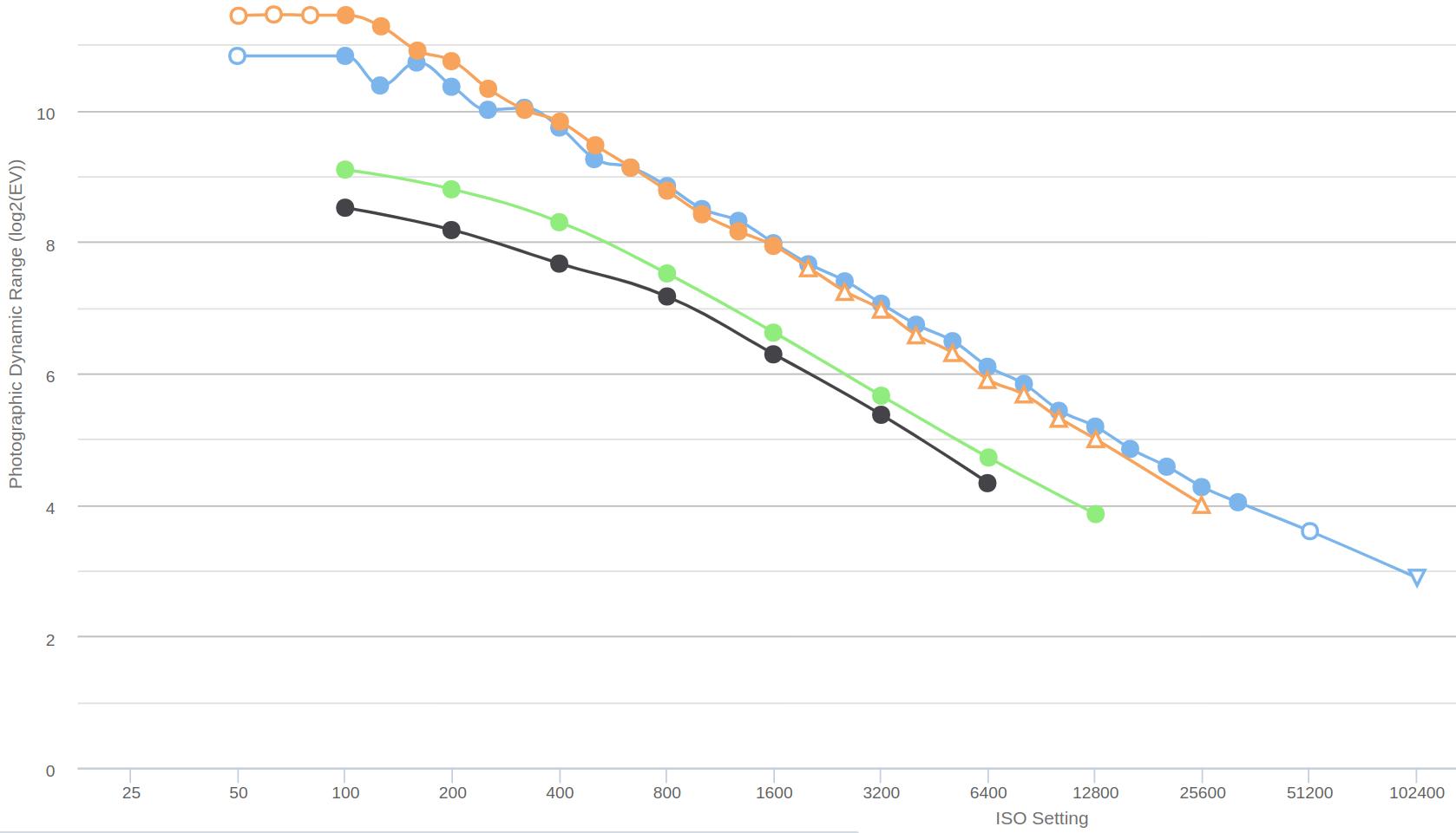
Source: https://www.photonstophotos.net/Charts/PDR.htm
The figure above shows the dynamic range of two full-frame (Canon EOS 5D Mark IV - blue, and Nikon D800E - orange) and two APS-C (Canon EOS 1100D - black, and Canon EOS 750D - green) cameras, according to the conditions specified by the author of photonstophotos.net.
Here too we can see the advantage of full-frame cameras. Increasing the ISO sensitivity significantly reduces the usable dynamic range.
In this video, Andy Astbury shows us how we can measure the maximum usable dynamic range of our own camera in a very simple way. He measured this himself in the video for the Nikon D800E 36 MP full-frame camera.
Andy Astbury measured at the lowest ISO setting. He considered the upper limit of the truly usable dynamic range to be the exposure at which there was no clipping at all in the raw data, and the lower limit to be the exposure at which there was no noise at all, even at high magnification. You have to determine the exposures corresponding to the lower and upper limits, then calculate how many stops there is between the two exposures, and that is the truly usable dynamic range. The camera should perform best at the lowest ISO setting, so Andy Astbury’s strict criteria are not excessive.
The Nikon D800E camera has a dynamic range of 14.3 stops at the lowest ISO, as measured by DxOmark, while Andy Astbury measured a truly usable dynamic range of 8.3 stops. That’s a huge difference.
I wrote the above so that we can see the reality, that we may not have nearly as much exposure value information available when photographing a highly dynamic subject as we think.
In a theoretical example, let’s see how, assuming an ISO sensitivity of 100, we can map the 9-stop range of raw data for a large subject with a dynamic range of 12 stops to just 7 stops of the JPEG image. Let’s look at the figure below:
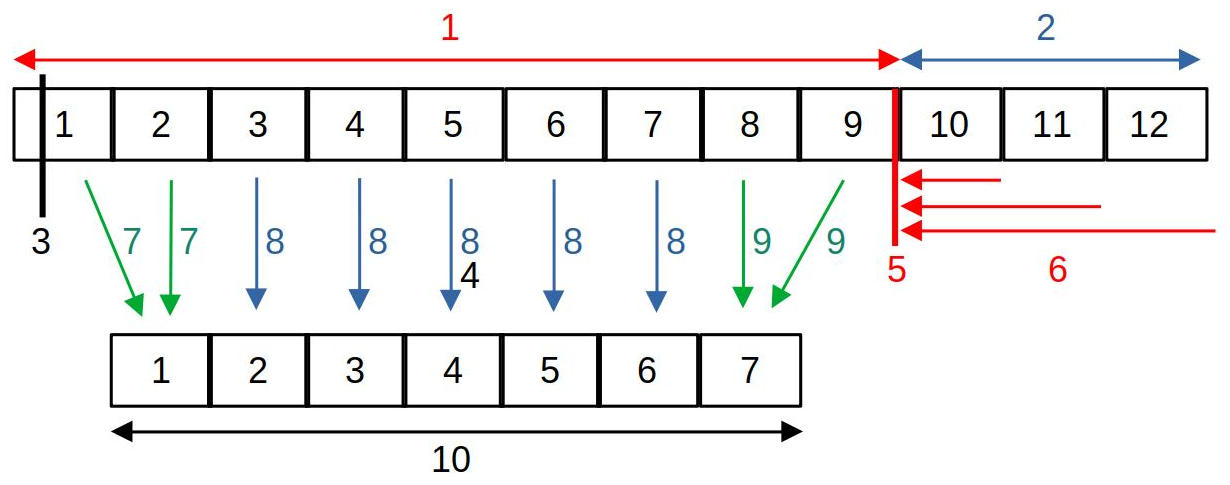
- The maximum information that can be extracted from the image sensor is 9 exposure values.
- The dynamics of the subject are greater than this (12 stops)
- Raw black level
- Target gray point (mid-gray)
- Raw white level
- Raw clipping: the information of the 11th, 12th, 13th exposure values is clipped (takes the raw white level value)
- Compressing dark tones
- We map the midtones by exposure value
- Highlight compression
- The gradation range displayed in a JPEG image (which should be 7 light levels)
The above figure shows the case when the subject has high dynamics, the dynamics of which exceed the tonal range that can be transmitted by the camera’s image sensor. Of course, the maximum tonal range that can be transmitted can only be utilized in raw format. Today’s image sensors are technically capable of transmitting a tonal range of 12-14 exposure values, but in reality less than this can be utilized. In the figure, we can see an image sensor capable of transmitting a maximum of 9 exposure values of dynamics, and I have numbered the tonal range for each exposure value. However, the subject has a dynamics of 12 exposure values, and the JPEG image in our example is only capable of displaying a tonal range of 7 exposure values. The fundamental question is what and how should be included in the 7 exposure value tonal range of the JPEG image from the data containing 9 exposure values of dynamics, and what should happen to the 10th, 11th, 12th exposure values that exceed the camera’s tonal range.
The figure shows the raw black level. The raw black level defines the lowest brightness value from which the data in the raw file can be used. Values below this are not used during processing, they are considered the same as the raw black level value (even though they are smaller than it), in other words, they are clipped.
In the figure, the raw white level is represented by the vertical red line at the end of the 9th light level. The raw white level determines the lightest shade value that can still be used. We can see that the subject has a shade range of 12 light levels, which is beyond the dynamics that can be transmitted by the sensor. Values above the raw white level take on the value of the raw white level, so clipping occurs.
In principle, we can produce 7 exposure values of data in the JPEG image from a raw file containing 9 exposure values. The figure shows a possible case, namely, we transfer the data between the 3rd and 7th exposure values of the subject to the JPEG image one by one (blue arrows). However, compression occurs for the highlights and the darkest tones, which means that more exposure values of data from the raw file are mapped to a range of fewer exposure values (one in the figure) of the JPEG image (green arrows). For dark tones, more than 1 exposure value of data is compressed, and for highlights, 2 exposure values of data are compressed. It would not be a good method to clip off exposure values that are outside the tonal range of the JPEG image, or to convert them to the extreme values of the tonal range of the JPEG image. Due to compression, tones outside the tonal range of the JPEG image also appear in the image, however, due to the compression in this section, the tone differences between individual parts of the subject will be smaller than they actually are (loss of contrast).
In the figure we can also see the Target gray point (mid-gray), which is theoretically a mid-gray with a brightness of 18%. The Target Gray Point is used to set the brightness at which the mid-gray light data of the raw file should appear in the output (e.g. in the JPEG image).
At the end of the raw file processing, the high dynamic range image data must be converted into a standard dynamic range (SDR) image that provides the usual visual experience, both for display on a monitor and for creating an image file. In other words, we can say that the image data must be made suitable for display. We saw an example of this in the figure above. ART can also be used to create a High Dynamic Range (HDR) image, but I will not discuss this in detail in my book. You can read about it in the ART documentation.
In ART, you can also adjust the (non-raw) black and white levels, which can be used to influence the brightness values in the image at which clipping occurs. Unfortunately, it is easy to cause clipping during processing. If we experience this, we can find out which processing step caused it and take action against it.
Detailless white (burned out) and detailless black (sunken) details (photo taken by the author)
In the image above, the gradation of the subject is too large. I’ve marked some sunken, detailless black areas with yellow arrows. I’ve marked two detailless, white, burnt-out areas with red arrows.
Our eyes are much more tolerant of clipping in the darkest tones (the blacks without detail) than in the brightest ones (the whites without detail). For this reason, many cameras intentionally underexpose the image by 1/3 to 1 1/3 of a stop. We can also do this by shooting in raw format (if necessary) and intentionally underexpose the subject slightly so that the highlights are not overexposed (clipped) in the raw file. We should strive to create a raw file that we can get the most out of in post-processing.
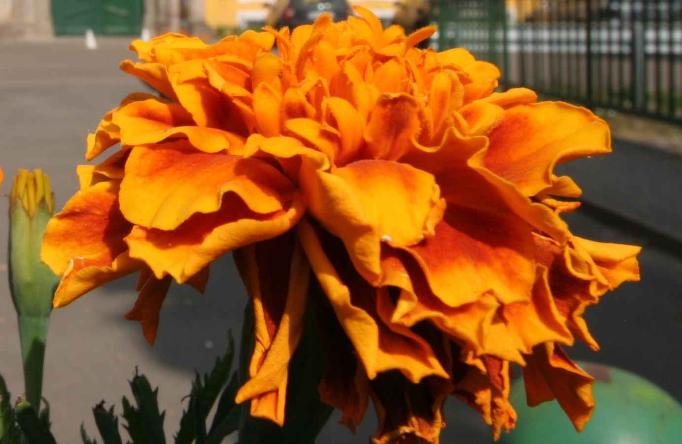
Now let’s deal with the color image a little. Let’s think about the RGB color system. Not only can clipping occur in all three color channels at the same time, but also in one or two channels. Let’s think about having a [120,130,230] lighter blue color. A certain ratio of the three color channels results in the perceived color. If we lighten this with exposure compensation, then the value of all three color channels starts to increase, and we get to the point where the value of the blue color channel reaches the maximum value, 255. If we lighten it further, then the value of the blue channel cannot increase any further, but the other two will increase, and the ratio of the three color channels changes, which leads to color shift. A typical example of this is light clouds in the sky, which, if clipped, can be pinkish due to color shift. Editing programs protect against this by cutting the other two channels as well, so that we get white, because even that is better than pink. We can also observe the phenomenon on flower petals. In the figure below, the lighter, paler parts of the petals (at the ends of the petals) are caused by clipping the red color channel.
2.7 Opacity
Many editing tools allow you to set opacity, so we need to talk about it. In fact, it is present even in editing tools where we don’t see this term (such as the threshold curve in the Capture Sharpening tool, or the “Strength” slider in some editing tools). Let’s review opacity using the Capture Sharpening tool as an example.
When creating the final image file, the editing tools take effect one after the other, according to the parameters you set. For each editing tool, we have two images:
- One is the input image of the tool, which it receives from the previous tool for further processing.
- The other is the image on which the tool has already had its effect, let’s call this the modified image.
The tool affects all parts of the image equally, for example, the sharpen tool sharpens the entire image equally. In the case of sharpening, the input image is the unsharpened image received from the previous tool, and the modified image is the image obtained after sharpening, which is sharpened equally everywhere.
In many editing tools, depending on some other parameter, it is possible to control how much the effect of a given editing tool is applied to different parts of the image (for example, more strongly in higher contrast areas, less in other places). This can be controlled with opacity. Opacity means the opacity of the image modified by the editing tool, it is given in %, and in many cases its level can be set directly in the editing tool, in other cases, for example, we can control the opacity of certain areas of the image with a curve depending on a certain property of the image. It is a very important point that the level of opacity can be different in different parts of the image.
Let’s imagine that we overlay the modified image with the appropriate opacity on the input image of the editing tool, and see what kind of image we get when we look at these two superimposed images:
- If the opacity of a certain area of the upper image is 0%, then in this part the upper image is completely transparent, as if it were not even there, therefore we will see the lower (input, not yet sharpened) image.
- In areas of the upper image where the opacity is 100%, nothing of the lower (input) image will be visible, we only see the upper (modified, sharpened) image, as if the lower one were not there.
- Between the two extreme values, the higher the opacity value, the more the effect of the upper, sharpened image prevails.
The final output image of the editing tool will be the resulting image of the two superimposed images.
The process of creating the resulting image using the input image and the modified image (taking into account certain parameters, such as opacity) is called blending.
Blending can not only be done in such a simple way, but there are several ways to blend two images, each blending mode can produce different results.
2.8 Feather
Feather is used with masks, the Spot Removal tool, and the Gradient Filter editing tool. Its purpose is to ensure that the effect of a given tool does not end with a sharp boundary line, but rather has a gradual transition towards its surroundings.
In the image above, we see a yellow mask with sharp edges. We want to brighten the image in the area of the mask.
The center of the image was brightened with a sharp boundary line.
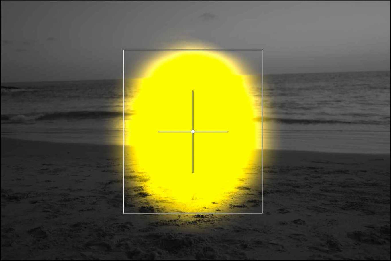
I added feather to the mask.
The effect of exposure compensation gradually disappears due to the feather.
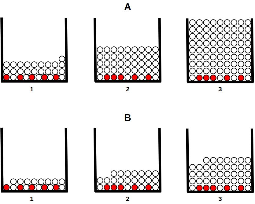
2.9 Wavelet decomposition
Wavelet decomposition is a complex mathematical procedure. It can be used to break down an image into multiple levels of detail. Each level contains different levels of detail in the image. For example, at the first level of detail, the program looks at the contrast of the pixels in each 2x2 pixel area of the image, at the second level it analyzes the image by dividing it into 4x4 pixel areas, at the third level it analyzes the area 8x8 pixels, etc. The figures below show the level of detail experienced at the second, fifth, sixth, and eighth levels.
Level 2 only contains very fine details of the image (source: darktable)
Level 5 only contains much larger details, not fine details (source: darktable)
Level 6 only contains even greater detail (source: darktable)
The 8th, last level only contains the largest parts of the image, no fine details (source: darktable)
Wavelet decomposition decomposes the image elements into components of the L*a*b* color space (L*, a*, and b*), and the differences in hue are also displayed at each level of detail.
Since only differences in hue or brightness (gradients or differences) are analyzed at each level, the detail levels do not contain any information if the image is completely uniform in brightness and color. In this case, the differences extracted from each level come from digital noise and changes in contrast (or hue).
The residual image is created by removing the details of the decomposed levels from the original image, and what remains is the residual image. This means that modifications made at a given detail level (contrast, hue, etc.) have no effect on the residual image, and vice versa. We can perform operations not only on individual detail levels, but also on the residual image. It is also possible that if we have changed something at certain levels, we can then make completely different changes at other levels (and the residual image).
By reuniting the detail levels and the residual image, we get the full image back. Leveling allows us to perform certain interventions only at certain detail levels, leaving the other levels and the residual image unchanged.
Wavelet decomposition can be used for several purposes, such as removing image noise, adjusting the contrast and tones of individual levels, blurring or removing unwanted details, changing saturation or colors, sharpening, etc.
If an editing tool’s name or description includes the phrase “by details”, we can almost be sure that it is Wavelet decomposition.
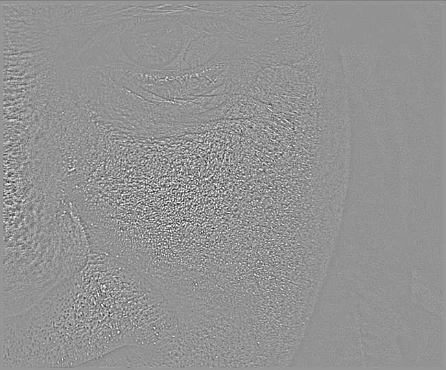
Let’s look at an example based on the darktable user manual. In the figure below we can see a detail of the original image, the problem is the skin defects on the face, which we want to reduce.
Original image (source: darktable)
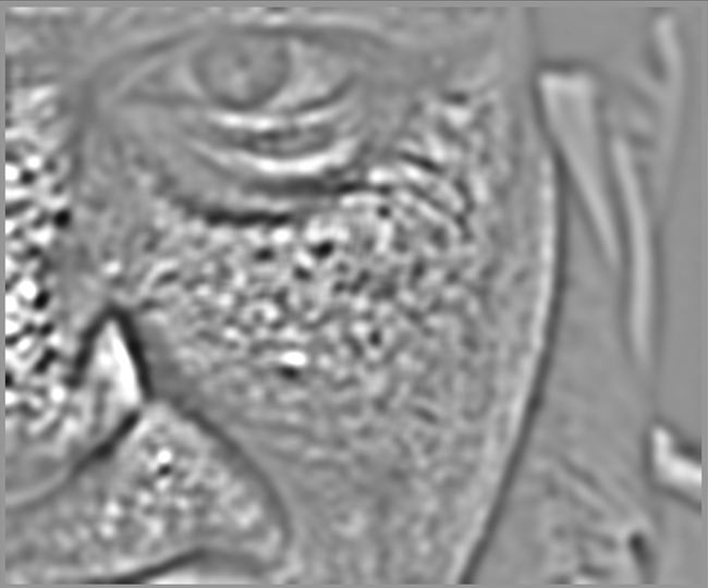
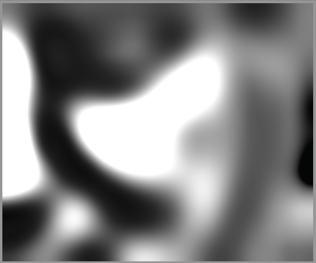
Level 5 is where skin imperfections are most visible. If we create a blur at this level, skin imperfections will be much less visible. (source: darktable)
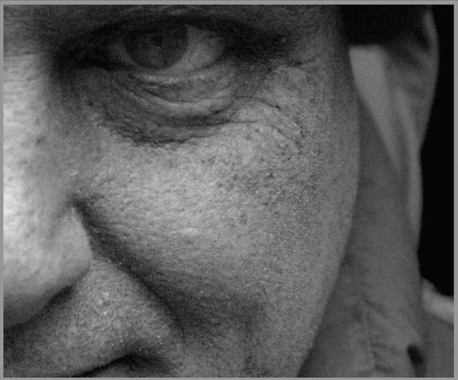
The resulting image, which retained fine details and was not affected by the blur (source: darktable)
We applied blur in such a way that it only had an effect on level 5, leaving the other levels unchanged.
2.10 Capture sharpening procedures
Sharpening is one of the most commonly used methods during processing. In principle, even common digital cameras do not provide the maximum real resolution achievable with the resolution of the image sensor. Maximum resolution would be achieved if the individual pixels were independent of each other, because then the brightness and color of the given pixel would depend only on the color and intensity of the light projected onto the elementary sensor, and not on other factors. In reality, pixels are not independent of each other. One reason for this is that the image sensor does not see colors, and colors are produced by interpolation using color filters (e.g. Bayer filter) in front of the elementary sensors, taking into account the data of neighboring pixels. Another reason is the anti-aliasing (AA) filter in many cameras in front of the image sensor, which intentionally results in a slight blur. Other factors also contribute to this, such as the imperfection of the lens and its lower contrast image.
Sharpness is a subjective feeling that is not the same as the resolving power of the lens, but it is not independent of it either. It is not at all certain that we will see the image of a lens with a higher resolving power as sharper. Contrast plays an important role in the perception of sharpness. We see the image of a lens that draws more contrast in the details as sharper than the image of a lens with the same resolving power but less contrast. Sharpening procedures are partly based on this.
Edges play an important role in sharpening. Edges are parts of an image where there is a sudden transition in brightness. These are not necessarily real edges on an object, but we still call them edges. They can be, for example, sudden transitions in brightness between small details of a subject. Edges play a role in sharpening because if we increase the contrast along the edges (at the transition in brightness), the image is perceived as sharper, even though the resolving power of the lens has not changed and no more detail appears in the image.
It is often not beneficial if sharpening affects the entire image to the same extent. It is unnecessary to sharpen blurred areas, because we will only make it worse. It is also not worth sharpening large, homogeneous areas, because that will only increase the image noise. It is especially worth sharpening small details.
The most well-known sharpening method is the unsharp mask method. This achieves sharpening by increasing contrast near the edges. There is usually a parameter called radius that affects how wide the contrast is increased along the edges. Sharpening usually works best when the radius is smaller, especially for images that are in focus and free of blur, taken at low ISO.
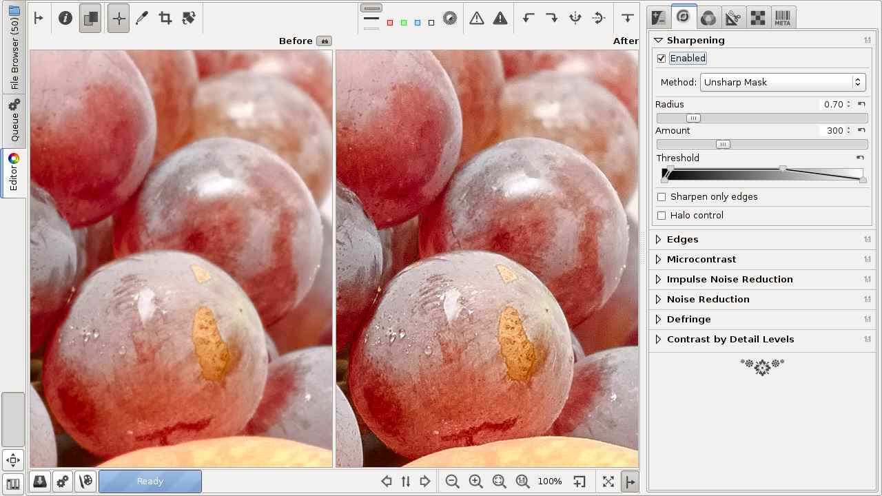
Image sharpened using the Unsharp Mask method (source: RawTherapee)
Some other methods are also possible:
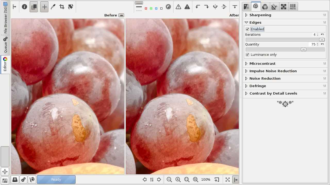
Sharpen edges only (source: RawTherapee)
Unlike an unsharp mask, edge sharpening is a true sharpening algorithm. It sharpens only edges that are already sharp, ignoring those that lack sufficient contrast.
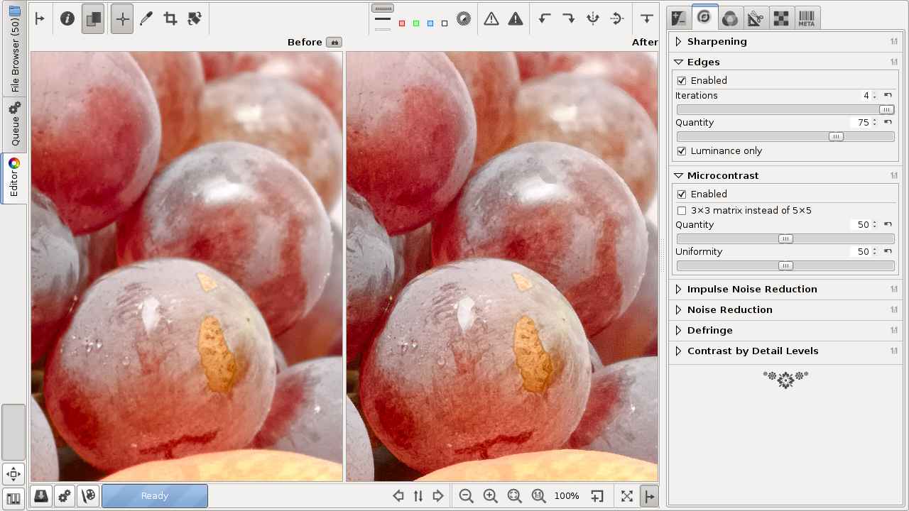
Only sharpening edges and increasing microcontrast (source: RawTherapee)
In addition to sharpening edges, it also increases microcontrast. Microcontrast refers to pixel-level (between pixels) contrast, while other types of contrast (e.g. local) refer to contrast between larger areas.

Sharpening by increasing microcontrast (source: RawTherapee)
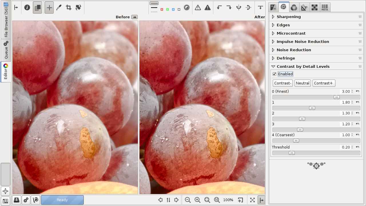
Increase contrast by detail levels (applies Wavelet decomposition) (source: RawTherapee)
The next sharpening procedure is RL deconvolution.
First, we need to talk about Gaussian blur. This is a method also used in image editing. With its help, the software performs a blur according to the Gaussian distribution function. This method results in a less subtle, less beautiful blur than lenses capable of more beautiful background blur.
The RL deconvolution method is suitable for reversing (“undoing”) the blurring according to the Gaussian distribution function. The blurring of lenses is not exactly like Gaussian blurring, but the method is nevertheless suitable for sharpening. Perhaps even more details may appear in the image.
Due to the imperfections of lenses, abrupt transitions are never as abrupt as in reality. If we take a picture of a figure in which a black and a white area are separated by a sharp boundary, then the boundary will not be as sharp in the photo, but some transition will occur, causing blurring. The contrast will also decrease somewhat, black will become lighter, white will become darker (gray). The RL deconvolution process is suitable for “undoing” and eliminating the transition that reduces sharpness along the edges. The figure below shows the result of sharpening performed with RL deconvolution.
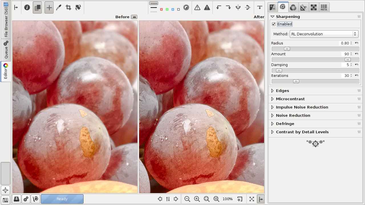
Image sharpened with RL deconvolution (source: RawTherapee)
Here too, you can set a radius parameter. If this value is too different from the required value, you may experience unpleasant artifacts, such as halos along the edges. The appropriate value for the radius must be determined by trial.
RL deconvolution is an iterative method, meaning it must be repeated several times in order to achieve the desired result. The number of iterations (successive executions) can be set. The output image data of a previous iteration becomes the input data of the next iteration, on which the RL deconvolution process is repeatedly executed, etc. Each iteration reduces blurring, increases processing time, and also increases the probability of artifacts. The most optimal settings can be found by experimenting. Often, the default settings give good results. Moderation is important, and excessive use of processing tools should be avoided in general.
Here I must talk about the so-called anonymization (censorship). In many cases, the people and license plates in the photo must be unrecognizable for legal reasons. If absolute unrecognizableness is important, then do not experiment with Gaussian blurring, but paint the face or license plate in the photo some color, because there is no way to undo it.
2.11 Noisy images
Another frequently used technique is to reduce image noise. We must distinguish between two types of noise: luminance noise and chrominance noise. In the case of luminance noise, the color of the noise does not differ significantly from the color of the surface on which it is located, while in the case of chrominance noise, it differs significantly.
Luminance noise dominates, chrominance noise is barely visible (Canon 750D, ISO 6400)
Significant chrominance noise (Canon 1100D, ISO 6400). The red chrominance noise is particularly noticeable on the black wallet, but it is also clearly visible on the green tablecloth
In programs that process raw files, we usually have to deal with the two types of noise separately. In the figures above, we can see that the images of the Canon 750D with its more advanced image sensor primarily have to deal with luminance noise, while in the case of the older Canon 1100D both have to be dealt with.
Significant image noise is most likely to occur when using high ISO sensitivity in low light, but noise can also occur in the darkest areas of an image taken at low sensitivity.
Three types of procedures have become widespread:
- Local method, in which the characteristics of each pixel are modified for noise reduction by taking into account the surrounding pixels. This is a resource-intensive method.
- Noise reduction using wavelet levels. This is faster.
- The Non-local means algorithm is based on averaging all the pixels in the image. This results in much greater clarity and less loss of detail compared to the local method.
The noise reduction tools used in practice have arisen from the further development of these methods and their combination with other procedures.
In case of strong noise, it may be worth applying two types of noise reduction in succession, if possible. Noise reduction methods involve some loss of image detail. A balance must be found between noise reduction and loss of detail. As a general rule, if we are forced to reduce image noise, we should be careful with sharpening, so as not to sharpen the image noise as well.
2.12 Artifacts in the image
The methods used in processing are not perfect and tend to create artifacts, especially when their effects are set too strong. Artifacts are the appearance of elements in the image (e.g. discoloration) that were not visible on the subject, caused by imperfections in the methods used in the editing tools.
For example, sharpening techniques generally do not work by showing more small details in an image, because these details are usually not available. Instead, they exploit the peculiarity of our vision that we perceive a higher contrast image as sharper. To increase sharpness, contrast is increased at sudden transitions in the image. Contrast is increased in such a way that the dark part becomes slightly darker and the light part next to it becomes slightly lighter. If you apply sharpening too strongly, a so-called halo appears next to the dark parts, like a halo around them. This is an artifact, because the subject did not have one. In the image shown in the figure below, I intentionally applied sharpening very strongly so that the artifact is clearly visible.
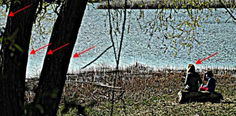
The figure shows halos created by over-sharpening. They appear in high-contrast areas, where there is a very bright subject next to a dark subject. Halos also appear near part of the tree trunk and the head of the model, where the lighter water surface is in the background. I have marked some of them with arrows. Artifacts can appear in more than just halos. We should try not to overuse the tools, as this can prevent unwanted artifacts from appearing.
2.13 The mid.tif image
The mid.tif image was posted by Alberto Griggio on the ART forum and can be downloaded from this link. I will use this image to demonstrate the effects of some editing tools that affect tones. It is worth downloading the file, as it helps to better understand the operation of many tools.
The image in the linear Rec.2020 color space contains increasingly lighter bands from top to bottom, which are exactly 1 exposure value apart. This means that from top to bottom, we get the values of the i-th band by multiplying them by 2 to get the values of the i+1-th band. There are 20 bands in total, the image contains a total of 20 exposure value ranges, the 11th band from the top is the 18% mid-gray shade. If we open this file for editing, we will of course see it in the preview in the sRGB color system, which is suitable for display. The 18% mid-gray shade in the sRGB color system is [119,119,119].
2.14 Recommended computer configuration
ART can be run on 64-bit Windows, Linux, and macOS operating systems.
In ART, you can see the effect of your changes in the preview while editing. Updating this is resource-intensive. Raw files from high-resolution cameras are large, and storing the data extracted from them in floating-point format is memory-intensive, especially since multiple copies need to be stored simultaneously.
If you have little memory (4 GB), you may experience significant slowdowns. The minimum required RAM is 8 GB (you may still have problems with large raw files).
As a minimum recommended configuration, a processor with at least 4 cores, capable of running eight threads in parallel, with at least 8 GB of RAM is recommended. However, 6-core processors are now easily available, so if you can, choose one. Also, be sure to check online how the processor you want to choose performed in tests. Choosing 16 GB of memory is preferable.
My current machine has an AMD Ryzen 7 5700G processor with 32 GB of RAM. The processor is capable of running 8 cores and 16 threads. It contains a GPU integrated into the processor. An important aspect when selecting it was that it had normal power consumption. The processor consumes a maximum of 60-87 W. I did not want a high-power, water-cooled machine. This works great with air cooling (but not with the processor’s own cooling fan, but I bought a Be quiet! Pure Rock 2 Silver cooler for it, because I don’t like the processor to be too hot and potentially limit performance due to overheating). This cooler keeps the processor temperature low enough. I am not a fan of overclocking computers, and it is completely unnecessary to overclock a machine with such performance for this purpose, it is fast without it.
With this machine (to a certain extent), you don’t have to worry about how many programs are running on the machine, how many tabs are open in the browser, etc. If you have a weaker machine and only 8 GB of memory, you may need to close all unnecessary programs and browser tabs when editing a large raw file.
2.15 What monitor should we use?
This is of course determined by what our goal is. If professional quality is the expectation, then we need to use a suitable monitor for processing. For amateur purposes, the requirements are different.
In any case, it is advisable to choose a monitor with an IPS panel, whose color range covers at least 98-100% of the sRGB range. The IPS panel has a fairly wide viewing angle, which means that even if you look at it slightly from the side, the colors do not change. It is very bad that if you move your head slightly to the side, the colors of the image on the monitor change. This makes it impossible to edit an image. Nowadays, you can find many suitable monitors. However, it is not bad to be careful before buying, you need to do your research thoroughly.
If high color fidelity is a requirement (for professional purposes), then we definitely need a professional-quality, calibrated monitor. This can ensure that our image looks the same on a printout or on the Internet as we saw it when editing. So it is important that the monitor can be easily calibrated. If we are lucky, our monitor may even be suitable for amateur use with the factory settings (without calibration). If we experience a problem, we can have our monitor calibrated.
The monitor should have a screen size of 23-27 inches. It is not advisable to choose a smaller one. These programs require a lot of things to be displayed on the screen at once. If the screen is too small, the individual elements will be too small, the screen will be crowded, and only some of the buttons on the ART toolbar may be visible at once. A larger monitor can be used, but it will unnecessarily increase the configuration cost.
The resolution and size of the monitor should be in harmony. For a smaller monitor, full HD is the ideal resolution (1920x1080), and for a 27” monitor, WQHD (2560x1440) is best. I say this despite the fact that there are those who prefer the highest resolution possible under all circumstances. It must be taken into account that if we choose a resolution that is too high for the given size, everything on the screen will be too small, and because of this we will be forced to reduce the resolution anyway. If we have a 32” monitor, it is advisable to choose a 4K resolution, but such a large monitor is not necessary for this purpose. I think a 27” monitor with a resolution of 2560x1440 pixels is a good compromise for our ideal purposes.
Several companies produce factory-calibrated monitors that have a good color gamut. For example, LG offers them. I use an ASUS ProArt PA278QV 27” monitor with a resolution of 2560x1440, factory-calibrated, and capable of reproducing 100% of the sRGB color space. This monitor can be calibrated well and is in the lower end of the professional monitor range.
2.16 How do we get lens profiles and camera profiles?
Lens profiles can be used to correct lens errors, and camera profiles can be used as input color profiles in ART.
The purpose of lens profiles is to reduce geometric distortion and/or peripheral darkening and/or chromatic aberration.
The basic idea is that if we create a database or profile file that contains the data needed to correct distortion, fringe darkening, and chromatic aberration for a given lens, we can use this database or profile file at any time to correct these lens errors, and we don’t have to manually correct them for each individual photo.
Camera profiles can be used as input color profiles in ART (in the Color Management tool in the Colors group). There are multiple camera color profiles for a given camera type, which can be based on the image styles of that camera, such as normal, portrait, landscape, monochrome, etc.
ART can also use Adobe LCP lens correction profiles and Adobe camera profiles. These profiles can be obtained from the free Adobe DNG Converter.
The method described here can only extract Adobe profiles from Adobe DNG Converter version 12.4, not later versions. This version was released in 2020, so it does not contain profiles for later cameras and lenses. As of this writing, version 12.4 is still available online, but it is no longer available on Adobe’s website. You need to download the installer for the Windows operating system (DNGConverter_12_4.exe, approx. 471 MB). You can download it from:
Do not install the program on your computer, but simply extract the downloaded installation exe file. For Linux (if necessary), install the Engrampa archive manager program to extract it. For Windows, the 7-zip program may be suitable, but it may be easier to temporarily install the DNG Converter program, which you can remove later.
In the case of Linux, after unpacking, we get three folders: $APPDATA, $PLUGINSDIR, $PROGRAMFILES64. We are interested in the $APPDATA folder, within which we find the three types of Adobe profile files in the path “Adobe/CameraRaw/”.
In the case of Windows, the profiles can be found in the “Adobe\CameraRaw” folder, starting from the installation location.
The lens profile files with the .lcp extension are located in the 1.0 folder in the Lensprofiles folder, in a separate subfolder for each manufacturer.
The Adobe Standard folder in the CameraProfiles folder contains standard color profiles for many types of cameras and phones. This is the color profile for the Standard (default) picture style. The files have the extension .dcp.
The Camera folder in the CameraProfiles folder contains profile files for non-standard picture styles (such as landscape, portrait) in a separate folder for each camera type. The files have the extension .dcp.
We should save the contents of these directories, or at least the profile files of our cameras and lenses.
The following options are also available to us.
There is a community-developed database called Lensfun that contains correction data for a wide variety of lenses. This is included in ART.
In some cases, the metadata embedded in the raw file may also contain lens correction data, but this is not very common.
Adobe DCP camera profiles can also be downloaded from Andy Astbury’s Camera Profiles page, they are newer than those extracted from Adobe DNG Converter 12.4.
In the Adobe Standard row on the right, you can download the standard profiles of all cameras, packaged together, and in the Camera row, you can similarly download the other profiles of all cameras. By double-clicking on the Adobe Standard label, you can choose from a variety of standard color profiles for phones and cameras, and by double-clicking on the Camera label, you can download other (portrait, landscape, etc.) color profiles for phones and cameras.
Find each camera type in the list and download the .zip profiles to a directory (by clicking Download), then unzip them and find the profiles for that camera in a folder named your camera type (e.g. Canon EOS 750D).
Save the profiles (or folders) to a directory from where you can open them with ART. Organize your profiles into folders to make them easy to use.
3. The ART raw file processing program
3.1 Overview
ART is a free, open source program that runs on Windows, Linux, and macOS platforms and has a Hungarian-language interface. Its main purpose is to produce high-quality image files by processing raw files. Image files in other formats (e.g. JPEG, PNG, TIFF, etc.) can also be modified with it, but in my book I focus only on processing raw files.
The big disadvantage of RawTherapee (and darktable) is that although it is a powerful tool, it has a complicated user interface and is not user-friendly and difficult to learn due to its very complex and complicated editing tools. In order to significantly reduce these disadvantages, Alberto Griggio created ART (Another RawTherapee) based on the RawTherapee code. ART offers an easier to use, more transparent user interface, simpler but very effective editing tools, while maintaining the excellent image quality of RawTherapee. It is much easier to learn compared to RawTerapee (and darktable).
Since the development of ART basically started from RawTherapee, we can also benefit greatly from RawTherapee’s online user manual.
For the sake of simplicity, I will continue to use the term “image” primarily to refer to a raw file, since this book will be about editing it. I do this even though the file containing the raw data is not an image. Of course, I will also use the term “image” to refer to the resulting JPEG, TIFF, PNG, etc. image.
3.2 ART website
You can find out more about the program on this page:
Here you will find a link to download the program (and the CTL scripts), to access the forum, and here you can also find the documentation.
3.3 Installing ART
You can download the latest, stable version of ART for your operating system from here:
I’ll just write a few words about installing on Linux, because it might not be so obvious. You need to download the compressed file ART-x.xx.x-linux64.tar.xz (where “x.xx.x” is the version number) and then extract it to the directory where it will be located. This doesn’t have to be a system directory, in principle it can be anywhere. I myself put it in the user-accessible part of the SSD RAM drive that also contains the operating system (i.e. not in the operating system area) so that it loads into memory faster. I copied the downloaded file into the created directory. I extracted it by right-clicking on it and selecting Extract to from the context menu. For example, an ART-1.19.3-linux64 directory was created, with the program’s subdirectories and files in it. I renamed this directory to ART. The downloaded file can then be deleted.
The above figure shows the contents of the ART directory, namely the unpacked directories and some of the files. The file to be launched is the script named ART, which is shown in the lower left corner. Our only task is to create a launcher icon on the desktop, which, when double-clicked, will execute the script and start ART. To do this, right-click on an empty space on the desktop and select Create Launcher from the context menu.
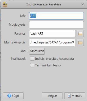
In the window that appears, we need to give the application a name (ART), start the script (bash ART), and in the working directory, we need to specify the path to the directory where the script called ART is located, and finally click the Save button. The launcher icon needs to be made executable. If we did it right, we just need to double-click on the launcher icon and ART will start. This was more complicated to describe than to do, the entire installation will take no more than three minutes.
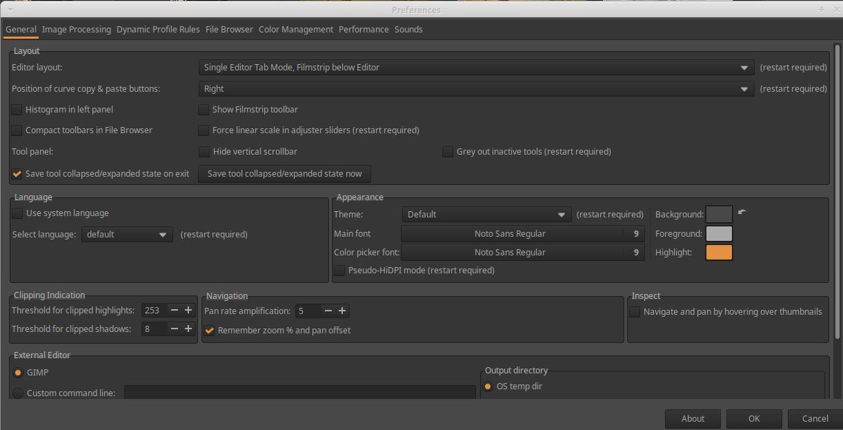
You can access the Preferences by clicking on the second icon (button) from the bottom in the lower left corner of the user interface. The figure above shows the Preferences window. You can set the language in the languages section. If the language of your operating system is correct, just check the “Use system language” option. After selecting the language, the program must be restarted.
3.4 Non-destructive processing
ART processes images non-destructively. This means that the program does not change anything in the file that is opened for editing. It only stores the settings of the editing tools used during editing and uses them later to create the resulting image.
When saving the current image or processing in the Queue, the resulting JPEG, TIFF, or PNG image files are saved by default in a subfolder named “converted” within the folder containing the edited file. If the subfolder already contains an image with the same name that was created during a previous processing, it is not overwritten, but by default the file name is appended with the suffix “-1”, “-2”, etc. (whichever comes first). For example, if there was already an image IMG_0322.jpg, the new version will be IMG_0322-1.jpg. You can also set it in the Preferences to overwrite the target file, but this is not recommended.
3.5 Sidecar files
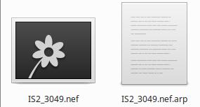
IS2_3049.nef is the raw file, IS2_3049.nef.arp is the sidecar file containing the editing settings, IS2_3049.nef.jpg.xmp is the sidecar file containing the image classification data (e.g., star ratings, color labels)
ART stores the settings for the editing tools in sidecar files, which have the extension .arp, which ART saves alongside the edited file. The collection of editing parameters stored in a sidecar file with the extension .arp is also called the processing profile. Only the latest version of the sidecar file will always be available alongside the edited (usually raw) file, and no previous versions will be available.
It is also possible to have ART save a sidecar file with each resulting image file, so that each edit version will have a sidecar file. This is highly recommended. It can be set on the Image Processing tab of the Preferences.
The significance of the sidecar files is that the editing tool settings (processing profile) stored in them are applied by ART when generating the image file (JPEG, TIFF, or PNG), or if we reopen a previously edited image for editing, ART automatically sets the editing tools based on the information stored in the sidecar file, and we can continue processing the image from the last editing state. Sidecar files are very important, if we lose them, we lose the editing parameters that led to the creation of the image version we like. In essence, we lose the work we invested.
ART stores image classification data (e.g., star ratings, color labels) in a sidecar file with the .xmp extension, which is saved with the raw file or image file. The .xmp file is not saved with the resulting image file.
In the following, when I mention a sidecar file, I am not referring to the .xmp file, but to the .arp file containing processing parameters.
3.6 The ART’s pipeline
When we edit an image, the sidecar file stores which editing tools were used during the editing process and with which settings. The last state of the editing tools’ settings is always stored in the sidecar file. When the image file to be saved is created, the editing tools used during processing (with the parameters stored in the sidecar file) are applied one after the other, starting from the raw file, and the result is the saved image file. Each tool performs its task one after the other. The data flow between the editing tools during the creation of the image file resembles the flow in an imaginary pipeline. The input data of the first editing tool is the raw file itself, its output data is the input data of the next tool, its output data is the input data of the third tool, and so on. The output data of the last tool is the finished image, which is saved in the format selected by the user. Image data therefore always flows in the same direction from editing tool to editing tool, similar to how water flows in a water pipe.
The order of execution of editing tools is fixed, they are always executed in the same order in the pipeline. The order of the tools was determined to provide the best possible quality result. Processing is performed on linear data as much as possible, which results in great image quality and fewer artifacts. The order of execution cannot be changed. The order of execution of the tools does not depend on the order in which the individual tools were used during editing.
The place occupied by the editing tools in the pipeline can be seen in the list below. Execution is from top to bottom, and I have numbered the tools accordingly. Next to the name of each editing tool, you can see the scene in which the given tool operates.
ART’s pipeline, according to currently available information, is as follows:
- Flat-Field - RAW
- Dark-Frame - RAW
- RAW black points - RAW
- Vignetting Correction - RAW
- Hot/Dead Pixel Filter - RAW
- Green Balance/Line Noise Filter - RAW
- RAW Chromatic Aberration Correction - RAW
- Film Negative - RAW
- Demosaicing - RAW
- Highlight reconstruction - Camera
- White Balance/White Point - Camera
- Spot Removal - Camera
- Input Color Profile - Camera (from camera to Linear RGB working profile)
- Noise Reduction - Linear RGB
- Haze Removal - Linear RGB
- Dynamic Range Compression - Linear RGB
- Lens/Geometric Corrections - Linear RGB
- Channel Mixer - Linear RGB
- Exposure Compensation - Linear RGB
- Color Equalizer - Linear RGB
- Tone Equalizer - Linear RGB
- Capture Sharpening - Linear RGB
- Impulse Noise Reduction - Linear RGB
- Defringe - Linear RGB
- Color/Tone Correction - Linear RGB
- Smoothing - Linear RGB
- Graduated/Vignetting Filter - Linear RGB
- Texture Boost/Sharpening - Linear RGB
- Log Tone Mapping - Linear RGB
- Saturation/Vibrance - Linear RGB
- Tone Curves - Linear RGB Bounded
- Film Simulation - RGB
- RGB Curves - Linear RGB Bounded
- L*a*b* Adjustments - L*a*b*
- Soft Light - RGB gamma 2.2 limited
- Local Contrast - L*a*b*
- Black-and-White - RGB gamma 2.2 limited
- Film Grain - L*a*b*
- Crop
- Resize
- Output Sharpening - Linear RGB
- Output Color Profile - Linear RGB (from working profile to output RGB color space)
3.7 Three basic views of ART
ART’s functionality is divided into three basic views: File Browser, Editor, and Queue. All three have important functions. You can switch between the views using the “tabs” on the far left.
File Browser
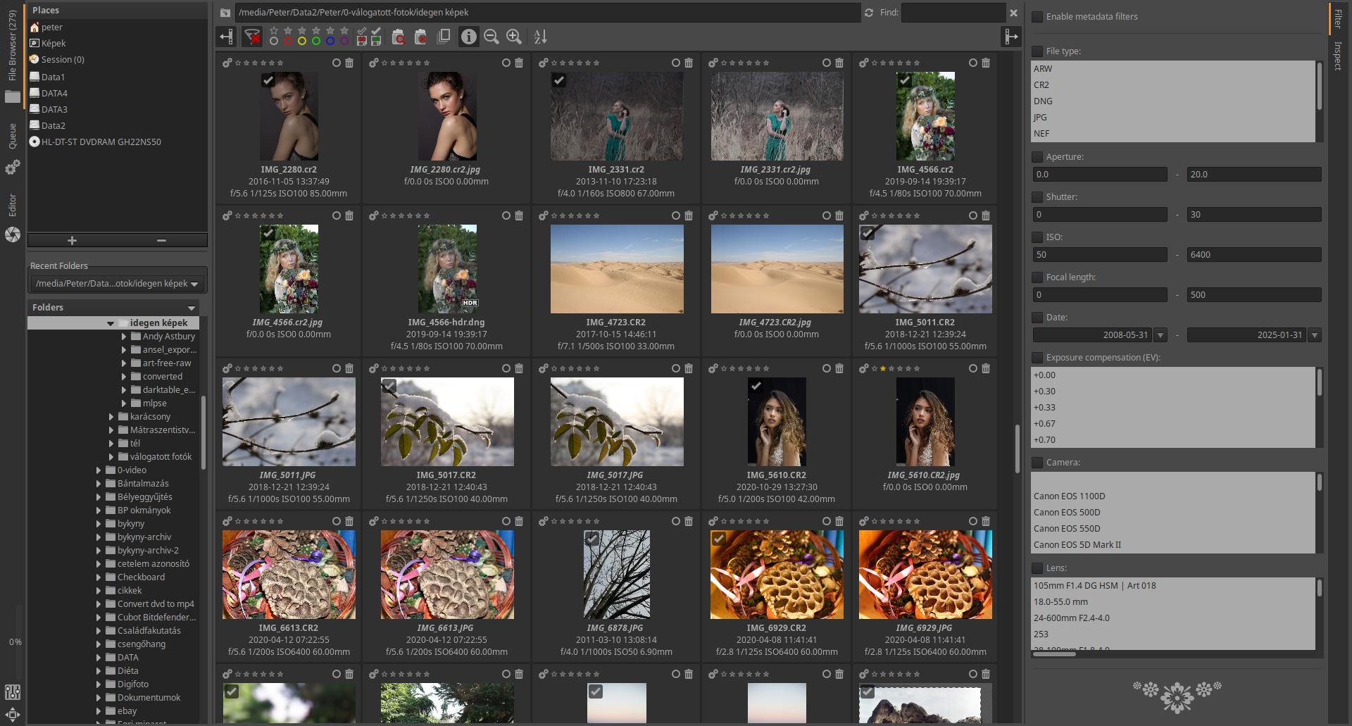
We usually use the file browser first. We have the ability to sort, rate, filter, and inspect our images at high magnification. If we double-click on a raw file, it will open for editing and we will be taken to the Editor.
Editor
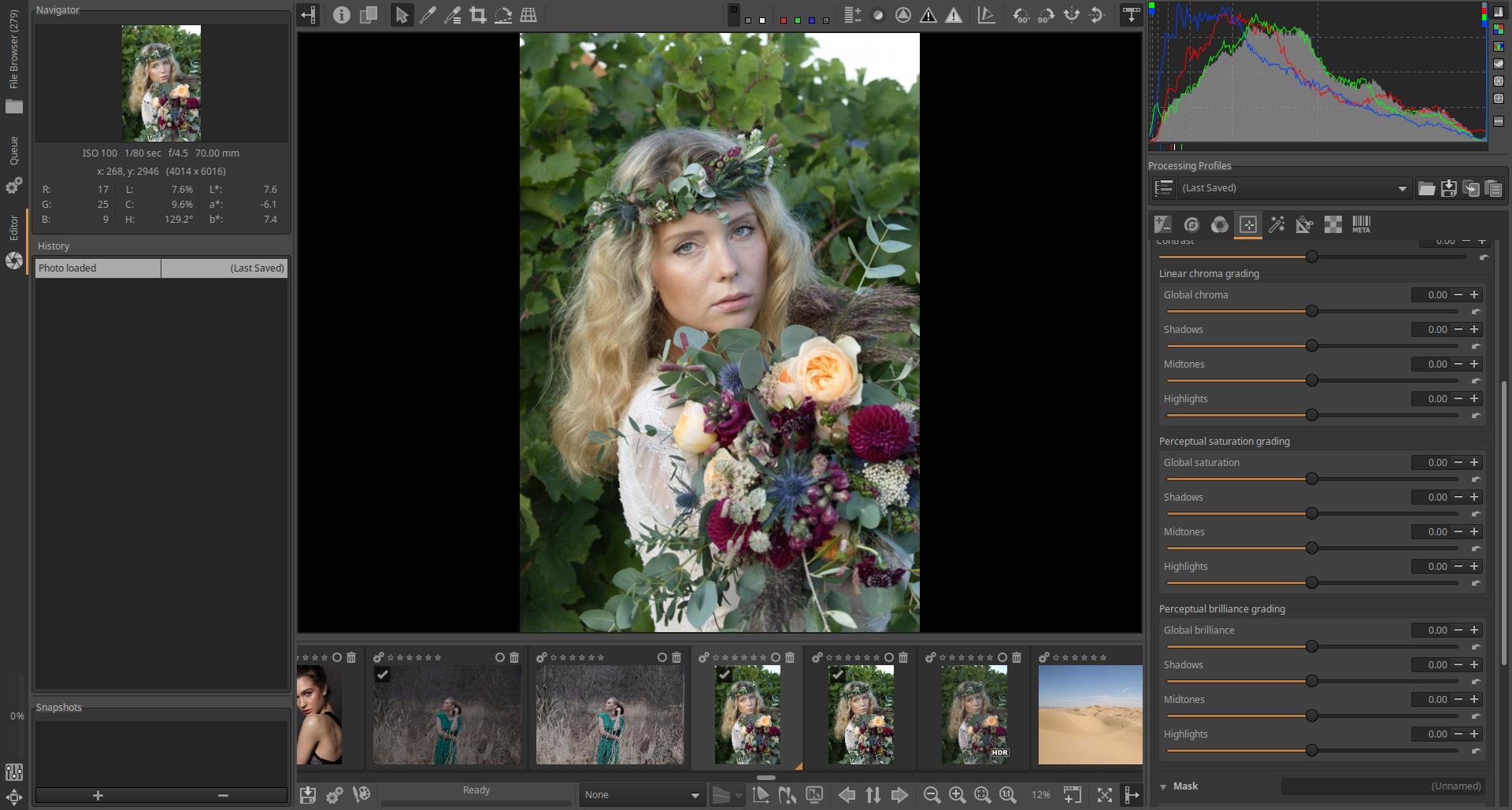
We can process (edit) our images in the Editor. Although we have the option to save each image to disk immediately after editing, the recommended workflow is to place the image in the Queue.
Queue
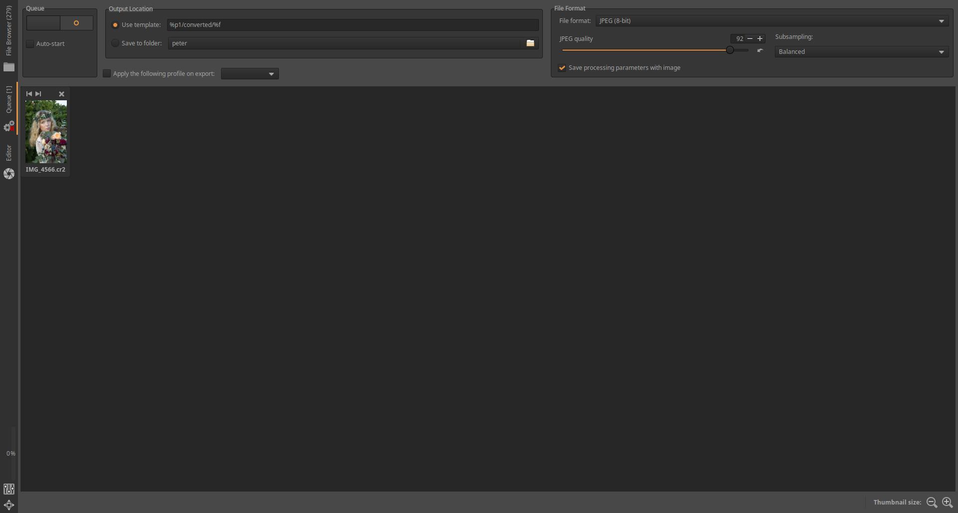
Once you have finished editing all your images and placed each image in the Queue at the end of the editing process, you should switch to this view. You just need to start processing and the images will be generated.
3.8 File browser
In this section, we will discuss the File browser, which allows you to directly browse and process your raw files and images on your computer. Imagine that you are placing your slides on a lighted tabletop to view, rate, group, and discard bad images. For example, you can rate your images with stars or group them using color labels. Here, you can also select which image’s raw file you want to edit.
3.8.1 File browser user interface
The ART user interface has been simplified and made easier to use compared to RawTherapee. The figure below shows the File Browser user interface:
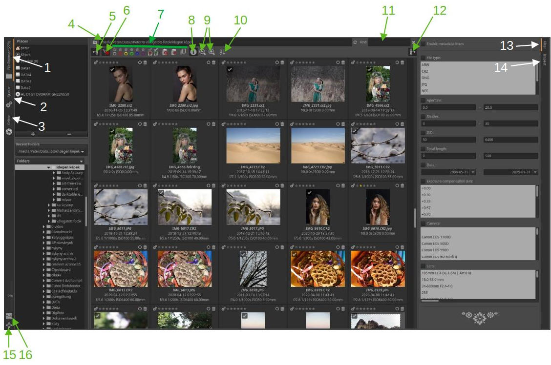
- File browser
- Queue
- Editor
- Displayed folder path, specify path for display
- Hide/show left panel
- Disable all filter conditions
- Filter conditions: Color labels, unsaved images, saved images, show trash contents, show only undeleted images, show only “original” images
- Show/hide image information
- Zoom in/out of thumbnails
- Sorting thumbnails
- Search
- Hide/Show Right Panel
- Filter
- Inspect
- Fullscreen
- Preferences
The ART user interface is divided into several panels. The width of the left and right panels can be changed by dragging their inner sides.
The three main views of ART can be switched by clicking on the tabs (1, 2, 3) in the leftmost, narrow vertical panel. The numbers in parentheses always refer to the numbering in the figure. At the bottom of the same panel, you can see the Fullscreen mode (15) and Preferences (16) buttons. If you move the mouse pointer over a button, in most cases an explanation of the button’s function will appear.
The wider panel next to it is the “left” panel, which shows the File explorer. It allows you to browse the file system of your computer and display the contents of any folder (directory), i.e. the raw files or image files in it, in the form of thumbnails in the large central panel. At the top, you can choose from Places, while below you can see the tree structure of the folders. If you double-click on a folder, its contents will be displayed in the central panel, but only the files directly in that folder, not the contents of the subfolders. In the middle, in the upper panel, you can see the path (4) of the directory whose thumbnails are shown in the large central panel. Here you can also enter the path to a folder. Next to it, you can see the Search field (11), in which you must enter the name of a file or part of its name to search.
Below the search field we can see the toolbar, where we can choose from the following options from left to right:
- The left panel can be hide/show together with the narrow panel next to it (5).
- We can turn off all filter conditions (6).
- We can filter the images to be displayed by star ratings and color labels, depending on whether they have been edited or not, saved or not, we can display the contents of the trash, only undeleted images, and only “original” images (7). Star ratings and color labels are important for classifying (with stars) and grouping (with color labels) our images. If multiple files exist with the same file name but different extensions, the one with the extension closest to the top of the list in Preferences > File Browser > Recognized extensions is considered the “original”.
- You can turn on/off the display of image information below the thumbnail (8) (exposure data, time the image was taken, file name).
- Decrease/Increase thumbnails size (9).
- Thumbnails order (10), click to select from the list.
Image classification data (e.g., star ratings, color labels) is stored in a sidecar file with the .xmp extension alongside the raw file or image file.
If the resolution of your monitor is not high enough to fit all the toolbar items, if you move the mouse pointer over the toolbar, you can use the mouse wheel to move the toolbar items left and right, thus accessing all options.
ART uses its own trash (completely independent of the operating system trash). You can place images in it, view the contents of the trash, remove images from the trash, and permanently delete images in the trash.
On the right edge of the user interface, we can see a narrow vertical panel, on which we can use the tabs to switch between the Filter view (13) or the Inspect view (14) displayed in the right panel to the left of it. The narrow vertical panel can be hidden/shown together with the right panel (12).
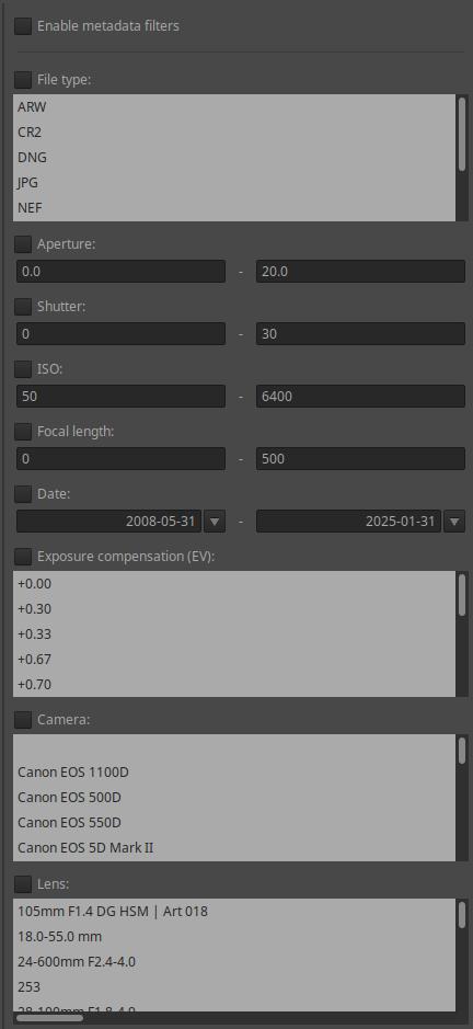
Clicking on the Filter tab (13) will display filter criteria in the right panel. This is shown in the figure above. You can filter by metadata, such as file type, aperture range, shutter speed range, ISO range, focal length range, date range of the shot, exposure compensation value, camera type, and lens type.
3.8.2 Thumbnails
Let’s look at the options available for thumbnails.
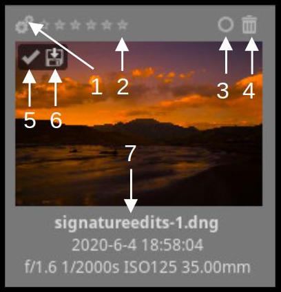
- Queueing
- Rating with stars
- Managing color labels
- Putting in the trash, removing from the trash
- Processed image
- Saved image
- Information: file name, time of capture, aperture, shutter speed, ISO sensitivity, focal length
A processed image means that it has a sidecar file.
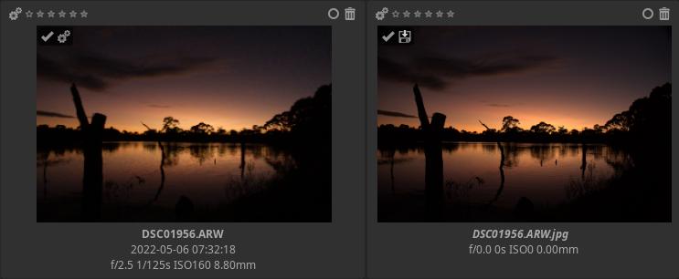
In the figure above, we see an image placed in the Queue and Saved. A saved image means that the image file has been saved (for example, via the Queue).
Clicking the Managing color labels button will open a small window that allows you to manage color tags. You can select multiple color tags for an image.
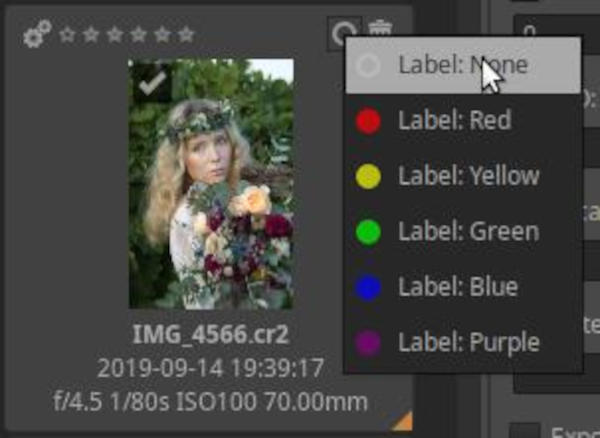
Images that have been declared as trash can be moved to the trash by clicking the trash button next to the thumbnails, or by right-clicking on one of the selected images and selecting File operations > Move to trash from the context menu.
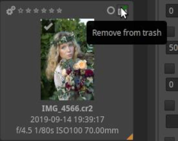
If we have placed an image in the trash, the trash button in the upper right corner will change, and by clicking on it we can remove our image from the trash, restoring the state it was in before being placed in the trash.
You can view the contents of the trash can by clicking the button on the toolbar.
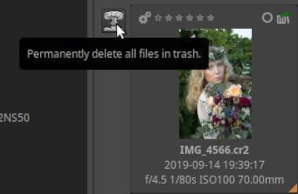
If we look at the contents of the trash, a new button will appear on the left side, which we can click to delete all images placed in the trash from the backup storage (hard disk, memory card, pen drive, etc.).
To return to the default view, click the Disable all filter conditions button on the toolbar.
You can delete images from the clipboard without using the Trash. Right-click an image or one of the selected images (if multiple images are selected) and select File operations > Delete from the context menu. This permanently deletes the selected images from the clipboard, and if desired, their sidecar files. You can specify the list of extensions of the sidecar files to be deleted in a window that appears.
3.8.3 Update thumbnails
When you open a folder that you haven’t opened in ART yet, ART will generate thumbnails for the photos in the folder in the central panel. For a raw file, it will generate the thumbnail based on the embedded JPEG image, and for an image file, it will generate it from the image itself. This can take a while for a folder with hundreds of photos, but it only happens the first time you open the folder. Each subsequent time you go to a previously opened folder, ART will load the thumbnails from the cache, if any, and this will be much faster than when you first open the folder.
Once you start editing the image, the thumbnail will be replaced with the preview in the Editor view, and any changes you make will be reflected in the thumbnail.
It is not advisable to change the size of thumbnails because thumbnails that are too large consume memory.
3.8.4 Context menu
If you right-click on a thumbnail, a context menu appears.
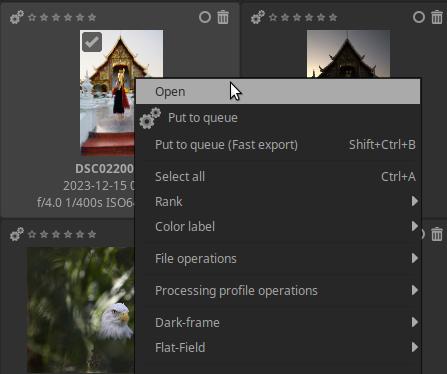
From the menu we can quickly and easily access the operations, which are the following:
- Open
- Put to queue
- Put to queue (fast export)
- Select all
- Rank (with stars)
- Color label
- File operations
- Processing profile operations
- Dark-frame
- Flat-Field
- Cache
If you want to apply the same menu item to multiple images, you need to select the thumbnails. Selection is done using standard key combinations: Shift+click to select a range, Ctrl+click to select individual images, and Ctrl+a to select all images. The frame color of the selected thumbnails will be slightly lighter, and a small orange triangle will appear in the lower right corner.
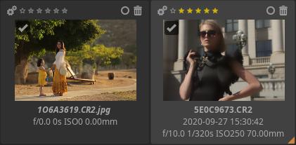
3.8.5 Processing profile operations
ART allows you to copy a processing profile (a collection of tool settings) to the clipboard, partially or completely, and paste it into any number of images. It also allows you to apply a pre-packaged (included with the program), custom-created, or neutral processing profile to any number of images at once. This gives us some great options. Let’s take a closer look at these.
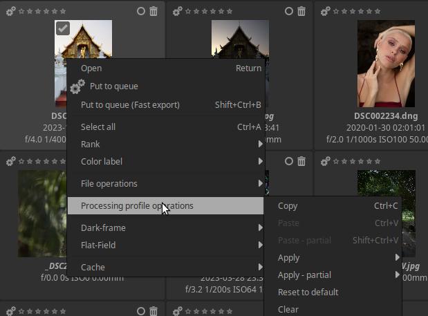
Both methods (applying a profile copied to the clipboard or saved) can be performed in the File browser. In both methods, we need to select the images to which we want to apply the processing profile.
Copying and pasting a processing profile to the clipboard for selected images is a very common task. Let’s say you’ve taken a series of photos, such as studio shots, or wedding portraits, or focus-shift macro shots. Each image in the series will be very similar to the other, probably taken with the same lens, the same ISO, the same white balance, and the shots were taken for the same purpose, the same use. This means that they will probably all need the same processing settings, the same noise reduction, the same sharpening, etc.
We proceed by opening an image from the series in the Editor view and processing it to our liking. We then apply the image’s processing profile to all the other images in the series. To do this, we go to the File browser, right-click the processed image, and select Processing Profile Operations > Copy from the context menu, then select the images to which we want to apply this profile, and finally right-click one of the selected images and select Processing Profile Operations > Paste from the context menu. This will assign the same processing profile (the same editing tool settings) to all the selected images.
ART also allows you to apply (paste) only a portion of a processing profile copied to the clipboard to selected images, rather than all of it. For example, you may want to apply only the resize tool so that ART resizes all images to the same size. To achieve this, instead of using Processing Profile Operations > Paste, you should use the Processing Profile Operations > Paste - partial menu item. In the window that appears, you can select which editing tool settings you want to apply.
Alternatively, you can apply a pre-packaged, custom, or neutral processing profile to the selected images. To do this, right-click one of the selected images, select Processing Profile Operations > Apply from the context menu, and then select the profile you want to apply.
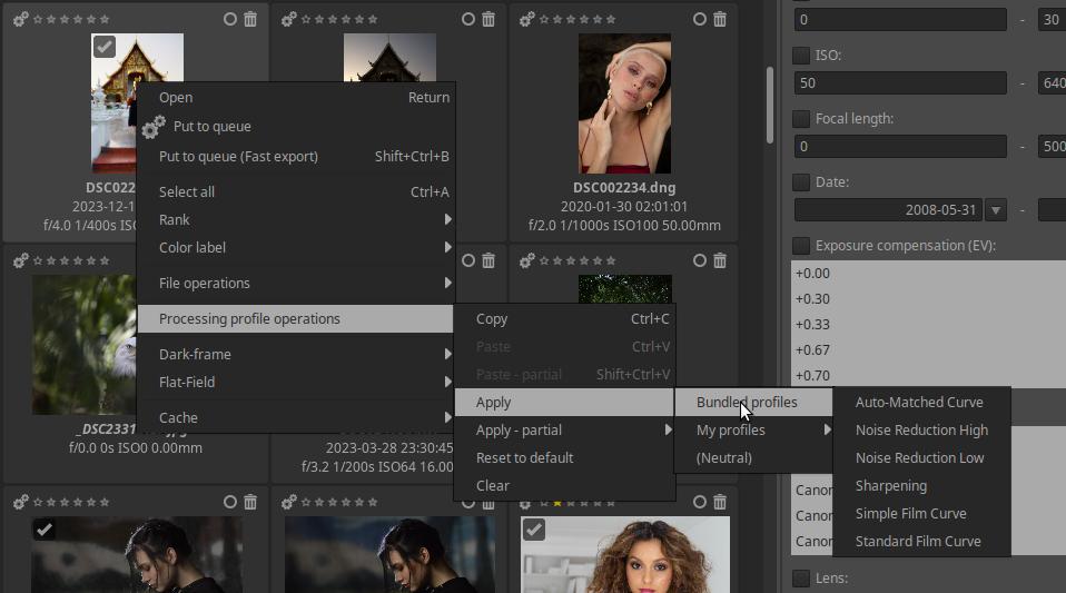
It is possible to partially apply the selected profile by selecting the Apply - partial menu item instead of the Apply menu item.
Processing profile operations can also be performed via the filmstrip (the filmstrip will be discussed in the editor view).
3.8.6 Sessions
ART also supports the use of sessions. The main purpose of this is to facilitate integration with Digikam and other similar applications, but sessions can also be created for other purposes. A session is a temporary collection of images created by the user, whose images are not necessarily located in the same folder.
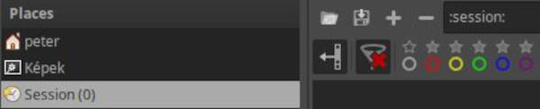
Within the Places section on the left panel, we find the Session option. If we click on this, four new buttons will appear above the toolbar, which allow us to load a saved session, save a created session, and add/remove an image to/from the session. You can see the four buttons above in the figure.
If we click the + button, a file selection window will appear, and by holding down Ctrl we can select multiple images to add.
When saving a session, you can give the session a name and save it to a location of your choice.
You can also add images selected in the File browser to the session by right-clicking on one of them and selecting File Operations > Add to session from the context menu.
3.9 Inspect
By clicking on the Inspect (14) tab, we can inspect the image whose thumbnail we clicked on in the right-hand panel.
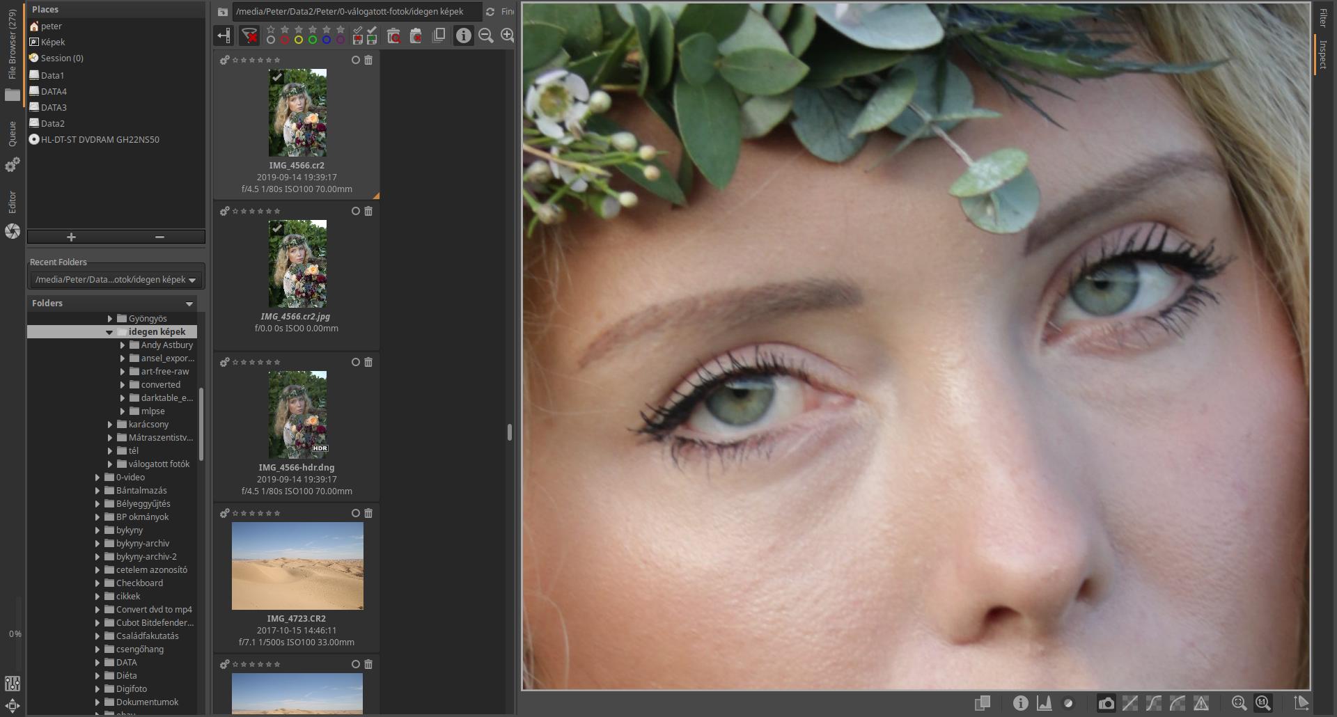
The image above shows the Inspect view. To get a larger preview, I’ve hidden the left panel, and I’ve widened the right panel by dragging its inner side so that the thumbnails in the middle panel are in just one column.
ART stores the current layout for the File browser, Queue, Edit, Filter, and Inspect views separately. This means that if, for example, you later click on the Inspect tab again, you will immediately get the layout shown in the figure above. You do not need to hide the left panel again or widen the right panel again, because ART remembers the settings.
In the figure, the preview is at 100% magnification, the “camera” button on the toolbar at the bottom is on, which means that we see a JPEG image embedded in the raw file. The preview can be grabbed and dragged with the mouse, so at 100% magnification we can see all the details of the image.

Below the image being inspected, a toolbar is visible, which allows you to select the information to be displayed. The functions of each button, from left to right, are:
- Split view on/off
- Quick info on/off
- Histogram on/off
- Focus mask on/off
- Embedded preview
- Fast raw rendering with linear tone curve
- Fast raw rendering with film-like tone curve
- Fast raw rendering with shadow boosting (lightening shadows slightly) tone curve
- Raw clipped pixels
- Fit to Window
- Zoom to 100%
- Enable color management
Inspection helps you check, classify, and discard images.
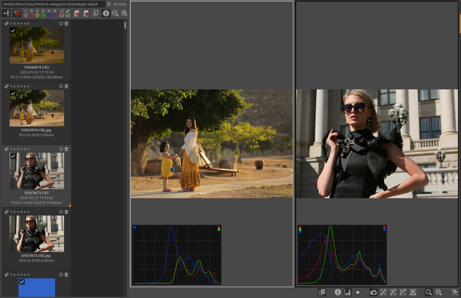
The image above shows the split view. If you click the Split view button, two windows will appear side by side, with the current window indicated by a white frame. You can click on a window to make it current. If you click on a thumbnail, it will appear in the current window. Split view allows you to compare images.
In the image above, I have displayed two completely different images in split view, but it is more useful for comparing images of the same subject.
3.10 Editor
The image editor allows you to edit raw files or image files in JPEG, TIFF, PNG, and other formats. In ART, you can choose between single-page mode or multiple-page mode under Preferences > General tab > Editor layout. Multiple-page mode requires a powerful computer and a lot of memory. We will leave this at the default value (the first option). This means that you can only edit one image at a time. We will only deal with this option in the following.
If the resolution of your monitor is not high enough to fit all the toolbar items, if you move the mouse pointer over the toolbar, you can use the mouse wheel to move the toolbar items left and right, thus accessing all options.
The figure below shows the ART Editor view.
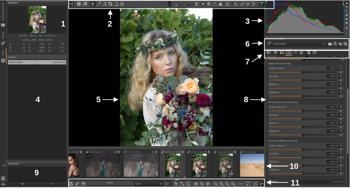
- Navigator
- Top toolbar
- Histogram
- History
- Preview
- Processing Profiles
- Editing tool groups
- Editing tools for the selected group
- Snapshots
- Filmstrip
- Bottom toolbar
Let’s briefly review the elements of ART’s default Editor.
3.10.1 Preview
The large central panel shows a preview of the edited image (preview image) (5). This allows you to monitor the effect of the changes you make during editing. You can zoom in/out the preview with the mouse wheel when the mouse pointer is over it.
3.10.2 Navigator
At the top of the left panel is the Navigator (1). The Navigator lets you track which part of the entire image is visible in the preview, and shows the color data of the pixels under your mouse pointer in RGB, LCH, and L*a*b* color systems.
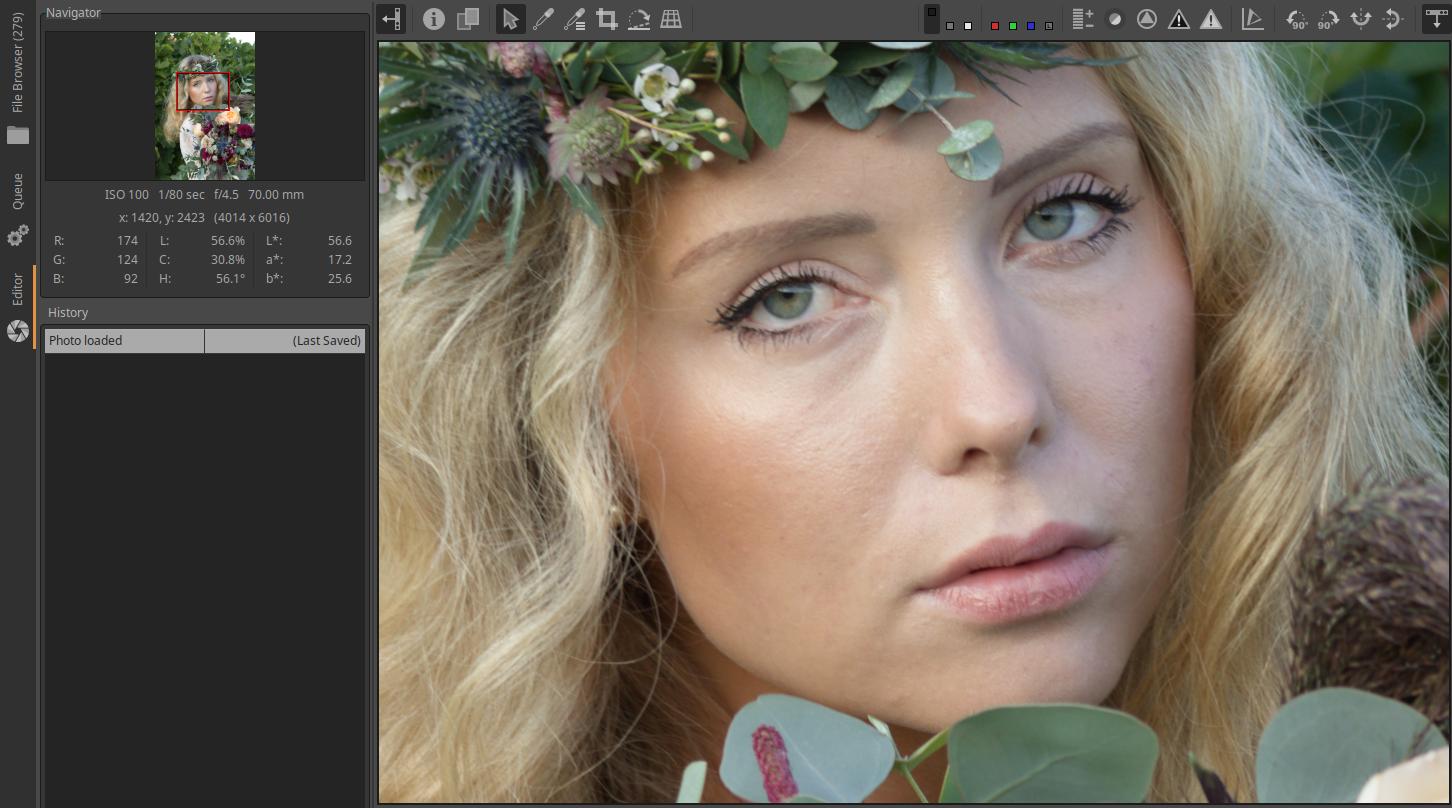
In the Navigator, you can click on the numeric values, except for L*a*b*, to switch between display formats. RGB values can be displayed in the range [0…255], or [0…1], or expressed as [%]. LCH values can be displayed in the range [0…255], or [0…1], or the H value can be expressed in degrees and the other two in %.
If the entire image does not fit in the available space in the preview (because it has been enlarged), a red frame will appear in the image navigator indicating the part of the image shown in the preview. This red frame can be dragged to the desired location on the image with the mouse, and the part of the image shown in the red frame will be visible in the preview.
3.10.3 Top toolbar

The buttons on the top toolbar (2) allow you to turn on/off a number of useful functions. Let’s look at the functions of the buttons from left to right.
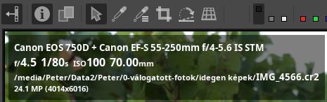
On the left edge we can see the button to hide/show the left panel, and then the button to turn image information on/off.
Next to it, you can see the button to toggle the before/after view on/off. This is useful not only when you have snapshots, but also at any time while editing.
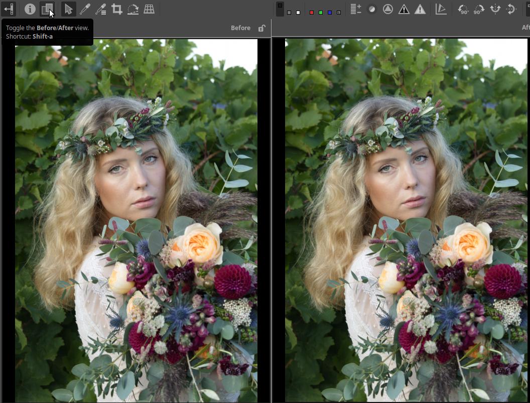
In the figure, next to the word “Before”, we can see the unlock/lock (“padlock”) button. If the before view is locked, it does not change. If it is unlocked, it follows our editing one step behind. In this case, the after image shows the current state, and the before image shows the state before the last editing operation.
The buttons next to it provide quick access to some processing tools.
On the left we can see the arrow tool, which results in the arrow-shaped mouse pointer.
Next comes the tool for selecting the white balance. Clicking on it activates it, and the White Balance editing tool opens in the right-hand panel. Once activated, you need to find an area in the image that is actually a neutral white or gray. If you click on this, ART will change the colors so that the sampled area is a neutral color (not discolored).
Next to it we can see the on/off button for the color selector.
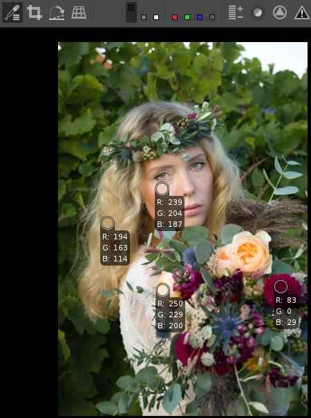
After turning it on, you can place color pickers in different places on the image with a mouse click, which you can drag to the desired location with the mouse, even afterwards. The color under the small circular area is selected using it. A color picker can be deleted by right-clicking on it. Ctrl+Shift+right-clicking on one of the color pickers deletes all color pickers. Right-clicking on an area outside the color pickers returns to arrow mode. The same thing happens when you click the color picker on/off button. The color picker shows the current RGB values of the selected color. You can use the color pickers to monitor the changes in the selected colors while editing.
Next is the crop button. By clicking on it in the preview, we can create the crop with the mouse and the Crop tool will open in the right panel.
This is followed by the straighten/fine rotation button. It is activated by clicking on it. Then you have to click on it, for example, at one end of the horizon, hold it down and drag the line along, and then release the mouse button when the end is exactly where you want it. If you use it on a tilted horizon, ART rotates the image so that the horizon is horizontal. Due to the rotation, it also cuts off the necessary part from the image. In the case of a vertical object, it works in a completely similar way. For example, you can use it to correct a tilted tower.
Photo taken by the author
The image above shows the selection made with the tool on the horizon. We can also read its inclination in degrees. The image below shows the result.
The last button in this group activates perspective correction. When activated, we will be taken to the Transform group in the right panel.
The next group of the toolbar can be seen in the figure below:
The three “switches” on the left allow you to change the background color of the preview. It can be black, gray, or white. This allows you to see how your image will look with different backgrounds. It is best to use gray for editing.
The four switches on the right allow you to display the values of the R, G, and B color channels in the preview, or to view the image in luminosity preview mode. We see black and white images because the luminosity values are not about colors.
Previewing each channel can be useful when editing RGB curves, planning black-and-white conversion, evaluating image noise, etc. If you notice a problem in your image, you can find out which channel clipping may be causing it. The luminosity preview mode can help you instantly view your image in black and white without changing any editing parameters.
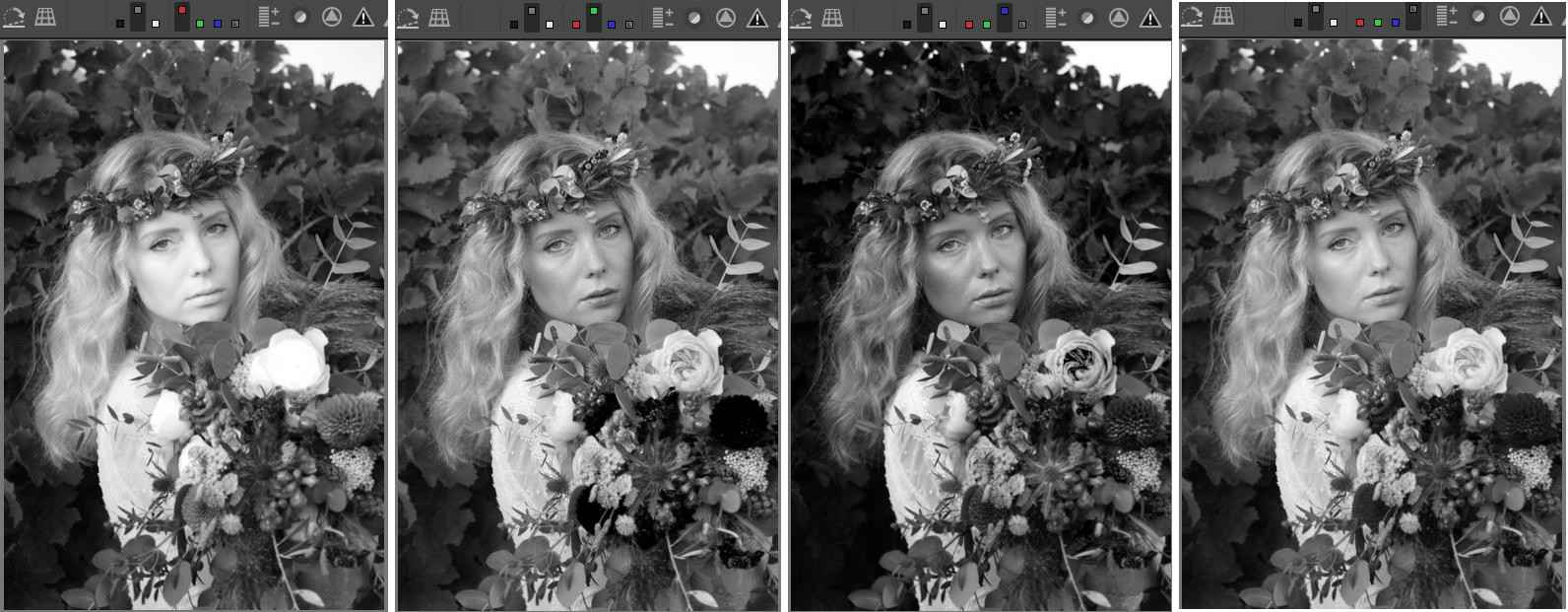
In the figure, we can see the position of the switches at the top of each image. From left to right, we can see the values of the red (R), green (G), and blue (B) color channels, and finally the result of the luminosity preview mode. For example, the luminosity of each pixel in the black and white image of the red color channel is proportional to the value of the red color channel of the same pixel in the color image.
The next group of the toolbar can be seen in the figure below:
The button on the left displays the exposure in false colors. When enabled, the button turns colored, showing which exposure level corresponds to which color in the preview.
The figure above shows the IRE values of false colors. In the preview, different brightness values are represented by different colors, which is intended to provide accurate information about the exposure level of each part of the image.
White represents blacks, Red represents highlights, and Medium Gray represents mid-gray.
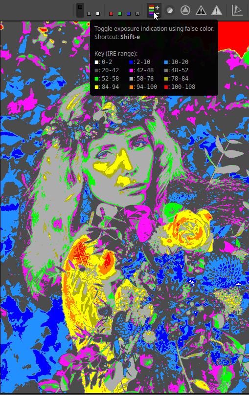
Next to it is the focus mask preview switch. When turned on, the sharpest areas in the preview are highlighted in green. It is recommended to use it with the preview zoomed in at 10-30%.
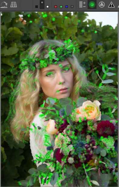
Don’t discard an image based on the focus mask preview, as it is not suitable for that purpose, and you may also discard (delete) an image that is actually quite sharp.
By clicking the next button, we can turn on the sharpening contrast mask.
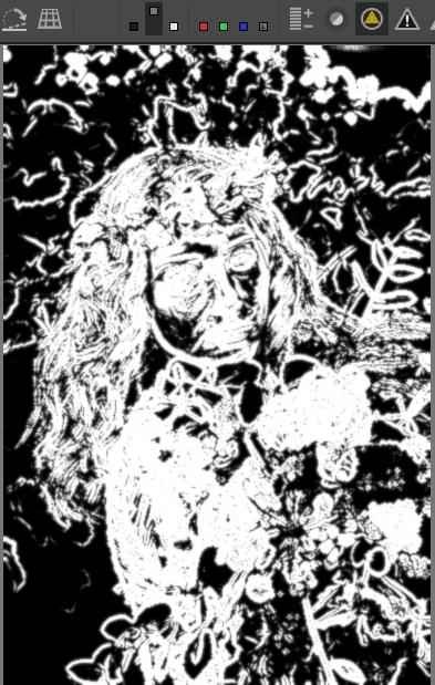
This only works if the Sharpen editing tool is enabled in the Details group. The mask can be refined in the Sharpen tool. The mask determines which details of the image are affected by sharpening. The white parts will be sharpened. For example, the blurry areas of a nice background blur do not need to be sharpened, because that would only highlight the image noise even more.
Clicking the next button will show underexposed (clipped) areas (clipped shadows). It highlights areas where all three color channels are below or above the threshold. The default threshold is 8.
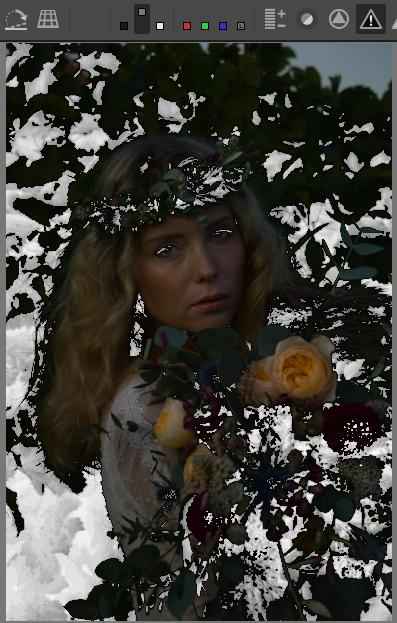
I applied almost three stops of negative exposure compensation to the image to demonstrate the effect of the button. In the image above, the underexposed areas are highlighted with white spots.
Finally, by clicking the last button, we can see the overexposed (clipped) areas (clipped highlights). It highlights the areas where at least one color channel value has reached or exceeded the threshold. The default threshold is 253. If we want to see only the areas where all color channels have reached or exceeded the threshold, we must also enable the luminosity preview mode.
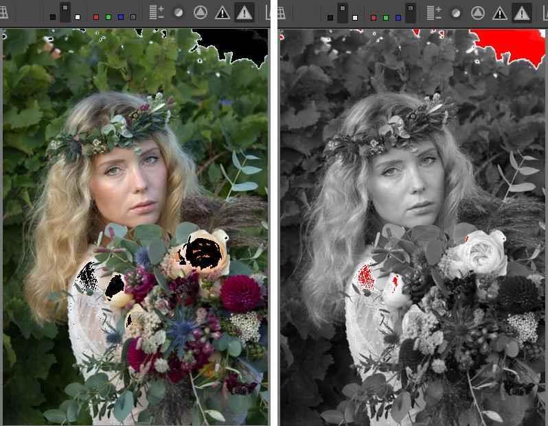
I had to apply positive exposure compensation to the image to demonstrate the effect. In the image on the left of the figure, I only turned on the overexposure indicator (which is also visible above). The overexposure indicator marks the areas in the preview that meet the above conditions with black. In this image, you can see the black spots in the sky above, near the girl’s shoulder, and on the flowers, which indicate that at least one of the color channels has reached or exceeded the threshold in those places. In the image on the right, I also enabled the luminosity preview mode preview mode, so it only marks the areas with red spots where all three color channels have reached or exceeded the threshold. You can see that the area of the indicator has decreased in several places, only in smaller areas did all three color channels reach or exceed the threshold.
Thresholds can be changed in the General tab of Preferences, in the Clipping Indication section.
Remember that dark/light pixels that reach or are below/above the threshold values can be part of the image just like any other pixel of lightness. Their quantity is not important. It is not good if, despite our intentions, too large an area becomes detailless black, or detailless and possibly even discolored white.

The next button is called the Color Scale button. When it is off (the default), the Histogram and Navigator display data according to the gamma-corrected (non-linear) output profile, when enabled, the linear working profile. The default working profile for ART is Rec.2020. This button has no effect on the raw histogram, but it does affect what is shown by the underexposure and overexposure (clipped) indicators.
The next group of buttons allows you to rotate the image by 90 degrees, or to flip it vertically and/or horizontally.
Finally, the last button on the toolbar allows you to hide/show the Filmstrip. When you are editing an image, you don’t need the Filmstrip.
3.10.4 Histogram
The right panel shows the histogram (3) at the top. In place of the histogram, several other diagrams can be displayed, including waveform diagrams and vectorscope diagrams.
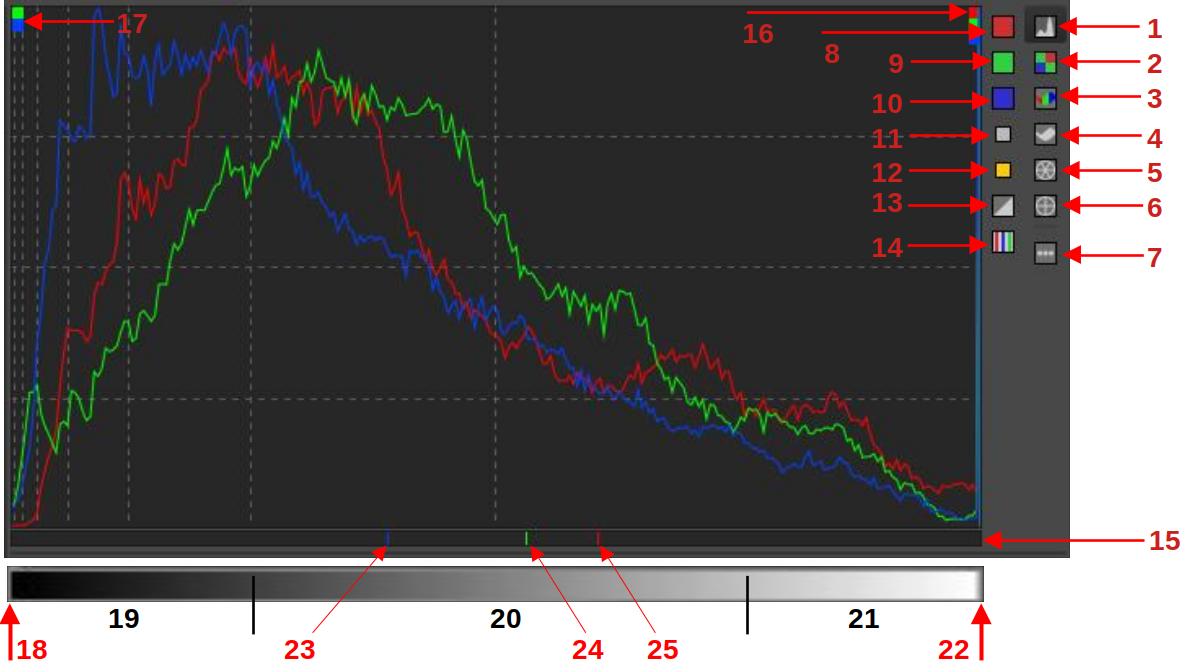
ART RGB histogram
- Display main histogram
- Display raw histogram (red, green, and blue color channels, before performing demosaicing on the source raw file)
- RGB parade
- Display waveform diagram
- Hue - saturation vectorscope
- Hue - chroma vectorscope
- Show/hide left button column
- Show/hide red channel
- Show/hide green channel
- Show/hide blue channel
- Show/hide L*a*b* luminance (L*) histogram
- Show/hide chromaticity histogram
- Switch the histogram display between linear-linear, logarithmic-linear, and logarithmic-logarithmic scales
- Show/hide indicator bar
- Indicator bar (shows the values of the pixel the mouse pointer is pointing to)
- Clipped highlight indicator
- Clipped shadow indicator
- Leftmost column, blacks without details
- Shadows
- Midtones
- Highlights
- Rightmost column, whites without details
- Blue channel of the pixel under the mouse pointer
- Green channel of the pixel under the mouse pointer
- Red channel of the pixel under the mouse pointer
3.10.4.1 Histogram
The histogram shows whether our image is technically correctly exposed and how much contrast it has.
Knowing the histogram is essential and very useful because it allows us to see certain problems in the image, regardless of the image quality of our monitor and whether it is well or poorly calibrated.
A histogram is a bar chart. It contains 256 vertical columns closely spaced. The columns touch each other, there is no space between them. In the figure above, we can see the tone scale at the bottom, this is not displayed in ART, we just have to imagine it. The tone scale is the range of possible tone values. The individual columns correspond to the tone values that can be displayed in the image.
The histogram always has 256 columns, regardless of the bit depth (resolution) of the input image. The possible tone range of the input image is always divided into 256 parts, and therefore a column never shows the number of pixels of a specific tone, but rather the number of pixels in a tone range.
The leftmost column represents the darkest tones (18), the rightmost column the lightest (22), and the rest are intermediate values. The height of each column is proportional to how many pixels of that tone are in the image. If it contains none, the column will be empty, if it contains few, the column will be lower, if it contains many, the column will be higher.
If the rightmost bar (22) is very high, it means that a lot of pixels are at maximum brightness, which may indicate that the highlights are being clipped. Areas containing only pixels at maximum brightness will appear as white without detail (burned out areas). Highlight clipping is also indicated by the Highlight clipped indicator (16) in the upper right corner of the histogram, which indicates clipping in all three channels.
If the leftmost bar (18) is very high, it means that a lot of pixels have minimum brightness values, which may indicate shadow clipping. Areas containing only pixels with minimum brightness values will be black without detail (sunken areas). Shadow clipping is also indicated by the Shadow clipped indicator (16) in the upper left corner of the histogram, which indicates clipping of the green and blue channels in the figure.
The darkest and lightest tones can be part of the image. The problem is if the number of these pixels is too high, which can indicate clipping. If few pixels have maximum or minimum values, and you don’t see any disturbing burnt-out or sunken areas in the image, then there is no problem.
If a histogram chart has a significant number of pixels in the first column (the chart “lies” on the left edge of the histogram), and the right side of the chart is empty, with no pixels corresponding to those brightness values, then the image is technically underexposed. In this case, the parts of the image in the leftmost column will be black without details. The higher the leftmost column, the larger part of the image will be underexposed.
If the chart “lies” on the right side of the histogram and the left side bars are empty, then the image is technically overexposed.
If the columns fill the histogram well horizontally, i.e. there are columns close to both the leftmost column and the rightmost column, then our image has high contrast. If the columns fill only part of the histogram horizontally, and there are only empty columns on one or both sides of the filled part up to the edge of the histogram, then our image has lower contrast.
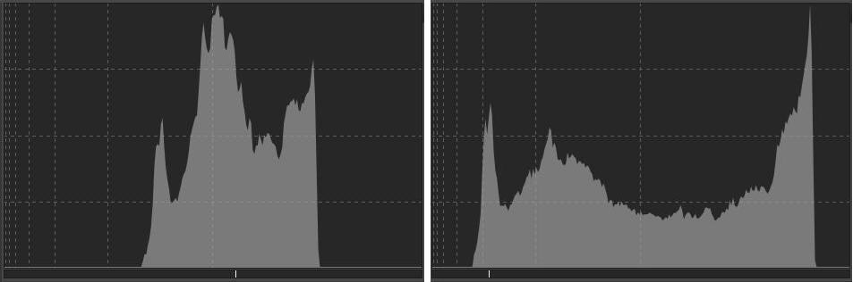
In the figure above, on the left, we see a luminance histogram of a low-contrast image. The non-empty bars are located in the middle of the histogram, occupying only a small portion horizontally. All the pixels in the image lie within a small range of the total tonal range. The contrast of the image is low because the difference in brightness between the darkest and lightest pixels is small (low on the x-axis). The bars are tall because all the pixels in the image lie within this narrow range of tones.
On the right side of the figure, we can see the histogram obtained after increasing the contrast. The bars now fill the histogram horizontally much better, and the difference in brightness between the darkest and lightest tones is much greater. The brightness of the pixels is distributed over many more bars, so the number of pixels (with a given brightness) in a given column is smaller, and the bars are lower.
The amount of pixels of each brightness in the image depends largely on the subject being photographed. In the case of a dark subject, many pixels will have low brightness values (high bars on the left), and vice versa. This is why there is no such thing as an “ideal histogram”. The ideal would be if there were no overexposed or underexposed areas, and everything in the image was at the usual or desired brightness.
Our eyes tolerate subdued (clipped) dark tones much better than burnt (clipped) highlights, so if we have to choose, we prefer to avoid burnt highlights.
The indicator bar (15) shows the values of the pixel that the mouse pointer is pointing to in the preview. In the figure above, we can see an RGB histogram, and the indicator bar accordingly indicates the location of the pixel’s R (25), G (24), and B (23) values. For example, it can be used to determine which parts of the image cause a peak in the histogram, where the darkest and lightest tones of the image are, etc.
Logarithmic/Linear display can be switched by clicking on the (13) button, which can be of the following three types:
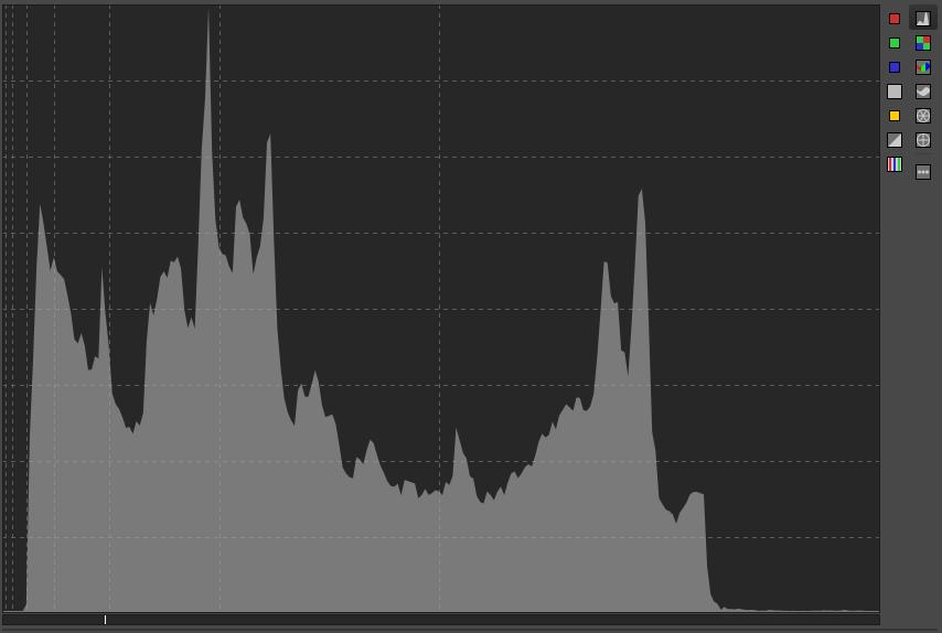
- Linear mode: The vertical grid lines (x axis) are not linearly scaled, but correspond to exposure values - from left to right, the value doubles with each grid line, so there are vertical grid lines at values 1, 3, 7, 15, 31, 63 and 127. The horizontal grid lines (y axis) are linearly scaled.
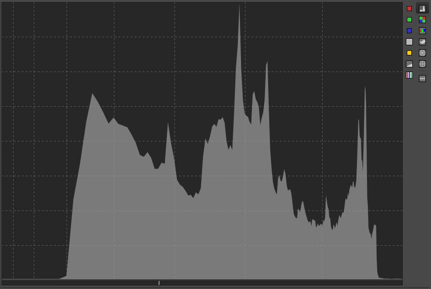
- Logarithmic-linear mode: The x-axis and vertical grid lines are scaled logarithmically. The horizontal grid lines (y-axis) are scaled linearly.
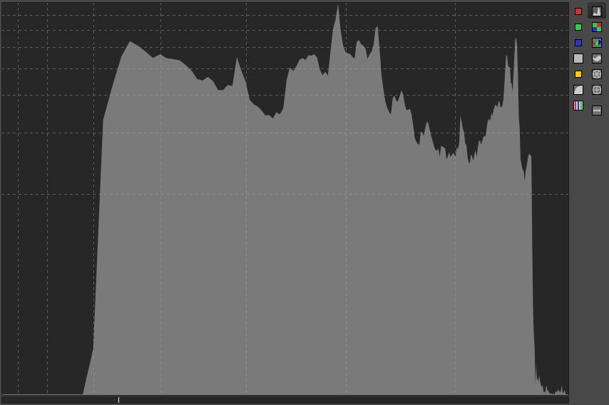
- Logarithmic-logarithmic mode: Both the x- and y-axes are scaled logarithmically.
Choose from the three display modes that best allow you to see the diagram.
The histogram can show one or more of the following at the same time:
- Red color channel (8)
- Green color channel (9)
- Blue color channel (10)
- L*a*b* luminance (L*) (11)
- Chromaticity (12)
- Raw histogram (2)
The luminance histogram actually shows the bars of the histogram. In the histograms of the red, green, and blue channels, as well as the chroma histogram, we do not see the bars, but only the colored graph lines connecting the tops of each bar.
The histogram shows the listed charts using the gamma-corrected output profile if the Color Scale button is disabled (default), or according to the working profile if the button is enabled. The state of this button affects the values displayed in the Navigator, as well as the clipped indicators for fallen shadows and burnt highlights, but has no effect on the raw histogram.
In the ART pipeline, we saw that image data flows in one direction from editing tool to editing tool. Most editing tools affect the color data, the tones of the image. By default, the histogram displays the data as it appears at the end of processing. In ART, it is possible to view the histogram at intermediate stages of the edit by clicking on any row in the History. By enabling the Color Scale button, we can access the data at an early stage, when it is converted to the working profile color space by ART. The raw histogram also allows us to view the raw data before Demosaicing is applied.
Raw histograms show values after subtracting the Black level. The right end of the histogram is fixed at the White level. Raw histograms are affected by the perceived black and white levels, as well as the user’s settings for the black and white levels.
When examining the raw histogram, it is worth setting the Demosaicing method to “None (shows sensor pattern)” so that we can see the data before Demosaicing is applied. This reveals the color filters before the elemental sensors in the preview. If Demosaicing is not performed, the R, G, B raw histograms show the data for the red, green, and blue color channels based on the raw file data, before Demosaicing is performed on the raw file. Before Demosaicing, there are no colors, only values read from the elemental sensors under the different color filters, proportional to the amount of light that hit the elemental sensor at the time of exposure. The values of the elemental sensors under the red (Bayer or X-Trans) color filters form the red raw histogram, the values under the green color filters form the green histogram, and the values under the blue color filters form the blue histogram.
In this case, the Navigator panel displays the raw RGB values of the pixel that the mouse pointer is pointing to. For example, if we look at the data for a elemental sensor under a green filter, only the green channel has a non-zero value, the other two color channels have zero values, and this is also the case for elemental sensors under red or blue color filters. These values are affected by the detected black and white levels and the black level settings made by the user in ART, but are not affected by the white level settings (white point corrections) made by the user in ART.
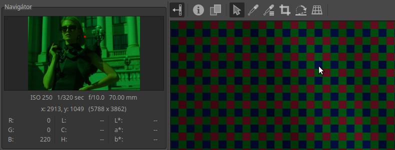
In the image above, we can see that I have turned off the Demosaicing method in the Raw group by selecting “None (shows sensor pattern)” and I have magnified the preview to 1600x. We can make the following observations in this regard:
- We can see the raw file data directly.
- The Bayer color filter pattern has become visible; in the figure, the red, green, and blue color filters are positioned in front of the pixels in the same way as they were positioned in front of the elemental sensors of the image sensor when the image was taken.
- It is obvious that the raw file also contains information about which color filter was in front of which pixel’s elementary sensor when the image was taken.
- The elementary sensor only detected the color according to the color filter in front of it, and a signal proportional to the amount of light detected could be read from it. This read value is stored in digital form for each pixel in the raw file.
- In the figure, the mouse pointer points to a pixel that had a blue filter in front of it, and from this we can also see that the value stored for this pixel in the raw file is the blue channel value. The Navigator also shows that the blue channel has a value of 220, and the other two channels have a value of zero.
- The raw RGB histogram represents the R, G, B values of the pixels with red, green, and blue filters (the other two channels are always zero) (the histogram is not visible in the figure).
- In the preview, each pixel is displayed in red, green, or blue with a brightness proportional to its value stored in the raw file. In the navigator, you can see that the preview is green. This is because there are twice as many green filters as red or blue.
3.10.4.2 The image and its histogram
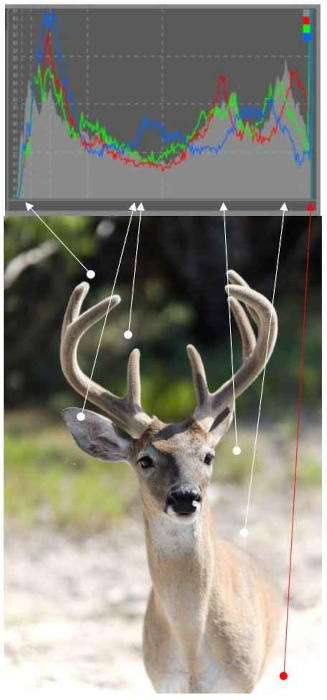
In the figure above we can see an R, G, B, and luminance histogram. We can see where the different light areas of the image appear on the histogram (which columns show the number of pixels with that luminance). The darker the area, the closer it is to the left edge of the histogram, the lighter the area, the closer it is to the right edge. In the lower right corner of the image we can see a larger burnt out, detailless white area (at the red arrow). This appears in the rightmost column of the histogram. Here the tones were clipped, because in reality there were details in this part of the subject as well, but their luminance values in the current conditions exceed the upper limit of the transferable tone range, so these pixels were converted to the maximum value, although they should be larger, but this is not possible. The Highlight clipped indicator in the upper right corner also indicates that we can experience clipping in all three color channels and in the luminance histogram.
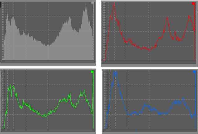
Histograms of the image shown in the previous figure
The above image shows the histograms for each of the luminance and color channels (R, G, and B) of the photo in the previous image. You can see that the rightmost bar is very high in each of them, almost sky high. This means that there is a large area of white without any detail. These areas have been clipped for each color channel.
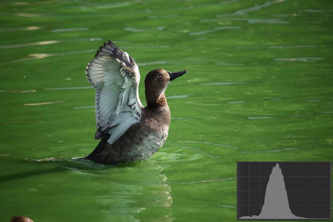
Photo taken by the author
In this image, the prominent wide part of the histogram in the midtones is caused by the green water surface, as this is the largest area (most pixels) in the image. The lower bars to the left of this histogram correspond to the darker pixels in the image, such as the bird’s beak, the dark back of the bird, and the shadow behind it. The lower bars to the right of the peak correspond to the lighter areas, such as the bird’s light feathers. The histogram shows that there are not too many dark and especially bright pixels.
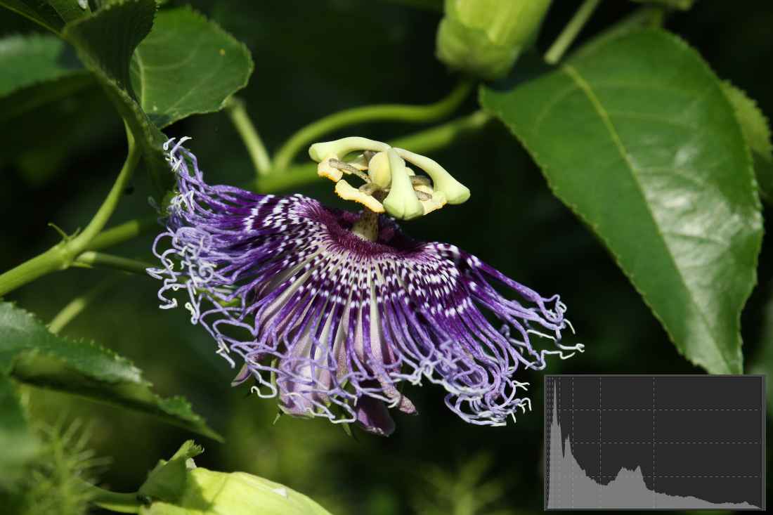
Photo taken by the author
This image has a lot of dark and black areas, which is shown by the peak on the left side of the histogram. The bars are tall in this area, indicating that there are a lot of dark pixels. There are far fewer bright pixels, so the bars are low on the right side of the histogram. The leftmost and rightmost bars of the histogram are empty, so the image is technically neither overexposed nor underexposed, but it fills the graph well horizontally, so the image has high contrast.
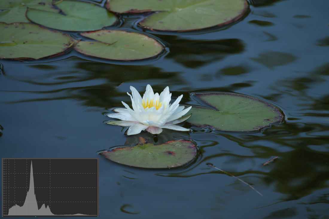
Photo taken by the author
This shot is technically well exposed, with the left and rightmost columns empty. The blue surface of the water and the green leaves have the largest areas. The large peak is caused by the large dark blue surface of the water, and the two small peaks to the right of it are the leaves. The dark areas to the left of the large peak correspond to the dark areas visible on the water. The lighter areas with low column heights after the double peak to the right of the large peak are the lower petals of the flower, and the slightly raised section to the right of this corresponds to the rest of the flower.
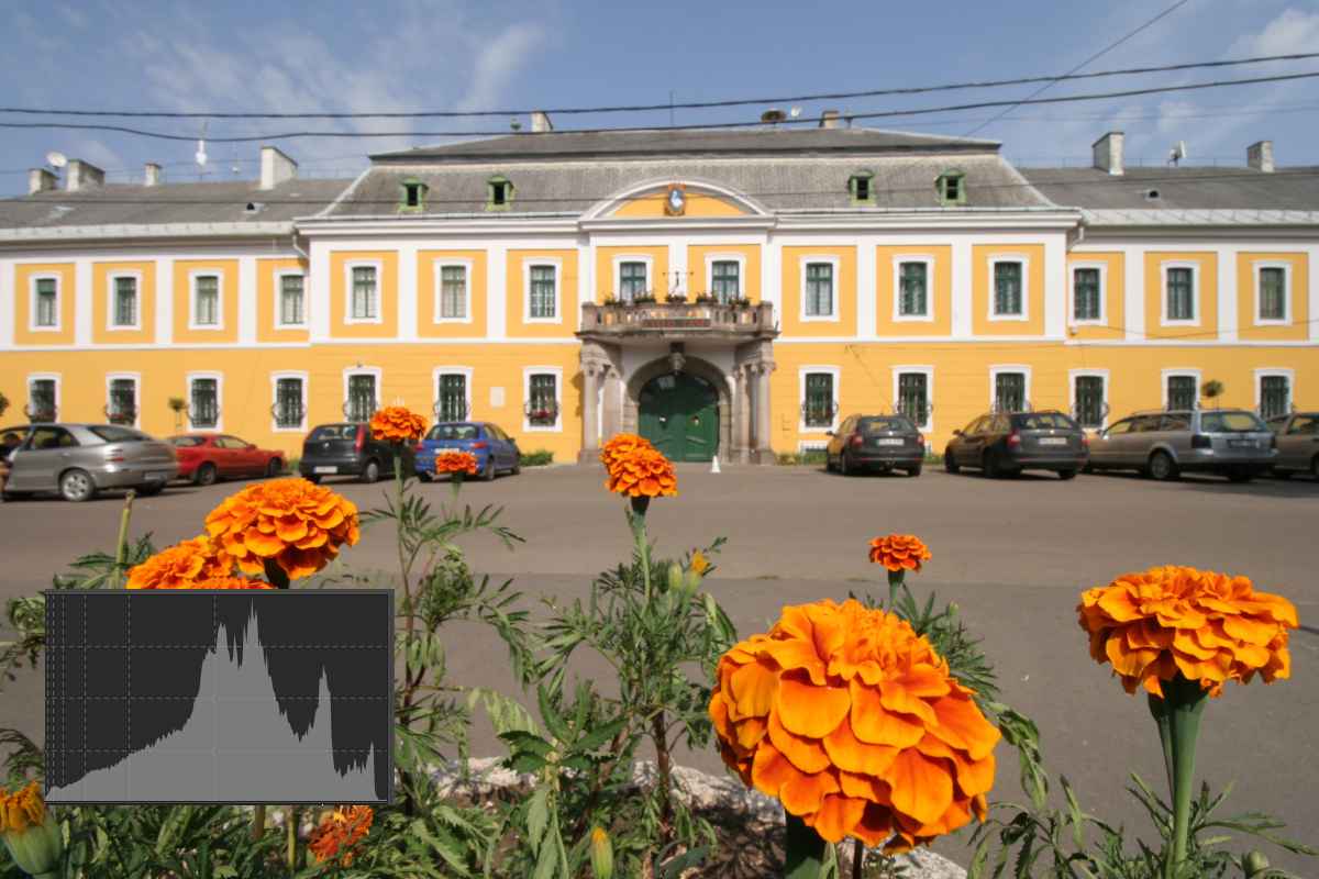
Photo taken by the author
The subject fills the histogram almost completely horizontally, so the contrast is high. Based on the luminance histogram, it appears that the image is not overexposed.
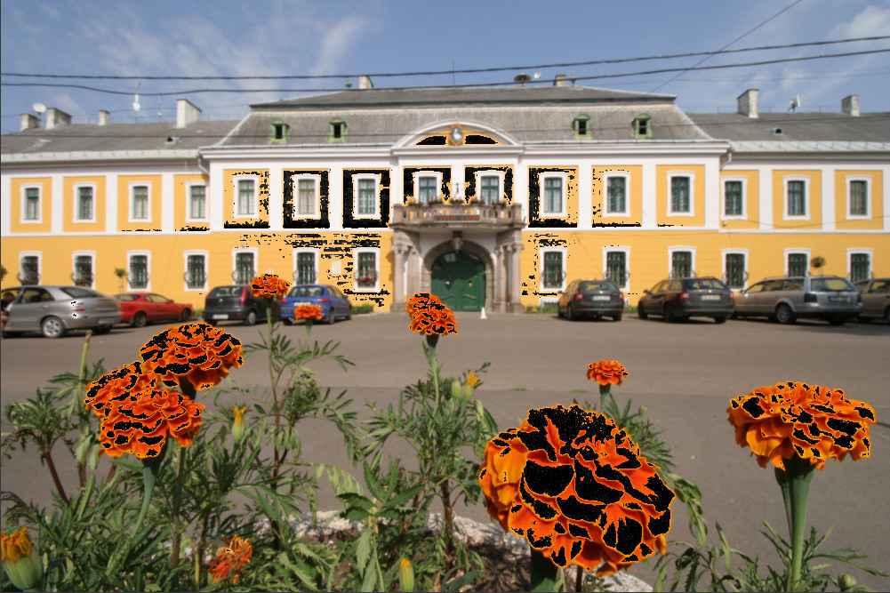
However, ART shows burnt (overexposed, clipped) areas in black. There are surprisingly many of them. In such cases, you need to look at the individual color channels of the image.
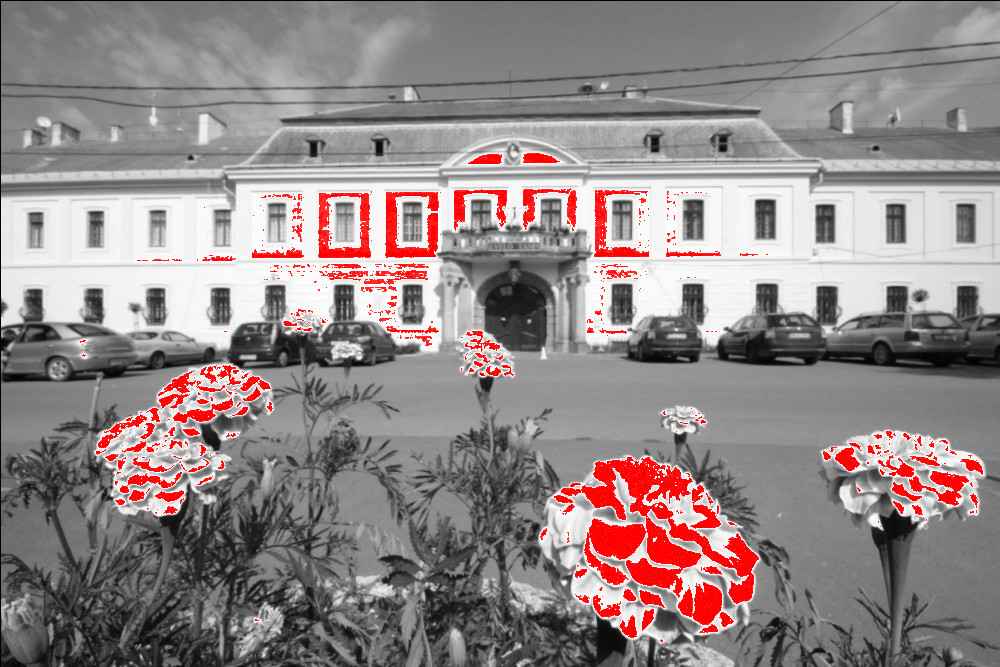
There is no problem with the green and blue channels. In the image above, we can see the red channel. Here is the problem, which is caused by overexposure (clipping) of the red channel. The overexposed areas of the red channel are indicated by ART in red. If a color channel is clipped, we can see a color shift in the overexposed areas. Let’s see what this manifests itself in. The large flower in the foreground has a lot of overexposed areas, while the small flower behind it has hardly any.
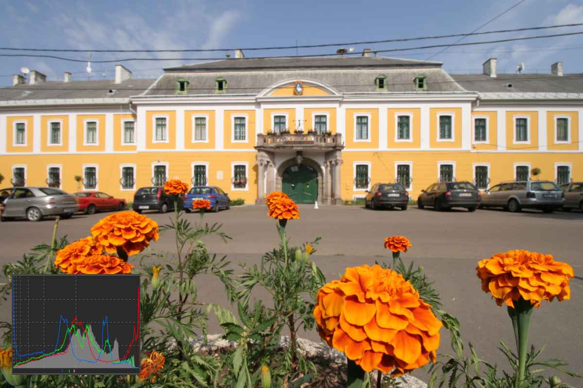
Let’s look at these two flowers in the image above. We can see that the color of the large flower is paler, less intense orange in the overexposed parts, while the color of the small flower behind it, which is not overexposed, is stronger, darker. The same can be observed in the flowers on the left. In those areas where the area marked in red in the previous image is located, in this image the flower petal is lighter, paler, directly next to it, where there is no red mark in the previous image, the color of the petal is stronger, less pale. This color shift was caused by the overexposure and clipping of the red channel.
In this image, we can see that if we display the histogram of the three color channels in addition to the luminance histogram, we can see the overexposure, as the graph of the red channel peaks very high on the far right.
In the histogram of this image, we can observe that not only is the red color channel high in the far right column, but the blue color channel is also very high at the far left of the histogram, meaning that there are quite a few underexposed, clipped pixels in terms of the blue color channel.
We can conclude that even though the luminance histogram did not show any over- or underexposure, there is clipping in the blue and red color channels in this image. This can be clearly observed in the histogram for each color channel. The clipping does not cause a catastrophic error, but it does result in color shift in certain parts of the image.
3.10.4.3 Interaction between preview, navigator, and histogram
Let’s look at how the Preview, Navigator, and Histogram work together.
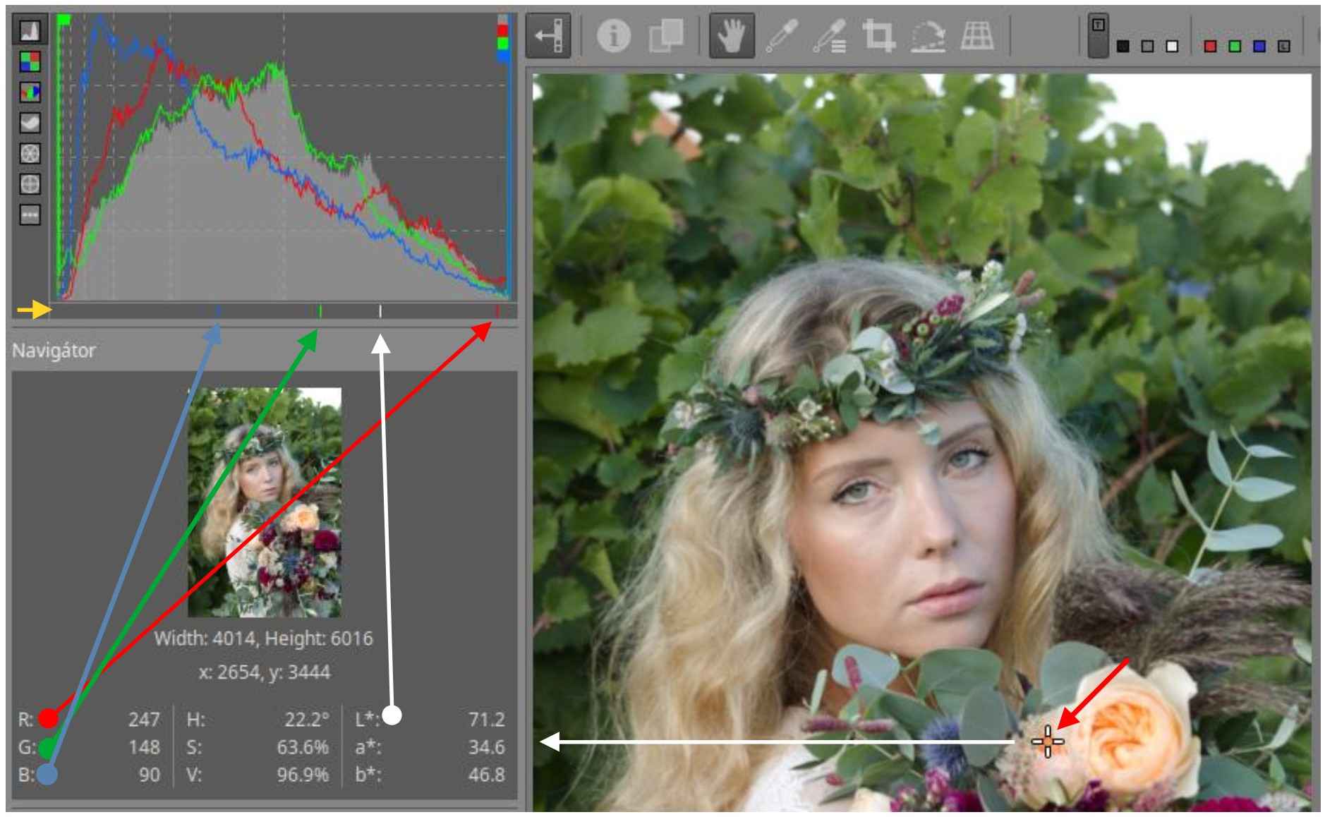
In the figure above, the histogram of the R, G, B color channels and the luminance histogram display are also turned on. On the left side, below the histogram, a yellow arrow shows the indicator bar, on which in this case we see four small lines, one red, one green, one blue and one white. You can see the mouse pointer that I set to the yellow flower in the preview. The Navigator displays the data for this point, including the values of the R, G, B color channels for the given point, the LCH, and the L*a*b* values, of which L* is the luminance value of the given point. The histogram can display 256 columns. The red, green, and blue channels are displayed in the indicator bar according to the RGB values. The smallest value of L* is 0, the largest value is 100. Taking this into account, a white line representing the value of L* is displayed on the indicator bar.
Note that the state of the Color Scale button affects the result. If it is disabled, the data according to the gamma-corrected output profile will be displayed in the Histogram and Navigator module, if enabled, the data according to the working profile will be displayed.
3.10.4.4 Determining the reason for the cut
If the histogram shows clipping (the first or last column is too high), first determine where the clipping is occurring. Check the raw histogram to see if any channels are clipped. If so, look at the location of the R, G, B, and L* values for these pixels on the histogram bar. Perhaps a highlight reconstruction can help. If the raw histograms are not clipped, then some stage of processing is causing the clipping. Make sure the range of the working profile is large enough by enabling the color gamut button. If the processing color profile is not causing clipping (the default processing color profile is Rec2020, which certainly has a large enough range), then your settings are probably causing the problem. You can temporarily go back in the History to see which tool applicate is causing the problem.
3.10.4.5 Waveform
The waveform diagram shows the number of pixels of different values as a function of their position on the horizontal side of the image. It is calculated based on the output color profile (the colors of the image to be saved).
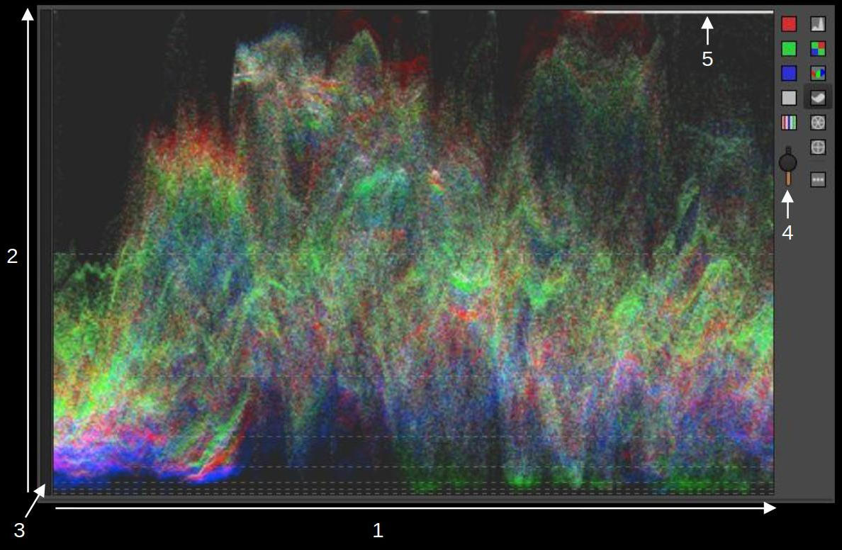
- x-axis: the horizontal side of the image. The left edge of the diagram represents the left edge of the image, and the right edge represents the right edge of the image.
- y-axis: tone values (R, G, B, or luminance). Blacks are at the bottom, the lightest tones are at the top.
- Indicator bar
- The slider controls the brightness of the chart.
- Clipped areas at the right edge of the image.
The brightness of each point in the diagram is proportional to the number of pixels of a given tone (y axis) at a given location (x axis).
On the waveform diagram, you can see some dashed horizontal lines. These represent the values 1, 3, 7, 15, 31, 63, and 127 (the same as the vertical dashed lines on the histogram). These correspond to values, so the values are halved/doubled.
In the figure above, all three color channels and the luminance display were turned on.
In the figure below, we can see the same thing in the RGB parade diagram. The only difference is that the individual diagrams are placed next to each other, not on top of each other.
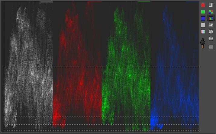
At the top right of all four diagrams, we can clearly see the overexposed area at the right edge of the image. All three color channels are overexposed, i.e. clipped in this case. We can determine whether clipping has occurred primarily by the number of maximally white pixels. The maximum brightness white can also be part of the image, since it is the same color as the others. If there are few such pixels, it is not a problem. If there are many such pixels, or large areas, as in the figure above, it is definitely caused by clipping.
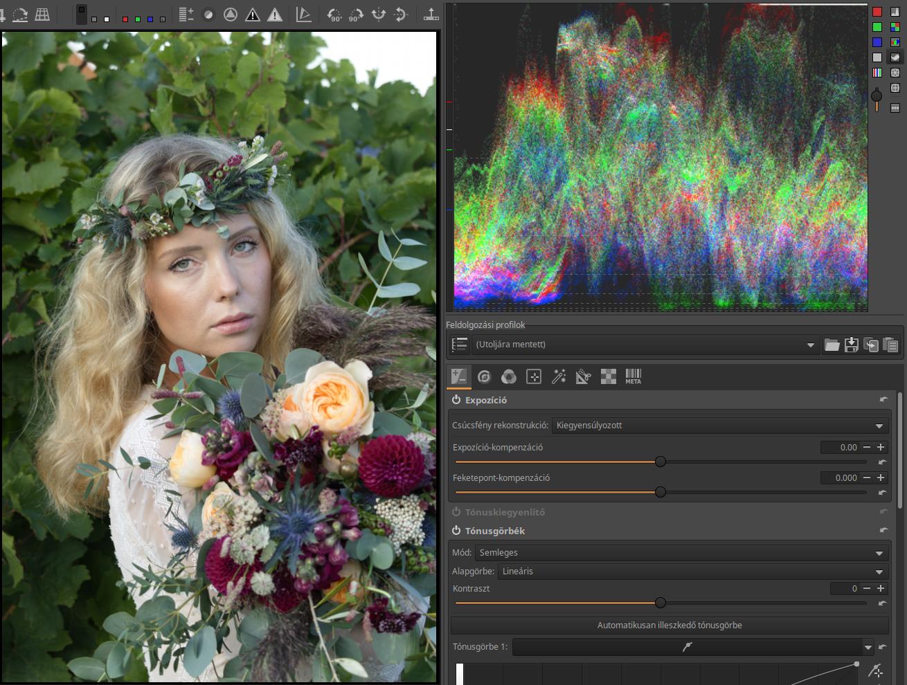
We have seen the waveform diagrams of this image in the figures above. The white horizontal line in the upper right corner of the diagram indicates the clipping of the sky in the upper right corner of the image.
3.10.4.6 Vectorscopes
A vectorscope chart is a graphical representation of the colors of pixels. Each pixel appears as a white dot on the chart and is positioned according to its hue and saturation. The brighter the dots, the more pixels in the image that have that hue and saturation. The closer the white dots in the chart are to the outer outline, the more saturated the color. It is calculated based on the output color profile (the colors of the image being saved).
The difference between HSL and LCH is that the latter represents colors in a way that is closer to how we see them.
If you hover your mouse pointer over a point in the preview, you can see where that point is located on the diagram.
Hue-Saturation vectorscope
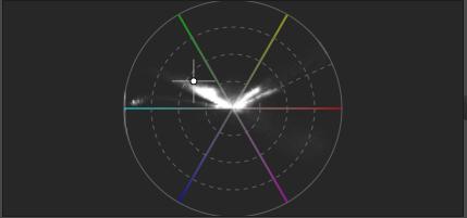
It shows the hue and saturation of pixels based on the HSL color model. The dashed circles indicate 25%, 50%, and 75% saturation, and the outer, solid circle indicates 100%. The edge of the diagram represents the boundary of the output color space range, so we can estimate how many pixels are close to the boundary of the range and how many are outside it on this diagram.
Color-chromaticity vectorscope
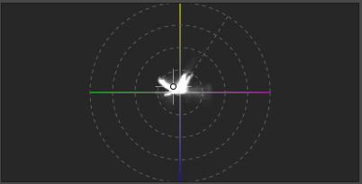
The LCH color space shows the color and chromaticity of pixels (according to our perception). The dashed circles indicate chromaticity values of 32, 64, 128, and 256.
3.10.5 Processing profiles panel
Below the histogram is the Processing Profiles (6) panel.
The Processing Profiles panel allows you to apply, save, load, copy to the clipboard, and paste processing profiles in whole or in part.
3.10.6 Editing tool groups
In ART, editing tools are grouped according to their function. You can switch between editing tool groups using the buttons (7) below the processing profiles panel. If you click on one, the editing tools belonging to the group will appear in the window (“tab”) below it (8).
In the image above, the first group, Exposure, is selected, indicated by the yellow underline on the button. The other buttons, from left to right, represent the following groups: Details, Colors, Local editing, Special effects, Transform, Raw, Metadata.
Chapter 4 of the book discusses the groups of editing tools and the editing tools in detail.
3.10.7 Editing tool header
ART offers a number of editing tools. They are located in the right-hand panel, grouped by function. Most tools need to be turned on (activated) or they are ineffective. There are some tools that are always active because they are always needed, and cannot be turned off. You can turn an editing tool on or off by clicking the power button on the far left of the tool header.

In the image above, we can see the Capture Sharpening tool header when it is turned on. If the tool is not turned on, the captions and buttons on the header are dimmed. Next to the power button is the name of the editing tool. On the right, the 1:1 icon indicates that the effect of this tool is only visible in the preview if its magnification is at least 100%. Of course, you don’t necessarily have to zoom in on the entire image to this extent; it is enough to place a Detail window with at least 100% magnification on the points of the image that are important to us. Its button is located on the bottom toolbar. On the right edge of the header, we can see the reset button.
Clicking on the name of an editing tool opens it, revealing its controls. Right-clicking on the name of a tool opens the tool, collapsing all other open tools in the group, leaving only that one open. Opening a tool does not activate it, it does not turn it on.
3.10.8 History
Below the Navigator, you can see the History (4). Each editing step results in an entry in the History, which contains the name of the tool and the settings (parameters) of the tool. By clicking on any line in the History, you can return to that state and continue processing from there.
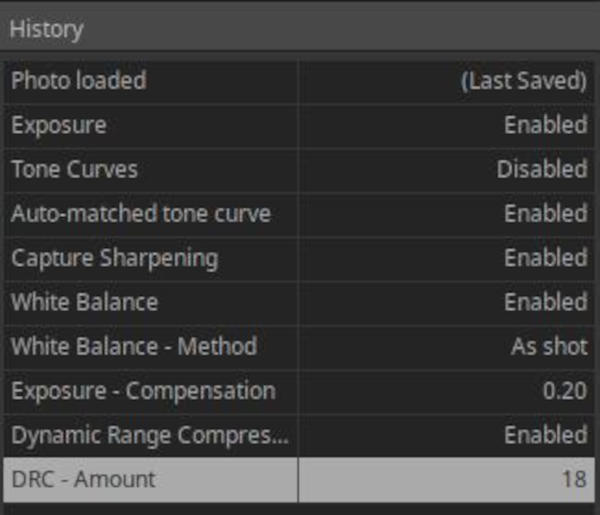
3.10.9 Snapshots
Below the history, you can see Snapshots (9). You can take a snapshot at any time during editing by clicking the “+” button next to Snapshots. You can delete the selected snapshot by clicking the “-“ button next to it. You can view the snapshots in the before/after view (if enabled on the top toolbar) or in the preview area. The snapshots are stored in the sidecar file, so if you open the image for editing later, they are available again.
3.10.10 Filmstrip
The bottom panel shows the Filmstrip (10). The images in the Filmstrip are composed of images that match the filter criteria. You can edit an image by double-clicking on it. Right-clicking on an image displays a context menu similar to the one in the file browser view.
You can select multiple images on the Filmstrip at once, and apply the action selected from the menu to them at the same time.
3.10.11 Bottom toolbar
The buttons on the bottom toolbar (11) provide us with many useful functions.

Let’s look at the elements of the bottom toolbar, moving from left to right.
There are several ways to save the currently processed image. One option is to click the first button to Save current image, place the finished image in the Queue by clicking the second button, or call an External program by clicking the third button (e.g. GIMP), in which you can further edit the image and save it from there.
If you choose to Save current image, the Save window shown in the figure below will appear.
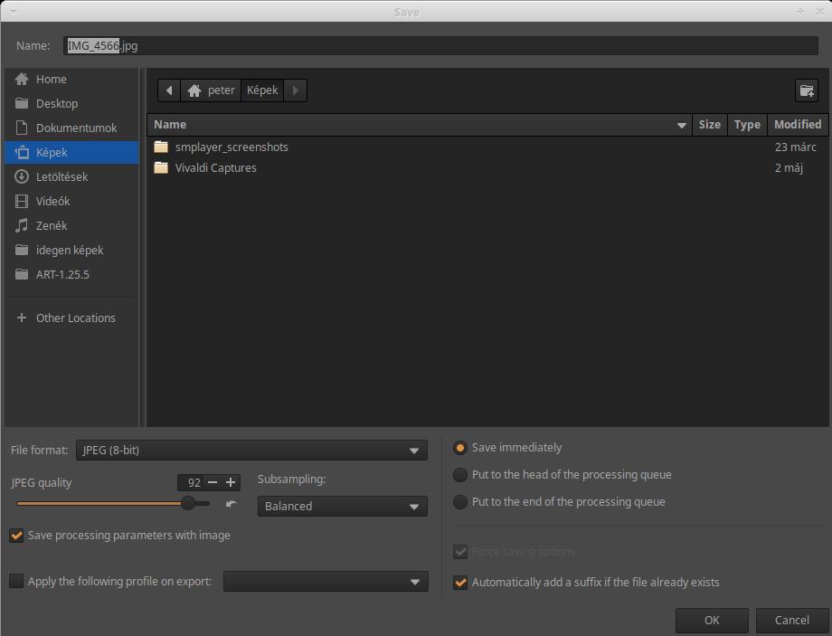
The default values are usually adequate, and should only be changed if necessary. If you wish, you can choose a different File format. JPEG quality of 92 means good quality with an acceptable file size. For the Subsampling option, you can choose Best quality if necessary, but this will increase the processing time. It is recommended to check the Save processing parameters with image option. By enabling the Apply the following profile on export option, you can also choose your own profile for export. For example, a profile you have created that resizes the image. On the right side, you can choose whether you want to save the image immediately, or place it at the beginning or end of the Queue. It is highly recommended to check the “Automatically add a suffix if the file already exists” option, because this prevents you from overwriting a previously saved image.
The Save current image window opens by default to the location where you saved it the last time you used it. The folder containing the source image is automatically added to the bookmarks on the left side of the save window (the “idegen képek” folder in the image above). If you want to save the image to the source folder, just click on the bookmark.
The Save current image function is not only important for saving the image immediately. It allows you to place an image at the beginning or end of the Queue so that ART processes it with the settings specified here, rather than the settings in effect there. This means that, for example, if the Queue is set to produce an 8-bit JPEG file, in this window you can set the current image to TIFF (16-bit) file format, and even Best quality for subsampling. What you set here will apply to this image in the Queue.
The bar next to the Save current image button indicates where the preview update is progressing.
You can select the color profile of your monitor from the drop-down list. If you are working with a calibrated monitor and its color profile is available, you can select it to get an accurate, color-correct preview.
On the Preferences > Color Management tab, under “Directory containing monitor color profiles”, you need to set the library containing the monitor’s color profiles.
Next to it, we can choose Rendering intent. Choose Relative Colorimetric (unless we have a good reason to choose something else).
By clicking the next button, we can enable Soft proofing preview. This is a way to estimate how the image will look when displayed on another medium (e.g. on another monitor or printed). So Soft proofing refers to the color profile of the display medium, not the output image. How we perceive an image (print) depends on its lighting, the color temperature of the illuminating light, the color of the background, the environment of the image, etc. Soft proofing helps us adjust the parameters of the image so that the best view is the result in a given environment (e.g. at an exhibition).
Turning on the next button highlights pixels with colors outside the color range (gamut). If Soft proofing is enabled, it indicates colors outside the Soft proofing color profile, if not enabled, it indicates colors outside the output color profile.
The next button (“monitor”) highlights colors that are outside the color range (gamut) of the monitor profile.

The Next button opens the previous image for editing compared to the image opened for editing.
Clicking the next button will center the currently edited image on the Filmstrip and will also make it the selected image in the File browser. If the currently edited image is filtered, its thumbnail will not be displayed.
The Next button opens the next image for editing in relation to the image currently open for editing.
The next group of buttons allows you to change the preview magnification.
The first and second buttons zoom in and out, the next one fits the preview to the screen (available space), and finally, by clicking the last button, we can view the preview at 100% magnification, full (1:1) size. There are some processing tools whose effects are only clearly visible in the preview when its magnification is at least 100%. These are mainly found in the Details group. This is indicated by a 1:1 icon on the right side of the header of each such tool.
The current zoom level is displayed next to the buttons, expressed in percentage.
By clicking the next button, we can place a new Detail window on the image. The figure below shows three such windows.
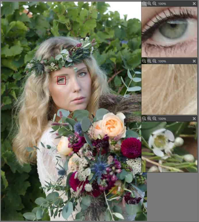
If you click on the button, a red frame appears and a small Detail window opens, in which you can see the preview detail in the red frame at 100% magnification. You can drag the red frame to any part of the image with the mouse, and you can move the Detail window to any place in the middle panel by grabbing its header. You can also move the image in the Detail window by grabbing it with the mouse. In the Detail window header, you can see three buttons: you can decrease the magnification, increase it, or set the magnification to 1:1 (100%). Of course, you can also set the magnification higher than 100%. The primary purpose of these Detail windows is to allow you to observe the effect of editing tools that are only clearly visible in the preview at a magnification of at least 100% on several parts of the image at the same time (think of observing the effect of the sharpening tool, for example). So, it is not necessary to zoom the entire preview to 100%, it is enough to place a few Detail windows. If you zoom the entire image to 100%, you can only observe the effect of the tool on a small part of the image, but if you place Detail windows, you can simultaneously observe parts of the image that are far apart at high magnification. A small red frame corresponding to the Detail window that is active (the one you clicked on) is always visible on the image. The Navigator color value indicators also work when the mouse pointer is over Detail windows.
Next is the button to hide/show all panels. If we hide the panels, only the middle panel with the top and bottom toolbars and the narrow panel on the left will remain visible.
Finally, the last button is used to hide/show the right panel.
3.11 Queue
Once you have finished processing an image, you can place it in the Queue. This is the recommended procedure. In the Queue, you queue up your images, waiting to start the process of creating image files, i.e., processing the images in the Queue. At this point, the image file is generated from the raw file, using the operations and parameters stored in the sidecar file. Each queued image is processed one after the other.
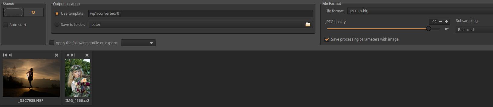
If the Auto-start option is checked, the image file generation will start immediately after the image is placed in the Queue. However, this is not the recommended behavior. Generating image files is very resource-intensive, so it is advisable to start it manually when you have finished processing all images in the editor. You can start batch processing by clicking the large power button (shown in the upper left corner in the figure).
The default parameters work well, but in justified cases it may be advisable to deviate from them. If we only want to save a single image with different parameters (for example, in TIFF format instead of JPEG), we place them in the processing queue via the Save current image function as described above.
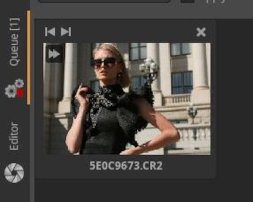
In the above figure, the icon in the upper left corner of the thumbnail indicates that the image was added to the Queue using the Put the queue (Fast export) function. Put the queue (Fast export) can be accessed by right-clicking on the thumbnail and selecting it from the context menu. When you use Put the queue (Fast export), some time-consuming processing steps are skipped, the image quality is reduced, and the result is not the image you see in the preview. The image can be up to the maximum size specified in the Preferences > Performance tab > Fast Export. Fast export is rarely useful.
3.12 Processing profiles
Processing profiles are text files with the .arp extension that contain editing tool settings.
So far, we have also called these sidecar files, which ART can save alongside the original (image or raw) file of the edit, or (if enabled) the image file created as a result of the edit. So the sidecar file is also a processing profile.
However, a processing profile is a broader concept. In addition to the sidecar file function, processing profiles have another role. They can be used to store settings for editing tools that can be applied to any image later.
When you first open a folder containing photos in the ART file browser, none of the images have a sidecar file associated with them. A sidecar file is created for an image when you perform one of the following actions:
- We open the image for editing.
- A processing profile is applied manually using the file browser or the filmstrip context menu.
- When the default processing profile is applicated, which may be a dynamic profile.
When you open a raw file for editing, ART converts the raw file data into a viewable image. To do this, it must apply a number of settings. These settings and their parameters depend on:
- From the default processing profile.
- From the rules of the dynamic processing profile, if any.
- From the processing profile selected and applicated from the right-click context menu.
The figure above shows the Processing Profiles panel. The elements from left to right are: Processing profile append mode for local editing tools (append/overwrite), Profile selector, Load processing profile, Save current processing profile, Copy current processing profile to clipboard, Paste processing profile from clipboard.
Processing profiles can come from three different sources:
- ART comes with a profile package. These are intended to provide a good starting point, demonstrating how the tools can be used together. These are the profiles that you will see in the “Bundled profiles” section of the Profile Selector drop-down list.
-
You can also create your own profiles, which will appear in the drop-down list in the My Profiles group.
-
Automatically generated profiles are profiles that are automatically created during image processing and are saved as sidecar files alongside the original raw files or images.
The processing profile (sidecar file) associated with the image is written to disk when:
- when manually applying a processing profile to the image or using a dynamic profile;
- if we close the current editing page;
- if we close the currently edited image by opening another image;
- when you manually save the processing profile using the Save current processing profile function in the Processing Profiles panel;
- when we close the current image by closing ART;
These were the most important cases.
If a photo has a processing profile associated with it, a green check mark appears in the upper left corner of its thumbnail.
Default processing profiles:
This can be set in the Preferences > Image Processing tab. When you open a non-raw file (e.g. a JPEG image), the default processing profile is Neutral. All tool settings in this profile are set to neutral and have no effect. Since non-raw images are usually already processed (e.g. by the camera software), it is desirable that ART does not modify the image by default.
ART uses a dynamic default processing profile for raw files, as shown in the figure below.
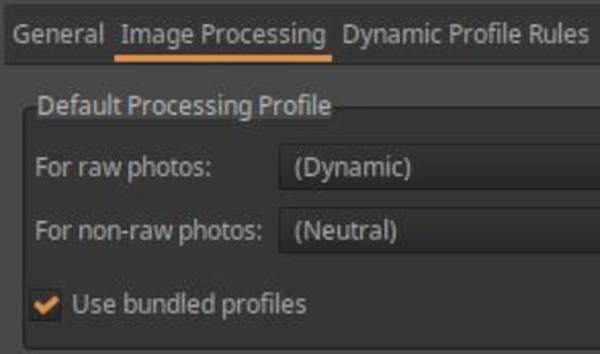
The figure below shows the rules configured for the default dynamic processing profile.
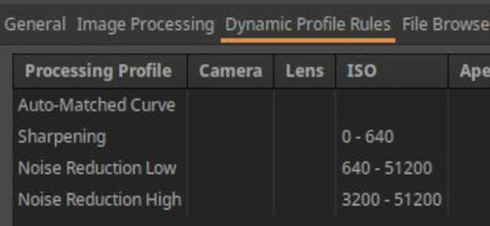
Always apply the Auto-Matched Curve wrapped profile. When applied, ART analyzes the JPEG image embedded in the raw file and adjusts the tone curve in the Tone Curves tool to produce a preview that closely matches the embedded JPEG image as a starting point for editing. Between ISO 0 and ISO 640, it also applies the Sharpening bundled profile. Between ISO 640 and 51200, it also applies the Noise Reduction Low bundled profile. Between ISO 3200 and 51200, it also applies the Noise Reduction High bundled profile. In other words, it applies multiple bundled profiles one after the other.
A dynamic profile can only be created as a default profile. In a dynamic profile, the processing parameters depend on the metadata associated with the image. Among the metadata, the camera type, lens type, focal length, aperture, shutter speed, ISO sensitivity, and exposure compensation can be taken into account when creating the rule.
When creating it, on the Preferences > Image Processing tab, the Default Processing Profile > For raw photos field must be set to Dynamic. Then, you can specify the rules on the Preferences > Dynamic Profile Rules tab.
Let’s take a look at partial processing profiles and loading modes in a few sentences. If you click one of the four buttons on the right side of the Processing Profiles panel, the action applies to the entire profile. If you click them while holding down Ctrl, it only applies to a subset of the editing tools. There is one exception, however: when copying to the clipboard, Ctrl has no effect, only a complete profile can be copied to the clipboard, and when pasting, you can select which editing tools to paste the settings for. When saving partially, loading partially, or pasting partially, a window appears and you can select which editing tools the action applies to.
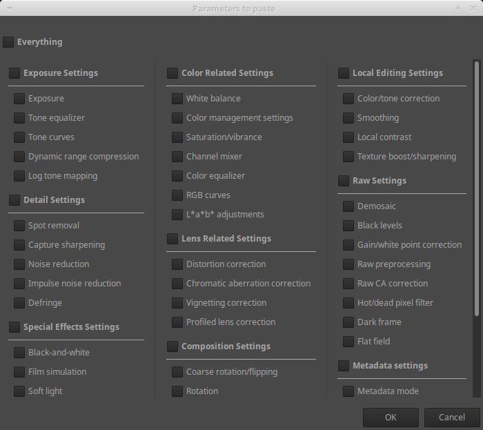
For example, it is possible to copy only the White Balance and Noise Reduction tool settings from one image to another.
The following differences can be observed between the behavior of the entire profile and the partial profile:
- The entire profile contains settings for all devices, including those that were turned off when the profile was saved. If this profile is applied in its entirety, all editing tools are set based on the settings stored in the profile. A device that is turned off in the profile will be turned off when the profile is applied. If the entire profile is only partially applied, only the settings of the selected devices will change to those stored in the profile.
- If a partial profile is saved, it only saves the settings of the selected editing tools in the profile, nothing about the other editing tools is stored in the profile. Even if the partial profile is used in its entirety, it only sets the parameters of the editing tools that were stored in the profile, and does not change anything in the settings of the other editing tools. In principle, we have the option to only partially apply the partial profile, but this is not a real option, because it is not possible to know which editing tool settings a partial profile contains (unless it’s in the file name when we save it). If we also select a device in the partial application of the partial profile whose settings are not included in the partial profile, the settings of that device will not change.
The “Processing profile append mode for local editing tools (append/overwrite)” button allows you to decide what happens when a partial processing profile is applied, when it also contains the settings of local editing tools (adjustment layers, masks settings). In the case of append mode (button pressed), the local editing settings in the profile will be appended to the current settings (the current settings will also be preserved). In the case of overwrite mode (button released), the local editing settings in the profile will overwrite the current settings (they will disappear, only the settings in the profile will be preserved). This only applies to tools in the Local editing tool group, this button is effective only when applying a profile containing local editing tools, it has no effect on the settings of other tools. Overwriting always occurs for editing tools in other tool groups.
3.13 Creating processing profiles
Processing profiles are very useful, and it is a good idea to create your own profiles for frequently used operations.
A processing profile is created by opening a raw file for editing, turning on the necessary editing tools, setting the parameters of the editing tools, and then saving it as a full profile or a partial profile.
3.13.1 Creating a default processing profile
We will create new processing profiles that we can use as default processing profiles for raw files. This means that we can even replace the original default processing profile with it. It is also possible to leave the original profile and only execute the new profile when we think it is necessary.
ART’s default dynamic raw processing profile attempts to create a preview that is similar to the JPEG image embedded in the raw file as a starting point. The advantage of this is that if you like the JPEG image that came out of the camera and only want to make minor changes to it, then a similar preview is a good starting point for editing. If you want to create something significantly different, then a more neutral image might be a better starting point. Many people prefer to start their editing with a more neutral image. We will focus on creating only SDR (standard dynamic range) images, and we will create new profiles that are suitable for this. If you follow these steps, you will also learn the basics of creating a reusable processing profile.
Let’s start with a clean slate and open any unedited raw file in the editor (no sidecar file).
Go to the Colors group and open the Color Management tool.
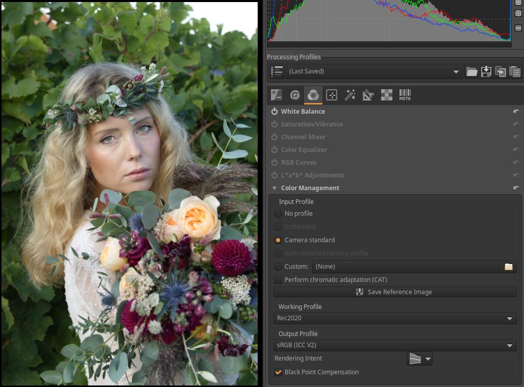
Leave everything at default and make sure that the sRGB (ICC V2) color profile is selected at the bottom for Output Profile. Up top, the Working Profile is Rec2020, and even higher up, the Input Profile is Camera standard. If one of them is not, select it. You can see this in the image above.
In the same group, White Balance should be on and all others should be off.
Let’s go to the RAW group. In the Sensor with Bayer Matrix subgroup, we can select the Demosaicing method for our camera with a Bayer-filter. So this does not apply to Fujifilm cameras, only to cameras from other manufacturers. Choosing the Demosaicing method is not the same. The difference between the individual algorithms is small, it can be felt mostly in the fine details of the image. Sometimes, for better results, two algorithms are used one after the other, and we will do the same. The default RCD method also gives good results. Although the combined use of the two algorithms we use is more resource-intensive, in some cases the result will be slightly better. However, the difference is small, it is best seen when we enlarge the preview to at least 100%. Select the RCD+Bilinear option.
In the Sensor with X-Trans Matrix subgroup, Fujifilm camera owners can also choose the appropriate method for Demosaicing. The best quality is probably given by the 3-pass (Markesteijn) Demosaicing method, so choose this one.
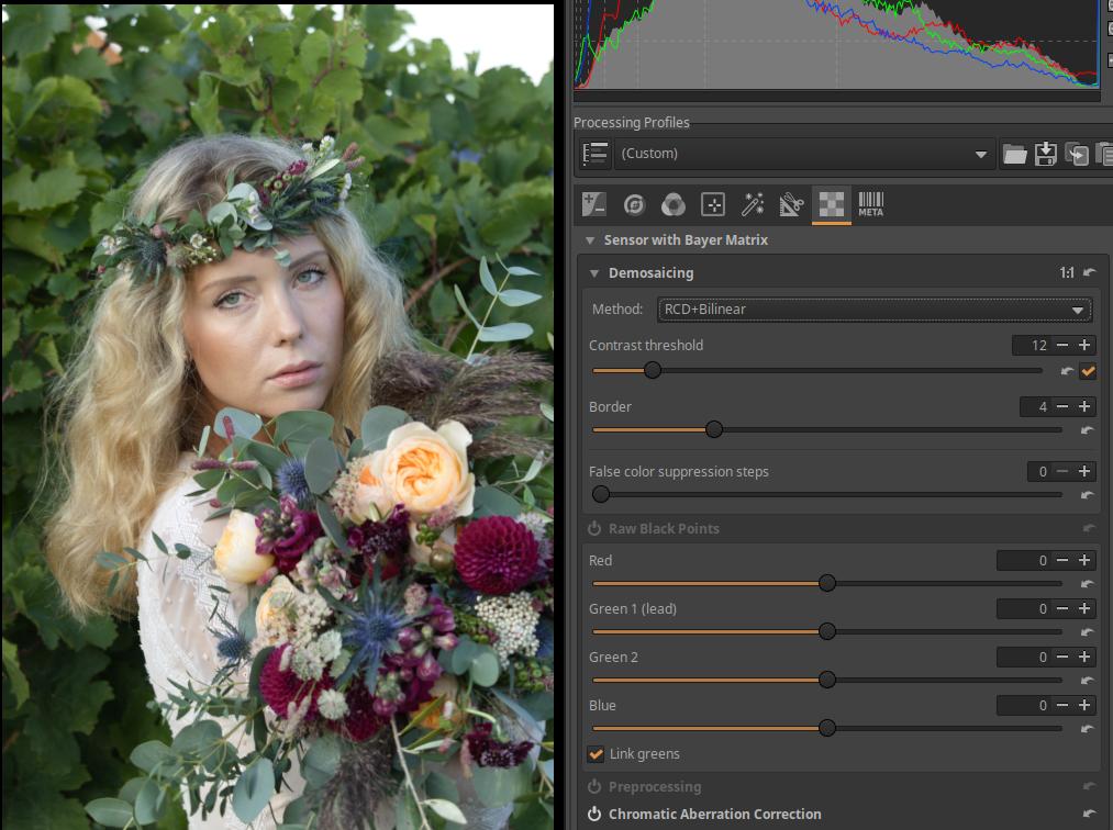
Close the Demosaicing section and open the Chromatic Aberration Correction tool. Make sure that Auto-correction is checked and Avoid color shift is unchecked. If this is checked, it could lead to color shift in certain situations.
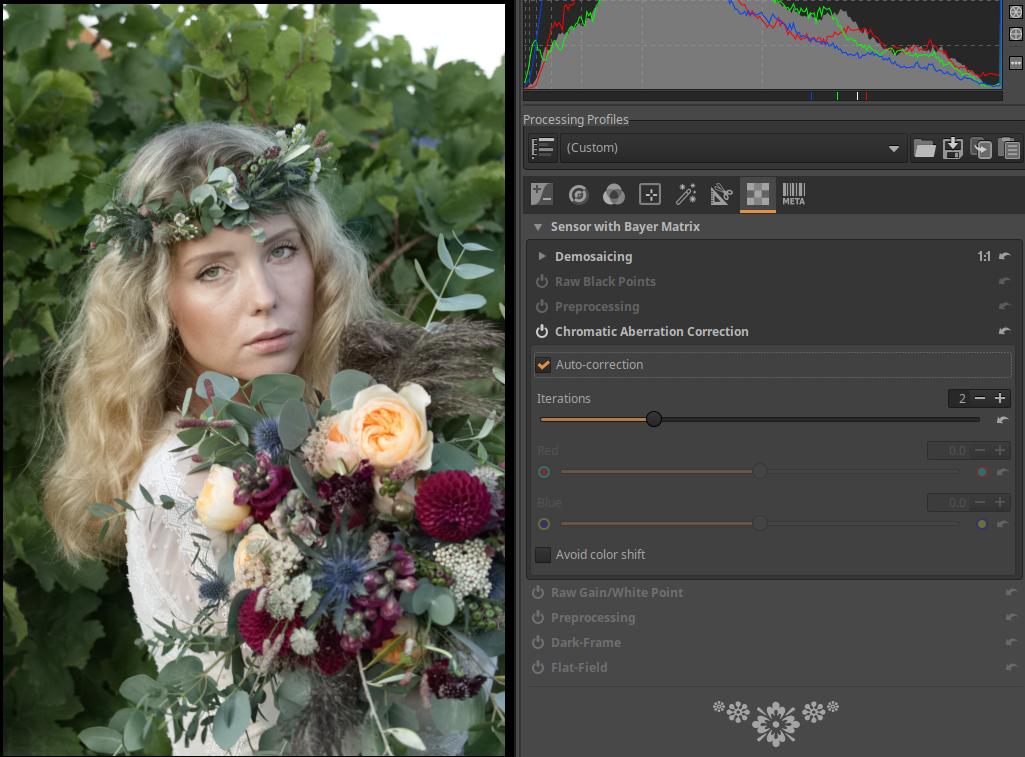
All tools in the Transform, Special effects, and Local editing groups should be disabled.
Let’s go to the Details group. Turn on the Noise Reduction module. Set the Color Space to RGB and the Mode to Conservative. Set the Luminance, Detail recovery, and Detail threshold sliders to zero. This will only reduce chrominance noise in the image, not luminance noise. This is okay, because if necessary, we can manually adjust the luminance noise reduction during processing.
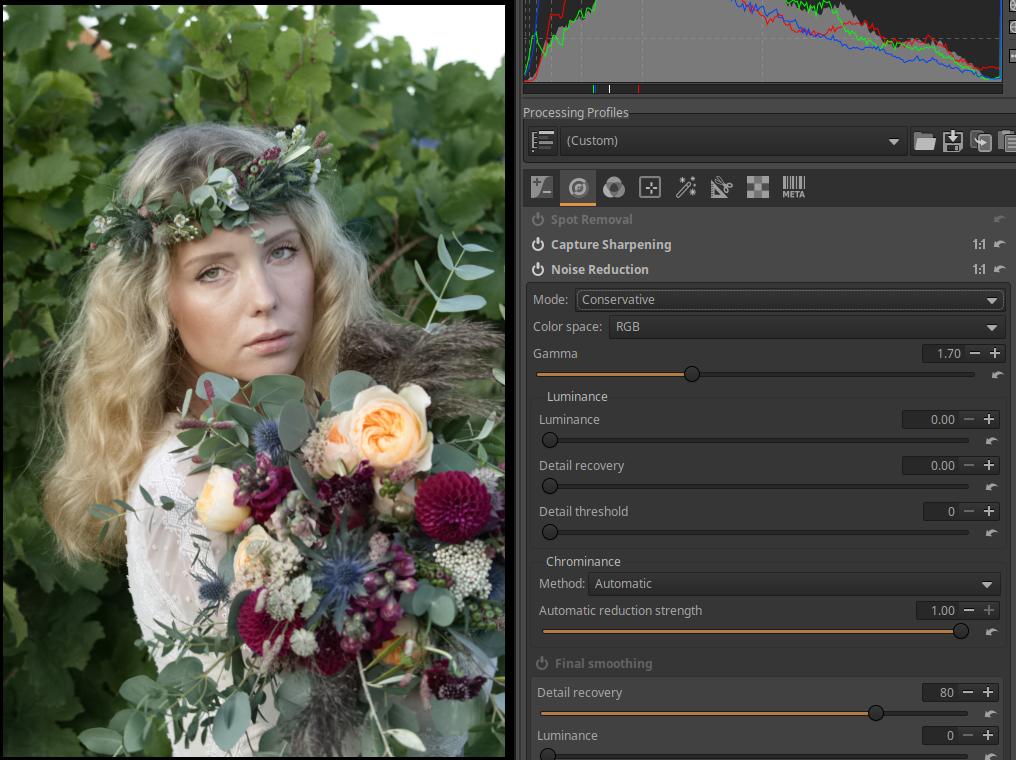
Here, turn on the Defringe tool and leave everything at default. Only the Noise Reduction, Defringe, and Capture Sharpening tools should be turned on.
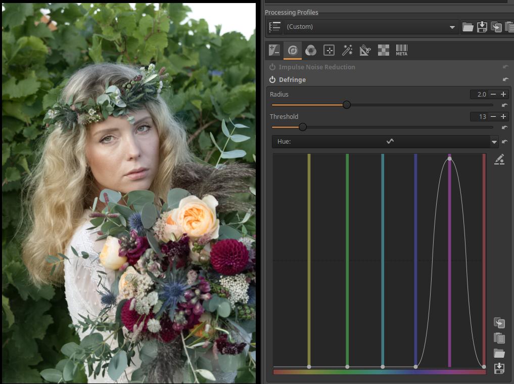
Go to the Exposure group and make sure all tools except Exposure are turned off. Open the Exposure tool and select Balanced for the Highlight reconstruction.
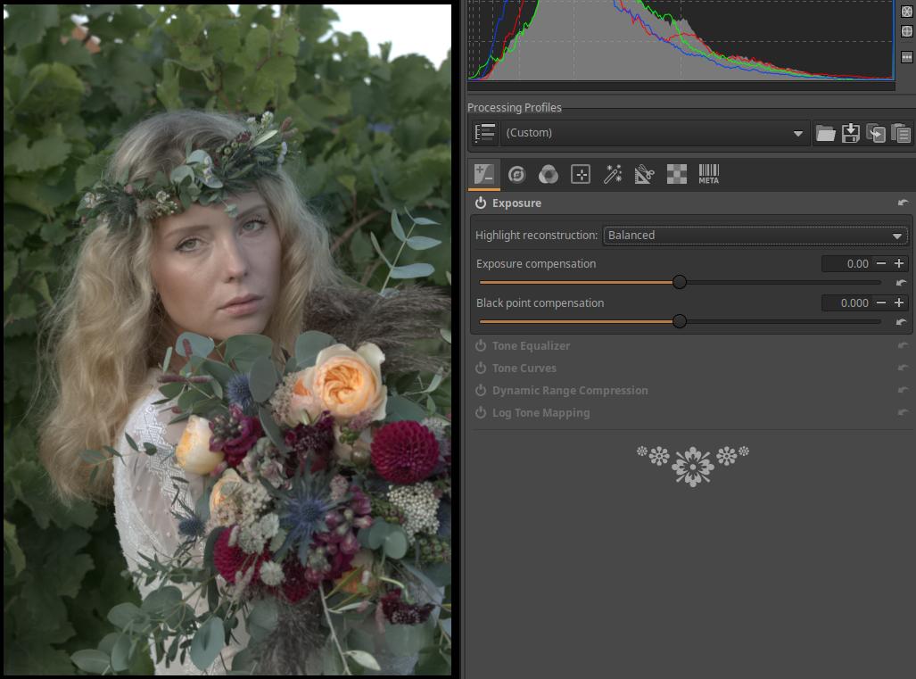
We are done with this. Now we need to save our finished processing profile. In the right panel, at the top of the Processing Profiles, click the save (“floppy”) button, in the window that appears, give the profile a name at the top, and click the save button. I gave it the name “ART Base”, so an “ART Base.arp” file was created.
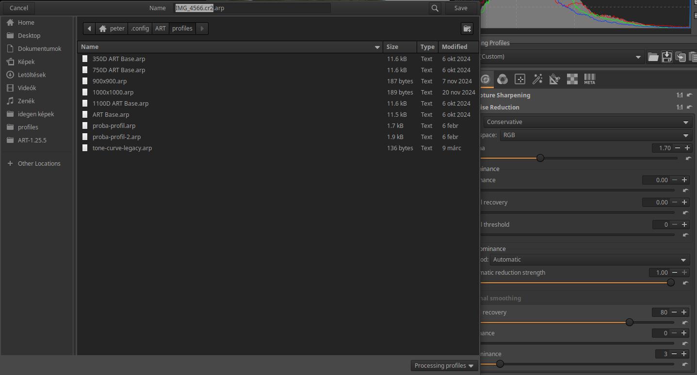
Applying the ART Base profile results in a neutral starting position, so the preview does not resemble the JPEG image created by the camera.
We can continue by using our camera’s .dcp profile to create a default processing profile for processing raw files taken with our camera. Using this profile, we can start processing from a preview similar to a JPEG image taken by the camera.
First, you need to download the .dcp profile for each of your cameras (if you have multiple cameras). DCP camera profiles can be downloaded from Andy Astbury’s Camera Profiles page. For information on downloading profiles, see “2.16 How do we get lens profiles and camera profiles?”.
After clicking on the link above, download the desired camera profiles on the page that appears and copy them to the appropriate directory.
When we are done copying, we need to continue in ART. We left off there, having saved the ART Base.arp profile. We need to continue from this state, this is important (!). If we exited the editor or ART in the meantime, that is no problem. If we go back to the editor and applicate the saved “ART Base.arp” profile as described below, we can continue.
Go back to the Colors group and open the Color Management tool. Click (None) next to Custom and select the Standard color profile from one of your cameras.
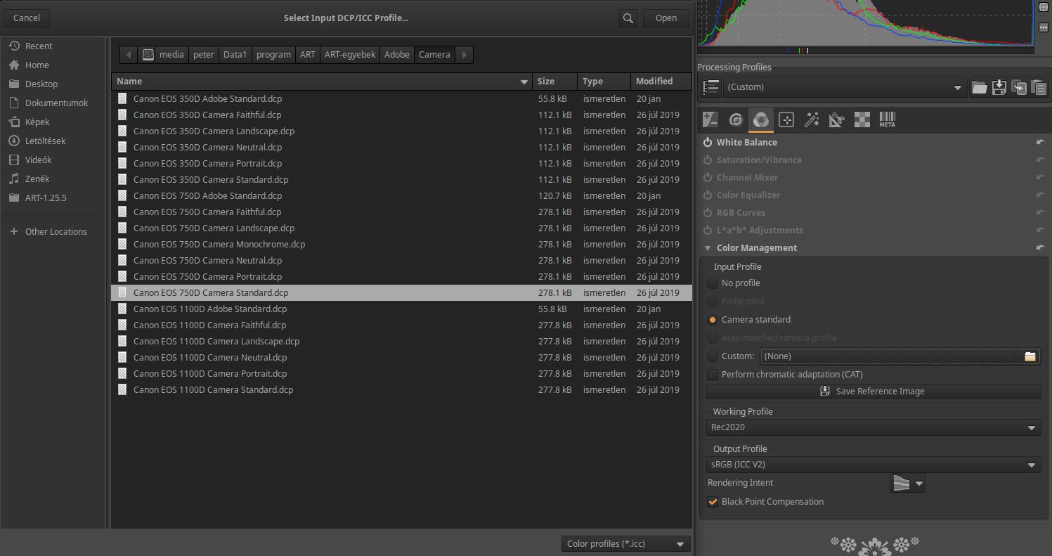
In the image above, I have selected the Standard profile for Canon EOS 750D camera. Click the Open button.
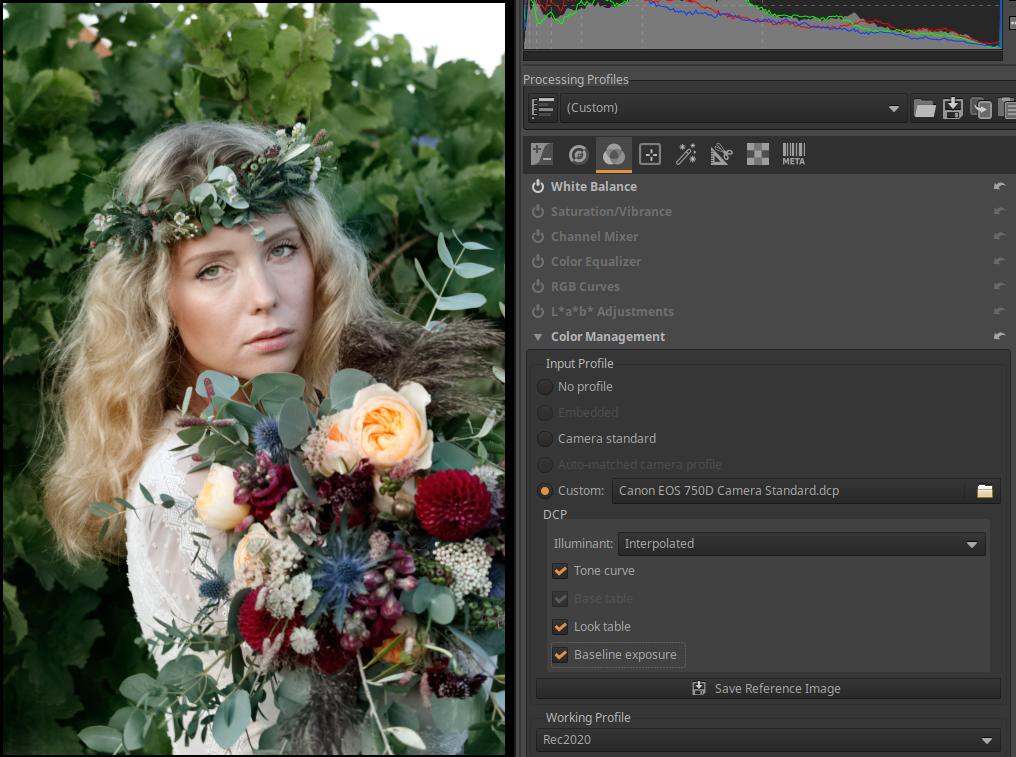
In the image above, you can see that the camera profile has been selected. Check the Tone Curve, “Look” table, and if possible, the Base Exposure option. That’s it.
Let’s save this too, for example I saved it as “750D ART Base.arp”. If we have multiple cameras, we can create a default processing profile for each one. To do this, similarly to the first camera, we need to select the Standard profile of the next camera, check the three options just mentioned, and then save the profile.
Of course, we can create a default processing profile not only for Standard profiles, but also for others (e.g. landscape, portrait, etc.) if we wish.
It should be clarified that the default processing profiles should not be used when we want to modify an already edited raw file compared to the last editing state and have it opened in the editor. Pay attention to this!
Only apply the new default processing profile when you want to start processing a raw file that has not yet been edited, or when you want to start editing a file that has already been edited (losing previous processing steps!!!!!). It should be applied immediately after opening for editing. It can be applied later, but then the previously performed editing steps will be lost.
We have to decide what we want. We have several options to choose from.
What we can do is leave the default processing profile for ART raw files and apply the profiles we just saved to specific images when we want. This is probably the best way.
To apply the profile, do the following. Open the raw file for editing. On the top right, open the drop-down list under Processing Profiles. In the My Profiles profile group, you will find the previously saved profiles, and by clicking on their name, select the one you want to apply. The simpler solution is to click on the folder button next to the drop-down list, and then in a window you can choose from your own profiles. This is shown in the figure below. From the camera-specific profiles, you must select the one with which the image to be processed was taken.
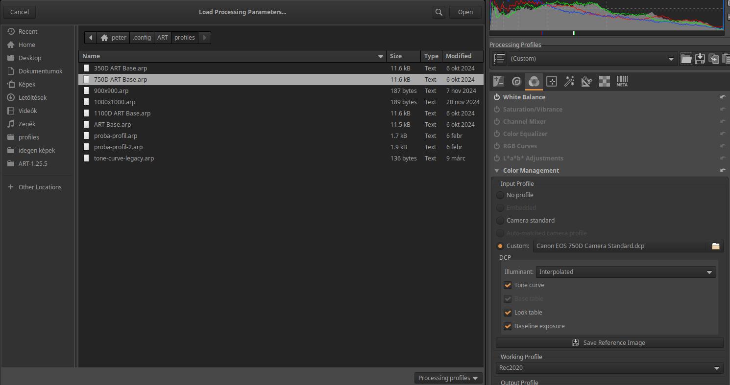
Once you have selected the correct profile and clicked the Open button, the profile will be applied immediately. This will also be visible in the history.
If you want your unprocessed raw file to always open with your own profile that results in a neutral preview, you can replace ART’s default profile (Dynamic) with your own (ART Base.arp). Doing this, and never applying the new profile directly, ensures that ART only applies it to unprocessed raw images.
To replace it, we need to open the Preferences window, then select the Image Processing tab. In the Default Processing Profile section, we need to select our saved profile from the drop-down list “For raw photos”. Here we need to select it similarly to when we applied it, i.e. in the My Profiles list we find the ART Base.arp profile. Of course, we can also apply a profile belonging to one of our cameras if we want a starting state similar to the JPEG image taken by the camera.
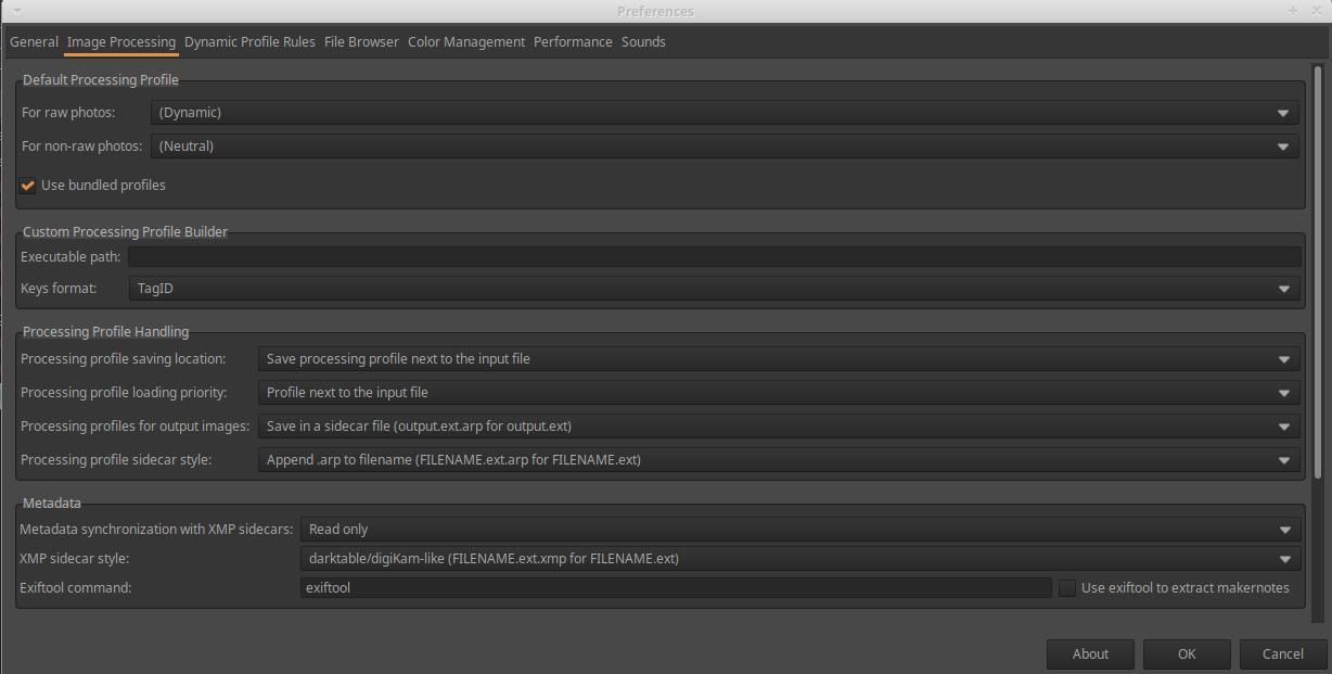
If we did it right, we should see something similar to the image below, of course everyone will see the name they gave their profile.
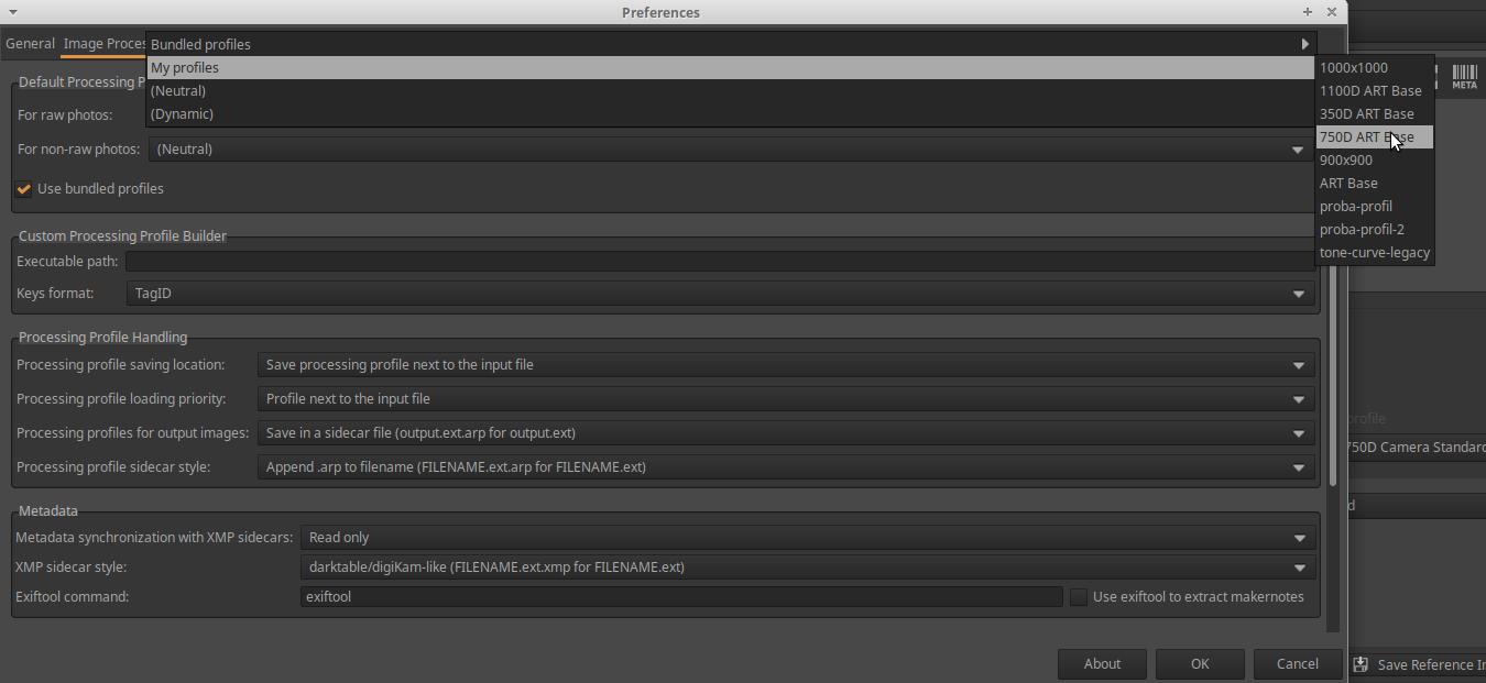
Of course, we can also change the settings in our new profile during editing, if necessary.
Let’s say you set the default processing profile to ART Base.arp in Preferences. If you open an unprocessed raw file for editing, the ART Base.arp profile will be applied to it. What if you want to use the 750D ART Base.arp profile as the default processing profile for the opened image? All you need to do is apply the 750D ART Base.arp profile to the raw image you have opened for editing. To do this, click the folder button in the top right corner of the Processing Profiles section, select the 750D ART Base.arp profile in the window that appears, and click Open.
3.13.2 Resizing Images
A great feature of ART is that you can apply a selected partial profile to the image to be processed in the Queue without including the data in the partial profile in the sidecar file for the given image. This is useful, for example, if you want to resize the images placed in the Queue to the same size. In this case, the sidecar file for the images will not include the resizing, meaning that you can create a full-size JPEG or TIFF image at another time, or any size you want.
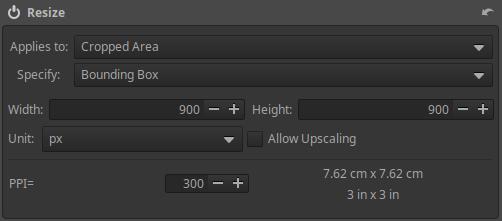
Let’s create a sub-profile that includes scaling. To do this, open a raw file for editing. Go to the Transform group, activate and open the Resize tool. Apply a 900x900 pixel Bounding box, leaving the PPI value at 300. A 900x900 pixel Bounding box means that the longer side of the image will be 900 pixels long.
Then, in the Processing Profiles section, hold down the Ctrl key and click the floppy button, enter a name for the profile, and click Save. I named it 900x900.arp.
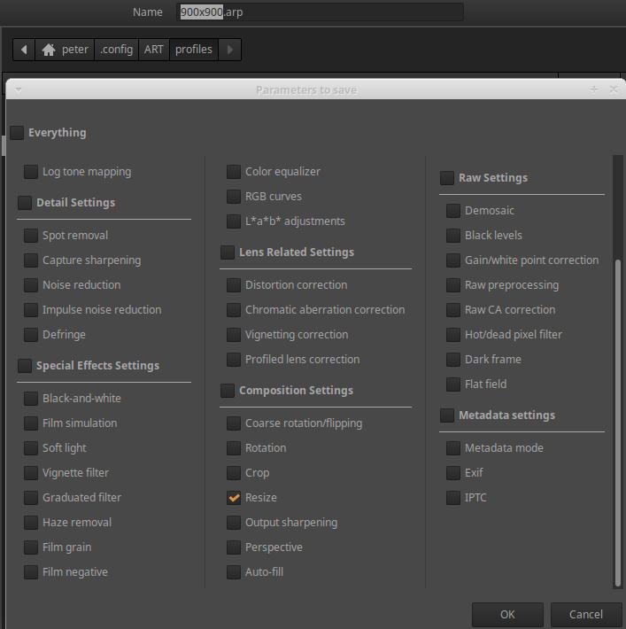
In the window that appears, select Resize and click OK.
To test the sub-profile, let’s place an image in the Queue.
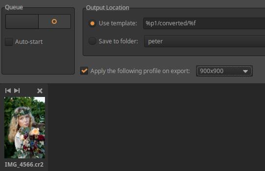
Check the Apply the following profile on export option. Select the partial profile you just saved from the drop-down list next to it. Start the processing and then view the result.
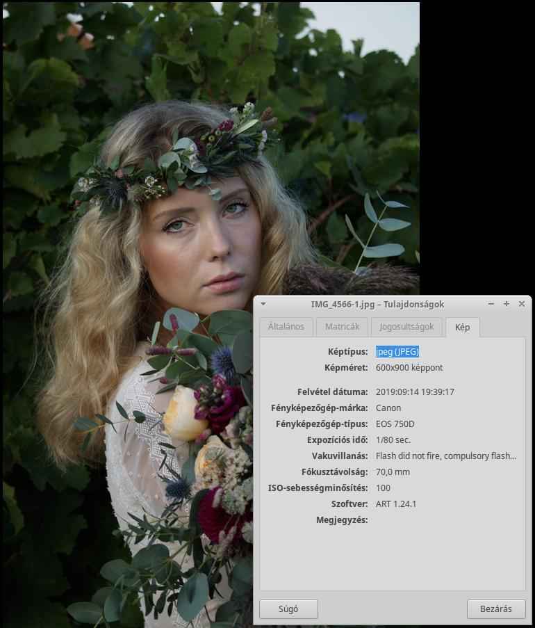
The resulting image has a height of 900 pixels and a width of 600 pixels.
The profile data applied in the Queue is not stored in the sidecar file. It is advisable to apply a profile here for which we do not want its data to be stored in the sidecar file.
The same option is available when Save current image in the editor view (the floppy button on the left under the preview). If you have set the profile to be applied in one place, ART will remember the need to apply the profile and will apply the profile the next time you Save current image or in the Queue view. Pay attention to this, and if you do not need to apply the profile, uncheck the Apply the following profile on export option.
Similarly to the above, using arbitrary tools and settings, we can create profiles from our frequently used settings that we can apply to any image. To do this, let’s also take into account what was described about profiles in the previous sections. We mostly create partial profiles this way.
3.13.3 Apply processing profile saved with image file
We will discuss how to apply the settings of the processing profile (sidecar file) saved with the resulting image file to the image.
With ART, we can create multiple versions of an image. If enabled, ART will not only save the sidecar file alongside the source file, but also save it alongside the resulting image file in the converted folder for each version. How can we apply this sidecar file to the raw file so that we can continue editing from this version? I will briefly discuss this here.
It might seem obvious that we would navigate to the converted folder in File browser, right-click on the resulting image, use the context menu to copy the processing profile to the clipboard, and then paste it into the raw file. However, this method does not work, nothing is copied.
Only loading from file, directly selecting the sidecar file, and applying it works. Open the raw file for editing, then in the Processing Profiles module, click the Load a profile from file (Folder) button. In the window that appears, navigate to the converted folder, select it, and apply the desired sidecar file.
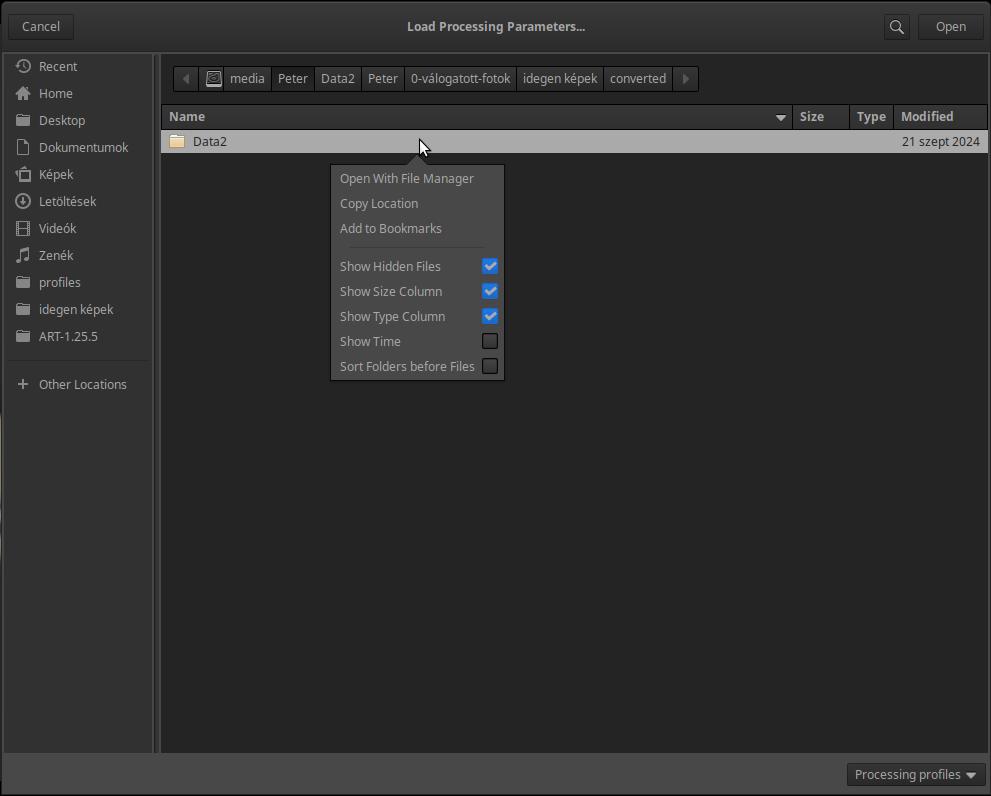
It’s good to know that if you right-click on any line, a context menu will appear. By enabling Show Hidden Files, you can also navigate between hidden folders and hidden files.
3.14 Sliders, curve editors
Every editing tool has controls that you can use to adjust the parameters of the tool. The most common are sliders and curve editors. Let’s take a look at these.
3.14.1 Sliders
Sliders are used to adjust the value of a parameter. Changing the value of a parameter changes some property of the image. For example, if you adjust the exposure compensation slider, the brightness of the image changes.
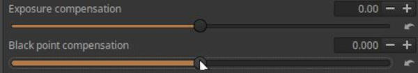
Sliders, top in normal mode, bottom in fine-tuning mode
To set the slider value:
- By scrolling: Move the mouse pointer over the slider, press the Shift key, and scroll the mouse. (If you scroll without pressing Shift, you scroll the entire right panel, not the slider.)
- With the slider button: You can also adjust the slider value by moving the button on the slider with the mouse.
- By clicking: If we click on the slider, we set the slider to the click location.
- Specified with a numerical value: The currently set value of the slider can be seen in a line to the right of the slider name. The value can be overwritten by clicking on it, and after entering the numerical value, press Enter.
- With +/- buttons: You can also adjust the value by clicking on the +/- buttons next to the numerical value (or by holding down the mouse button on them).
Fine Tuning Mode: In the above figure, we can see two sliders, the upper one is in normal setting mode, the lower one is in fine tuning mode. Fine tuning mode is indicated by the slider line in front of the button becoming wider.
We can enter fine tuning mode by:
-
press the slider button, hold it down for one second without moving it, then, while still holding the mouse button down, move the slider to the desired extent by moving the mouse.
-
if you hold down the Shift key and click on the slider button, you will immediately enter fine-tuning mode, and by holding down both keys (Shift+left mouse button), you can fine-tune the slider value.
Each slider has three values:
- Current value: which was generated by moving the slider button to a position (using one of the methods mentioned).
- Default value: which is in most cases (but not always) zero. This can be achieved by clicking the reset button, which is located directly at the end of the slider.
- Initial Value: the value that the processing profile used when the image was loaded into the editor. The slider is set to this value when you hold down the Ctrl key and click the reset button.
3.14.2 Curve editors
ART uses three general types of curves: tone curve, flat curve, and threshold curve.
These curves are used to create a relationship between input values on the horizontal (also known as x) axis and output values on the vertical (also known as y) axis using the line of the curve. The input and output properties are often (but not always) the same.
How the curve works: The curve receives an input image. For each pixel of the input image, it looks at the value of the property represented on the horizontal axis of the curve (e.g., brightness) of the given pixel, determines what output (y) value corresponds to this input (x) value according to the curve, and sets this for the given pixel, taking into account also which property of the pixel (e.g., saturation) should be modified with the output value. So, in the case of a brightness-saturation curve, the curve determines the new saturation value of that pixel according to the brightness value (x) of a pixel of the input image, and changes the saturation value of the given pixel. This operation is performed for each pixel of the input image.
3.14.2.1 Tone curve editor
Let’s look at how ART’s curves work using the example of a tone curve (Exposure > Tone Curves tool).
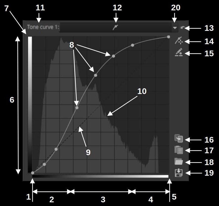
ART tone curve elements
- Black
- Shadows
- Midtones
- Highlights
- White
- Tones, same as in the picture below
- Tone scale
- Control points
- Linear straight line
- Histogram
- Name of curve
- Type of curve
- Reset
- Add adjustment point
- Edit control point input/output values
- Copy current curve to clipboard
- Paste curve from clipboard
- Load a curve from file
- Save current curve
- Curve type selector
Since this is a tone curve, both the input and output values are tones. On the left and below you can see a scale of tones. The two scales are identical. At the bottom I have marked the darkest black, the lightest white, the shadows, the midtones, and the highlights. These are also located similarly on the vertical axis.
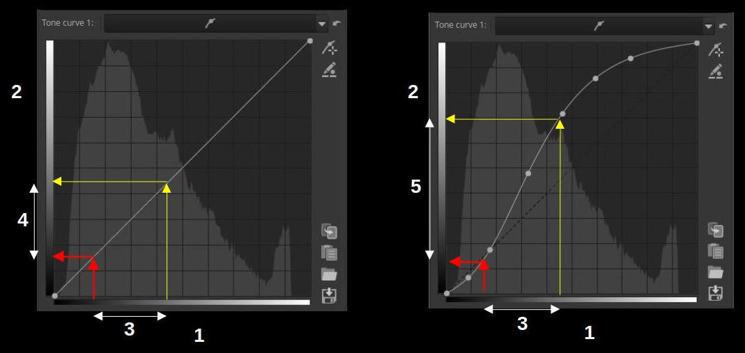
Left linear, right custom tone curve
- Input values (x axis)
- Output values (y axis)
- Identical input tone ranges
- Due to the linear curve, the output tonal range is the same as the input tonal range (the curve has no effect on the image)
- Due to the steeper curve than the linear curve, the output gradation range is larger than the input, resulting in a higher contrast image
In the figure above, let’s look at how the curve creates a connection between the input and output data. On the left, you can see a linear curve, which is a diagonal line. It actually implements the y=x function known from mathematics, where the output (y) value is the same as the input (x). If we are curious about what output value (tone) we get as a result of the curve for a given input value (tone), then at that input tone value, a perpendicular must be set to the horizontal (x) axis, and where this line intersects the curve, a perpendicular must be drawn from that point to the vertical (y) axis, and the tone corresponding to the intersection of the perpendicular line and the vertical axis will be the output tone. This sounds complicated, but it’s simple. I drew a yellow perpendicular arrow to the curve line at the point where a certain tone corresponds to the horizontal axis (input tone). Where this arrow meets the curve, from that point I drew a yellow arrow perpendicular to the vertical axis to the vertical axis. Where the tip of the arrow meets the vertical axis, the shade you see there will be the output tone. In the case of a linear curve, obviously the input tone is the same as the output tone, so the curve will have no effect on the image, since the tone value of all pixels in the image will be the same after the curve is applied as it was before.
On the right side of the figure, you can see a custom curve. The linear curve (straight line) is also indicated with a faint dashed line. I have marked the same input tone value that you can see in the figure on the left with a yellow arrow. The unique curve is above the linear curve at this tone value, so the output tone will be lighter than the input tone by the amount by which the curve is above the linear curve at this point. So the tones where the curve is above the linear line will become lighter, and those where the curve is below the linear line will become darker.
Let’s also look at the contrast. In both figures, I have marked the same darker shade with a red arrow. In both figures, I have marked the difference between the two tones with a white arrow on the horizontal axis (input) (3) and on the vertical axis (output) (4 and 5). In the linear curve, it is obvious that the white arrow at the output is in principle the same length as the one at the input. In the custom curve, however, this tone range has increased at the output, the white arrow has become longer along the vertical axis. This shows that in this input tone range (between the red and yellow arrows on the x-axis), the contrast has increased at the output. It has increased because in this range the curve is steeper than the linear straight line.
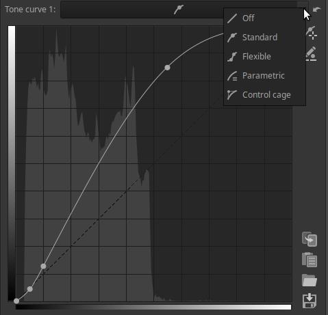
The Curve Type Selector (20) offers five options: Off, Standard, Flexible, Parametric, Control cage.
By clicking around the Curve Type (12) icon, you can hide/show the curve editor. This does not affect the curve’s functionality, but it does take up less space on the screen. If a curve is not disabled and the editing tool that contains the curve is enabled, that curve will affect the image regardless of whether the curve editor is visible.
While using the curve editor, pressing Ctrl+Z goes back one level in the History, not undoing the action performed during curve editing.
The Reset button can be used to reset the curve to the default value.
In the background of the curve, a luminance histogram (10) reflecting the state before editing the curve (the input image of the curve editor) is visible. The changes that occur during editing of the curve and its shape cannot be tracked on this histogram.
For certain types of curves, ART places control points at the two endpoints of the curve. In such cases, we can also place control points ourselves by clicking on a point on the curve, which we can move with the mouse along the curve line and move up/down to shape the curve. The control points only help to shape the curve, only the shape of the curve matters for the effect of the curve. To remove a control point we have created ourselves, drag it out of the editing area with the mouse and release it there.
If you hold down the Ctrl key while moving a control point, the movement will slow down considerably and allow for finer adjustment. If you hold down the Shift key while moving a control point, the control point will take on the value of a key element. Such key elements can be, for example, the maximum or minimum value of the curve, the point of the 45-degree diagonal line, the same value as the previous or next control point, or the point of the line connecting the previous and next control points. The element to which the snapping has been made will turn red.
Most often, the Add adjustment point appears next to the curve. The Add adjustment point allows you to place a control point on a curve exactly where the mouse pointer is pointing in the preview. This feature is useful, for example, when intervening in the colors of an image, but it can also be useful in other cases. Click the button to turn on the Add adjustment point. If you now move the mouse pointer over the preview, a horizontal or vertical line will appear on the curve, depending on the type of curve. This line indicates the value of the pixel over which the mouse pointer is. If you want to place a control point on the curve at the value over which the mouse pointer is, press and hold the Ctrl key, then press and hold the mouse button, and a control point will appear on the curve. You can then release the Ctrl key. If you continue to hold down the mouse button, you can adjust the control point without leaving the preview by moving the mouse up and down. If you also hold down the Ctrl key, you can adjust the control point very finely. To turn off the Add adjustment point, click the button again or right-click in the preview.
Each curve has a button that allows you to Edit control point input/output values. This can be used, for example, to align the output value of a control point to a reference value.
To use it, you need to create control points. This is easiest done with the Add adjustment point. Activate the Edit control point input/output values and the Add adjustment point by clicking on the buttons. A fields containing the “In” and “Out” value will appear below the curve. The values of the fields correspond to the point under the mouse pointer when you move the mouse pointer over the curve or the preview. If you move the mouse pointer over the preview, you can place a control point on the curve by Ctrl+clicking as described above. To edit the input/output values of the control point, right-click on the control point. The control point will then turn red and have a red ring around it.
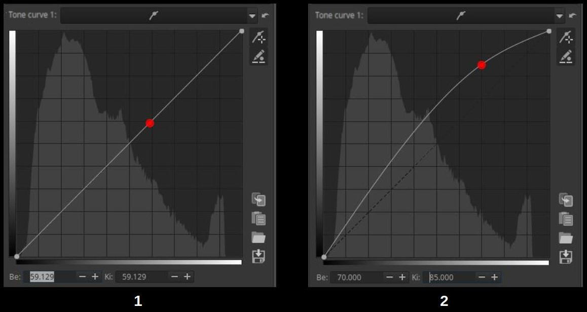
- Create a control point, activate edit mode
- Changing values
In the figure on the left, we can see that we have created the control point and by right-clicking on it we have entered the editing mode. Due to the linear curve, the input and output values in the figure are the same. Now you can edit the input and output values by entering the numerical values in the fields below or by clicking the +/- buttons next to the field, and the control point will move according to the entered values. The result of the editing can be seen in the figure on the right. You can exit the editing of the values by clicking the on/off button or by right-clicking on the area outside the control points on the curve.
There are several types of curves available, let’s take a look at them.
- Off (switched off)
- Standard
- Flexible
- Parametric
- Control cage
Off: the curve is turned off and has no effect on the image.
Standard: This is what we covered above. We can adjust the shape of the curve using control points.
Flexible: Changing a control point on a flexible curve will have less effect on the far side of the curve than with a standard curve.
Parametric:
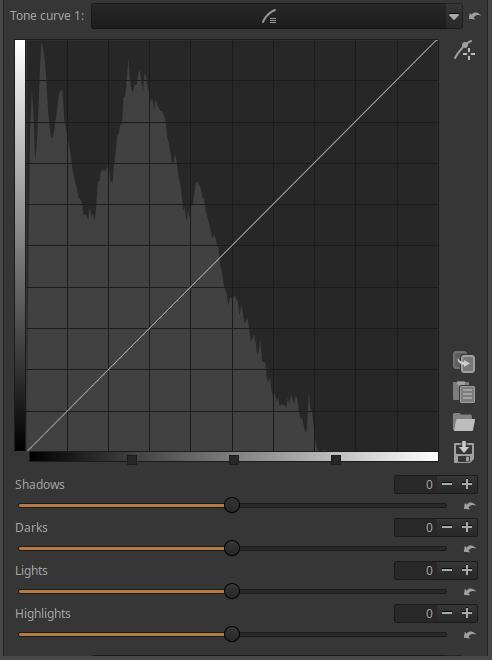
It allows you to use sliders instead of directly shaping the curve. The input brightness values are divided into four ranges, namely Shadows, Darks, Highlights, and Highlights. Within these ranges, the curve can be adjusted using the four sliders below the curve. If you move the mouse pointer over one of the sliders, the lighter area next to the curve line, as shown in the figure above, indicates the range within which the curve can be changed with that slider. On the tone scale below the curve, you can see the Zone Selector, which is divided into four parts by three control points. These can be moved left and right with the mouse. The position of these control points determines which tones will be affected by the effect of each slider. Moving them changes the brightness of certain parts of the image, the area within which the slider can be shaped with the slider, and the shape of the curve itself. Moving the left control point to the left lightens the dark tones, moving it to the right darkens them. Moving the middle control point to the left lightens the midtones, moving it to the right darkens them. Moving the right control point to the left darkens the highlights, moving it to the right brightens them. The control points can be used to adjust the operation of the curve editor to the nature and brightness values of the image.
The reset button next to the sliders can be used to reset individual sliders. The reset button in the upper right corner above the curve can be used to reset all four sliders and all three control points. If you right-click on the zone selector, the control points are reset, but the slider values do not change.
Control cage:
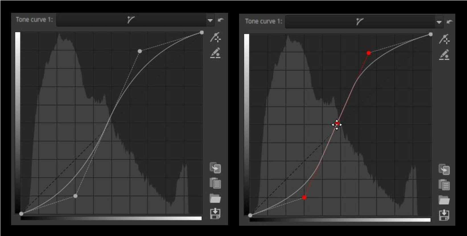
At first glance, this type of curve looks very similar to a standard curve, but there are some differences. A standard curve touches all control points, while a control cage has control points outside the curve and pulls the curve towards itself (left figure). Control cage allows you to create a straight section on the curve, while a standard curve cannot. With a control cage, you need to create at least three control points (so there will be at least five in total). If you hold down the Shift key while dragging a control point, you can more easily create a straight section by snapping the middle control point to the line connecting the previous and next control points (the three control points will turn red) (right figure). Many users prefer control cage curves over the available alternatives.
3.14.2.2 S-curve
Now that we know the tone curve, let’s talk about its special case, the S-curve. It gets its name from its shape, which resembles an elongated “S”.
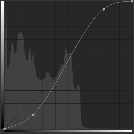
The S curve is often used to adjust the tones of an image. The middle section of the curve (midtones) increases the contrast of the image, while shadows and highlights are compressed, resulting in a loss of contrast.
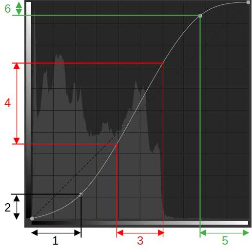
- Dark tones input range
- Output range corresponding to the input range of dark tones
- Selected input range of midtones
- Output range corresponding to the input range of midtones
- Light tone input range
- Output range for input range of light tones
On the horizontal axis below, I have marked three tonal ranges for the input tones, one for the shadows (1), one for the midtones (3), and one for the highlights (5). On the vertical axis, I have marked the output tonal ranges that correspond to each input tonal range (2, 4, 6).
Where the output tonal range is smaller than the corresponding input tonal range, compression occurs; where it is larger, stretching occurs. Stretching is the opposite of compression. Stretching increases contrast, compression decreases it.
In the case of an S-curve, the output tonal range is smaller in the shadows and highlights, so compression occurs, which results in a loss of contrast because the difference in brightness between tones decreases. The output tonal range is larger in the midtones, so stretching occurs, which results in an increase in contrast because the difference in brightness between tones increases.
3.14.2.3 Flat curve editor
This curve is used by several tools in ART. Let’s get acquainted with it through the Color group > Color Equalizer tool.
- Input values (color scale)
- Output values (H, S, or L)
- Curve name
- Curve type icon
- Curve type selector (Off/Equalizer)
- Reset
- Add adjustment point
- Control point input/output value editor
- Copy current curve to clipboard
- Paste a curve from the clipboard
- Load curve
- Save current curve
- Control points
- Linear straight line
The user interface for the Color Equalizer tool is shown in the figure above. This tool contains three flat curve editors, correspondingly, at the top, next to the Channel label, are the H, S, and L curve editor headers. The headers contain three elements:
- The curve name, which in this editing tool corresponds to the name of the output property that can be changed using the curve. In this case, we can see the H (Hue), S (Saturation), and L (Lightness) curves according to the channels of the HSL color system, with which we can change the hue, saturation, and lightness of the image.
- The curve type icon, which indicates the selected curve type. The icon will be a wavy line if Equalizer is selected, and a horizontal line if Off is selected. In the figure above, the S and L curves are turned off.
- In the drop-down list, you can select curve type. If you select Off, the curve is disabled and cannot be edited, while if you select Equalizer, the curve can be edited. A disabled curve has no effect on the image.
By clicking on its header, we can make the curve current. We always see the editor of the current curve (if the curve is not turned off). The header of the current curve is darker. In the figure above, curve H is the current one, and we see its editor. If we click on the header of the already current curve, we can hide the curve editor, it will not be visible, and it will be visible again by clicking again. The only role of this is that when we are not editing the curve, it does not take up space on the screen. The effect of the curve is not affected by whether the curve editor is visible or not. Only the shape of the curve matters.
Below, on the x-axis, we can see the input property, depending on the value of which the output property of the curve in the image changes. Below, we can see that the input property is currently the hue, and we can also see the color scale. On the left, on the y-axis, we can see the output property, which can vary depending on the value of the input property, which is hue for the H curve, saturation for the S curve, and lightness for the L curve. The output property and its values are usually not indicated in the flat curve editors.
If the input property is hue, then the hue of the color wheel are displayed on the color scale below the curve. The hues on the color wheel are enclosed, which means that after the end of the color scale, the hues of the color wheel continue at the beginning.
The linear state, when the curve has no effect, is also shown in the figure, as the horizontal line in the middle. The linear, horizontal line is always faintly visible in the curve editor. Where the curve line passes above the linear line, the value of the output property increases, the higher the curve runs. Where the curve line passes below the linear line, the value of the output property decreases, the lower the curve runs.
You can see six vertical lines of different colors. The color of the line corresponds to the input hue (the color shown on the x-axis below). That is, the vertical lines represent certain colors of the input hue range.
At the intersection of the linear horizontal line and the colored vertical lines are control points, with their help we can shape the curve.
The reset button resets the current curve to linear.
By clicking the Add adjustment point button, you can select a point from the preview to which you can adjust the curve. It works similarly to the tone curves.
By clicking the Control point input/output value editor button, we can enter values using numeric values. We will discuss this in detail below.
Clicking the Copy current curve to clipboard button copies the current curve to the clipboard.
Clicking the Paste curve from clipboard button will paste the curve previously copied to the clipboard.
By clicking the Save current curve button, you can save the current curve to a file.
By clicking the Load curve button, you can load the curve previously saved to a file.
The effect of the curve is perhaps easiest to understand with the L curve. In the figure above, we see an L (lightness) curve. This curve controls how the lightness of each pixel changes depending on the color of the given pixel. The linear “curve” is the horizontal line running through the middle. Looking at the curve from left to right, we can see that the lightnesss values do not change until the yellow color, then the lightness of the yellowish-green areas (pixels) in the image begins to increase, the lightness of the green areas increases the most, and then the lightness gradually returns to the original value for the blue-green color. The lightness of the blue-green areas does not change, then moving towards the blue color, the lightness of the given color areas decreases more and more, the lightness of the blue areas decreases the most. Moving from blue to purple, the lightness increases back to the original value, the lightness of the purple color and the colors to the right of it do not change. The curve changes the lightness of the pixels compared to their original lightness.
If we move the mouse pointer to one of the control points at the intersection and hold down the button, the vertical line will thicken, and then when we start moving the mouse, the thick horizontal line will also appear. We can always move the thick line, in this case both. The color of the lines changes during movement, in principle we can see the output color. Below the vertical line we can see the input hue on the color scale, which will change to the color of the thick line(s) in the image. The transition is determined by the shape of the curve.
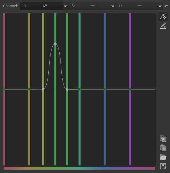
We can create control points ourselves by clicking on any point in the area of the diagram between two vertical lines. These behave in the same way as the ones that already exist. We can remove the control point we have created by dragging it out of the editing area with the mouse and releasing it there. We have inserted two new control points in the diagram because this way we can create a more abrupt (steeper) transition. We will see in a moment that we can influence the transition in other ways.
If you hold down the Ctrl key and move the mouse, the control point will move slowly, allowing for very fine adjustments.
If you hold down the Shift key while moving the control point, you can snap the control point to a key point. Key points are: the point of the linear curve, the maximum value, or the minimum value.
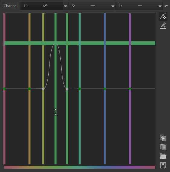
If we place the mouse pointer on the vertical line, but not on the control point, and hold down the mouse button, we can move the control point on that line horizontally or vertically, depending on the direction in which we make the first movement with the mouse. If we move the mouse vertically, we can only move the control point vertically, i.e. the horizontal line will be thick, moving together with the control point, as shown in the figure. If we move the mouse horizontally, we can only move it horizontally, in which case the vertical line will be thick. The movable line will always be thick. The mouse pointer shows the direction of movement. This method ensures that the control point only moves in the direction we want it to, and we cannot move it in the other direction. If we grab the control point itself with the mouse, the control point can be moved in all four directions.
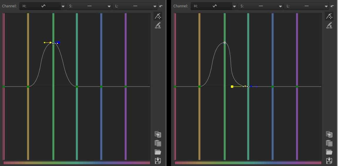
If you place the mouse pointer over the control point, a yellow and blue indicator point will appear to the left and right of it. If you hover over one of these with the mouse pointer, the mouse pointer will change to a left-right arrow, and by pressing the button, you can change the slope of the curve (in this case, the gradualness of the hue change transition). By setting the curve to steep, you can ensure that the hue change only affects a small range of the input hue.
By creating control points and adjusting the slope of the curve, you can create a curve of any shape.
This curve type also has the option to Control point input/output value editor. To do this, click the Edit control point input/output values button to the right of the curve. Then, right-click on the control point whose values you want to edit, which will turn the control point red.
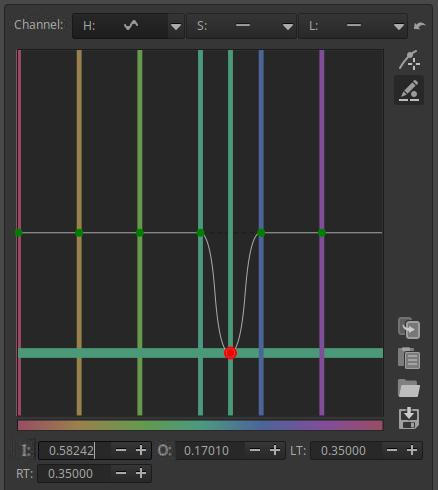
The I (In) and O (Out) fields are used to specify the input and output values for the control point, with LT controlling the slope of the curve on the left side of the control point, and RT controlling the slope on the right side.
Let’s look at a simple example of using the flat curve.
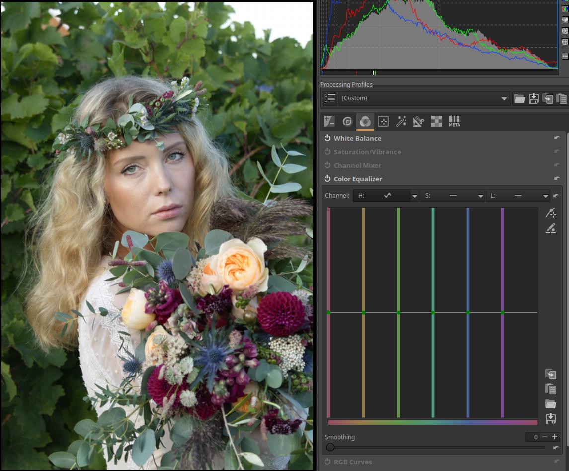
Let’s change the color of the leaves behind the girl. It would be good if there was nothing else in the image that was the same color as the leaves, because if there were other elements of the image with a similar color, then their color would change too. This is not completely true, because some of the green on the bouquet of flowers also changes. Go to the Colors group, activate it, and open the Color Equalizer tool. Open it to the right of the “H” curve header and select the Equalizer option.
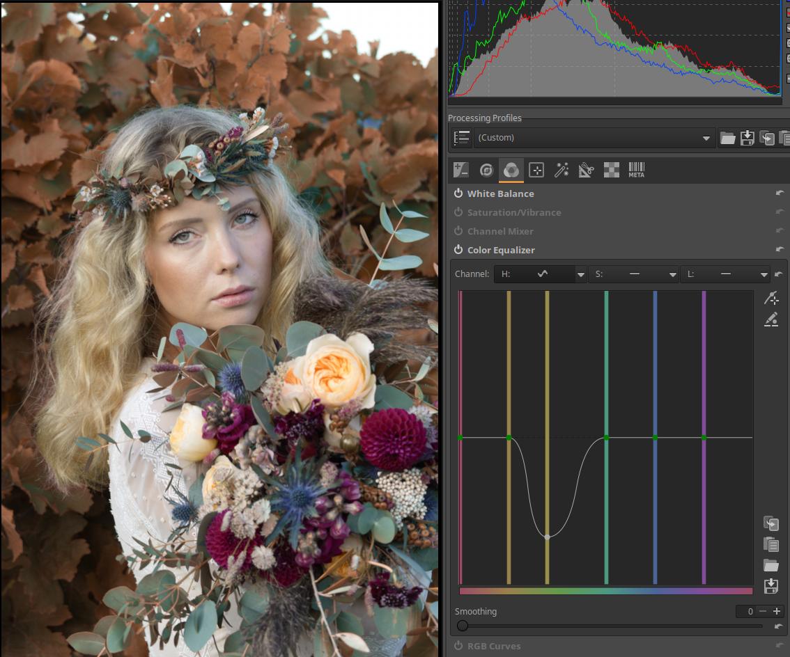
Grab the control point in the middle of the green vertical line with your mouse and move it down and sideways until you reach the desired color. When you are satisfied with the color of the leaves, release the mouse button.
3.14.2.4 Threshold curve editor
The threshold curve determines how we want to process the image with the given tool depending on the tones or other properties of the image.
Let’s look at the use of the threshold curve through the example of the Capture Sharpening tool in the Details group. Within Capture Sharpening, we need to select the Unsharp Mask method to display the threshold curve.
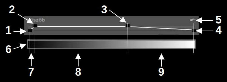
- Bottom left control point, value 20
- Top left control point, value 80
- Top right control point, value 1200
- Bottom right control point, value 2000
- Reset
- No sharpening
- Gradually increasing sharpening
- Maximum sharpening
- Gradually decreasing sharpening
Below the threshold curve we need to imagine the tone scale, with the darkest on the left and the lightest on the right. I have put it there in the figure above. On the threshold curve we can see four control points, two at the bottom, two at the top, and between them the “curve” is drawn, which always consists of straight lines. You cannot create new control points, only these four can be adjusted. In the figure I have colored the four control points black so that they can be seen better.
In the Capture Sharpening tool, the threshold curve controls how much sharpening is applied to a given area of the image based on the tone. Noise appears first in the darkest parts of the image, because that’s where the least amount of light hits the image sensor. We don’t want to sharpen noise, because that would make it even more visible in the image.
The four control points allow for up to five ranges, one before the bottom left, three between the four control points, and one after the bottom right. In the example shown, only four ranges are visible; the fifth would be created after the bottom right control point if it were dragged from the far right position to the left.
If you move the mouse over the curve, it will show the current values.
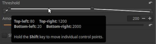
In the figure, we can see that the lower left control point has a value of 20, the upper left control point has a value of 80, the upper right control point has a value of 1200, and the lower right control point has a maximum value of 2000. These values indicate the brightness values to which the control points are set. The extreme left position has a value of 0, and the extreme right position has a value of 2000. Where the curve runs at the bottom, the tool has no effect at all on those tones, where it runs at the top, the tool has maximum effect, where it is slanted, the degree of sharpening gradually increases and decreases in the given tone range. If we look specifically at the curve in the figure above, we can see that there is no sharpening in the darkest areas, because the lower left control point is set to 20, and the curve runs at the bottom below 20. For tones between the lower left and upper left control points, the curve runs at an upward slant, and the degree of sharpening gradually increases. These are still quite dark areas of the image. The sharpening reaches its maximum effect at the top left control point, and from there it remains at its maximum until the areas of light corresponding to the top right control point. Then the amount of sharpening gradually decreases until the bottom right control point, in this case the lightest tones.
The reset button restores the default values. Ctrl-z goes back one step in the History, not in the curve editing steps.
To move each control point individually, hold down the Shift key before clicking a control point with the mouse. You can move pairs of control points together, such as the bottom left and top left, or the top right and bottom right, without holding down the Shift key. If you hold down the Ctrl key while moving a control point, you can move it very finely.
With the Capture Sharpening tool, the threshold curve actually controls the opacity of the sharpened (modified) image depending on the brightness of the pixels.
3.15 CTL scripts in ART
Starting with ART version 1.21, a great feature is the use of CTL scripts. CTL (Color Transformation Language) is a scripting language designed to create pixel-level image transformation operations. CTL scripts allow you to create tools for complex image manipulation operations in a relatively simple scripting language similar to C or C++.
The creator of ART, Alberto Griggio, has also created a very useful CTL script collection, the latest version of which can be downloaded from this page as a compressed (.zip) file:
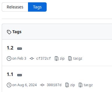
To download, click on “zip” in the row below the version number.
Unzip the downloaded file. After unzipping, you will get a directory containing the CTL scripts and a directory called languages with the translations of the scripts (language files). From this directory, you will need to copy all the files with the .ctl extension and the languages directory containing the translations to the appropriate location (you do not need to copy the README.md file).
The file name of the language files is the name of the given language (e.g. Hungarian), which should not be changed, because then ART will not find it. The language files contain translations of the user interface of the scripts. Currently, Catala, default (English), Deutsch, Espanol, Francais, Italiano, Japanese, Corean, Hungarian, Nederlands, and Potugues (Brasil) are available. If a CTL script language file is not available for the language selected for the program user interface, the user interface of the scripts will be in English.
Scripts can be installed in two ways, depending on our goals:
One option is to copy all files with the .ctl extension and the languages directory and its contents to an empty ctlscripts directory in the ART installation directory. This solution will make the CTL scripts available to all users. The disadvantage of this method is that when a new version of ART is installed, the copying process will have to be done again.
If we change the language in the ART settings, the CTL scripts will also be displayed in the same language (if a translation for that language exists).
Alternatively, you can copy the CTL scripts to the ART configuration directory along with the languages directory. Each user has a separate configuration directory within their own Home directory, so if multiple users use the ART program on the computer, the copy must be made for each user. The ART configuration directory is usually the $HOME/.config/ART directory on Linux, and the %LOCALAPPDATA%\ART directory on Windows. In this directory, you need to create (if it does not already exist) a directory called ctlscripts. From the unzipped files, you need to copy all files with the .ctl extension and the languages directory.
When ART starts, it reads the CTL scripts and they become selectable under Mode in the Color/Tone Correction tool in the Local editing group. There are currently 26 CTL scripts available, but this will certainly grow.
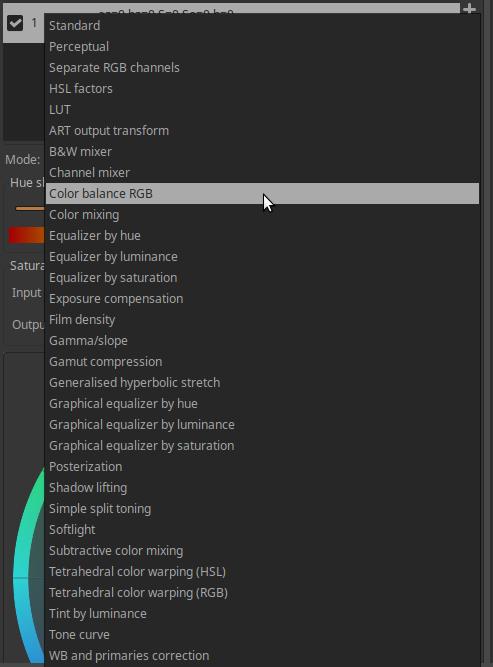
After selection, the sliders, possibly curve editors, etc. belonging to the selected tool will appear.
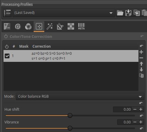
In the following, I assume that the CTL scripts are installed and available.
3.16 Basic ART workflow
This chapter is based on the “ART Quick Start” article in the ART documentation, which was contributed by Barry Thomas.
This is not a translation of the aforementioned document, but was created using it.
Source of the raw file shown here (downloadable from here): IMG_3760.CR2
The author of this image is Barry Thomas. The image is in the public domain, so you can use it to practice editing. The image shows Wollaton Hall, located in Nottinghamshire, United Kingdom. You may want to download the raw file so you can try out the editing steps.
In this section, we will process Barry Thomas’ well-exposed raw image. In doing so, we will review the most basic steps of processing, the basic workflow.
When processing any photograph, similar considerations must always be considered. Our goal is to improve and modify the image from a technical point of view, such as correcting lens aberrations, reducing image noise, etc., and to make changes that modify the aesthetic appearance of the image, such as exposure correction, modifying colors, etc.
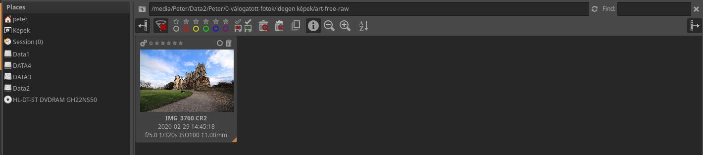
The image above shows the File Browser view. The raw file to be processed is shown as a thumbnail.
First, we can inspect the image. We can access the Inspect view by clicking on the Inspect tab in the upper right.
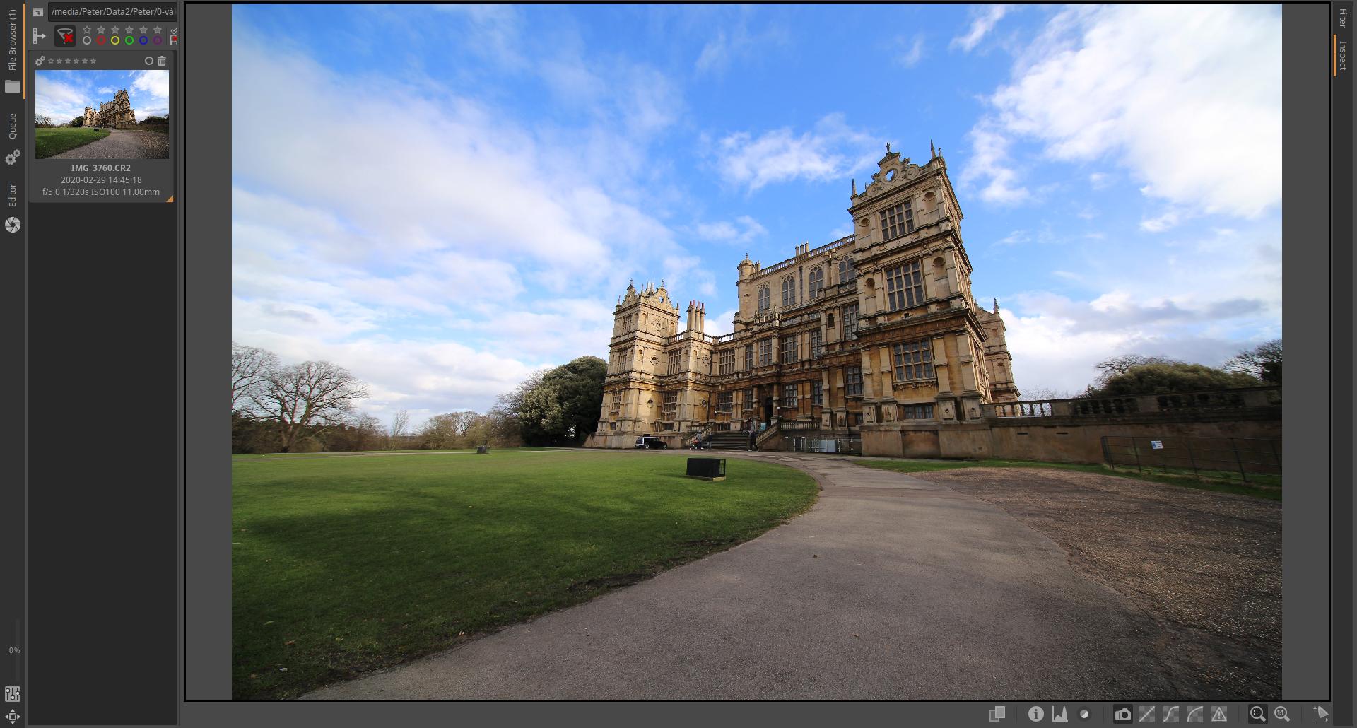
The inspect helps to assess what interventions need to be performed on the image.
Then double-click on the thumbnail of the image you want to edit, which will open in Editor.
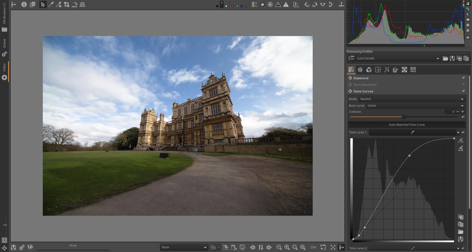
I’ve disabled the filmstrip and the left panel to give more space to the preview. Let’s set the preview background to gray.
At this stage, it is better to reduce the preview size so that it can be viewed surrounded by a gray background, as this is the best way to make basic adjustments. The perception of colors also depends on the brightness and color of the background.
From this point on, the photo thumbnail is no longer based on the embedded JPEG, but on the actual raw data. When you make changes to the image in the editor, the thumbnail updates to reflect the changes.
You may be happy with the result now, but that’s not the point, it’s about going through the basic editing steps. Our goal is not to create the best possible image.
First we need to adjust the white balance. To do this, go to the Colors group, which can be done by clicking on the third button from the left. In the image below, this button is underlined.
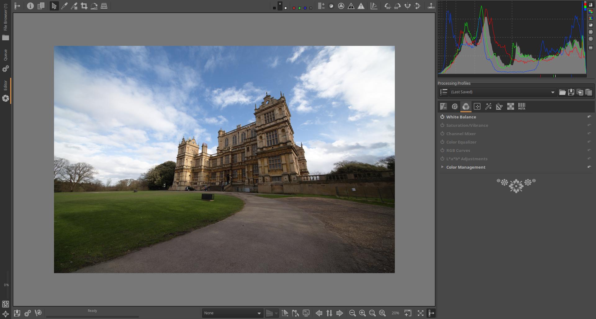
The image above shows the tools in the Colors group. The White Balance tool is on by default (if it’s not, turn it on). Click on its name to open it and show the controls.
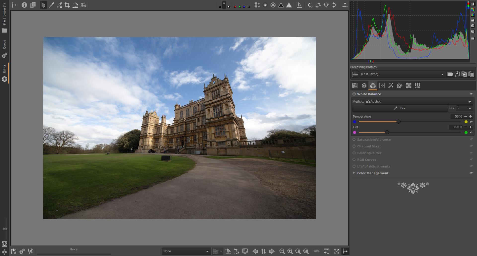
By default, it uses the camera setting (As shot). Do not change this. If you do not see all the elements as in the figure above, make the right-hand panel wider by dragging its inner edge. We mostly use the Temperature slider if we want to adjust the color temperature. Remember that in this case we are adjusting the color temperature of the light illuminating the subject, and compared to this, ART corrects as much as if we wanted to get real colors. So if we adjust it in the colder direction (towards a higher color temperature), we get warmer tones. We can also see the color temperature value to the right of the slider, in this case 5640 K. If we want warmer colors, we should adjust the slider to the right, if we want colder colors, we should adjust it to the left. If we experience color shift, we can correct it with the two sliders below it. I set the Temperature slider to 6500K.
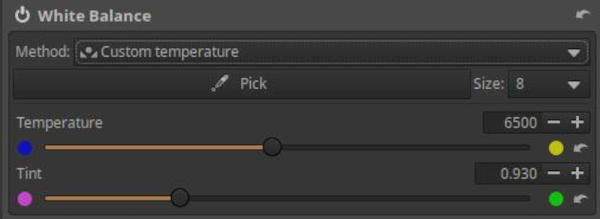
The result is shown here:

We can then go to the Exposure group and adjust the Exposure Compensation slider if necessary.
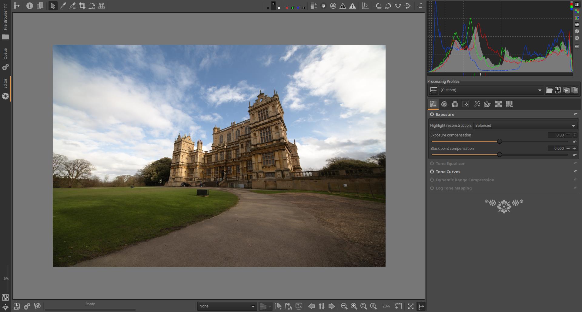
This image is well exposed, so this is not necessary. Now we can increase the size of the preview to fit the window. In the Exposure group, activate the Tone Equalizer tool and open it. There are too dark areas in the foreground of the image, let’s lighten them by setting the Shadows slider to 30.
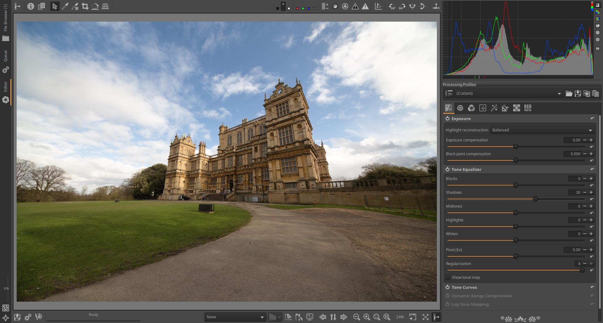
There are some white cloud patches on the right side of the image. To fix this, you need to compress the highlights. This can be achieved by moving the Highlights slider to the negative side (I set it to -50).
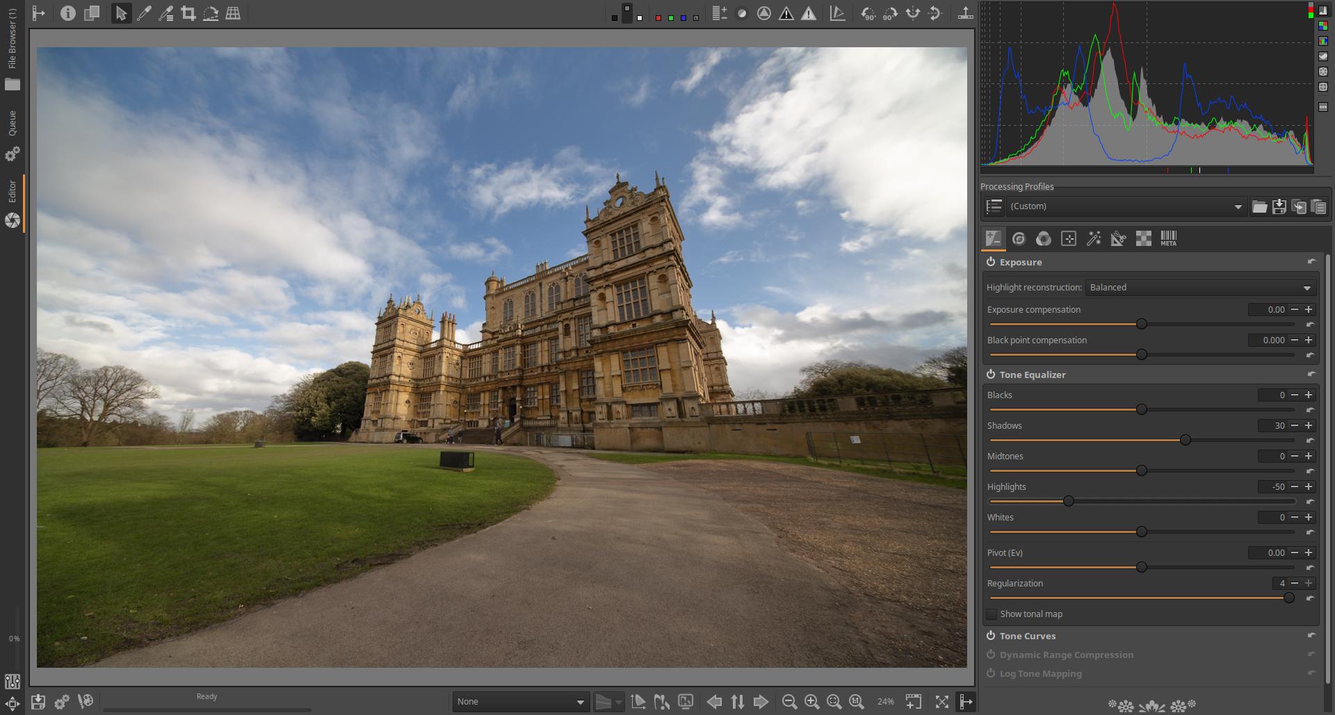
The settings are shown in the figure below.
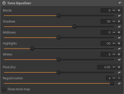
Now let’s go to the Details tab (second button from the left).
Here we find five tools: Spot Removal, Capture Sharpening, Noise Reduction, Impulse Noise Reduction, Defringe. We will need the Sharpen tool now, so turn it on if it is not there and open it. Our goal is to sharpen the building a little.
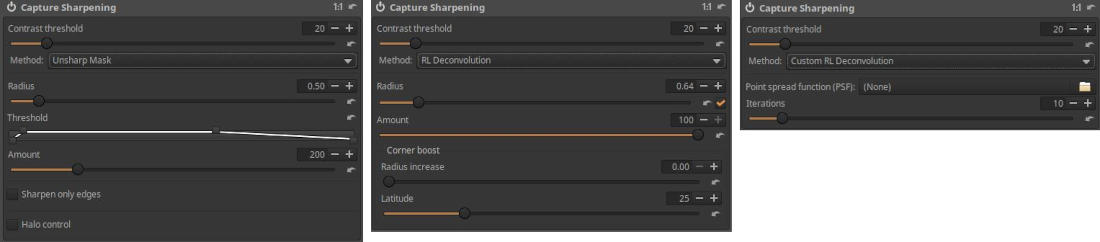
There are three sharpening methods to choose from, each with a different set of controls. In the image above, the controls for the Unsharp Mask method are on the left, the RL Deconvolution method is in the middle, and the Custom RL Deconvolution method is on the right. We want to use the Unsharp Mask method now, so let’s select it from the drop-down list. In the Capture Sharpening tool header, we can see that its effect is only visible in the preview at 100% magnification, so click the 1:1 zoom button on the toolbar below the preview. This will show the building detail at 100% magnification.
The default setting is fine in most cases, but we want to achieve a slightly stronger effect, so we’ll tweak the setting. To do this, I changed the Radius slider from 0.5 to 0.7, and set the Amount slider, which controls the amount of sharpening, to 260 instead of 200.
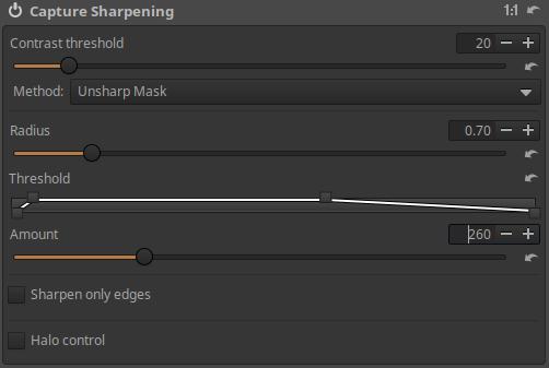
We can see the result here:
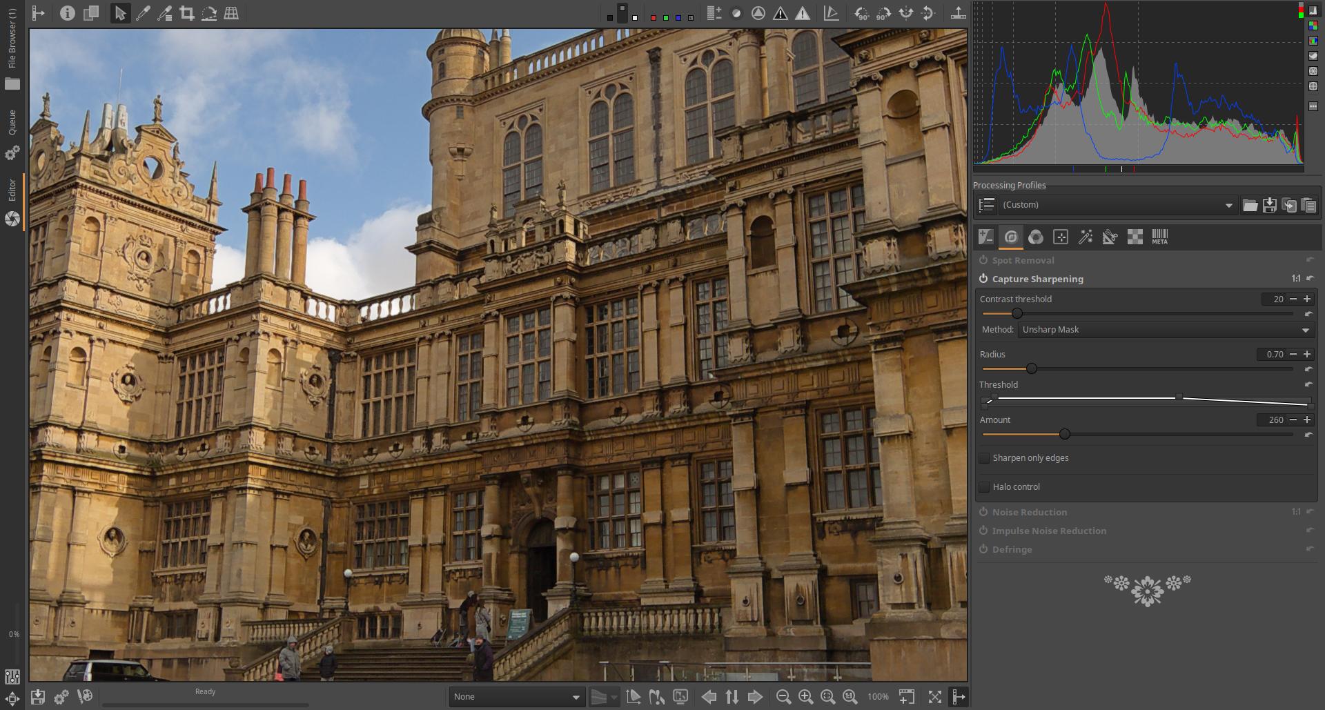
Finally, we will make changes to the geometry of the image. To do this, go to the Transform group, where you will find the following tools: Crop, Resize, Output Sharpening, Geometry, Lens. We need the Geometry subgroup, so let’s open it. There is no on/off button in its header, this tool is always active, but its default settings do not change anything in the image. Within the Geometry subgroup, we need to turn on the Perspective Correction tool, because we want to correct the building’s strongly converging edges upwards.
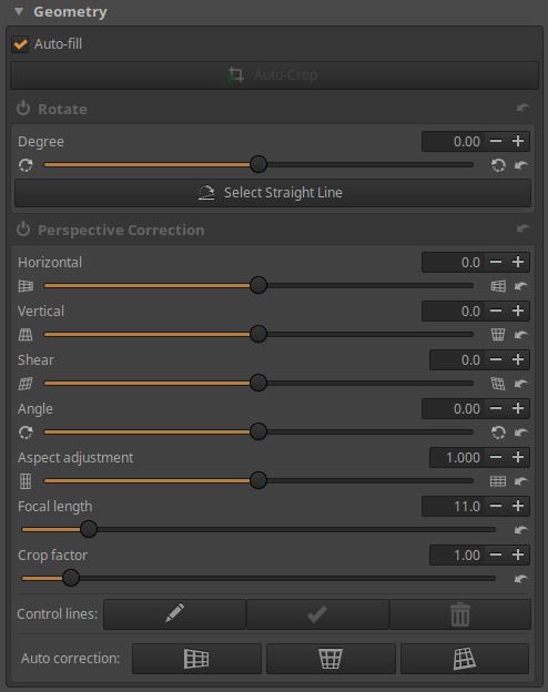
We want to make the building a little wider at the top, so we need to adjust the Vertical slider. The amount of change depends on our taste. I set the slider to 10.9. At this point, the building is quite “straightened”.
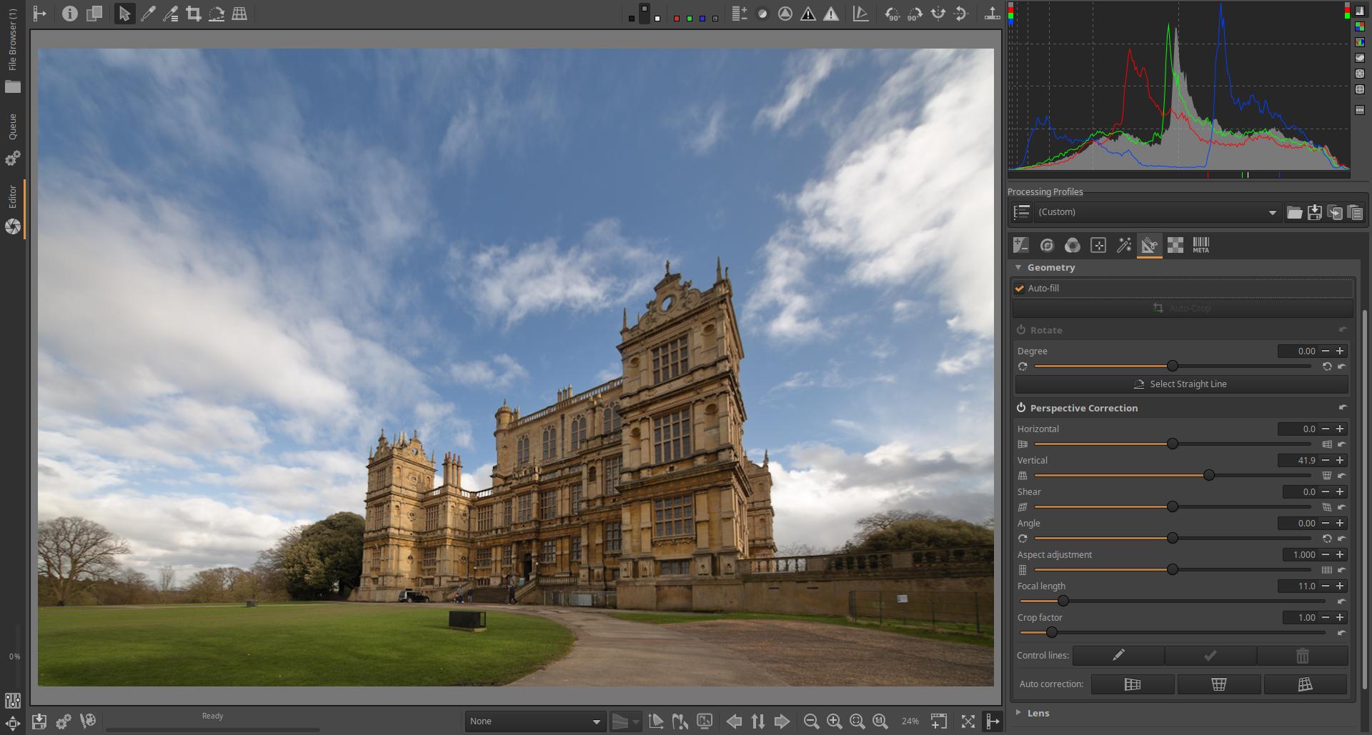
However, the more we straighten it, the less of the image fits into the crop. In the figure above, we can see that less of the foreground and the clouds fit into the image during the modification. In any case, perspective correction also changes the crop. This should be considered when taking the shot. If we uncheck Auto-fill under Geometry on the right, we can see what happened during the correction and why ART had to cut out the image.
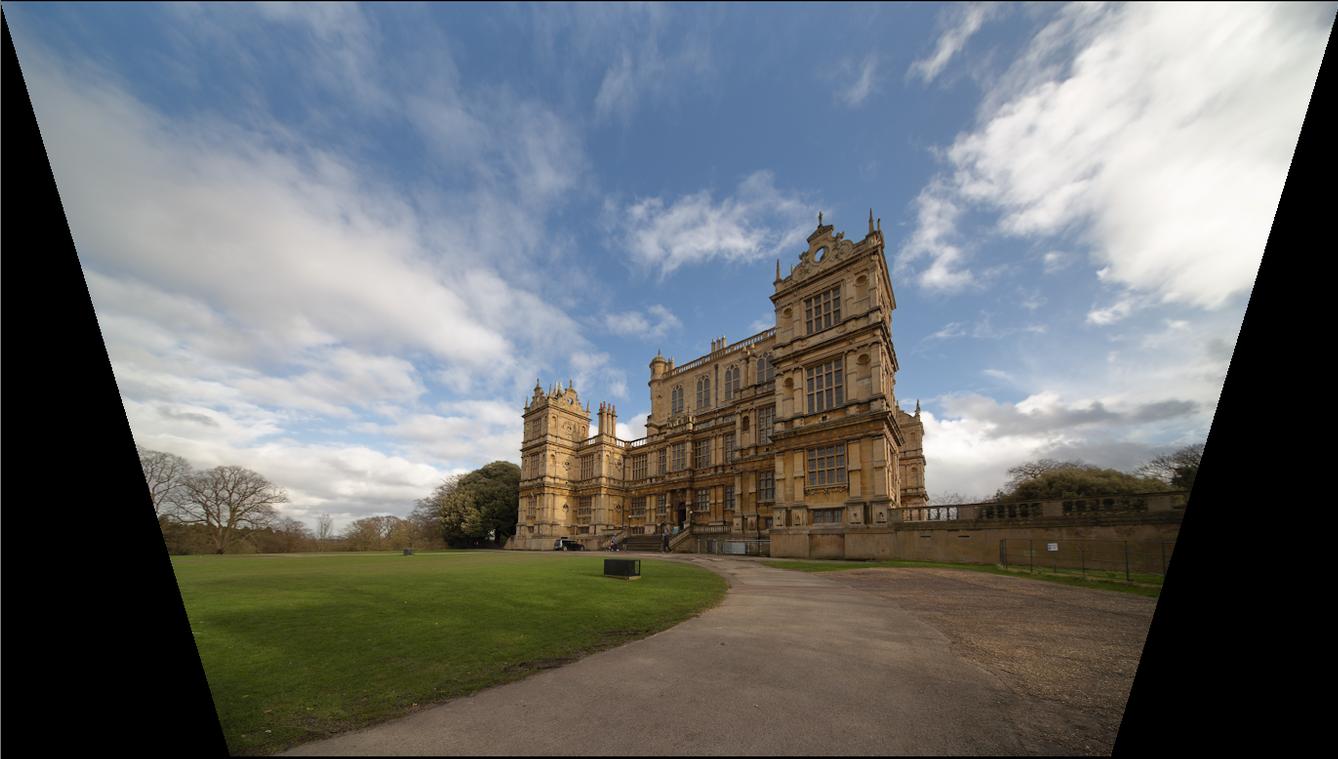
Check Auto-fill again.
As a final step, we can crop a part of the image so that the building fills the image field better. The easiest way to do this is to click the Crop Selection button next to the “eyedropper” buttons on the toolbar at the top. This will open the Crop tool in the right-hand panel.
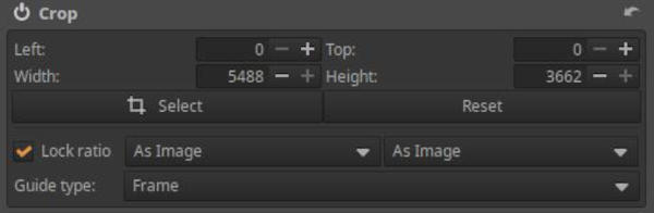
Turn it on, and if you want to crop the part with a different aspect ratio than the original, uncheck the Lock ratio box. Click the Select button, select the part to be cropped, and then click the Done button.
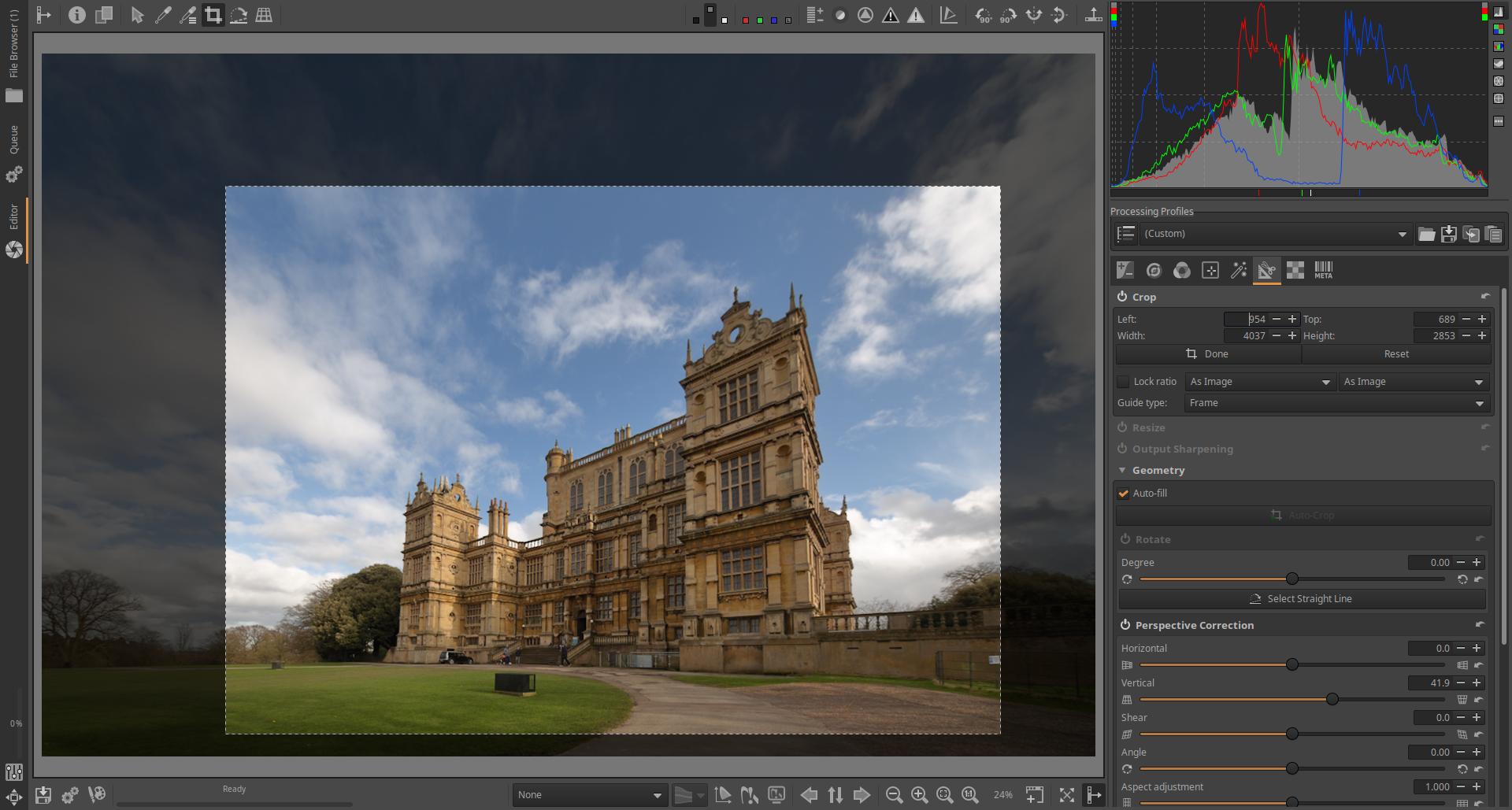
We’re done. We just need to add the edited image to the Queue.
The button for placing in the queue is on the bottom toolbar, second from the left, next to Save current image, a button with two gears. Click on the button. This will place the image in the Queue.
Now enter the Queue view by clicking on the tab on the left. Do not change the default settings.
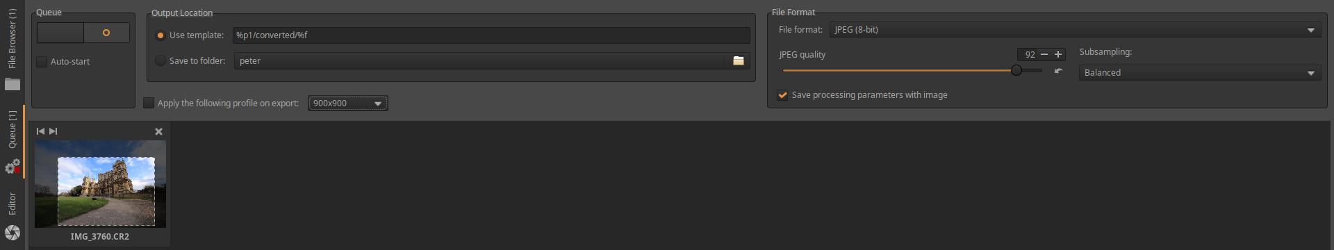
You can start processing the images in the queue by clicking on the large switch in the upper left corner. Let’s start processing.
When the processing is complete, the thumbnail image disappears. Now let’s look at the folder containing the raw file. A folder called “converted” has been created in the folder (if it didn’t exist before), and we can find our JPEG image in it. The name of the image file is the same as the name of the raw file, with the extension .jpg. Next to the raw file, we can find the sidecar file (.arp), and if Save processing parameters with image was checked next to the image in the Queue view, then next to the JPEG image as well. It is advisable to check this, because this way, the sidecar file will also be there next to each of our JPEG images. Only the latest version of the sidecar file will always be found next to the raw file.
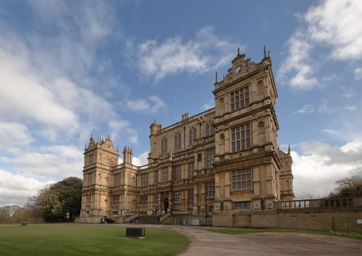
With this we have processed our first image.
3.17 Editor shortcuts
The table shown in the figure below is displayed in Editor by pressing the F1 key.
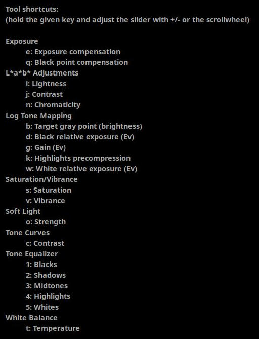
The table shows the keyboard shortcuts that can be used in the Editor. Each keyboard shortcut can be used to adjust the value of a slider. All you have to do is open the file for editing and you can apply the keyboard shortcuts. You don’t have to do anything, you don’t have to switch on the editing tool, you don’t have to open it, you don’t have to do anything. You just have to hold down the appropriate key and use the mouse scroll or the + and - keys to adjust the slider value. You can also see the slider value below the preview. It also turns on the editing tool whose slider you are adjusting. Using keyboard shortcuts really speeds up your work and makes basic settings very easy and quick.
For example, we open a raw file for editing. If we want to adjust the exposure compensation, we hold down the “e” key and then adjust its value by scrolling the mouse or using the + and - keys. If we also want to adjust the vibrancy, we hold down the “v” key and adjust the value of this slider as well, etc. Very simple and fast.
4. ART editing tools by tool group
In ART, the editing tools are grouped according to their function, the groups from left to right are as follows:
- Exposure
- Details
- Colors
- Local editing
- Special effects
- Transformation
- Raw
- Metadata
I will describe the tools of each group below in the above order.
Metadata is not actually a tool group, but a tool for editing metadata.
It is worth noting the importance of the Local editing group, which provides a very significant part of ART’s functionality.
Our vision cannot be described mathematically, so it is not possible to achieve good results with a single “omnipotent” tool. It should not be surprising that ART’s many editing tools and CTL scripts serve a similar purpose, as is the case with other similar programs. Primarily, we can choose from a wide range of options to adjust the tones and colors of the image. Many methods have been developed in recent decades to adjust these. One is more suitable for this, the other for something else, none of them is perfect. The tool must always be chosen according to the nature of the given image and the goal we want to achieve. There is no general method for selection. We must try out the individual tools, and in the process we will acquire the practical knowledge that will help us to select the tools that best suit our taste, taking into account the nature of the image.
4.1 Exposure group
The Exposure tools are primarily used to adjust the tones of the image using various global editing tools. Global editing tools affect the entire image. They also have the ability to compress highlights and shadows. The Exposure tool allows you to reconstruct (restore) burnt-out highlights.
Group editing tools:
- Exposure
- Tone Equalizer
- Tone Curves
- Dynamic Range Compression
- Log Tone Mapping
4.1.1 Exposure
It is located in the Exposure tool group.
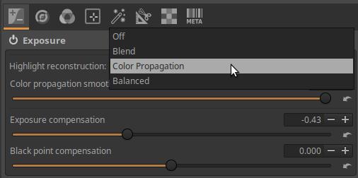
Highlight reconstruction: Burnouts in overexposed areas of a photo can be restored by extrapolating the partial information available around the cropped pixels. There are four options to choose from:
- Off: Disables the restoration of burned areas.
- Blend: Attempts to figure out the clipped color channels by filling in their values based on nearby, unclipped highlight areas.
- Color Propagation: This is the most powerful recovery method. In addition to restoring brightness, it attempts to restore color information by “leaking” the surrounding, unclipped color into the clipped area.
- Balanced: This method is a slightly less aggressive method than Color Propagation, and can sometimes help avoid artifacts. It takes the average of the pixels next to the cropped pixels and uses that to determine the color of the highlights. This method is sensitive to the white balance setting.
Exposure Compensation: This slider most directly affects the global luminance level (brightness) of the image in linear space, without clipping. The slider allows you to specify the amount of exposure compensation in exposure values. It shifts the entire histogram in the direction of the slider (left or right), and moves the black point and white point in the opposite direction.
Black Point Compensation: This slider raises or lowers the relative black point (the point corresponding to zero exposure) of the histogram, causing the opposite change in the exposure of the shadows. As the black point rises, the shadows darken, as it falls, they brighten.
4.1.1.1 Covering burned area with Color Propagation
Now we will look at the Color Propagation method of restoring burnt-out highlights.
Open the raw file in Editor.
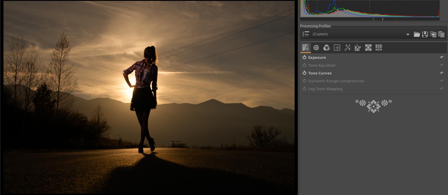
The problem is that the sun and its surroundings are completely burnt out, white. What can be done to make it disappear?
The problem can be solved by using Color Propagation, which fills the white area with color samples taken from the area around the white spot. The yellow area at the edge of the white area is extended by ART into the white area, covering it.
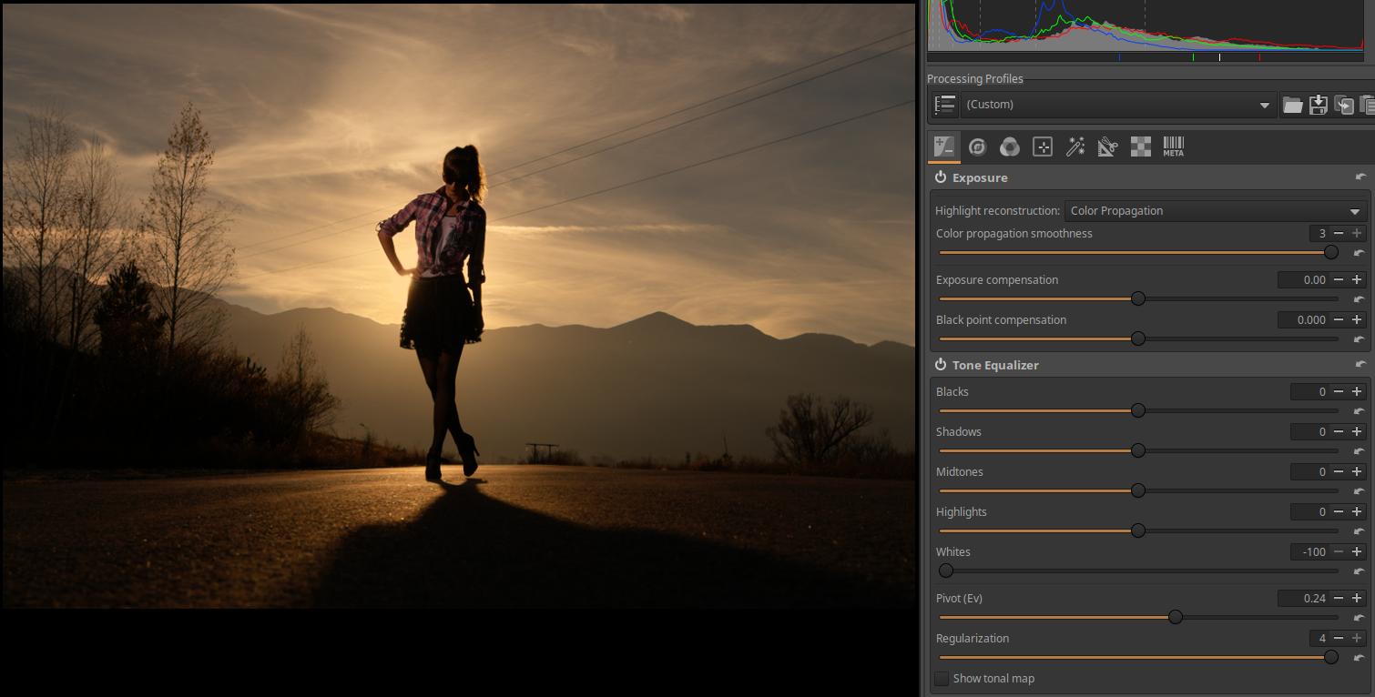
First, in the Exposure tool, under the Highlight reconstruction, select the Color Propagation option. Then, activate the Tone Equalizer editing tool. In this case, we want to remove the white spot, so we need to reduce the value of the Whites slider, in this case it should be set to the lowest value, -100. Set the Pivot slider to a value that covers the white spot the most with the yellow color, in this image it had to be set to 0.24. The Color propagation smoothness slider in the Exposure tool can be used to adjust the smoothness of the transition of the color propagation towards the surroundings. In this case, the maximum value of the slider gives the best result.
4.1.2 Tone Equalizer
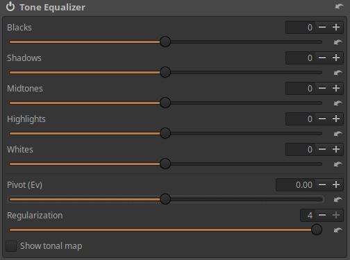
Located in the Exposure tool group, the Tone Equalizer tool divides the entire tonal range into five zones, allowing you to adjust tones while trying to preserve local contrast. The five zones are:
- Blacks
- Shadows
- Midtones
- Highlights
- Whites
There are five sliders to change the brightness of the five zones.
Pivot: This allows us to set which tonal range the tool considers as midtone, the brightness of which can be adjusted with the Midtones slider. Essentially, we can shift the tonal zones that can be adjusted with the sliders so that they better fit the image being edited. For example, if the image basically contains dark parts, it is worth shifting the shade range that should be considered midtone towards darker tones. The shift can be set in exposure value.
Regularization: This slider attempts to smooth the transitions between zones to avoid unwanted effects such as loss of local contrast.
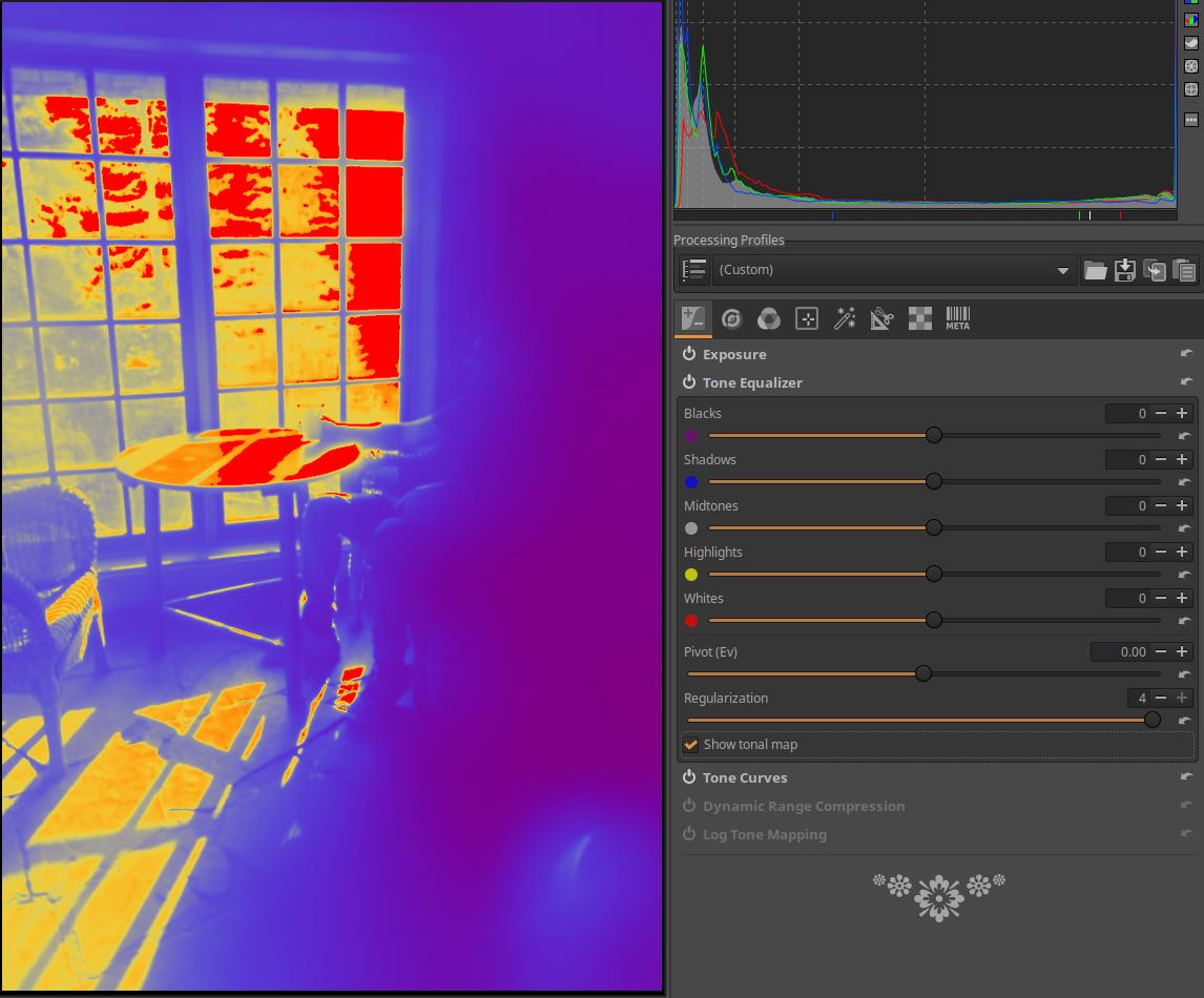
Show tonal map: If enabled, it assigns different colors to each of the five zones and uses these colors to display the zone distribution in the preview. Colored dots appear next to the sliders, so you can see which part of the image each slider affects. By enabling it, you can also clearly see the effect of the Pivot and the Regularization sliders.
I will illustrate the effect of the tool using the mid.tif image.
In the image above, I’ve opened the image for editing. Since this is not a raw file, but an image, ART uses a neutral default profile, meaning it doesn’t change anything in the image. You can see that the lightest tones have been clipped.
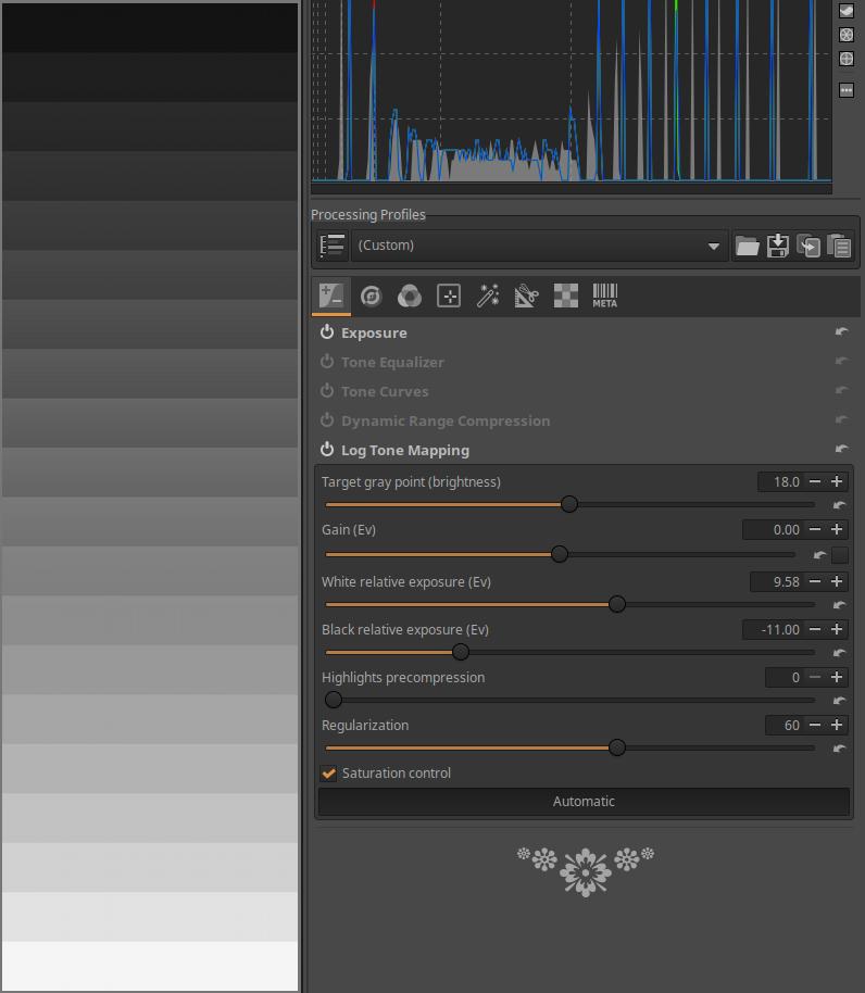
I activated the Logarithmic Tone Mapping tool, then clicked the Automatic button within it. This eliminated clipping, and the tones were distributed more or less evenly between the bands. This made the image data suitable for display. We can also say that the huge 20-level tonal range of the mid.tif file was mapped (by compression) to a much smaller tonal range suitable for display, without clipping. This of course means that the difference between the bands suitable for display is no longer 1 level, but less.

Next, I activated the Tone Equalizer tool. I enabled the tone map display, which shows which sliders will affect which bands. The midtones are indicated by a gray color and are located around the transition between yellow and blue.
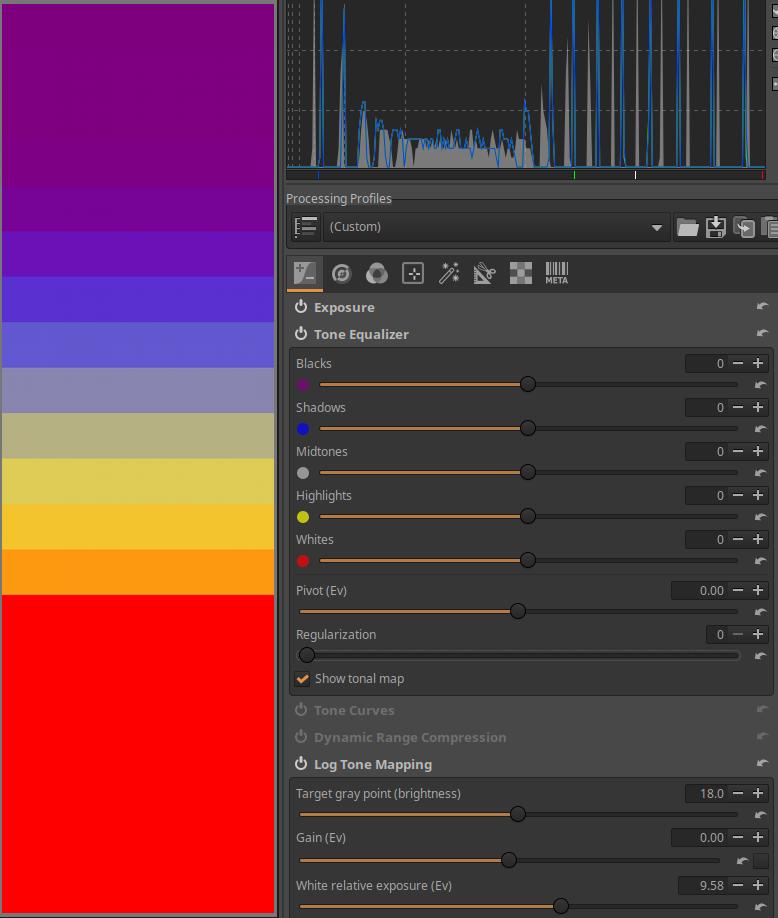
I set the Regularization slider from 4 to 0. You can see that the zones are not blurred together, but are clearly separated from each other. Then I set the slider back to 4.
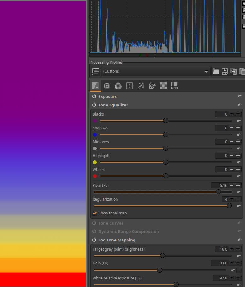
I then increased the Pivot slider from 0 to 6.16. This moves the midtone range much lower in the image (in the lighter tones), and now I can adjust the tone of these lighter bands with the Midtones slider.
Since all five zone sliders are set to zero, changing the Pivot slider will not change anything in the image. However, the tone map will show that the zones assigned to the sliders have changed.
If the zone sliders were non-zero, changing the Pivot slider would affect the image because the sliders would affect the changed zones.
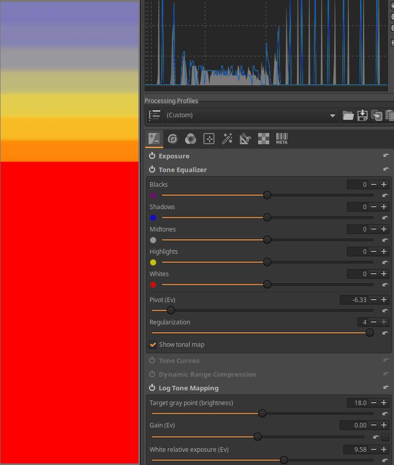
I then reduced the Pivot slider from 0 to -6.33. This moved the midtone range much higher in the image (in the darker tones), and now I could adjust the tone of these darker bands with the Midtones slider. I then set the Pivot slider back to 0.
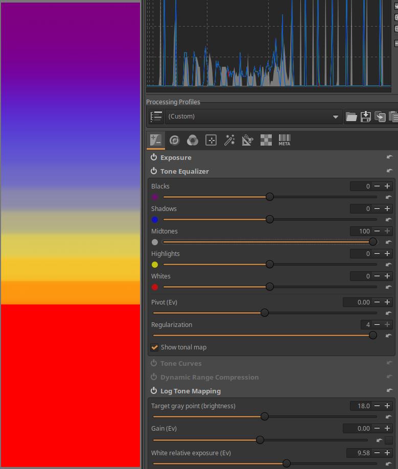
Then I set the Midtones slider to its maximum value of 100. You can see that this has no effect on the location of the zones. I set the slider back to 0. I turned off the Tonal Map display.
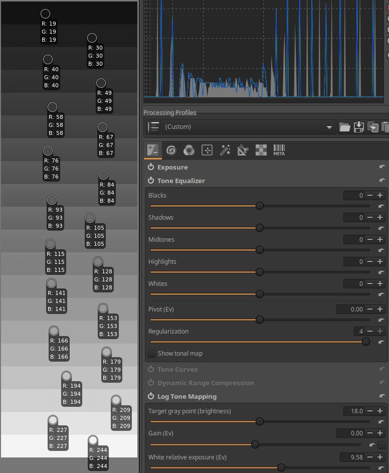
I placed a color picker on each band, so we can observe the RGB values of each band.
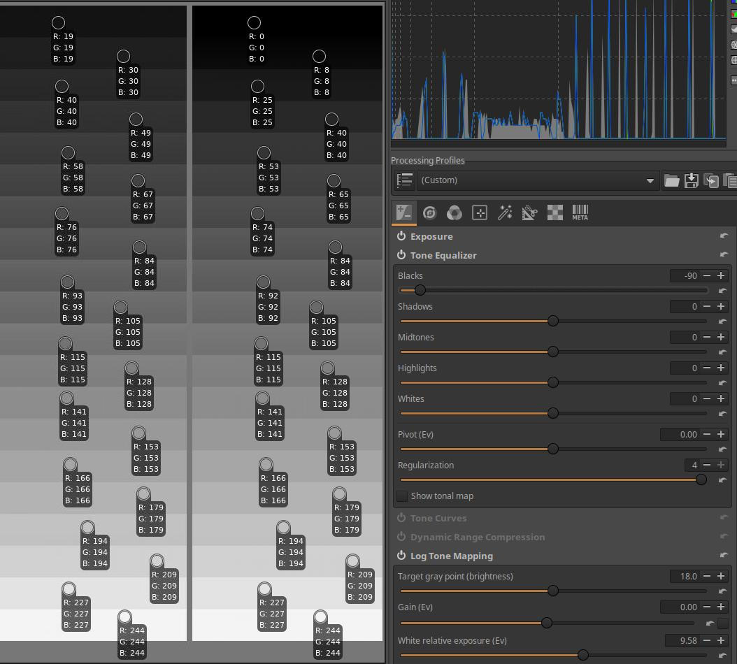
I set the Blacks slider to -90. In the images above and below, in the left column, you can see the RGB values of each band when the band sliders are set to 0. In the right column, you can see which bands’ RGB values have changed and by how much.
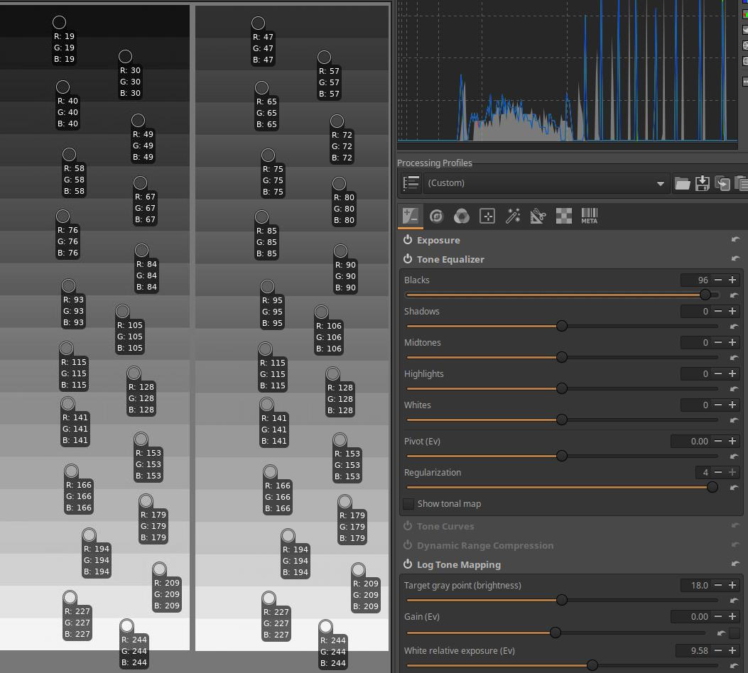
I set the Blacks slider to 96.
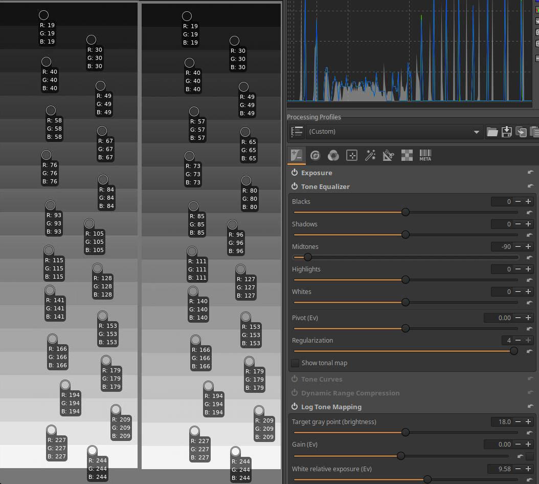
I set the Midtones slider to -90.
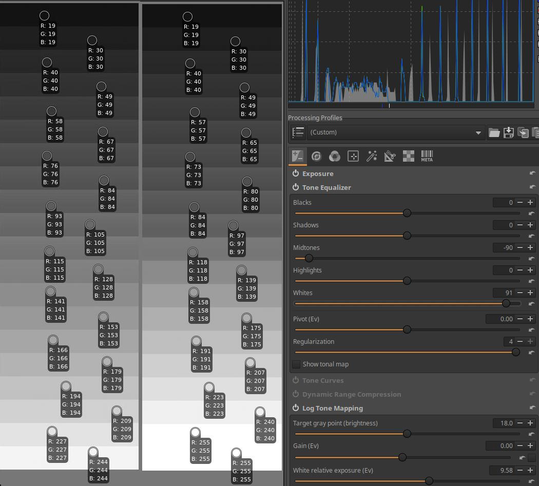
Finally, I set the Whites slider to 91. The bottom, lightest band was clipped because both this and the previous band have RGB values of [255,255,255,]. In the penultimate band, the RGB value [255,255,255,] may still be part of the image, but in the next band, clipping has definitely occurred.
4.1.3 Tone Curves
It is located in the Exposure tool group. During editing, we mostly work with linear data with an “infinite” range. This data needs to be transformed into displayable data towards the end of the pipeline. This editing tool is also suitable for this. In the preview, we see the already transformed image. In this editing tool, we can create tone curves, adjust the contrast and saturation of the final image. We can also adjust the white point. Other tools are also suitable for adjusting the parameters of the final image (e.g. Sigmoid).
There is a separate chapter about ART’s curve editors, here we will briefly look at the unique features of the Tone Curves editing tool.
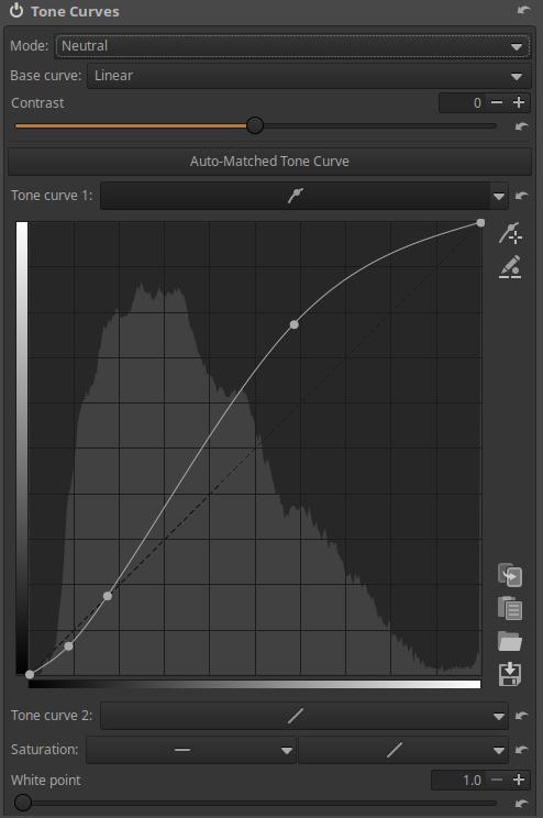
The image above shows an Auto-Matched Tone Curve. This is usually created by the default processing profile applied to raw files. The goal is to make the initial preview look similar to the JPEG image embedded in the raw file. When you click the Auto-Matched Tone Curve button, ART will create the curve.
You can create two tone curves, Tone curve 1 and Tone curve 2. The Auto Fit tone curve will always be Tone Curve 1.
The histogram displayed in the background of the curves is derived directly from the data that is present at the input of the curve. This is different from the ART histogram, which is generated from the final image data at the end of the pipeline.
Why are two tone curves needed? Because it allows for finer control of tones. Typically, Tone Curve 1 is used to decrease values, and Tone Curve 2 is used to increase values. The result of the two curves is usually a curve similar to an S-curve, but with two curves there is less risk of unrealistic colors.
The Contrast slider is used to adjust the contrast of the image. The Contrast slider always uses Standard mode.
In the image above, we can see the White point slider, which has a default value of 1. The White point slider controls the cutoff point of the highlights and the range of tones affected by the curve.
ART is usually used to produce SDR (Standard Dynamic Range) images, and a value of 1 is usually sufficient, which forces the brightness of the pixels to the range [0, 1]. A value of 1 corresponds to a maximum monitor brightness of 100 nits, which is adequate for “standard”, non-HDR monitors.
If you are creating an HDR image, you need to increase the white point value. Increasing it by 1 means a 100 nit increase in monitor brightness. So if you have an HDR monitor with a maximum brightness of 1000 nits, you need to set the White point to 10. The slider will automatically “stretch” the curve and adjust the contrast formula as needed. This makes no sense with an SDR monitor, as you would end up with an unbearably bright preview.
So the point is that you can use the White point slider to adjust the highlight cutoff point to the maximum brightness of the display tool, and ART will automatically stretch the curve accordingly. So this tool causes the tones to be clipped. In the pipeline list, you can read next to the tool that it says “Linear RGB clipped”, and “clipped” refers to clipping.
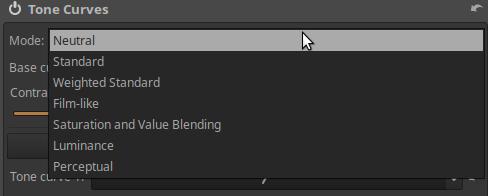
Mode: Allows you to select the appropriate algorithm used for the curve. The Mode strongly influences the appearance of colors, especially when using a contrast-enhancing S-curve curve. Depending on the Mode, unwanted color changes may occur in some cases. You should select the Mode that best suits your taste and needs for your photo.
In Mode we can choose from the following options:
- Neutral: Applies the curve to all three color channels, then performs gamut compression to reduce hue shift and ensure that highlights naturally approach white. Gamut compression means converting colors that are outside of a given color space (e.g. sRGB) to colors that are within the color space.
- Standard: Applies the curve to all three color channels, which can result in color shift. The S-curve generally increases the separation of the color channels, thereby increasing saturation.
- Weighted Standard: This can limit the color shift of the standard curve, but does not completely eliminate it.
- Film-like: This curve gives a very similar result to the Standard type, but the RGB-HSV color space remains constant, meaning there are fewer color shift issues. This curve type was designed by Adobe as part of DNG, and is therefore also used by Adobe Camera Raw and Lightroom.
- Saturation and Value Blending: This mode is best suited for high-key photos, but can also be used for creative effects on other photos. The result is very similar to a L*a*b* color space luminance curve (i.e., changing contrast without affecting hue or saturation). Contrast-enhancing curves tend to have a slightly desaturated appearance.
- Luminance: Hue and saturation are unchanged. However, contrast enhancing curves may result in a slightly desaturated appearance.
- Perceptual: This mode preserves hue and saturation, meaning that if you apply an S-curve, for example, the contrast will actually increase, but the hues will remain the same and the image will appear to have a similar saturation to the original. It can be used to create a particularly pleasing base contrast without altering the colors provided by the camera profile (which does not apply a curve). It is significantly slower than other curve modes due to the complexity of the algorithm.
Curves that increase contrast will usually appear slightly desaturated. This is not because the curve desaturated the colors, but because in human vision, contrast and saturation are closely related, so the same image with higher contrast requires higher saturation to be perceived as having the same saturation.
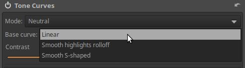
The Base curve drop-down list allows you to choose from two predefined base curves that ART applies to the tool’s input image. The choices are as follows:
- Linear: Does not apply a base curve.
- Smooth highlights rolloff: Leaves shadows and midtones untouched and provides a nice smooth (soft, gentle) transition towards the selected white point without harsh clipping.
- Smooth S-Shaped: Also darkens the shadows slightly to slightly increase contrast. Provides a nice smooth (soft, gentle) transition towards the selected White point, without harsh clipping.
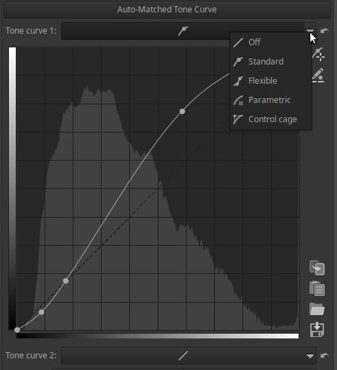
The two tone curve editors have the usual curve types available.
In the editing tool, under the tone curve 2, there is the Saturation section, we find an Flat curve and a Tone curve type curve.
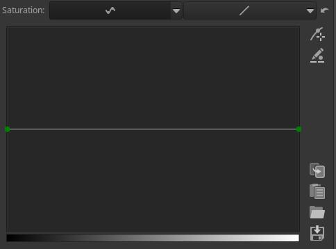
Using the flat curve, we can increase or decrease the saturation of colors according to the tones of the image.
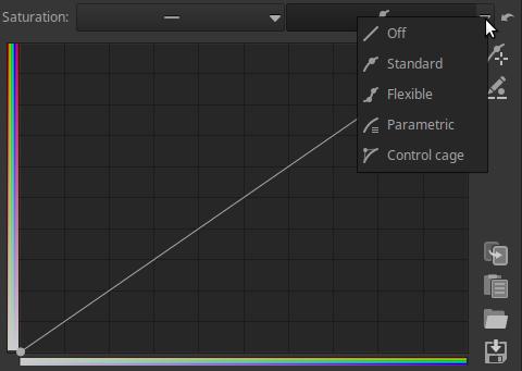
With the curve editor shown in the figure above, we can change the saturation of the colors according to the saturation of the colors in the image.
In current versions of ART, only one Mode can be selected, and when Mode is selected, it applies to both Tone Curves 1 and 2. Previously, Mode could be selected separately for both tone curves, as shown in the figure below.
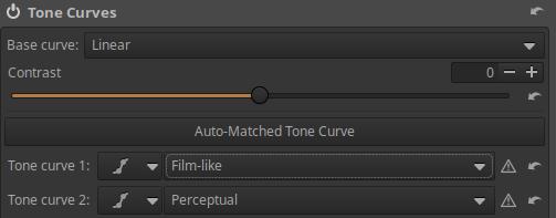
Some people preferred the old way of working. This can be achieved very easily in newer versions as well. You need to create a text file (processing profile) with a suitable text editor (e.g. Notepad for Windows, Mousepad for Linux). You need to copy the following lines into it.
[Version]
Version=1025
[ToneCurve]
CurveMode=Standard
CurveMode2=Perceptual
Curve=4;0;0;1;1;
Curve2=4;0;0;1;1;
ContrastLegacyMode=true
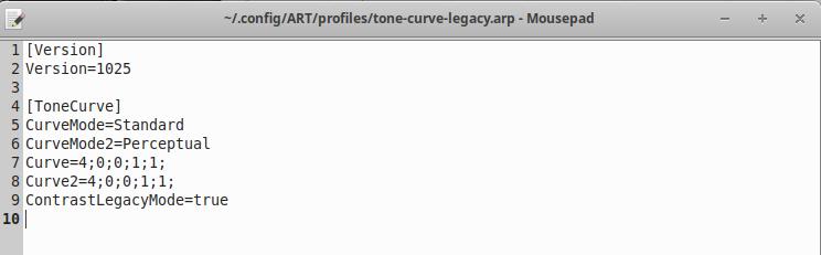
Name the file, for example tone-curve-legacy.arp, and save it in the directory containing your own processing profiles. If you apply this profile to the edited image, you can select the Mode for the two tone curves separately, as shown in the figure above. Apply the profile before you start editing the curves.
If we have applied the profile and selected Tone Curve Mode 1 and 2, we will experience the following behavior:
- If at least one tone curve is turned off when you exit Edit view, you will see the user interface of the newer versions again, and there will be only a Mode selector, which will show the previously selected Mode of Tone Curve 1. The previously selected Mode of Tone Curve 2 will remain in effect, but it will not be visible in the user interface, and we cannot change it. The old user interface will only be visible after reapplying the profile, but this will result in the loss of the previous curves. It is advisable to save the curves beforehand.
- If both curves are turned on when you exit Edit view, the old user interface remains, i.e. the Mode Selector appears for both tone curves. Therefore, turn on the unused curve in linear mode, for example by selecting another curve type instead of “Off”.
- Clicking the Automatically Fit Tone Curve button always turns off Tone Curve 2, please note this.
4.1.4 Dynamic Range Compression
It is located in the Exposure tool group. In an image with a very high dynamic range (i.e., there are both very bright and very dark areas), you may need to reduce the dynamic range between the shadows and highlights to avoid clipping. The Dynamic Range Compression tool can achieve this reduction, effectively compressing the shadows and highlights. This can be seen on the left and right sides of the histogram.
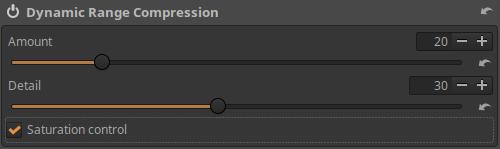
Amount: You can adjust the amount of compression. Higher values result in a narrower dynamic range.
Detail: You can adjust how much local contrast the tool preserves. Positive values reduce compression to increase contrast, negative values reduce contrast.
Saturation Control: When checked, reduces the increase in highlight saturation due to compression.
4.1.5 Log Tone Mapping
It is located in the Exposure tool group. The Log Tone Mapping tool allows you to compress the dynamic range of an image, i.e. the shadows and/or highlights. It is similar in purpose to the Dynamic Range Compression tool, or to some extent, the Tone Equalizer tool.
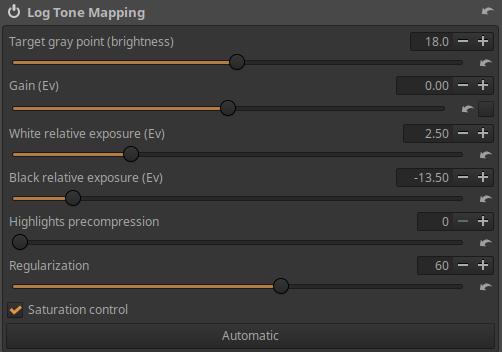
Target gray point (brightness): We can set where the input mid-gray value (which will always be 0.18 on the slider) should be mapped to in the output. It can be used to control the overall brightness of the image after tone mapping.
Gain (Ev): The amount of exposure compensation to apply before tone mapping.
White relative exposure (Ev): We can set how many exposure values the input white point should be above the Target gray point. The Target gray point on this slider will always be set to 1.
Black relative exposure (Ev): We can set how many exposure values the input black point should be below the Target gray point. The Target gray point on this slider will always be 0.
Highlights precompression: Allows you to compress highlights before applying tone mapping.
Regularization: Higher values preserve fine details better, but may result in halos.
Saturation control: If checked, it reduces the increase in highlight saturation due to compression. Enabled by default.
Automatic: When clicked, it sets the slider values to initial values calculated based on the image properties.
I will demonstrate the behavior of the tool using the mid.tif image published by Alberto Griggio.
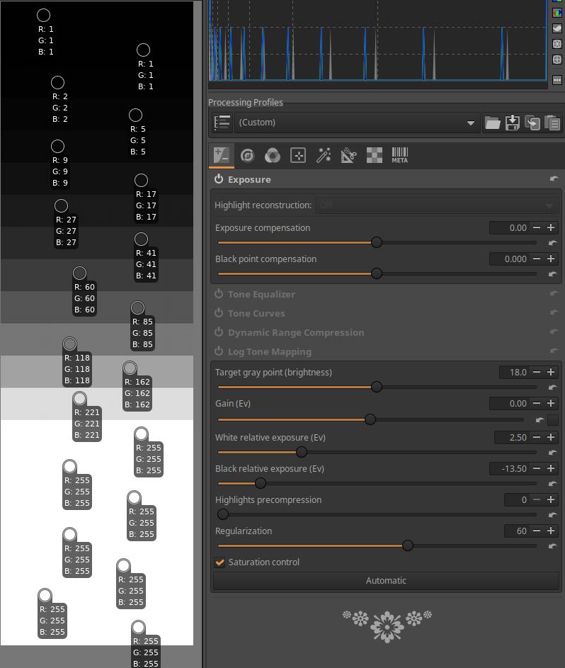
In the image above, I have opened the image for editing. Since this is not a raw file, but an image, ART uses a neutral default profile, meaning it does not change anything in the image. I have placed a color picker on each band except the bottom band, which shows the RGB values of the band. You can see that the 11th band from the top is the 18% mid-gray ([118,118,118]). The lightest tones have been clipped, there are bands with a maximum value ([255,255,255]), and the top five dark-toned bands are also close to the minimum.
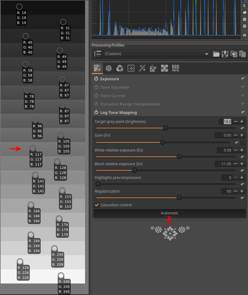
I clicked the Automatic button at the bottom, and ART adjusted the White Relative Exposure and Black Relative Exposure slider values. This made the mid.tif’s 20-level dynamic range suitable for display, i.e. compressed it. This means that the difference in brightness between the bars visible on each monitor is actually not one light level. The 11th bar from the top remains the middle gray ([117,117,117]), I marked this bar with a red arrow. You can see that the bars are evenly spaced, there is no clipping. There is no color picker on the bottom bar, [247,247,247] is RGB. The relative exposure of White relative to mid-gray is 9.58 exposure values, the bottom band is 9 exposure values away from mid-gray ([247,247,247]), and would reach the RGB value [255,255,255] in the next band (if there were one). The relative exposure of Black relative to mid-gray is 11 exposure values, the top band is 10 exposure values away from mid-gray, its RGB value is [19,19,19], and would reach the RGB value [0,0,0,] in the next band (if there were one). Remember that pixels with values [0,0,0,] and [255,255,255] could also be part of the image if no clipping was done. It is important to understand that the exposure values mentioned are the exposure values of the original mid.tif file. The fact that “the bottom band is 9 exposure values away from the middle gray” means that the compression was done in such a way that the bottom band of mid.tif (which is indeed 9 exposure values away from the 11th middle gray band from the top) was also mapped to the bottom band in the displayable image (visible on the monitor) (without clipping).
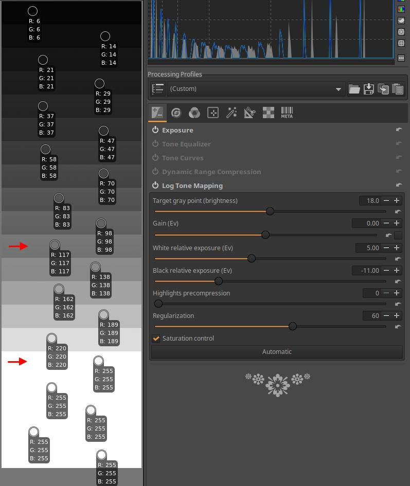
I set the White relative exposure from 9.58 to 5. The middle gray remained in the 11th band. In comparison, it reaches the [255,255,255] RGB value in the 5th band downwards, and clipping occurs in the bands below it (they also have [255,255,255] RGB values, but they should be higher values, but this is not possible). I marked the last band, not yet clipped, with a red arrow at the bottom. The light tones are less compressed, so the fifth band, down from the midtone of the mid.tif, reaches the maximum possible brightness values in an image suitable for display. The bands below this have been clipped. In the bands between the two red arrows, the difference in brightness between the individual bands, i.e. the contrast, has increased.
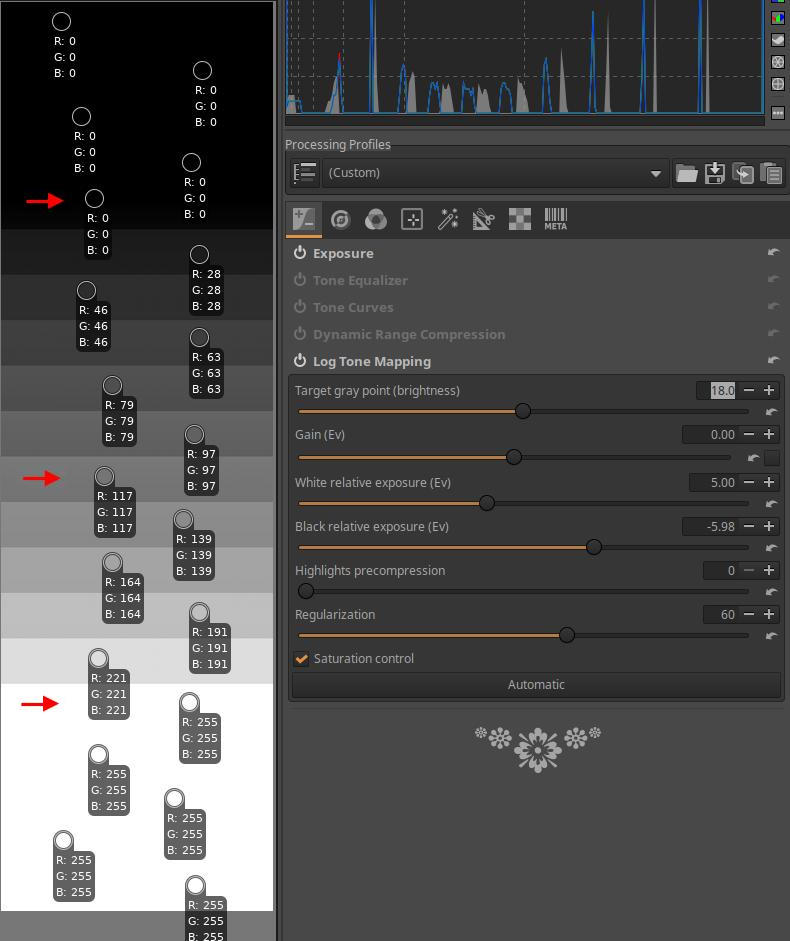
Then I adjusted the Black relative exposure slider from -11 to -5.98. The middle gray remained in the 11th band, the position of the red arrow below, and the RGB value of the band [255,255,255] did not change. In comparison, it reaches the RGB value [0,0,0] in the 6th band upwards, and clipping occurs in the bands above (they also have the value [0,0,0], but should be smaller, but this is not possible). I also marked the last band, not yet clipped, with a red arrow at the top.
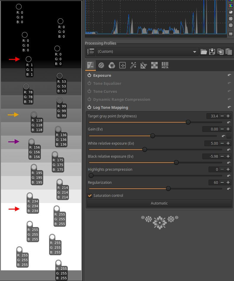
I adjusted the Target gray point slider from 18 to 33.4. The middle gray was previously in band 11, which I marked with the purple arrow in the image. It has shifted two light levels and is now in band 9 from the top (marked by the yellow arrow). The RGB values marked with the top and bottom red arrows have not changed much, but the intermediate tones have.

I set the Highlight Precompression slider from 0 to 65. The positions of the top red arrow and the yellow arrow, and the RGB values of the bands are essentially unchanged, the lightest tones in the bands before and after the bottom red arrow band have been compressed, and there is no clipping in the bottom band either. However, there is a loss of contrast due to the compression.
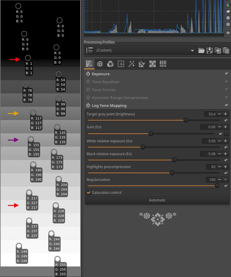
Finally, in the last image, you can see that I changed the Regularization slider from 60 to 100. The RGB values of each band remained essentially unchanged.
If you do not enable the Saturation control option, it will have no effect because the saturation of a black and white image is zero.
4.2 Details group
This group contains global editing tools primarily related to image details.
Group editing tools:
- Spot Removal
- Capture Sharpening
- Noise Reduction
- Impulse Noise Reduction
- Defringe
4.2.1 Spot Removal
It is located in the Details tool group. To remove unwanted parts of an image, you can overlay them with image fragments taken from other parts of the image. The source area is the area from which you take the image fragment, and the destination area is the area to which you copy the image fragment taken from the source area.
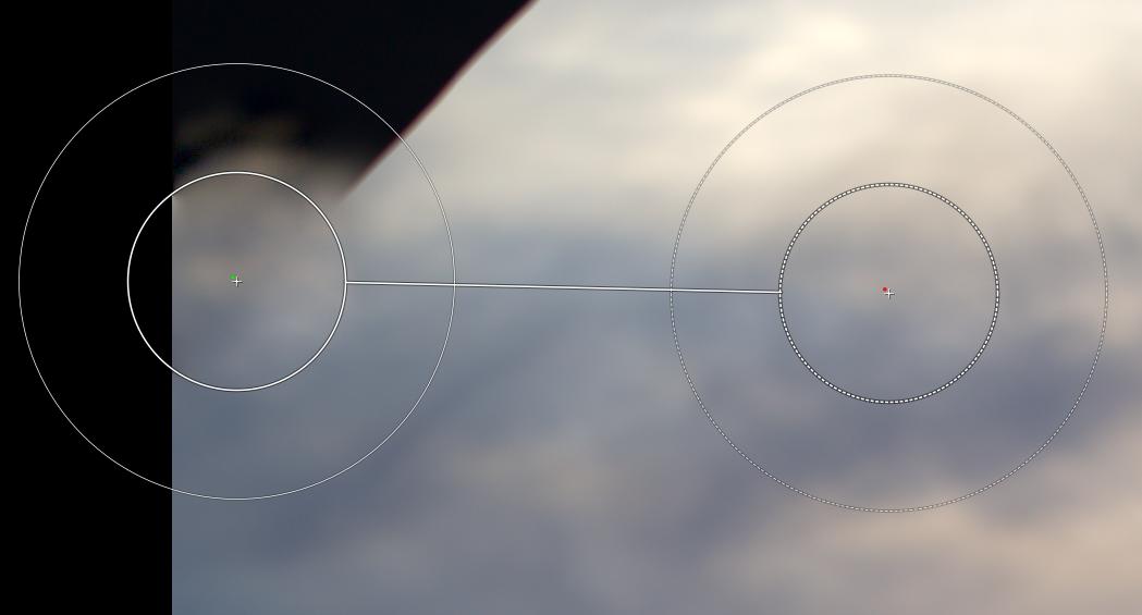
On the right we can see the source area, the center of which is marked with a tiny red dot, and on the left we can see the target area, the center of which is marked with a green dot. The target or source area itself is the area of the inner circles. The related source and target areas are connected by a line. The feather is located around the inner circles, which is delimited by the outer circles. The feather provides a gradual transition around the target area, towards its surroundings. If feather is set, it takes image details not only from the source area, but also from its surroundings, as shown in the figure, and uses them to form the feather around the target area. On the left in the figure (above), we can also observe the gradual transition around the target area. The concentric circles of the source or target area connected by a line are collectively called a “spot”. By using multiple spots, we can cover the entire black area shown in the figure with image details taken from the clouds.
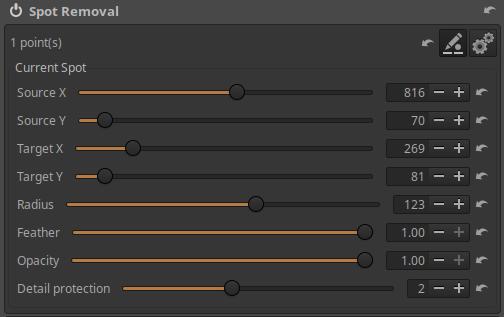
The image above shows the controls of the editing tool.
In the top row we can see the number of spots created, as well as three buttons to the right, which from left to right are:
- Deletes any spots created so far
- Add/modify spots in the preview: You can create and modify spots in the preview using the mouse.
- Add/modify spots in simplified preview: Only works if the previous button is active. If this is also enabled, ART will switch to a simplified preview, as it requires fewer resources to work with spots.
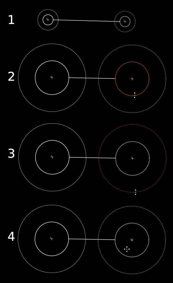
Let’s look at the figure above, where we can observe the following four options after we have enabled the add/edit mode:
1: Press the Ctrl key, click on the center of the future source area, hold down the mouse button, release the Ctrl key, move the mouse pointer to the center of the target area, and then release the mouse button. At this point, you should see something similar to the structure shown at the top of the figure. The center of the circles is marked with a “+”. The right side of the figure shows the source area, marked with a small red dot at its center, and the left side shows the target area, marked with a green dot. The image fragment visible in the inner circle of the source area will be copied to the area of the inner circle of the target area. The outer circles show the width of the feathering, i.e. the transition to the environment. The image fragment is copied from the source area to the target area together with the feathering, i.e. with a gradually fading edge.
2: The size of the source or target area (the inner circles) can be adjusted with the mouse. The color of the circle whose diameter is being changed changes as shown in the figure. The diameter of the source and target areas change together, if we change one, the other also changes.
3: The size of the feather of the source or target area can also be adjusted with the mouse. The diameter of the (outer) circle indicating the feather is currently being changed, its color changes as shown in the figure. The diameter of the circle indicating the boundary of the feather of the source and target areas changes together, if we change one, the other also changes.
4: You can move the source and target areas to the desired location in the preview with the mouse.
You can delete a spot by right-clicking on it.
For unselected spots, only the center of the target area (“+”) and the green dot are visible in the preview. If you move the mouse pointer over the center of a spot and click, that spot will be selected and can be modified.
You can also use sliders to modify the parameters of the selected (current) spot that you previously set with the mouse.
Source X: Moves the center of the source area horizontally.
Source Y: Moves the center of the source area vertically.
Target X: Moves the center of the target area horizontally.
Target Y: Moves the center of the target area vertically.
Radius: The radius of the target or source area.
Feather: Width of the feather.
Opacity: The opacity of the target area in percentage. At 100% opacity, only the image portion copied from the source area is visible in the target area. If the opacity is less than 100%, the original image also appears in the target area. At 0% opacity, only the original image portion is visible, not the copied one.
Detail protection: If set to 0, it simply copies the source area to the destination area, while higher values mix the source area and the image fragment copied from the destination area.
Let’s look at how to use the tool:
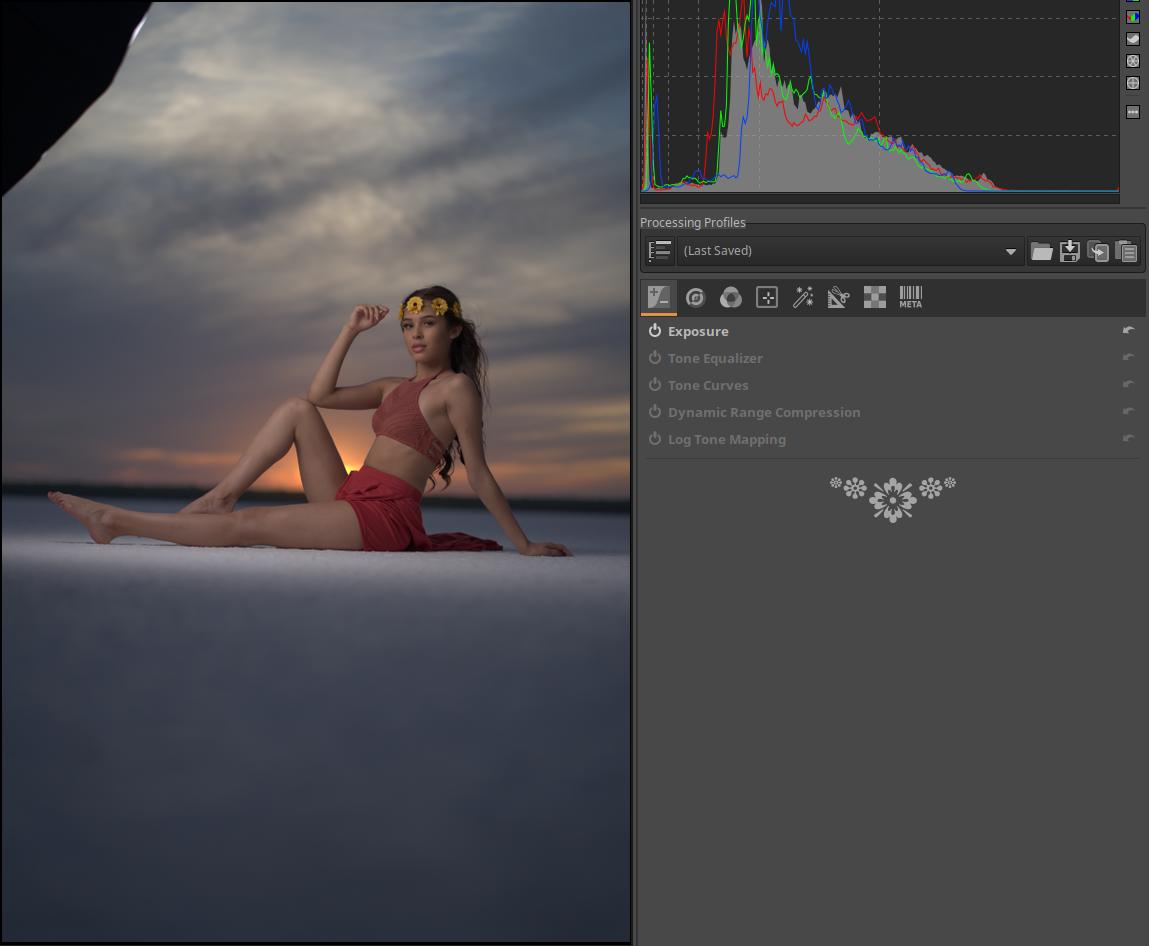
In the upper left corner of the image we see a large black spot, we will cover this with image details taken from the clouds next to the black spot.
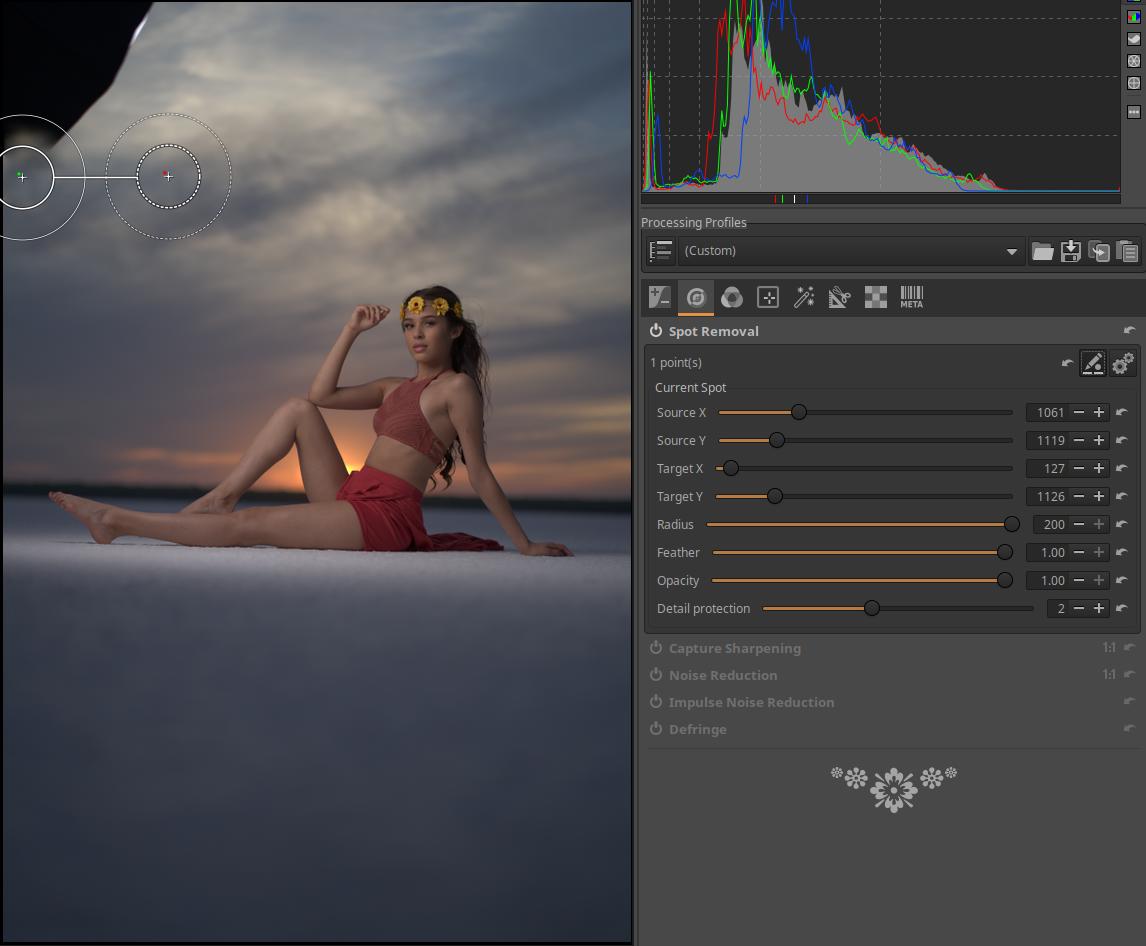
You can see the placement of the first spot in the image above. I set the feathering to large because I want a gradual transition around the spot.
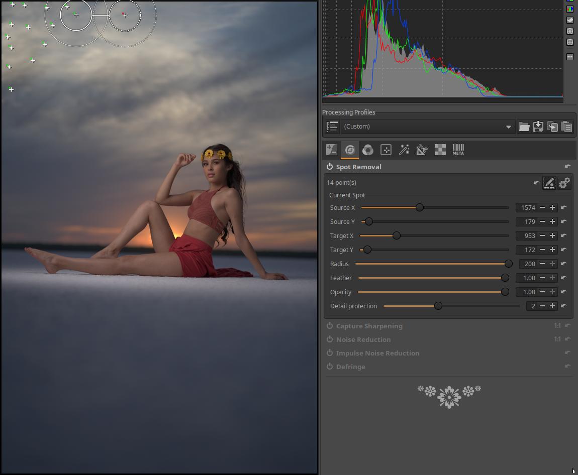
In this figure we can see the placement of the last, 16th patch.
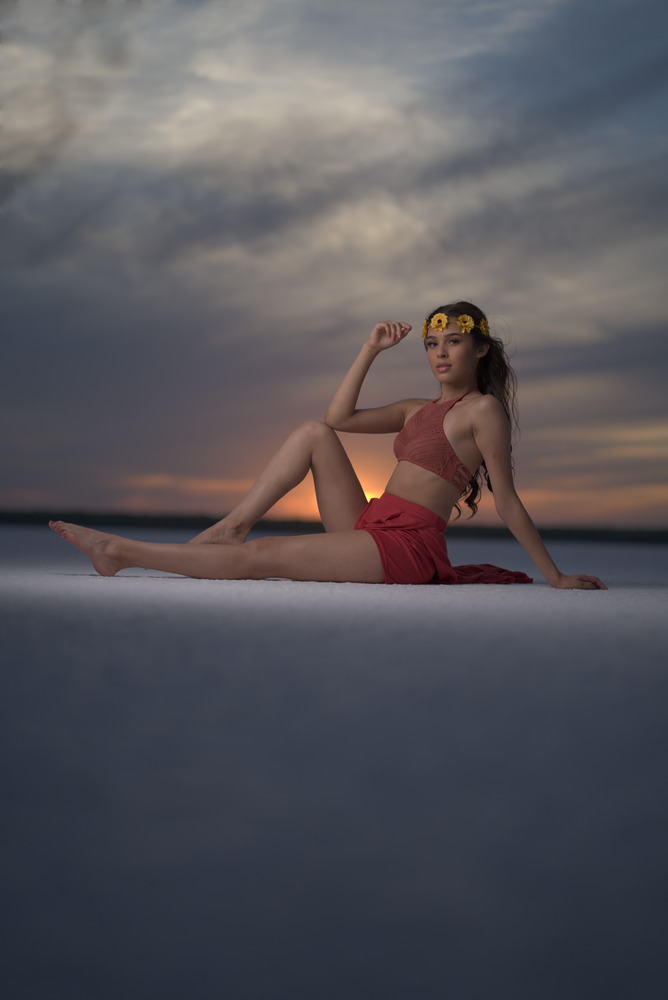
The image above shows the final result. It could be further refined by adding more spots.
4.2.2 Capture Sharpening
It is located in the Details tool group. To properly see the effect of sharpening, zoom the preview to at least 100% (1:1) or place several Details windows on different parts of the image (the button is located on the bottom toolbar).
The primary purpose of sharpening is to compensate for the loss of sharpness that occurs in the camera. Sharpness can occur in two ways in a camera. On the one hand, due to the imperfection of the lens, and on the other hand, due to the anti-aliasing filter that is still present in many cameras today. In the latter case, a very slight blurring of the image is intentionally created by a filter placed in front of the image sensor. The sharpening tool is primarily used to compensate for these effects, but anyone can use it for whatever they want.
By default, the tool analyzes the image and calculates initial values for the parameters in a way that prevents image noise from being amplified by sharpening. In many cases, the default values provide good results.
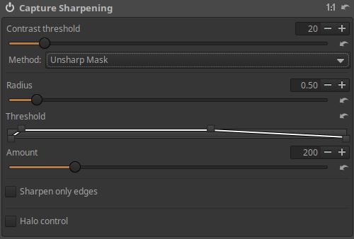
Contrast threshold: Increasing the slider value means that details need to have more contrast to be sharpened. Higher contrast threshold values reduce the amount of sharpening applied to noise. You can see the effect when you turn on Sharpening Contrast Mask.
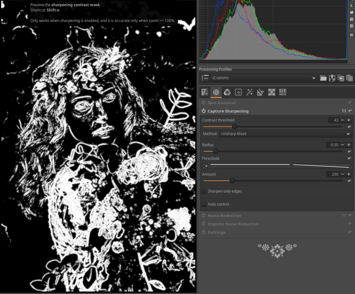
In the image above we can see the Sharpening Contrast Mask, it is recommended to turn it on when using the Sharpen tool. The mask can be turned on above, in the toolbar, we can also see the button that needs to be clicked. It can only be turned on when this Sharpen tool is turned on. Only the white areas of the mask will be sharpened.
Method: There are three types: Unsharp Mask, RL Deconvolution, and Custom RL Deconvolution.
4.2.2.1 Unsharp Mask
Unsharp Mask is a method used to increase the apparent sharpness (edge contrast) of an image. The method does not actually sharpen the image, no more details appear in the image, however, due to the increase in contrast at the edges (abrupt transitions), the image is perceived as sharper.
Radius: The radius value required to compensate for the above-mentioned effects is automatically set by the tool. However, this can be changed if necessary. Radius determines the size of the sharpened details, the distance along the edges and in which band the sharpening is performed. In general, the quality of sharpening is better if the sharpening radius is smaller. For images with low ISO sensitivity, in focus and without blur, a value of 0.5…0.7 is sufficient. If the value is too low, there will be insufficient sharpening, and if it is too high, it can lead to strong halo formation along sudden transitions (“edges”).
Threshold: Below the threshold curve, we can plot the tone scale. The vertical axis corresponds to opacity, with 0% at the bottom and 100% at the top. The threshold curve editor allows us to set the amount of sharpening in the image’s brightness range. In the figure above, we can see that on the left side, in the darkest tones, there is no sharpening (the lower left control point is 20), then the sharpening level increases quite abruptly, reaching the maximum value, from which point maximum sharpening occurs in a wide range, and finally the sharpening level gradually decreases in the light tones. The default threshold curve protects against oversharpening and haloing in most cases.
Amount: The amount of sharpening can be increased or decreased using.
Sharpen only edges: If this is checked, homogeneous areas will not be sharpened. This will avoid sharpening image noise. Enabling this is recommended for noisy images. If enabled, two new sliders will appear.
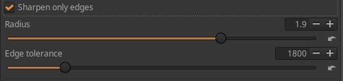
Radius: Used for noise detection. If the noise is low, a smaller radius can be used, and vice versa. A larger radius will slow down image processing.
Edge tolerance: Determines how much a pixel must differ from its neighbor to be considered edge-on and not noise. It is very similar to the Unsharp Mask Contrast Threshold parameter and has a large impact on visual quality. For low ISO (low noise) images, use 1000 or less, for high ISOs, use 2500-3000 or more.
Halo control: Used to avoid halos appearing around bright objects when sharpening too aggressively. When activated, a new slider appears.
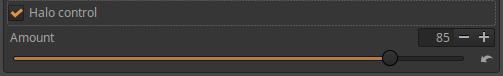
Amount: The slider has its maximum effect at a value of 100, reducing the unpleasant visual side effect of the Unsharp Mask method.
4.2.2.2 RL Deconvolution
The RL Deconvolution method was developed to “redo” the effect of Gaussian blur. If a blur is Gaussian, then a mathematical procedure can be used to restore the original information. In reality, the blur seen in a photograph can differ significantly from a Gaussian blur, so certain artifacts, such as halos, can appear if the beam is too different from the type of blur seen in the image and when the sharpening effect is too strong.
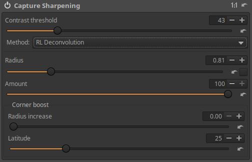
Radius: The radius determines the spread of the Gaussian blur in the image. You can experiment to find the best value for your image that provides adequate sharpening and few artifacts.
Automatic: There is a checkbox at the end of the Radius slider, next to the Reset button. If this is enabled (checked), it will automatically calculate the appropriate Radius value based on the raw data.
Amount: Controls the blend factor between the unsharpened image and the sharpened one (opacity).
Corner boost: Due to lens imperfections, images are often softer or more blurry in the corners of the image than in the center of the frame. The two sliders here allow you to adjust the sharpening in the corners of the image.
Radius increase: Increasing the slider value increases the sharpening at the edges of the image.
Latitude: Determines how much of the image is considered to be corners. But if corner boost is zero, then it doesn’t have any effect.
4.2.2.3 Custom RL Deconvolution
In real life, we don’t exactly see Gaussian blur in our images, and the RL Deconvolution tool assumes Gaussian blur, so it’s not entirely accurate. This leads to the idea that if we knew the so-called point spread function (PSF) of the recording system, we could more accurately remove the blur from our image.
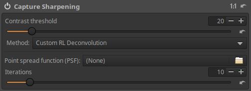
There is very little information to be found about this method. To apply it, you would need the point spread function (in the form of a PNG image) of the recording system (I think the body and the lens). The method of generating this is unknown to me. It is not possible to generate the exact point spread function with a simple method. An inaccurate point spread function does more harm than good.
It’s probably not worth bothering with the Custom RL Deconvolution method because RL Deconvolution works perfectly.
4.2.3 Noise Reduction
It is located in the Details tool group. It can be used to reduce luminance noise and chrominance noise. To properly see the effect of noise reduction, zoom the preview to at least 100% (1:1) or place several Detail windows on different parts of the image (the button is located on the bottom toolbar).
Basically, we can distinguish two types of noise:
- Luminance noise: Appears as small spots of varying brightness, somewhat resembling grain in negative film.
- Chrominance noise: Appears as small spots of different colors.
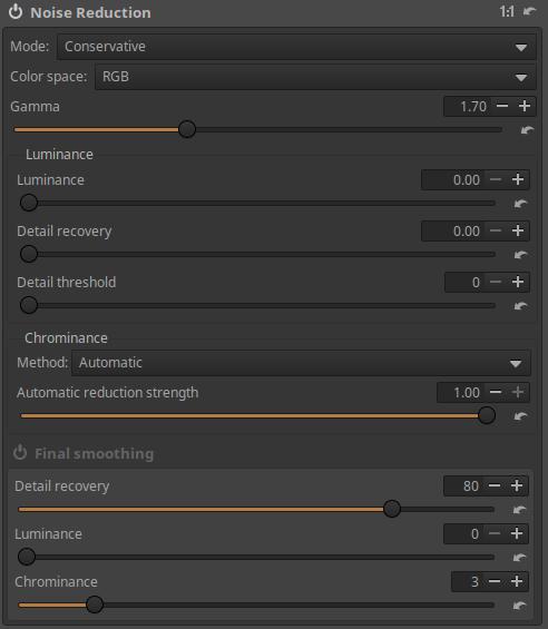
Mode: There are two general noise reduction modes (Conservative and Aggressive) that control whether to remove only high-frequency noise or also low-frequency noise. Low-frequency noise is noise with patches covering a large area, while high-frequency noise has smaller patches.
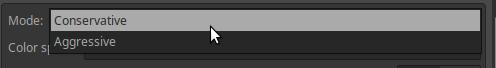
- Conservative: This mode removes all noise except very low frequency noise, so color details are better preserved at the expense of not removing very large spots. This is the preferred mode in most cases.
- Aggressive: Removes even very low frequency noise, with the disadvantage of being more aggressive with higher frequency noise. Only use on extremely noisy photos.
Color space: You can choose whether noise reduction should be performed in RGB or L*a*b* color space.
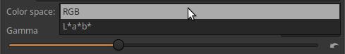
The difference between the RGB/L*a*b* color space and the Conservative/Aggressive effect can be seen clearly by zooming the preview to at least 100% or placing several Detail windows on different parts of the image. These options do not give the same results, you should always choose the combination that best suits the given image.
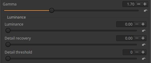
Gamma: Varies the strength of noise reduction according to tones. Lower Gamma values allow noise reduction to affect all tones, including shadows, while higher Gamma values limit the effect to only the brighter areas of the image field.
4.2.3.1 Luminance
In this section, we can reduce the luminance noise.
Luminance: The Luminance slider controls the strength of the noise reduction effect.
Detail recovery: The slider allows you to restore details without causing an increase in image noise.
Details threshold: Threshold for restoring Details.
4.2.3.2 Chrominance
With these settings, we can reduce Chrominance noise.
Method: You can choose between Automatic or Manual.
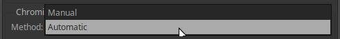
Automatic:
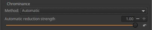
Automatic reduction strength: The slider allows you to control the strength of Automatic noise reduction.
Manual:
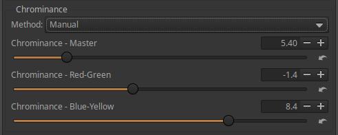
Chrominance - Master: Controls the strength of Chrominance noise reduction.
Chrominance - Red-Green: Reduces/increases noise reduction in the red-green channel (channel a* of the L*a*b* color space).
Chrominance - Blue-Yellow: Reduces/increases noise reduction in the blue-yellow channel (the b* channel of the L*a*b* color space).
4.2.3.3 Final smoothing
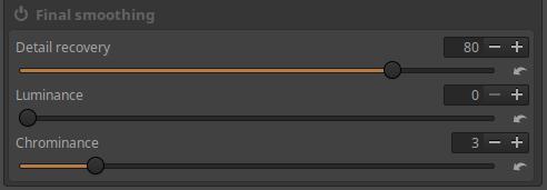
Detail recovery: The slider allows you to restore details without causing noise amplification.
Luminance: Controls the strength of luminance noise reduction.
Chrominance: Controls the strength of Chrominance noise reduction.
Application example
Let’s look at the image fragment shown in the figure below.
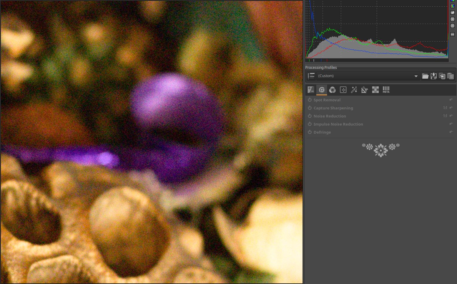
The image was taken with a Canon 1100D camera at ISO 6400. Significant luminance noise and chrominance noise are also visible.
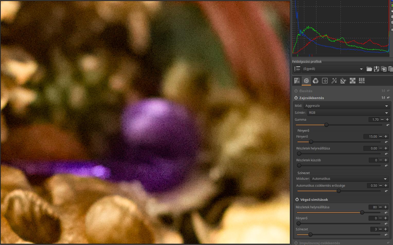
I just turned on the Noise Reduction tool, and in the image above you can see the effect of the default settings. ART used Aggressive Mode, RGB color space, and Auto Mode in the Chrominance section. The result is very good.
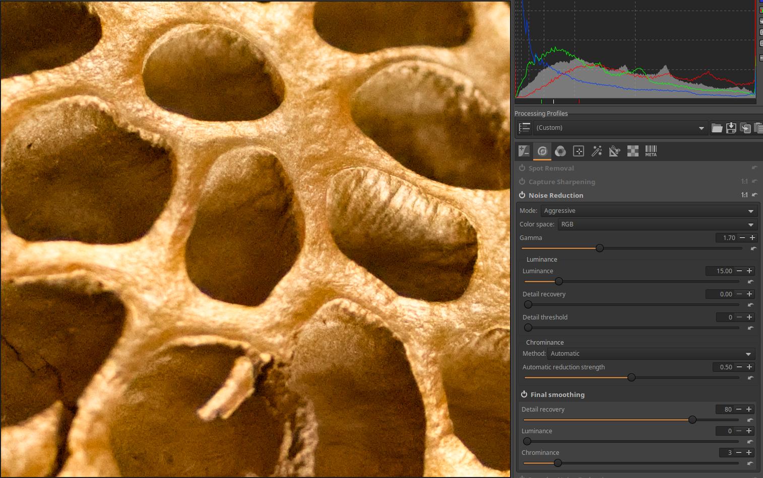
Another detail of the image, also with default settings.
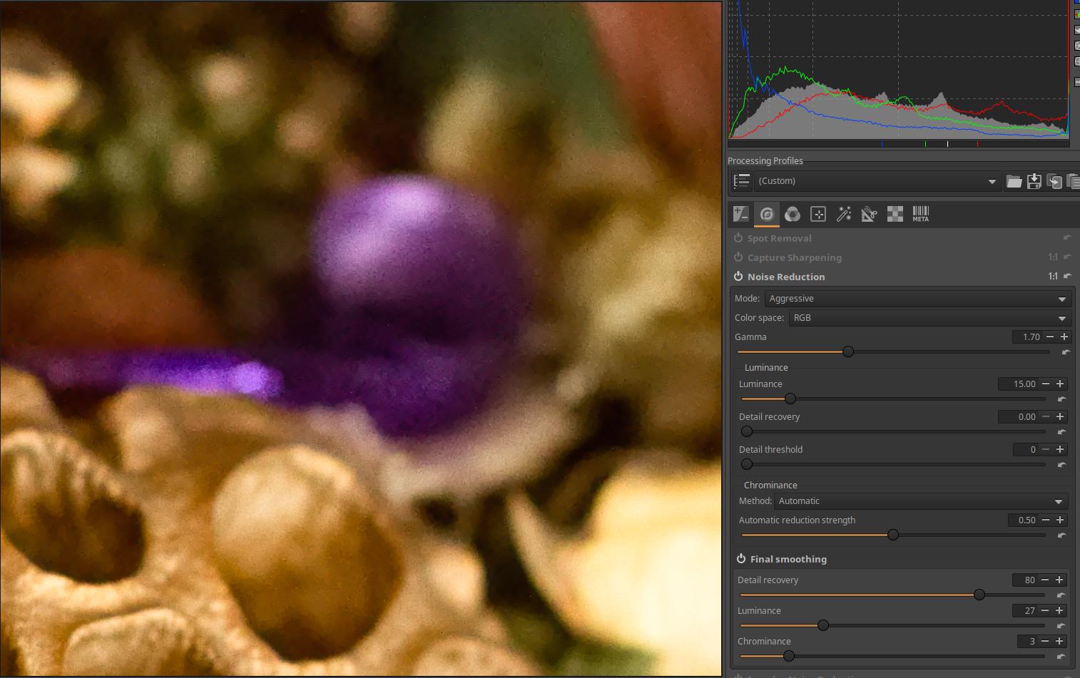
I tried to reduce the remaining noise by setting the Luminance slider in the final adjustments section to 27, but this resulted in blurring of details.
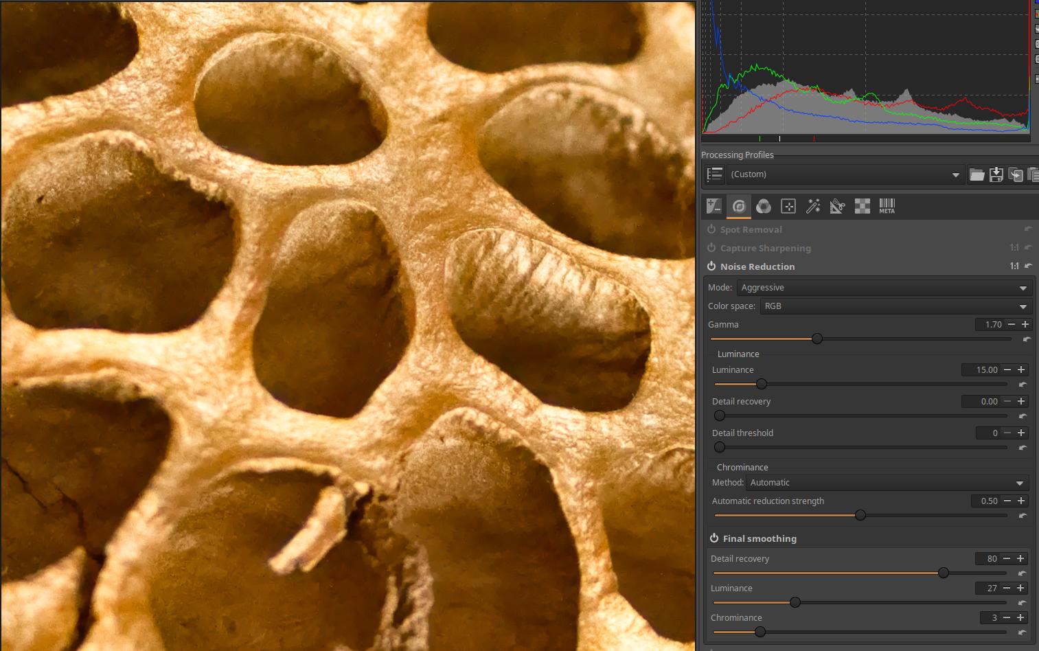
The other image fragment after setting the Luminance slider to 27.
4.2.4 Impulse Noise Reduction
It is located in the Details tool group. This tool reduces the effect of impulse noise, also known as salt and pepper noise. Impulse noise consists of white and black pixels that resemble salt and pepper sprinkled on a photo. This tool works after you perform Demosaicing.
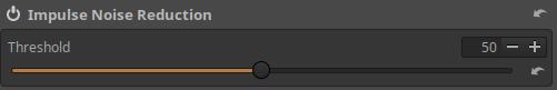
Threshold: You can set the threshold for Impulse Noise reduction.
4.2.5 Defringe
It is located in the Details tool group. This is a chromatic aberration that appears as purple, violet, or green fringes. This is a form of longitudinal chromatic aberration and appears along the dark edges next to bright areas due to lens imperfections. It often appears in areas outside the focus plane as purple and green fringes. Lenses that do not focus all colors on the same plane can also cause this problem. Lenses are optimized to focus longer wavelength visible light on the same plane, but the image produced by shorter wavelength light is not sharp on the same plane, but either in front of or behind it. Therefore, these shorter wavelengths of light (purple, violet) can visibly color the dark areas when the bright areas next to them are of sufficient intensity. This can be seen when photographing the foliage of a tree with the sun shining through the leaves.
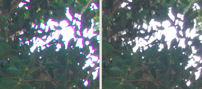
Source: Rawtherapee, Rawpedia
The uncorrected image is shown on the left, the corrected image is shown on the right.
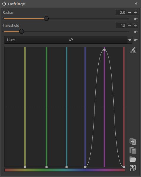
Radius: The radius of the effect. It affects the width of the colored border to be removed.
Threshold: You can set the threshold for removing the colored border.
Hue: Here you will find a flat curve. You can select the hue you want to remove the border from, and the higher you drag the curve above the selected color, the stronger the effect of the tool will be.
The JPEG image shown in the figure below is by Slavica Panova, source: Wikimedia.
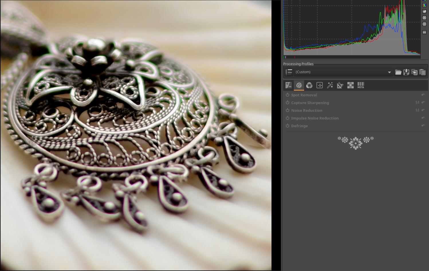
The image shows a detail of an image taken with a Nikon D7000 camera, AF-S Nikkor 50mm f/1.8G lens, aperture f/1.8. The image shows significant longitudinal chromatic aberration in green and purple.
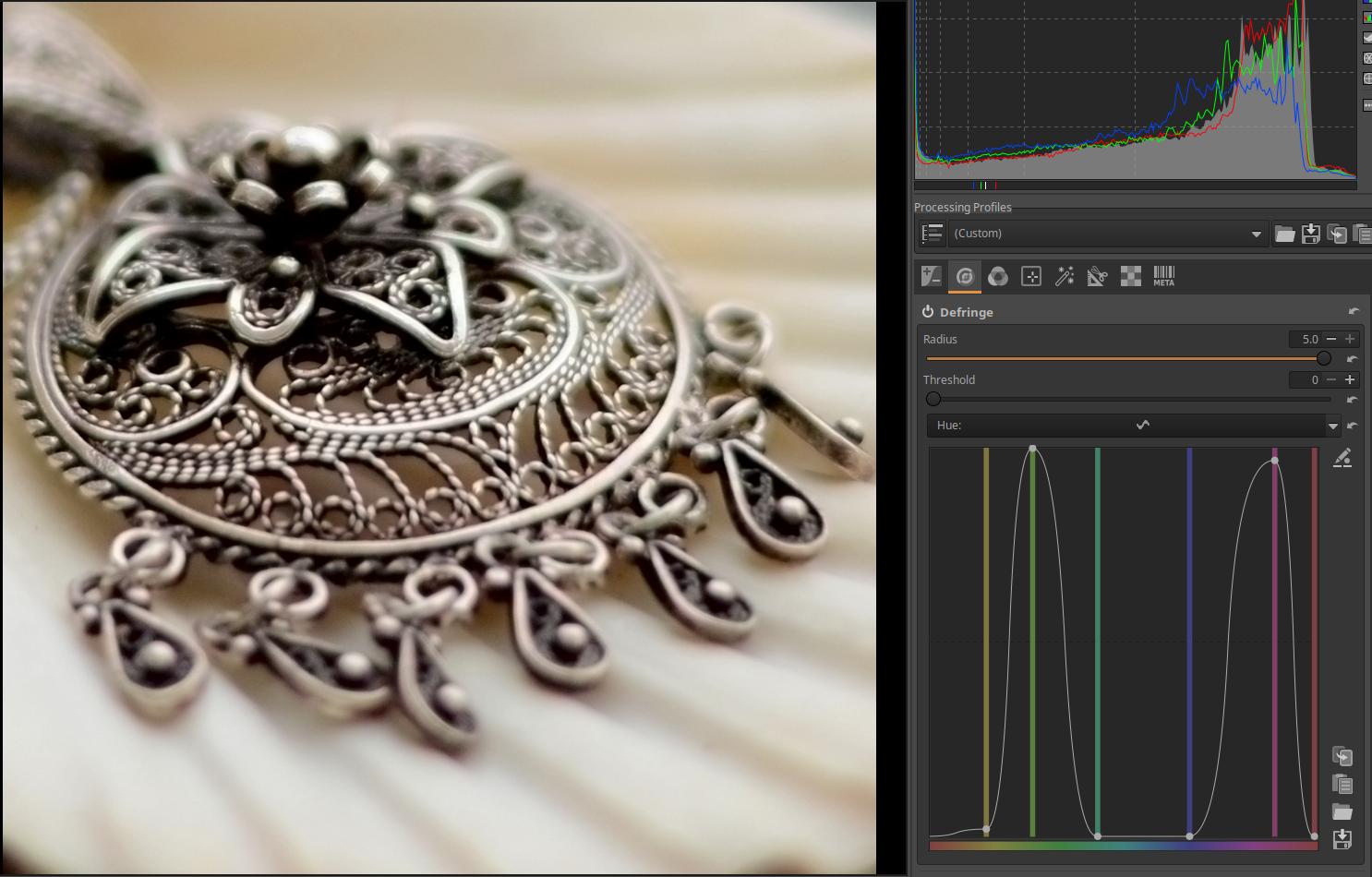
The settings shown in the figure significantly reduced the chromatic aberration, but the result is not perfect. With Radius set to maximum, Threshold set to zero, and Hue curve applied, the green and purple chromatic aberration was significantly reduced.
4.3 Colors group
This group contains global editing tools related to adjusting the colors of the image.
Group editing tools:
- White Balance
- Saturation/Vibrance
- Channel Mixer
- Color Equalizer
- RGB Curves
- L*a*b* Adjustments
- Color Management
4.3.1 White Balance
It is located in the Colors tool group. By setting the white balance correctly, you can create color-correct images. Use this tool to set the correct white balance, and use other tools to modify the colors of the image for creative purposes.
When taking photos, the color of the light illuminating the subject is not always the same. For example, on a sunny summer morning, the light is warmer and redder than at noon, the light from a traditional incandescent lamp is also redder than the light from a flash, etc. We only get realistic colors in a photo if we adjust it appropriately to the color of the lighting. This correction is achieved by setting the white balance correctly.
By setting the white balance (WB) we compensate the colors when creating a JPEG image so that the neutral (not discolored) white or gray object in the image is also neutral white or gray, and we assume that then the other colors will also be true to life and we get a color-correct image.
The white balance setting affects all colors. The easiest way to tell if your white balance setting is incorrect is if a neutral white or gray object doesn’t look neutral, but rather appears discolored.
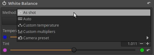
Method: The method used to determine white balance, which can be one of the following:
- As shot: Determined from the data stored in the metadata in the raw file. “Stored” refers to the white balance as set in the camera at the time the shot was taken.
- Auto: Automatically estimates the coefficients of each color channel by analyzing the image data.
- Custom temperature: You can set a custom color temperature and hue using the Color Temperature and Hue sliders, and/or using the eyedropper tool by clicking the Select button. To set the correct white balance, you need to sample a neutral white or neutral gray area of the image. You can select the size of the sampled area from the Size drop-down list. When you sample the image, the Method automatically changes to Custom temperature.
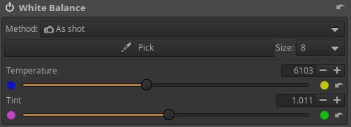
Remember that when you adjust the Temperature slider, you are adjusting the color temperature of the light illuminating the subject, and ART will adjust it as if we were trying to get real colors. So if you adjust in a colder direction (towards a higher color temperature), you will get warmer tones, and vice versa.
The Tint slider can be used to adjust towards magenta and green colors.
- Custom Multipliers: Using the three RGB sliders, you can directly set the multiplier values for each color channel.
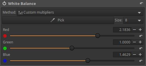
- Camera preset: You can choose from the camera’s predefined color temperatures.
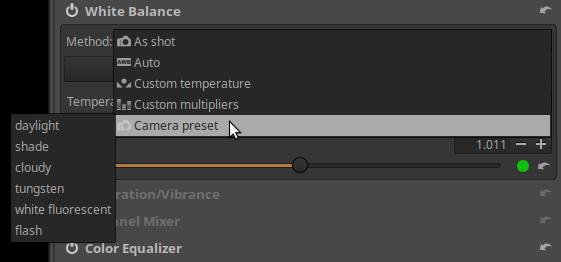
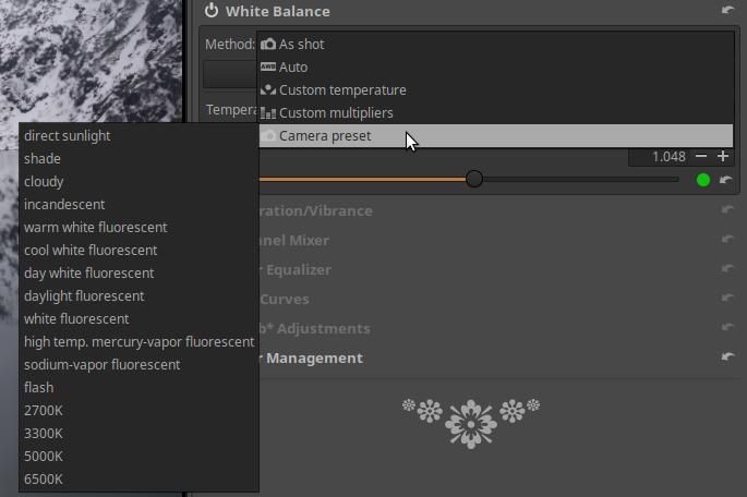
As you can see from the two images above, the options available vary depending on the camera model. You can find the predefined color temperatures for your camera model in the camera’s user manual.
4.3.2 Saturation/Vibrance
It is located in the Colors tool group. You can adjust the saturation of the hues using it.
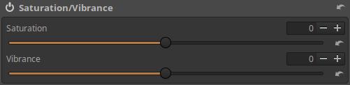
Saturation: Changes the saturation equally for all colors.
Vibrance: Changes the saturation of less saturated colors more strongly than colors that are already saturated.
4.3.3 Channel Mixer
It is located in the Colors tool group. You can choose between RGB matrix and Primaries correction.
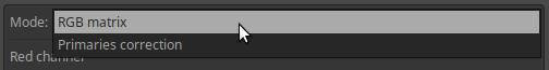
4.3.3.1 RGB Matrix
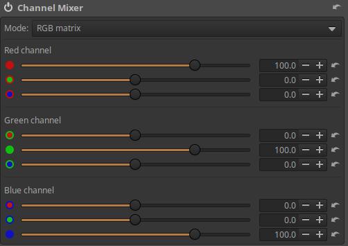
The RGB matrix mixer generates new R, G, and B values for each pixel in the image using the pixel’s original R, G, and B channel values and the percentage values set on the sliders.
The Channel Mixer has three sections: Red Channel, Green Channel, and Blue Channel. In the Red Channel section, a new Red (R) channel value is created for a given pixel from the pixel’s original R, G, and B values. The Red, Green, and Blue sliders control the proportion of the pixel’s original R, G, and B values that make up the pixel’s new R value. In the Green Channel and Blue Channel sections, the new G, and B values are created in a similar way.
We can observe that
- if we move the sliders in the Red channel section to the right, the image will become redder, if we move it to the left, it will become more cyan blue,
- if we move the sliders to the right in the Green channel section, the image will become greener, if we move it to the left, it will become more magenta,
- if we move the sliders to the right in the Blue channel section, the image will become bluer, if we move it to the left, it will become yellower.
This is not a very user-friendly method because it is far removed from the way we perceive colors. People don’t think about colors in color channels.
4.3.3.2 Primaries Correction
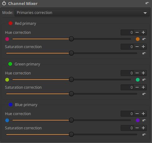
We can adjust the hue and saturation of the Red primary, Green primary, and Blue primary. We can change the hue towards the adjacent secondary colors, and we can adjust the saturation for each primary color. This allows us to modify and adjust the colors of the image.
In ART, changes are made in linear RGB space during editing. In the Colors tool group/Color Management tool, we can also see that the Working Profile is Rec.2020, which is a very wide color gamut color space.
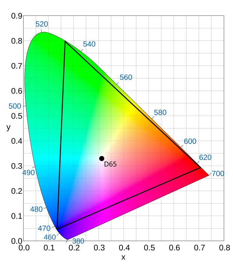
The figure above shows the Rec.2020 color space. The three primary colors (red, green, blue) are located at the vertices of the triangle, which are called primary colors. In different color systems, including the Rec.2020 color system, the coordinates of the white point, the red, green, and blue primary colors are precisely defined. By modifying the primary colors, we can move the vertices of the triangle along the sides of the triangle, and thus the colors located inside the triangle also change. We can move the Red primary toward magenta or yellow, the Green primary toward yellow or cyan (greenish blue), and the Blue primary toward cyan or magenta.
4.3.4 Color Equalizer
It is located in the Colors tool group. You can change the hue, saturation, and/or lightness of selected colors in an image using adjustment curves.
It contains three flat curve editors that work exactly the same.
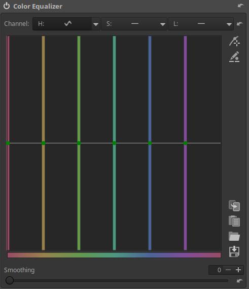
Channel: We can see three Flat curve editors that work in exactly the same way, which change the colors and lightness of the image according to the three channels of the HSL color system (Hue, Saturation, and Lightness). The input colors can be seen at the bottom. We can turn off each curve by opening it next to its name, or we can select the Equalizer option, which will display the curve editor. The neutral position of the curve editors (when they do not change anything) is the middle horizontal line.
H curve: We can change the hue of the areas of the selected hue below. If we drag the curve down or up above the selected color, we can set different output hue. This way, we can change the color of certain colored areas of the image.
S curve: You can change the saturation of the hue selected below. If you drag the curve downwards above the selected hue, the saturation decreases, and if you drag it upwards, the saturation increases.
L curve: We can change the lightness of the hue selected below. If we drag the curve downwards above the selected hue, the lightness decreases, and if we drag it upwards, the lightness increases.
The three types of curves are completely independent of each other, and we can even use all three at the same time.
Smoothing: Blurs the edges of the affected areas, higher values result in more blur.
4.3.5 RGB Curves
It is located in the Colors tool group. It allows you to apply a tone curve to each RGB channel separately.
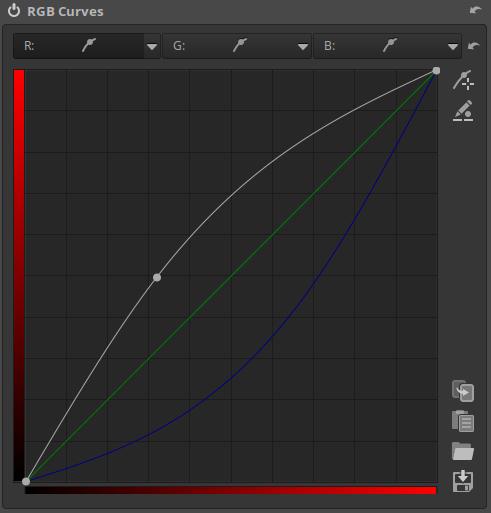
The editors for all three channels (apart from the color of the color scales) are completely identical. In the figure above, we can see the curve editor for the Red channel. The curve that appears in white belongs to the channel that is currently being edited (red in the figure), the other two colored curves (green and blue in the figure) are the curves created in the other two channel editors. In all three curve editors, we also see the curve created in the other two.
4.3.6 L*a*b* Adjustments]
It is located in the Colors tool group. It works in the L*a*b* (L*: Lightness, a*: Green-Magenta, and b*: Blue-Yellow) color system. The L*a*b* color system often has fewer side effects than the RGB color system, which is why it is used. The reason for the fewer side effects is that the L*a*b* color system treats lightness (luminosity) and color separately.
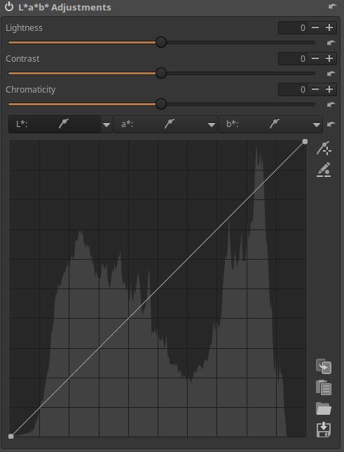
Lightness: This slider applies a tone curve to the L channel of the L*a*b* color space. The black point and white point do not move.
Contrast: This slider increases or decreases the contrast of the image, also affecting the L channel.
Chromaticity: This slider increases or decreases the color of the image by applying a contrast curve to the a* and b* channels of L*a*b* space. Setting this slider to -100 removes all color, making the image black and white. However, the recommended way to convert an image to black and white is to use the Black-and-White tool in the Special effects group.
L* curve: This is actually a tone curve. The curve determines the output tones based on the input tones of the image.
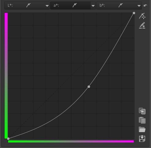
a* curve: The curve can be used to determine the output values of the a* channel depending on the input values of the a* channel.
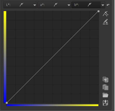
b* curve: The curve can be used to determine the output values of the b* channel depending on the input values of the b* channel.
4.3.7 Color Management
Here we can set the Input Profile, Working Profile, Output Profile, and Rendering Intent.
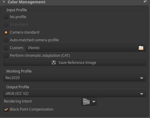
Input Profile
An essential step in raw processing is to convert the camera sensor data into ART’s internal RGB color space (the Working Profile). This conversion requires an input profile specifically designed for that camera. Such a profile is the result of an analysis of how specific colors and tones are captured, processed, and represented as raw data by that camera. Without a camera-specific input profile, accurate color representation is impossible.
No profile: No color conversion occurs, do not use this for editing.
Embedded: Only available for non-raw files. Uses the color profile embedded in the image file, if available.
Camera Standard: Uses a simple, predefined, compromise color matrix that depends on the camera type. If this is checked, the option to enable “Perform chromatic adaptation (CAT)” will appear. (Chromatic adaptation is the ability of human vision to adapt to changes in lighting while maintaining the perception of the color of objects. For example, a white sheet of paper is perceived as white even in the light of sunset.)
Auto-matched camera profile: ART includes several high-quality, custom-created, general-purpose DCP profiles that can be automatically matched when a supported camera raw file is opened. The matching only works with the exact camera name (case-sensitive) as found in the raw file metadata. This is more accurate than the Camera Standard profile. It can only be selected if available.
Custom: Select a custom DCP or ICC camera input profile. Select this if Auto-matched camera profile does not work or if you want to override the Camera Standard or Auto-matched camera profile.
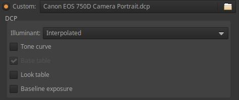
If selected, the setting options shown in the figure above will appear:
Illuminant can be:
- Interpolated: Calculates based on the selected white balance if the white balance is between 2850 K and 6500 K, otherwise the closer of the two is selected. This is the default mode and usually does not need to be changed.
- 2850K: The subject is illuminated by a traditional incandescent lamp or an LED light source with this color temperature and good color fidelity.
- 6500K: The subject is illuminated by sunlight.
Tone curve: DCP profiles can include a tone curve, which can be used to add contrast and brightness for a film-like look. This is mainly used for profiles that produce a preview similar to a JPEG image created by the camera. It can only be enabled if the profile includes a tone curve.
Base table: This allows the use of the DCP “HueSatMap” table, which is used to add nonlinear corrections on top of the base matrix. Normally left on. This cannot be enabled if the HueSatMap table is missing from the loaded profile.
Look table: This allows you to apply the DCP “LookTable” table, which is intended to provide a subjective look, usually in conjunction with an embedded tone curve. Leave it enabled.
Baseline exposure: This is an exposure compensation that is usually intended to match the brightness of the preview image to the brightness of the camera’s JPEG image. This is applied “under the hood” and is not visible on the exposure compensation slider. Cameras tend to underexpose on purpose, and Base Exposure is used to compensate for this.
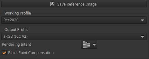
Let’s look further at the possibilities:
Save Reference Image: Clicking this button will save a linear TIFF image before the input profile is applied. This saved file can then be used to create a camera input profile. The open source ArgyllCMS program can be used to create ICC profiles, and DCamProf can be used to create ICC or DCP profiles.
Working Profile: The default Working Profile of ART is linear Rec2020. Do not change it for normal use.
Output Profile: We can select the output color profile. Before saving, the processed image is converted to this color space and the profile is embedded in the metadata. There are two types: ICC v2 compatible and v4 compatible. The default Output Profile of ART is sRGB (ICC V2).
Rendering Intent allows you to choose how ICC profiles are used to convert between ranges or color spaces. For example, at the end of the process, the image data (from the source color space) should be placed into the monitor profile color space (target) for correct display. Or, in the case of a printer (in the Soft-Proofing section), the source is the end-of-process image data and the target is the color space of the selected printer profile.
The Rendering Intent can be one of the following:
- Perceptual: Colors from the source that are outside the target color space are compressed into the destination color space, affecting colors in the gamut as well. The way the compression is done depends on the gamut mapping in the color profile, and usually involves some de-saturation and sometimes even hue shifting. The Perceptual intent only works with LUT profiles that include the necessary gamut mapping tables (most ICC profiles do not), and in such cases the Relative Colorimetric intent is actually used instead (this is the default behavior for most software).
- Relative Colorimetric: Source colors that are outside the gamut of the target color space are displayed as the closest color within the gamut, without affecting colors within other gamuts. The white point is corrected. This is the default setting and works with all profiles.
- Saturation: This is very similar to Perception Intent, except it subtly increases saturation to compensate for the decrease in saturation.
- Absolute Colorimetric: Similar to Relative Colorimetric, but the white point will not be corrected. Therefore, it is used when you want to match the whiteness of the paper to the screen. It may be useful when making proofs, but not otherwise.
Black Point Compensation: This is a good option to enable to avoid clipping. When enabled, the black point level of the output image is set to the black point level of the input image during color conversion (e.g. from a working profile to a display profile). This means that only the luminance channel is compressed or expanded. This feature preserves detail in the shadows (avoiding dark areas without detail), at the expense of color accuracy.
4.4 Local editing group
The Local Edit tools differ from the global tools in other groups in that you can use masks to change specific parts of the image, not just the entire image. If you don’t create a mask, the tools in the Local editing group act as global tools that affect the entire image.
Since these editing tools can also be used as global tools, I always write about changing the “image”, but if we have created a mask, then of course the change only happens in the area of the mask. So I don’t write in each case whether it is “in the image or in the area of the mask”.
Group editing tools:
- Color/Tone Correction
- Smoothing
- Local Contrast
- Texture Boost/Sharpening
In the Color/Tone Correction tool, we also have the option to apply CTL scripts.
4.4.1 Masks overview
Let’s look at the effect of a mask on a simple example.
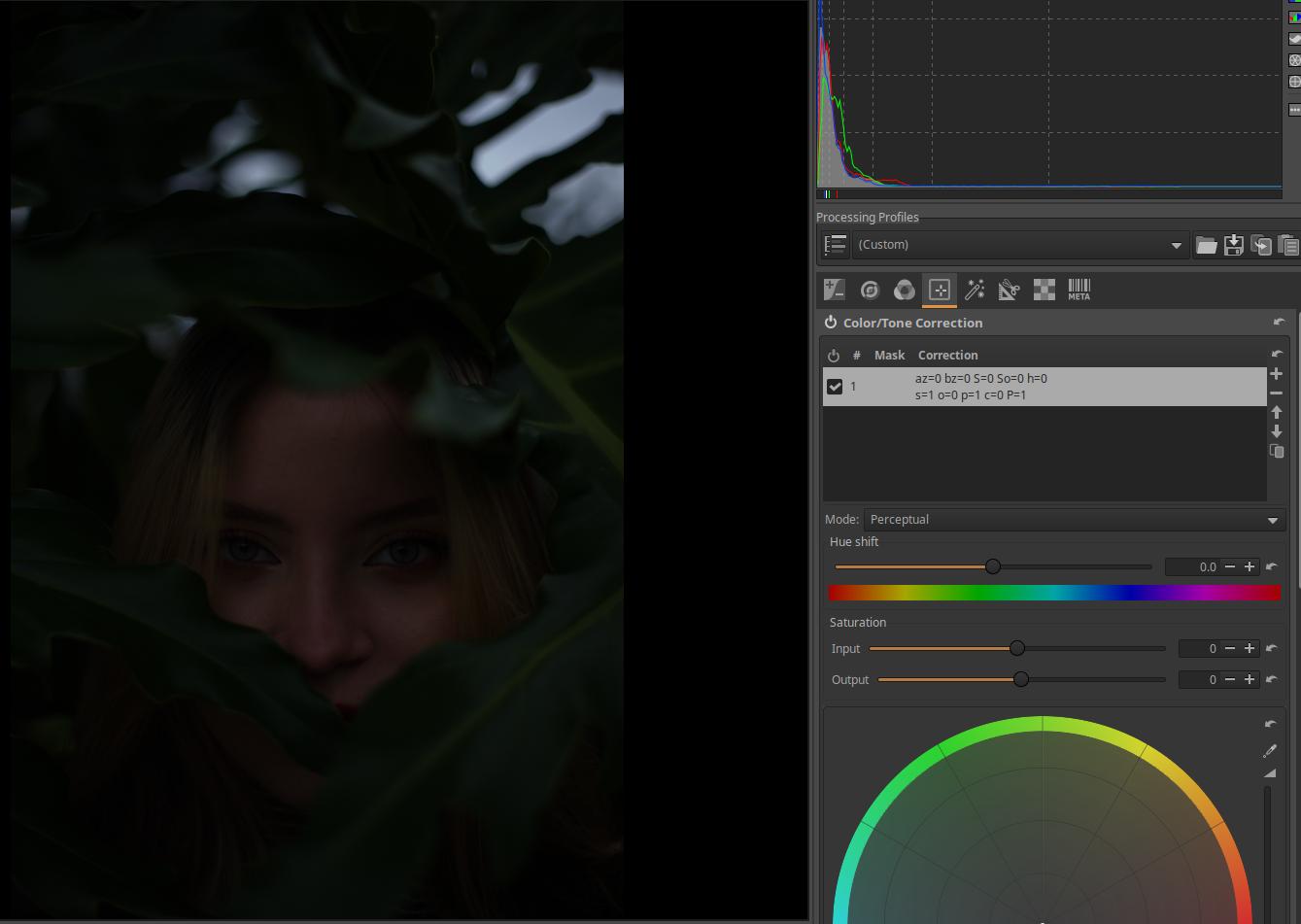
In the image shown above, we only want to brighten the model’s face with Exposure Compensation, leaving the other areas dark.
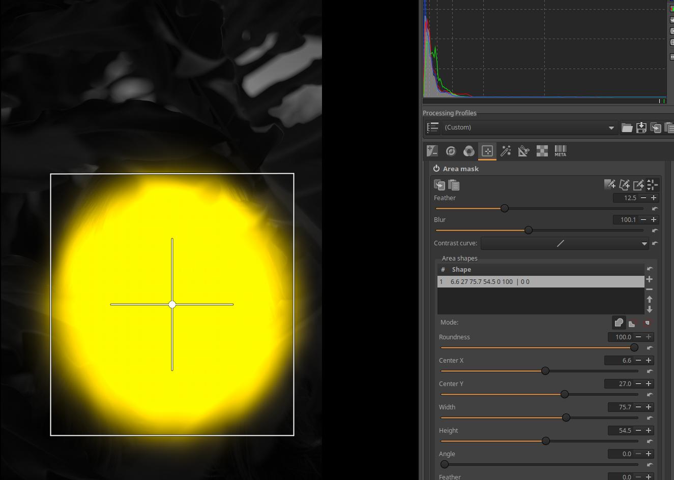
We create an Area Mask on the model’s face, with Feathering and Blur. Because of the mask, the Exposure Compensation CTL script in the Color/Tonal Correction tool within Local Edit only applies to the area of the mask, and the Feathering and Blur cause the Exposure Compensation effect to fade out very nicely at the edge of the mask. The mask appears yellow above the image. The gradual transition at the edge of the mask will cause the Exposure Compensation effect to fade out.
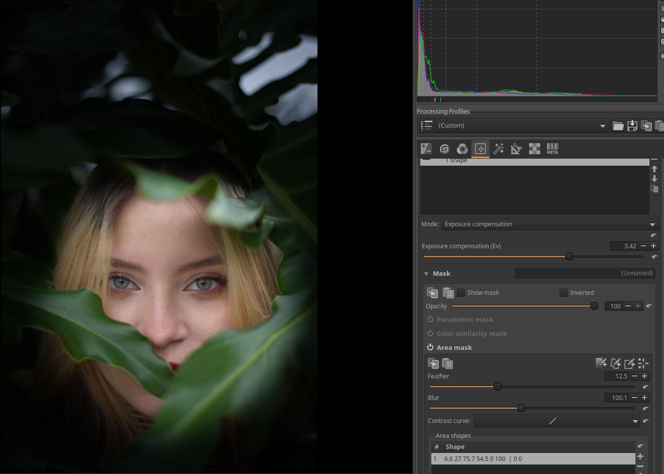
I set the Exposure Compensation to +3.42 stops. The result is shown in the figure above.
4.4.1.1 Adjustment Layers
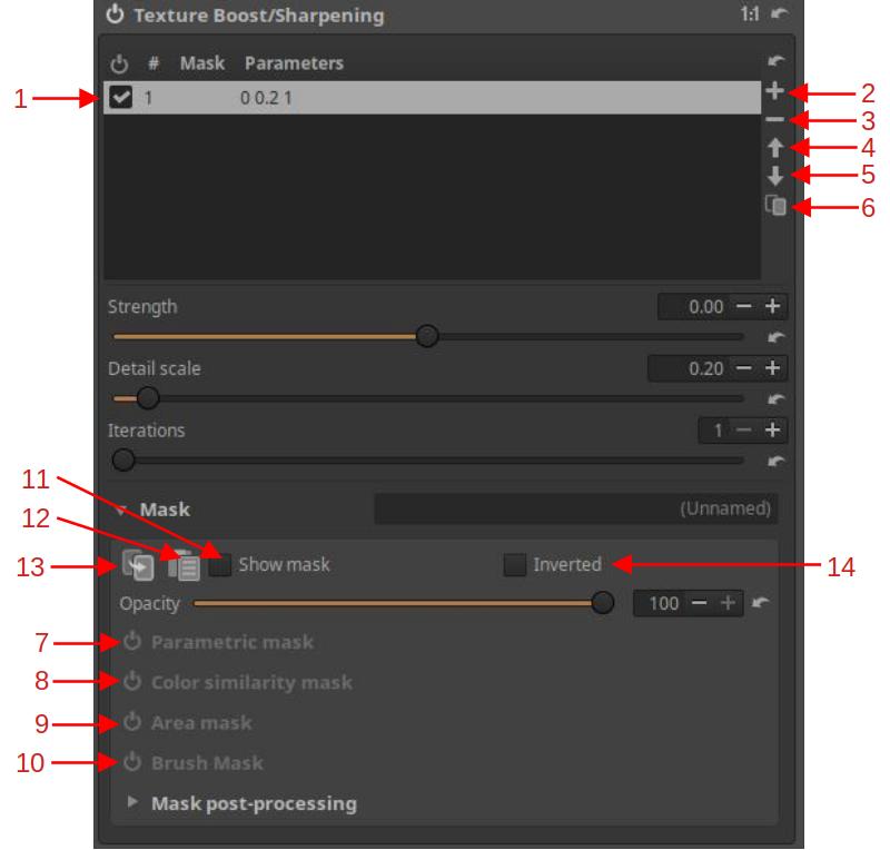
- List of Adjustment layers
- Add an Adjustment layer
- Remove selected Adjustment layer
- Move selected Adjustment layer up in the list
- Move selected Adjustment layer down in the list
- Create a copy of a selected Adjustment layer
- Parametric mask
- Color similarity mask
- Area mask
- Brush mask
- Show mask on/off
- Paste a mask from the clipboard
- Copy mask to clipboard
- Inverted mask
Below the editing tool header, you will find a list of Adjustment Layers. When you enter a local editing tool, an Adjustment Layer (1) is automatically created. You can select an adjustment layer (make it current) by clicking on it in the list.
- Each Adjustment Layer works independently of the others.
- The effects of multiple Adjustment Layers are added together.
- The Adjustment Layer affects the entire image, unless this effect is limited by one or more Masks.
At any time, you can add new Adjustment layers (2), delete the selected Adjustment layer (3), move the selected Adjustment layer up (4) or down (5) in the list, or create a copy of the selected Adjustment layer (6). You can also use the checkbox to turn the given Adjustment layer On/Off (1).
When you create a copy, the masks associated with the Adjustment layer are also copied.
There is no maximum number of Adjustment layers. Adjustment layers (and therefore masks) are processed in the order they appear in the list, from top to bottom. Different processing orders may produce different results, so the position of a given Adjustment layer in the list matters.
4.4.1.2 Masks
You can create any number of adjustment layers. We always create a resulting mask for the selected Adjustment layer using the four mask types. Each of the mask types can participate in the creation of the resulting mask (in which area of the image the tool should have its effect and to what extent).
- There are four types of masks: Parametric mask (7), Color similarity mask (8), Area mask (9), and Brush mask (10).
- Any Adjustment layer can apply any or all of the four types, but only one of each type.
Parametric Mask selects an area based on the hue, chroma, and lightness of pixels and/or the contrast of neighboring pixels.
The Color Similarity Mask selects pixels based on how similar they are to the selected reference color in terms of hue, chroma, and lightness.
Area Mask allows user-created shapes to be used to define the area of the mask. Any number of shapes can be created. The contrast, feather, and blur of each shape can be adjusted. Each shape can stand alone or overlap. Overlapping shapes can be set to add together to form a combined shape, or subtract, which means that the shape cuts out the area of the overlap, or they can form an intersection, which means that only the common part of the overlapping shapes, the overlap itself, is selected.
A Brush Mask is made up of one or more brush strokes. Each brush stroke can be added with different settings. There are also adjustment tools that allow you to adjust the characteristics of all brush strokes at once.
This implementation gives a lot of freedom. For example, with Area mask, any number of areas can be part of the mask, with Parametric mask, different properties of pixels can simultaneously select parts of the mask, with Brush mask, we can create any number of brush strokes, with Color similarity mask, areas of the image with similar colors can form the mask.
You can turn on/off the Show mask (11). You can copy the current mask to the clipboard (13) and, for example, paste it from the clipboard to another Adjustment layer (12). You can turn on/off the Inverted mask setting (14). If you turn it on, the mask will be inverted: the area that was not part of the mask will become part of it, the area where the tool had little effect will have a strong effect, etc.
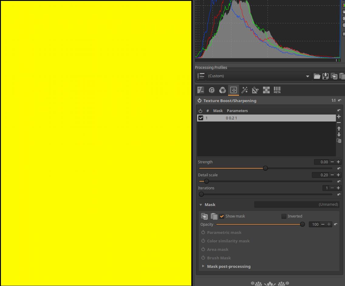
In the image above, the automatically created Adjustment Layer shown in the Adjustment Layer list has no mask type activated below it. In this case, the editing tool has its full effect on the entire image, i.e. it can be used as a global tool. If we then turn on the Show mask option, a yellow, opaque layer appears above the preview.
When you turn on Show mask, the preview turns black and white, and the mask appears in yellow. If only the yellow mask is visible (the mask is at maximum opacity), as in the image above, the tool will have full effect on the entire image. Where the image is visible from under the mask (the mask is somewhat transparent), the tool will only have partial effect, the more transparent the yellow mask, the less effective it will be. Where the mask is completely transparent and only the black and white preview is visible, the tool will have no effect.
To the right of the Mask label, you can also give the mask of the selected Adjustment Layer a name (the mask shown in the figure has no name (Unnamed)).
4.4.1.3 Parametric mask
The mask can be defined by limiting the Hue (H), Chroma (C), and Lightness (L) Flat curves. You can also create a Contrast threshold mask.
At the top, we can see the headers of the three Flat curve editors, namely the editors for the hue (H), chroma (C), and lightness (L) curves. They can be activated by opening them at the right edge and clicking on Equalizer. All three curves work independently of each other. Their linear state is a horizontal line at the top.
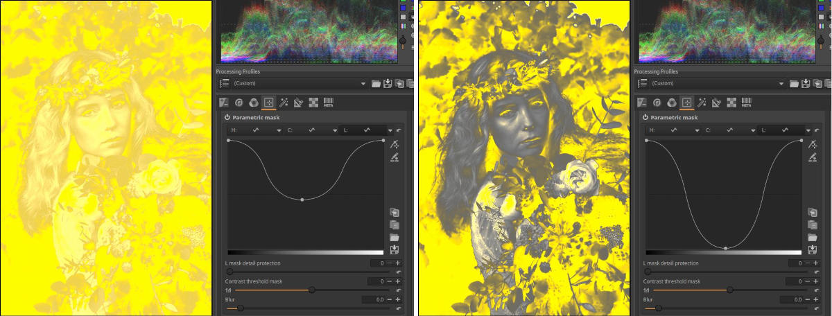
In the figure above we can see an L curve. The lower the input value, the more lightness is excluded from the mask. The further down the curve is, the more it is excluded. The amount of the reduction affects the opacity of the excluded area.
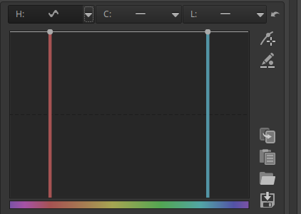
The figure shows the Hue (H) curve editor. Below we can see the input Hue, for which Hue we drag the curve down, that Hue or Hue range will be excluded from the mask.
The figure shows the Chroma (C) curve editor. Below we can see the input Chroma, for which Chroma we drag the curve down, that Chroma or Chroma range will be excluded from the mask.
The image above shows the Lightness (L) curve editor. It allows you to exclude a certain tonal range.
The mask itself can be influenced by the sliders shown in the figure above.
L mask detail protection: If we increase the slider value, more and more small details will be part of the mask.
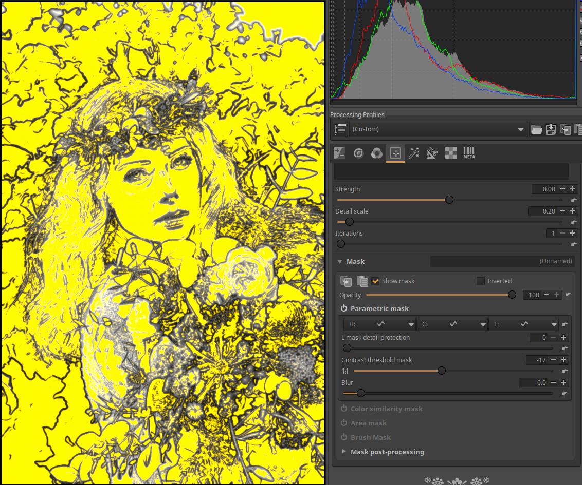
Contrast threshold mask: You can create a contrast threshold mask using this, which can be seen in the image above.
Blur: Adds a blur to the mask.
Let’s look at the application of a parametric mask.
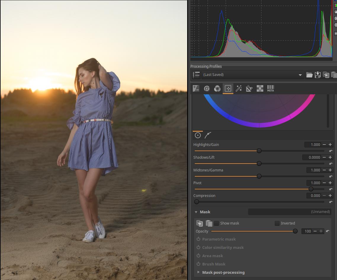
In the image above, we want to create a mask for the model’s clothes. Activate the Color/Tone Correction tool in the Local editing group, and then select the Parametric mask section.
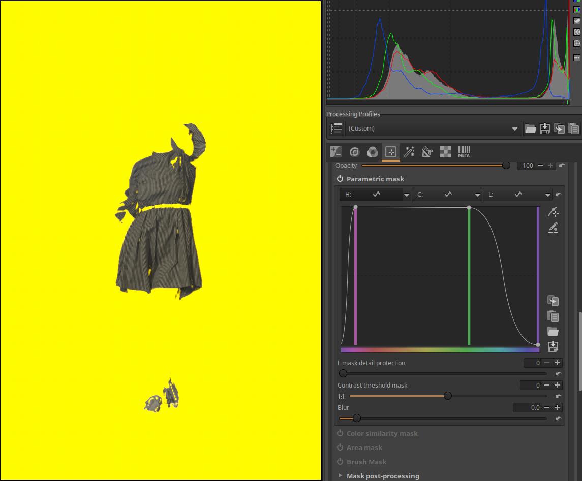
Turn on the Show mask, then the entire image will be covered by a mask. For the H (hue) curve, select the Equalizer option and try to exclude the dress from the mask. First, we try to create a mask for the other image elements except the dress. To do this, we need to exclude the blue and the colors around it. You can see the curve in the figure above.
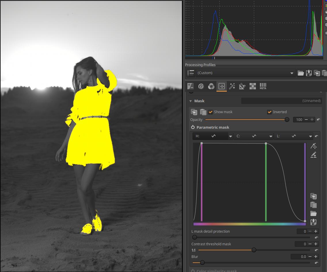
Check the Inverted checkbox next to Show Mask. This will invert the mask. You can still see some yellowish discoloration on the background and the model’s legs. If you drag the two control points at the top to the right and left, the discoloration will disappear.
The model’s shoes have also become part of the mask, which can be removed with a brush mask. You can see this in the Brush Mask section.
Let’s look at the picture below.
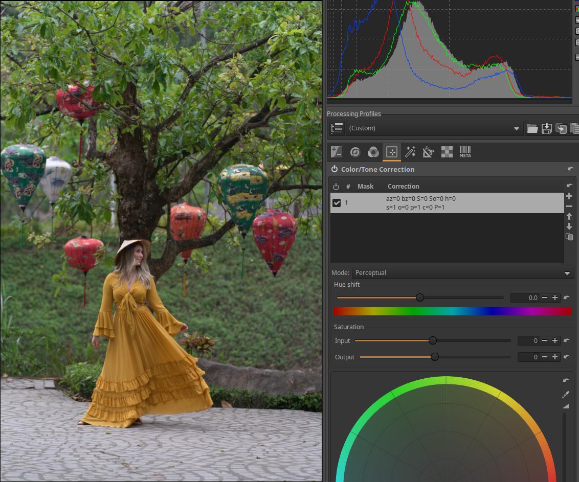
We want to create a mask for the model’s clothes using Parametric Mask.
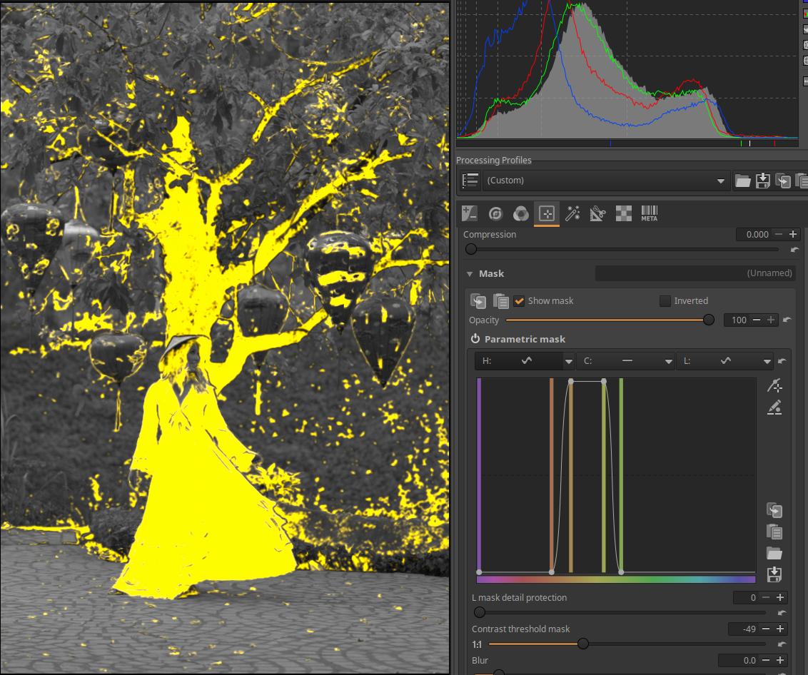
Enable the Color/Tone Correction tool in the Local editing group. Within this, enable Parametric mask and turn on Show mask. This will cover the entire image with a mask that is not transparent at all. Open the H (hue) curve editor and try to limit the colors so that only the clothes form the mask as much as possible. In the image above, we can see that we cannot achieve this completely.
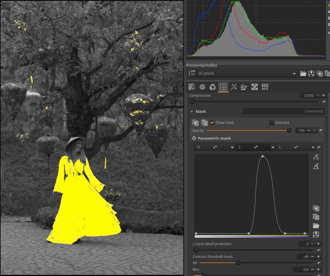
Open the C (Chroma) curve editor and use the curve to limit the area outside the cloth to be part of the mask. You can see the result in the image above.
This is not good enough, it needs to be refined. If we surround the model with an area mask, the parts outside the area mask will not be part of the mask. We can also see this in Area Masks.
4.4.1.4 Color similarity mask
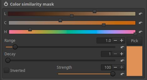
Color Similarity Masks are based on the similarity of image pixels to a selected reference color.
Pick: After pressing this button, you can select the reference area by clicking on the appropriate point in the preview, in which the pixels of the image will be compared to the characteristics of the pixels.
The L, C, H, and Range sliders shown here allow us to refine how closely a pixel must match the reference area to be part of the mask. In other words, we can refine how much of a difference from the reference color a pixel can be allowed to be in the mask.
L, C, and H sliders: L, C, and H refer to the LCH color system. The L, C, and H sliders each represent two independent sliders. There is an upper slider that adjusts the L (Lightness), C (Chroma), and H (Hue) values, respectively. The lower sliders add a weight (importance level) that controls how much weight the upper slider value is given in calculating the mask. The weight slider will be more permissive at values to the left (larger deviations will be tolerated, resulting in a larger mask area), and more restrictive at values to the right (smaller deviations will be tolerated, resulting in a smaller mask area).
You can also follow the setting visually on the sliders. If you move the lower slider to the far left, the slider color will turn black, and whatever value you set on the upper slider will not be taken into account when calculating the mask. The further you move the lower slider to the right, the more it will take into account the value set on the upper slider, and the colors shown on the slider will appear brighter.
Range: If the Range slider is set to a higher value, a larger deviation from the reference will be allowed, therefore a larger area will be part of the mask, and vice versa.
Decay: This allows you to adjust the width of the transition between the masked and unmasked areas. Lower values provide a larger transition area and a smoother transition, while higher values make the transition more abrupt and less gradual.
Strength: Sets the opacity of the mask and thus the strength of the editing tool’s effect.
Inverted: Checking this will reverse, invert the Color similarity mask.
Applying a color similarity mask:
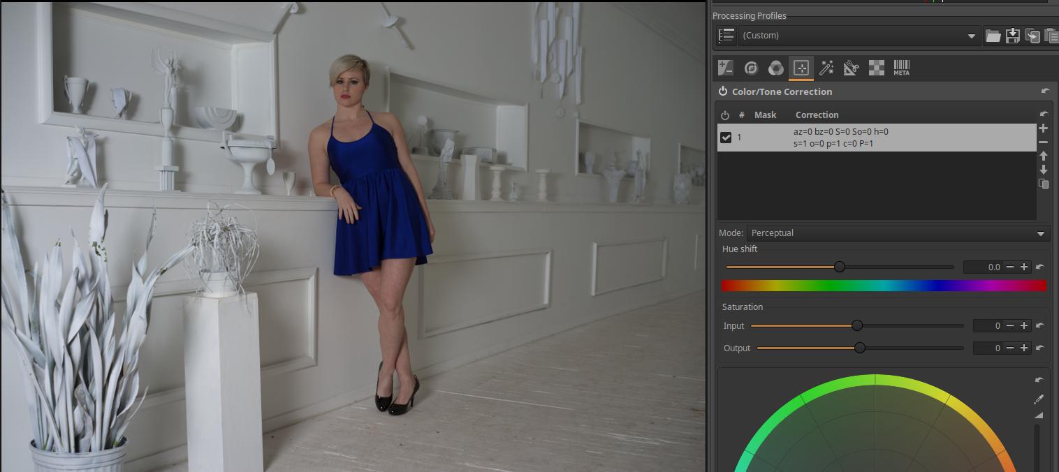
We have opened the image shown in the figure above for editing. Our goal is to change the color of the model’s clothing using a mask. In this image, we can easily do this because the colors of the other image elements are very different from the color of the clothing, so it is easy to apply the Color similarity mask, which is based on selecting areas of similar color. In our example, we will create a mask on the clothing so that the color change only applies to the clothing.
In the Local editing group, turn on (activate) the Color/Tone correction tool, click on its name to open it, and the controls will become visible. The Mode should be Perceptual. You can see that we already have an Adjustment layer. We will now create a mask for this.
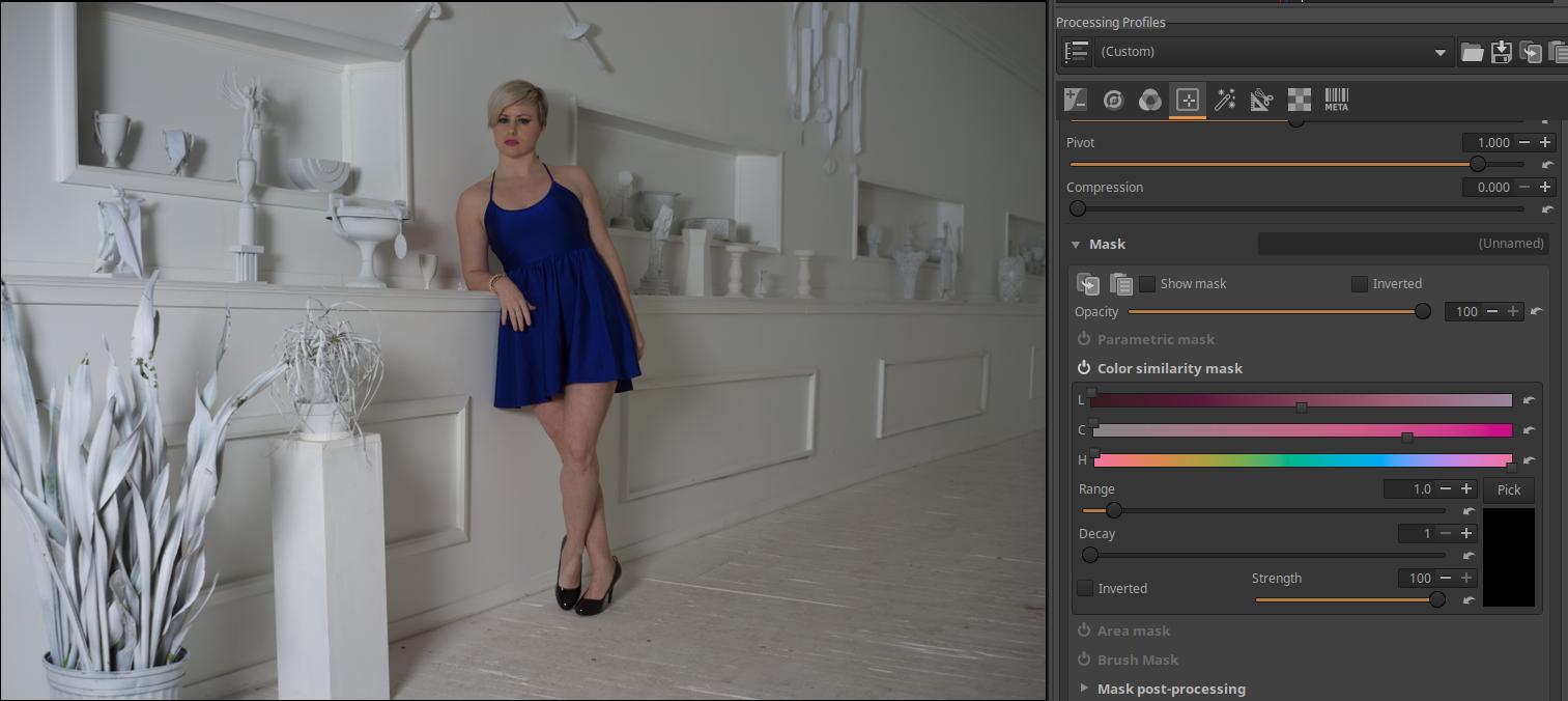
We need to scroll down and open the Mask section. Then we need to turn on the Color similarity mask and then open it by clicking on its name.

Next, we need to click the Pick button. We move the mouse over the area of color we want to change, which in our example is the model’s dress, and then click the mouse. The selected color will then appear in the rectangular area below the Pick button.
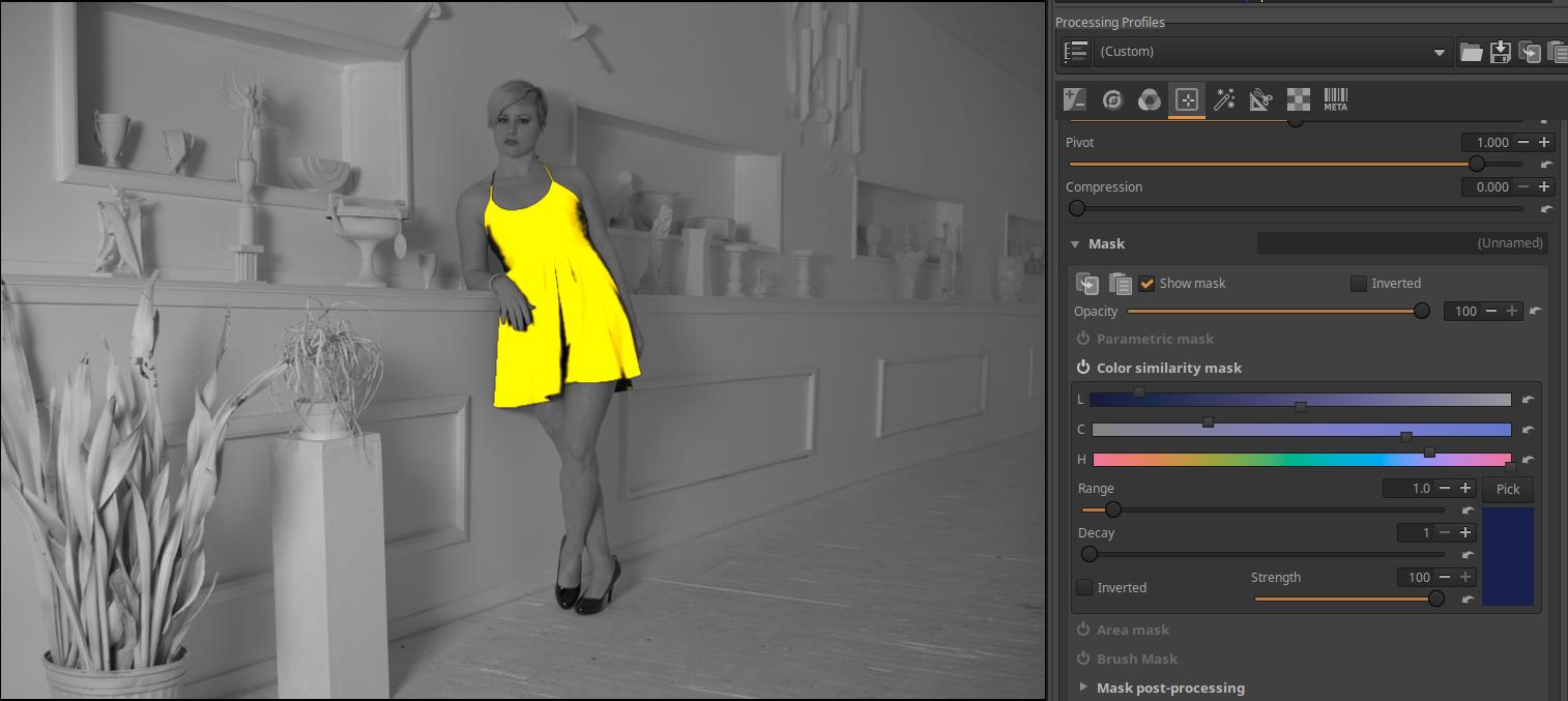
We can see that the color has actually appeared. Let’s turn on the Show mask. Then the preview will be grayscale, and the yellow mask will appear. Where we see yellow, the tool will have an effect on the image. The tool will have its full effect on the opaque yellow parts (the grayscale image does not show through the yellow mask at all), the more the grayscale image becomes visible, the less the effect of the tool will be. We can see that the selection is not very good, because we want the mask to completely cover the dress, since we want to change the color of the entire dress. The problematic parts are where we see black parts on the dress at the edge of the yellow mask. We can correct this problem with the Range slider. With this slider, we tell the program how much the color in the image that should still be part of the mask can differ from the selected color. The default value is 1, but this should obviously be increased because we need to include areas with a greater difference in the mask in order to include the black areas next to the mask as well. If we increase the Range too much, the yellow color of the mask will also appear in other areas outside the dress. If we then start to decrease it, the last thing we can see outside the dress is the black shoes. We need to decrease it until the yellow color just disappears from the shoes (it should no longer be part of the mask). Here, we need a mask with a sharp boundary, since we want the entire dress to be covered evenly by the mask, but nothing else should be part of the mask.
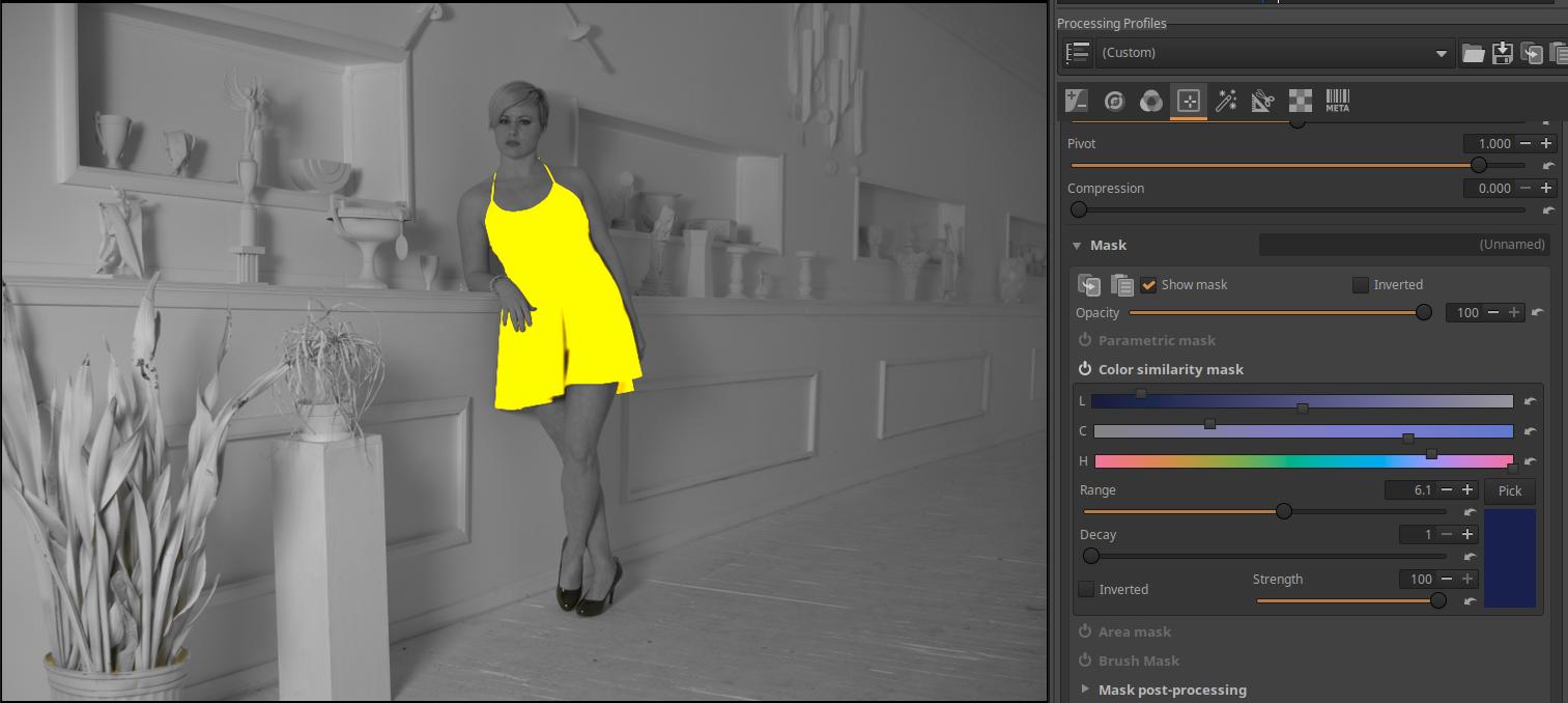
This made it much better, we had to increase the Range value to 6.1. If we looked at it in a larger size, we would probably still find differences in the accuracy of the mask. Of course, there are tools to refine the mask, for example, you could refine it with Brush mask, but I won’t go into details about that now.
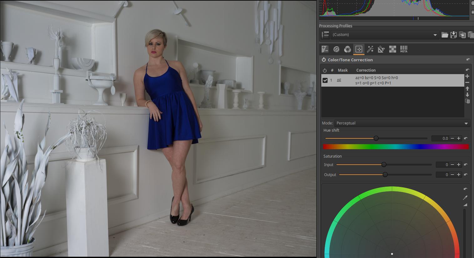
Turn off the Show mask and you can see the model in a blue dress again. You can change the color of the dress using the Hue shift slider. Its default value is 0. Because of the mask, the Hue shift slider only has an effect on the mask area, and has no effect outside of it. In the figures below, I have indicated the value of the Hue shift slider that resulted in the color shown in the image.
Color Offset: -32.7
Color Offset: -150
Color Offset: -180
Color shift: 25.8
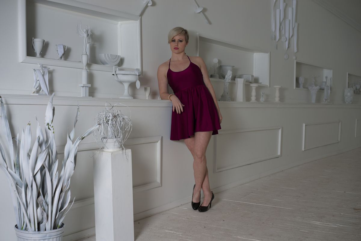
Color Shift: 86.8
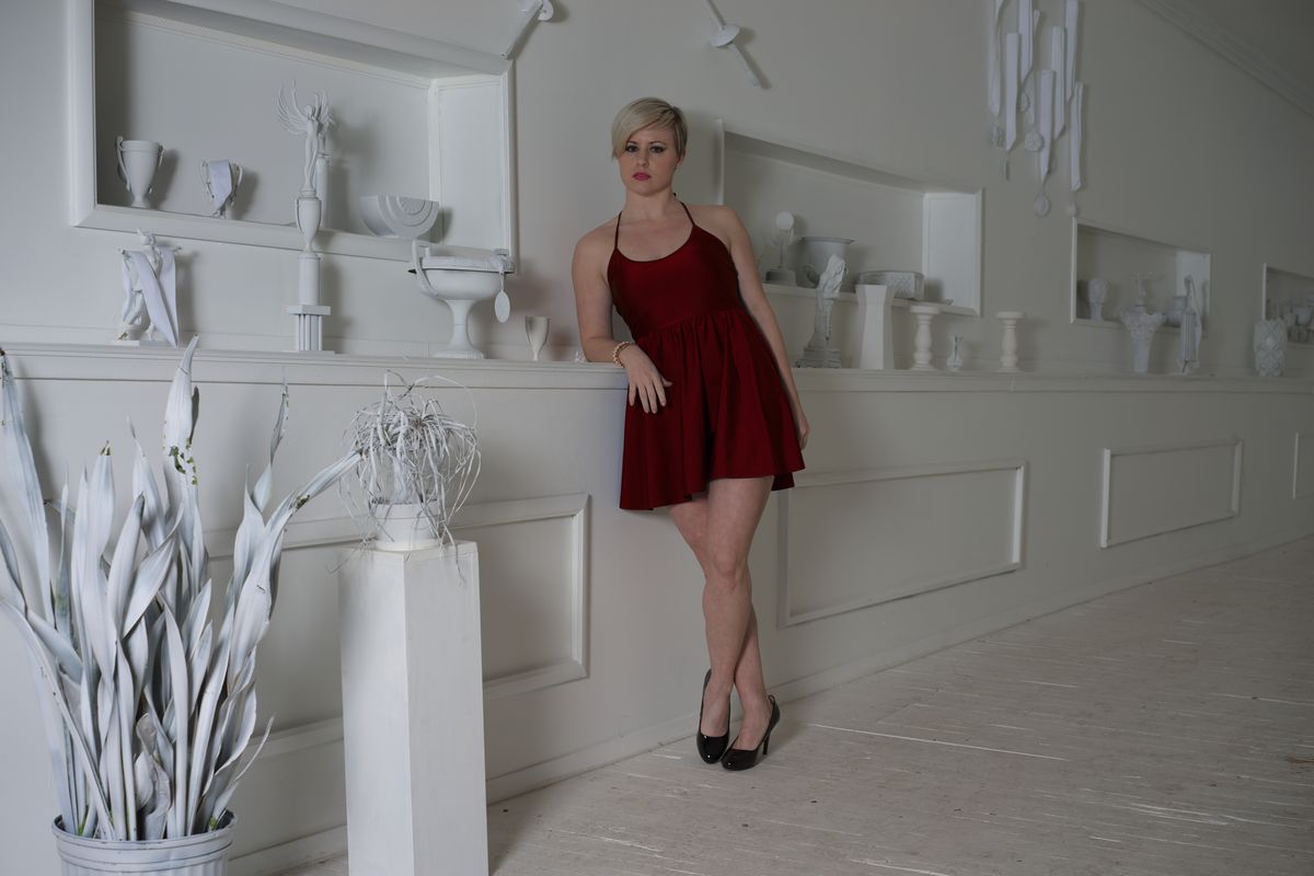
Color Offset: 123.4
Of course, we can change not only the color of the clothes, but also other properties. We can apply exposure compensation, change saturation, adjust contrast, etc.
4.4.1.5 Area mask
You can create a rectangular, elliptical, circular, curved, polygonal, or gradient mask with it.
Feather: You can add feather to all created shapes.
Blur: We can add a Gaussian blur to all created shapes.
The Feather and Blur sliders that appear below the list of shapes only affect the selected Shape, not the others.
Contrast Curve: We can make adjustments to the mask using a simple contrast curve. The effect is best seen when the mask is not only completely transparent and completely opaque, but also has areas of intermediate opacity.
Shape: List of shapes. Here you can see the shapes you have created.
A shape can be selected (made current) by clicking on it in the list.
Next to the shape list, we see buttons to the right, whose functions from top to bottom are as follows:
Reset: Deletes all created shapes.
+: Add a new shape.
-: Remove the selected shape.
Up arrow: Move a shape up in the list.
Down arrow: Move a shape down in the list.
Mode: (from left to right) Add, Subtract, or Intersect (common part).
At the top right we can see four buttons, the functions of which, from right to left, are as follows:
1. Displays the current shape in the preview, which can also be edited.
2. Add a rectangular shape by drawing on the preview. Rectangular shapes can extend beyond the preview boundaries as much as you like.
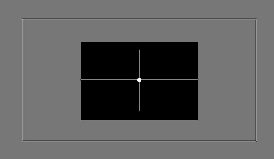
The black area is the edited “image”, and the white rectangle is the shape that extends well beyond the preview boundaries.
3. Create a polygonal shape in the preview by adding points. Polygonal shapes can extend beyond the preview boundaries as much as desired.
- Add a transition.
4.4.1.5.1 Add, edit rectangle
Click the second button from the right (number 2 in the list above) and use the mouse to draw a rectangle on the preview.
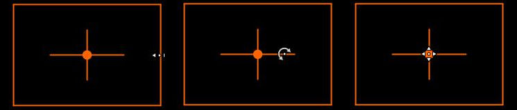
You can drag the sides of the shape with the mouse. Opposite sides move simultaneously and symmetrically.
You can rotate the rectangle around its center by dragging one of the two lines through the center with the mouse.
You can move the rectangle to any location by holding the center of the rectangle with the mouse.
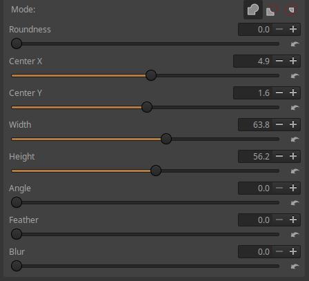
Roundness: If we increase its value, the corners of the mask will become increasingly rounded, and at the maximum value of the slider, 100, we will get an ellipse. If our shape is square, the final result will be a circle instead of an ellipse.
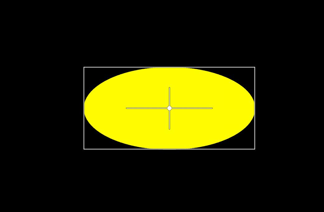
The elliptical mask obtained with a roundness value of 100 is shown in the figure above. As you can see, the shape itself will not be elliptical, only the mask will be.
The position of the shape in the preview, the width and height of the rectangle, and its rotation can be adjusted not only with the mouse, but also with sliders.
Center X: Moves the center of the shape horizontally.
Center Y: Moves the center of the shape vertically.
Width: You can set the width of the rectangle.
Height: You can adjust the height of the rectangle.
Angle: You can set the angle of rotation around the center of the shape.
Feather: Add feather to the selected (current) shape.
Blur: We can add a Gaussian blur to the selected (current) shape.
4.4.1.5.2 Add, edit polygon
For this part I used Jean-Christophe Frisch’s writing.
It can be used to create a mask bounded by a polygon or a curved line.
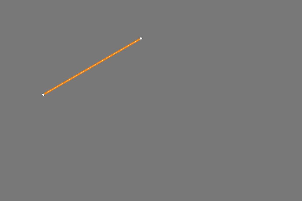
Let’s start creating the polygon. Click on the Create Polygon button. The rightmost button for displaying and editing the shape will also be active. This should remain active as long as you are editing the shape. Position yourself on the preview and Ctrl + click to create the first point. In the figure above, this is the leftmost point. Then position yourself on the second point and Ctrl + click to create the second point. You should now see what you see in the figure. The white line is dashed because there is no shape yet (there must be at least three points). An orange line has also appeared, which we call the Insertion Line. The two points at the ends of the orange line indicate the ends of the Insertion Line. The default location of the Insertion Line is between the last and first points of the shape, which closes the shape.
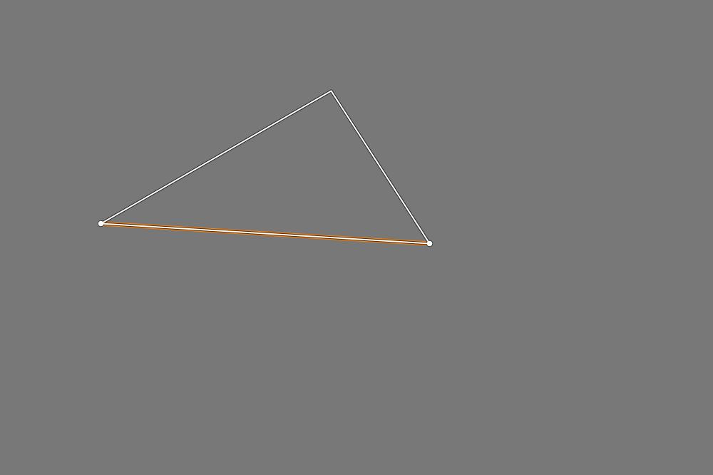
If we now create another point outside the shape by Ctrl + clicking, the two lines created will indeed connect to the endpoints of the Insertion Line shown in the previous figure. We can see that the white line has changed to a solid line, and the shape has been created. The shape created with the solid line will be the boundary of the mask.
If we create a point outside the shape again by Ctrl + clicking, it will again be connected to the two ends of the Insertion Line shown in the previous figure (between the last and the very first point).
If you hover over any side of the shape with the mouse pointer, that side becomes the Insertion Line, and you can create a new point on it by Ctrl + clicking.
If you hover over a point with the mouse pointer, the point will turn orange and that point will become the current point. You can grab any point with the mouse and move it to any location. You can delete the current point by pressing Ctrl + right-clicking on it. You cannot delete the last three points, only the entire shape can be deleted by clicking the “-“ button next to the Shape List.
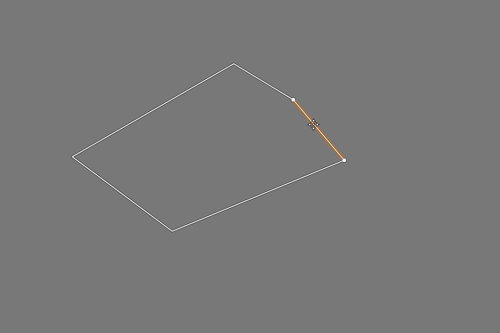
You can grab any side of the shape with the mouse and move it as you like. If you also hold down the Shift key, you can move the entire shape.
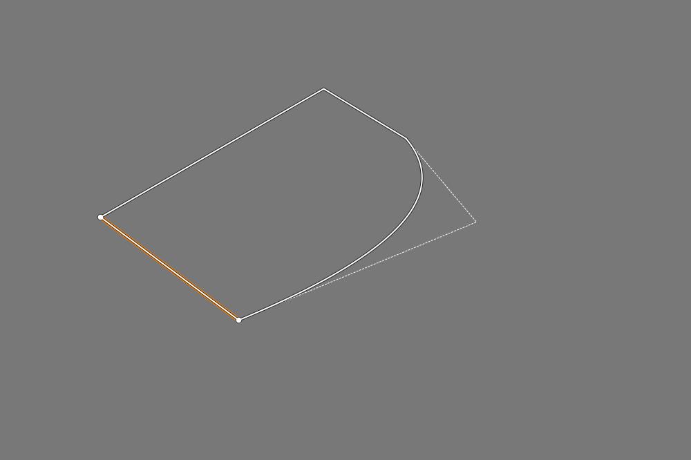
If you hover over a point with the mouse pointer, press the Shift key, and move the mouse to the right, you can round the vertices of the shape. Moving it to the left will make it increasingly sharp again. The rounding is always created between two adjacent points of the point. The two adjacent sides of the shape will be dashed, the rounding remains a continuous line, indicating that it will be the edge of the mask.
Ctrl + click creates maximally pointed points, and Shift + Ctrl + click creates maximally rounded points.
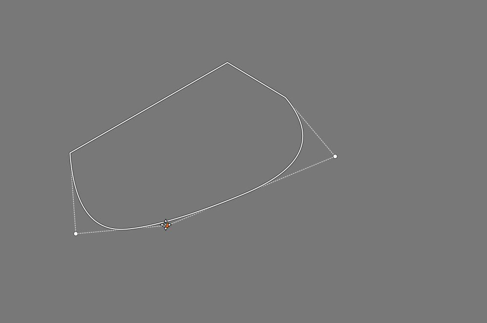
If we change the roundness of one of two adjacent rounded points, it will also affect the shape of the roundness curve of the adjacent point. The solution to this is shown in the following figure.
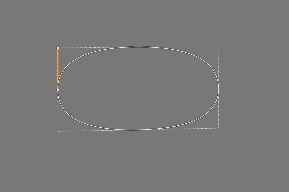
In the figure, the rounded points are located at the four vertices of the rectangle. I have placed a maximally sharp point in the middle of each side. Since the rounding is always created between two neighboring points of the rounded point, the points located in the middle of the sides prevent the effect of the rounding from spreading to the other vertex of the rectangle. So the points located in the middle of the sides only serve the purpose of ensuring that if we change the roundness of one corner, it does not affect the roundness of the neighboring vertices of the rectangle.
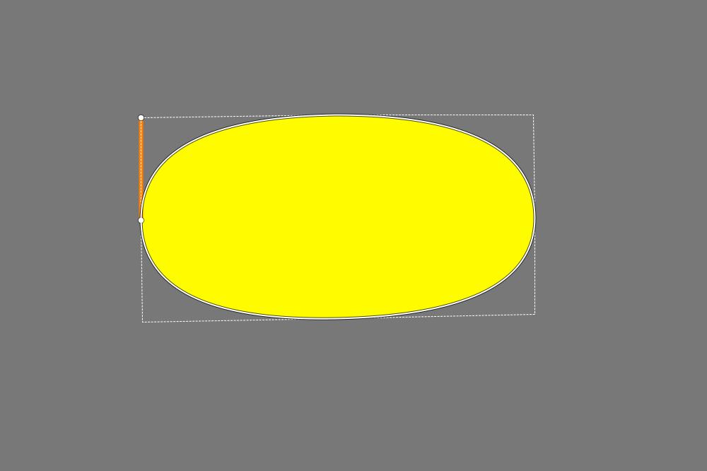
Let’s look at the mask.
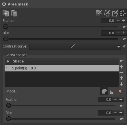
The Feather slider below the Shape list allows you to add feathering to the mask (selected in the shape list).
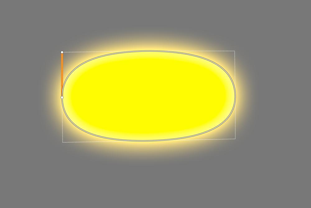
The mask with the feathers.
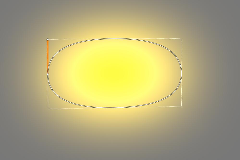
The Blur slider under the Shape list allows you to add a blur to the mask. In the image above, you can see the feather and the blur together. The Blur slider does not affect the image, but the mask itself, and by using it, the gradient will be much smoother compared to if we had only applied Feather.
4.4.1.5.3 Add, edit gradient
Click the fourth button from the right to add the gradient and you can edit the transition in the preview.
You can adjust the width of the gradient by dragging one of the two parallel lines with the mouse.
You can rotate the transition by dragging one of the lines through the center with the mouse.
By holding the center point with the mouse, you can move the transition to the desired location.
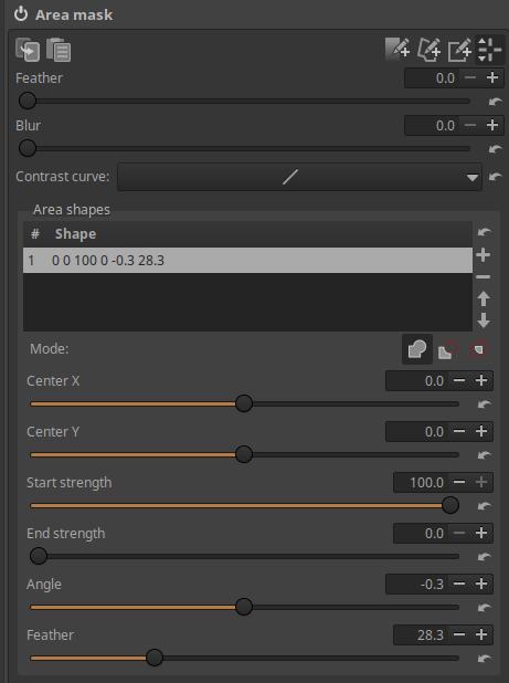
Center X: Moves the center horizontally.
Center Y: Moves the center vertically.
Starting Strength: You can set the starting strength of the transition using.
Final Strength: The final strength of the gradient can be set using.
Angle: Used to set the rotation angle of the gradient.
Feather: You can add feathering to the gradient. If Feathering is set to 0, an abrupt transition is created.
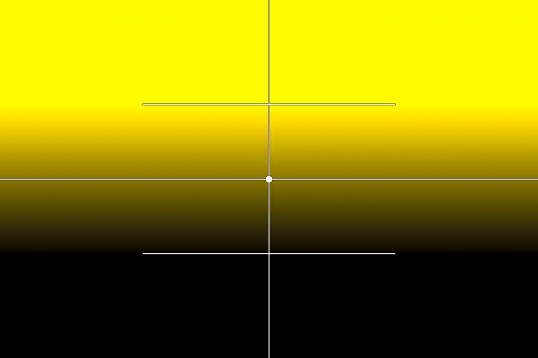
4.4.1.5.4 Area mask outside image borders
The area mask can be extended beyond the image boundaries. This can be seen in the figure below.
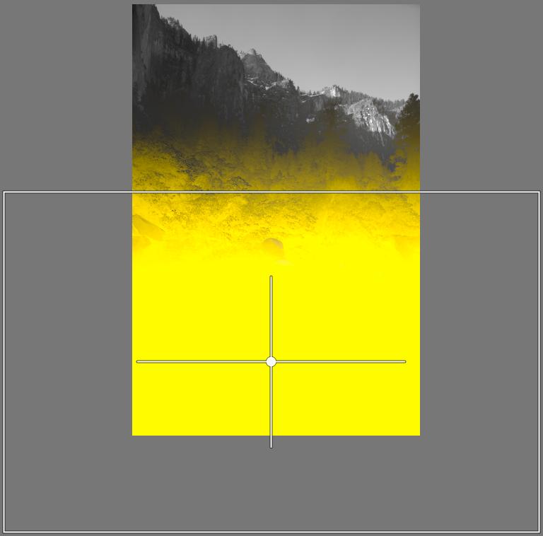
In the image above, we want to lighten the bottom part of the image so that there is a gradual transition at the top of the mask border, but no transition at the sides and bottom of the image. We will achieve this transition by adding feathering. The boundaries of the area mask should be well outside the image on the right and left sides and bottom of the image, because this way we can achieve that the feathering on the right and left sides and bottom of the image is outside the image and does not affect the image.
4.4.1.5.5 Excluding the area outside the area mask from the mask
I created the mask shown in the image above using Parametric mask. The problem is that I was unable to create the mask in a way that did not include anything other than the model’s clothing.
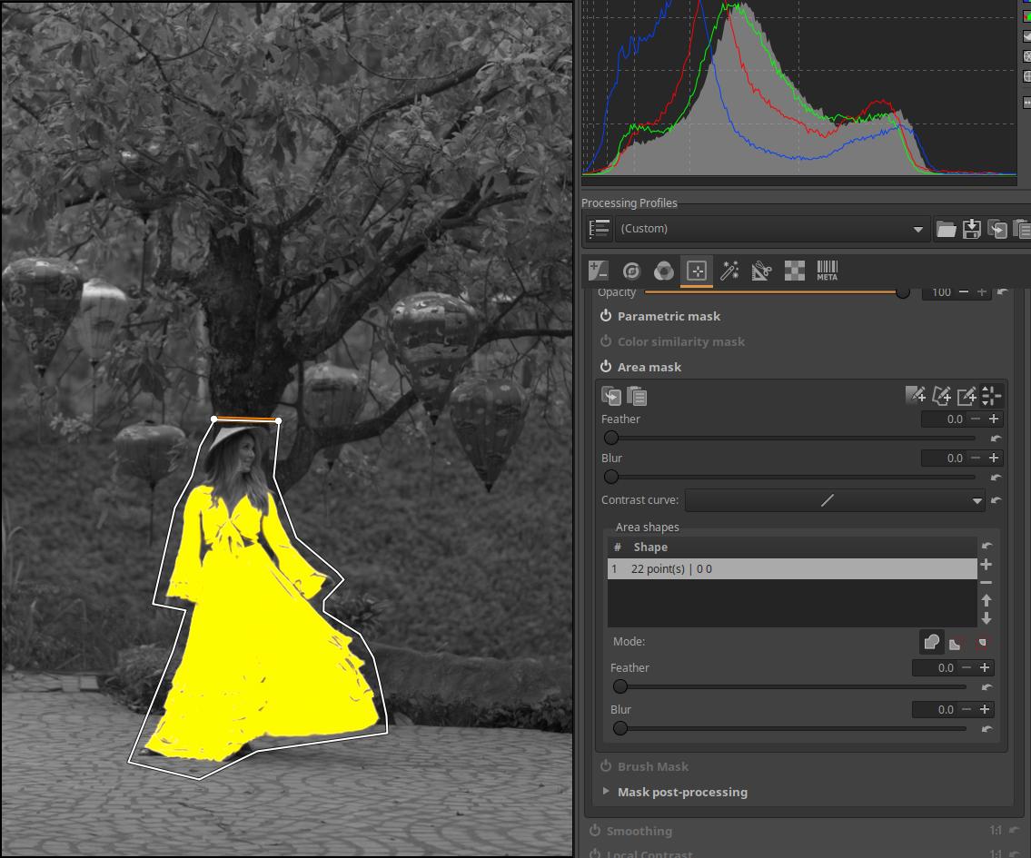
In the image above, I created a polygonal Area mask around the model, which excluded areas outside of it from the mask.
4.4.1.6 Brush mask
We can draw a mask on the preview with a brush and delete a mask or part of it previously created with any mask type.
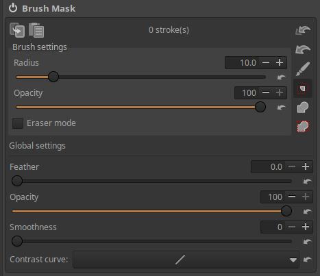
On the right side we find buttons one below the other, which from top to bottom are as follows:
- Delete all brush strokes.
2. Deletes only the last group of strokes (last “brush stroke”).
- Brush on/off.
4. Intersection with other masks (the common part will be the resulting mask).
5. Add the mask created with the brush on top of the other masks.
6. Add the brush mask above the other masks only within the active area mask.
If you turn on the brush, you can draw a mask on the preview with the brush (by holding down the mouse button). The mask can be created with multiple brush strokes, the number of brush strokes is not limited. Painting without releasing the mouse button is counted as one brush stroke. You can initiate another brush stroke by releasing the mouse button. If you mess up a brush stroke, you can delete it immediately afterwards.
If you go over the same area multiple times within a single brush stroke, or even with multiple separate brush strokes, the effects of the brush strokes will not add up, but will look as if you had only painted the area once. This is great for when you accidentally miss a small area. In this case, you can go over the missing area again with the brush, and you don’t have to worry that where you go over the mask area next to the missing area again, the brush will have a double effect. However, when you hold down the Ctrl key while creating the brush strokes, the effects of the brush strokes will add up. Imagine creating a brush mask with 20% opacity, and then release the mouse button. Then, if you press the Ctrl key (and of course the mouse button) while painting over the previously created mask or part of it, you will notice that the effects of the previous and new brush strokes are added together, and the mask has become more opaque in the place of the new brush strokes. Here too, it is true that painting over multiple times within a brush stroke only produces a single effect. Using the Ctrl key allows you to achieve a softer and more subtle effect by starting with a less opaque and/or larger feathered brush, and then applying more brush strokes until you achieve the desired effect.
Brush settings:
In the Brush settings section, you can change the Brush settings on a per-brush basis. These changes have no effect on previously created brush strokes, they only affect brush strokes created after the change.
Radius: You can adjust the radius of the brush using it.
Opacity: You can set the opacity of the brush strokes to blend with the original image (in percentage). Below, the Opacity applied in the Global settings is considered 100%, and compared to this, the resulting opacity will be less according to the Opacity applied in the Brush settings. For example, if we set the opacity in the Global settings to 50% and the opacity in the Brush settings to 50%, then the resulting opacity will be (0.5x0.5=0.25) 25%.
Eraser Mode: If enabled, you can use the brush to erase parts of a mask you have previously created in any way. If the Inverted checkbox next to Show mask is checked, you do not need to enable Eraser mode to erase, but you do need to enable it to add.
Global settings:
Changes made in the Global settings section will affect all previous and future brush strokes.
Feather: Feather can be added to achieve a gradual transition to the mask’s surroundings.
Opacity: The opacity of the brush strokes for blending with the original image (in percentage). The Opacity shown in the Brush settings considers the opacity set here to be 100%.
Smoothness: Adjusts the smoothness of the transition from the mask to its surroundings. Higher values result in a smoother transition.
Contrast curve: A simple contrast curve can be used to make adjustments to the mask. The effect is best seen when there are areas of intermediate opacity, not just fully transparent and fully opaque.
4.4.1.6.1 Removing unnecessary mask parts from inverted mask
We have already seen the above figure for the Parametric mask. There we have enabled the Inverted option next to Show mask. The model’s shoes do not need to be part of the mask, so we will remove the mask from it using the Brush mask.
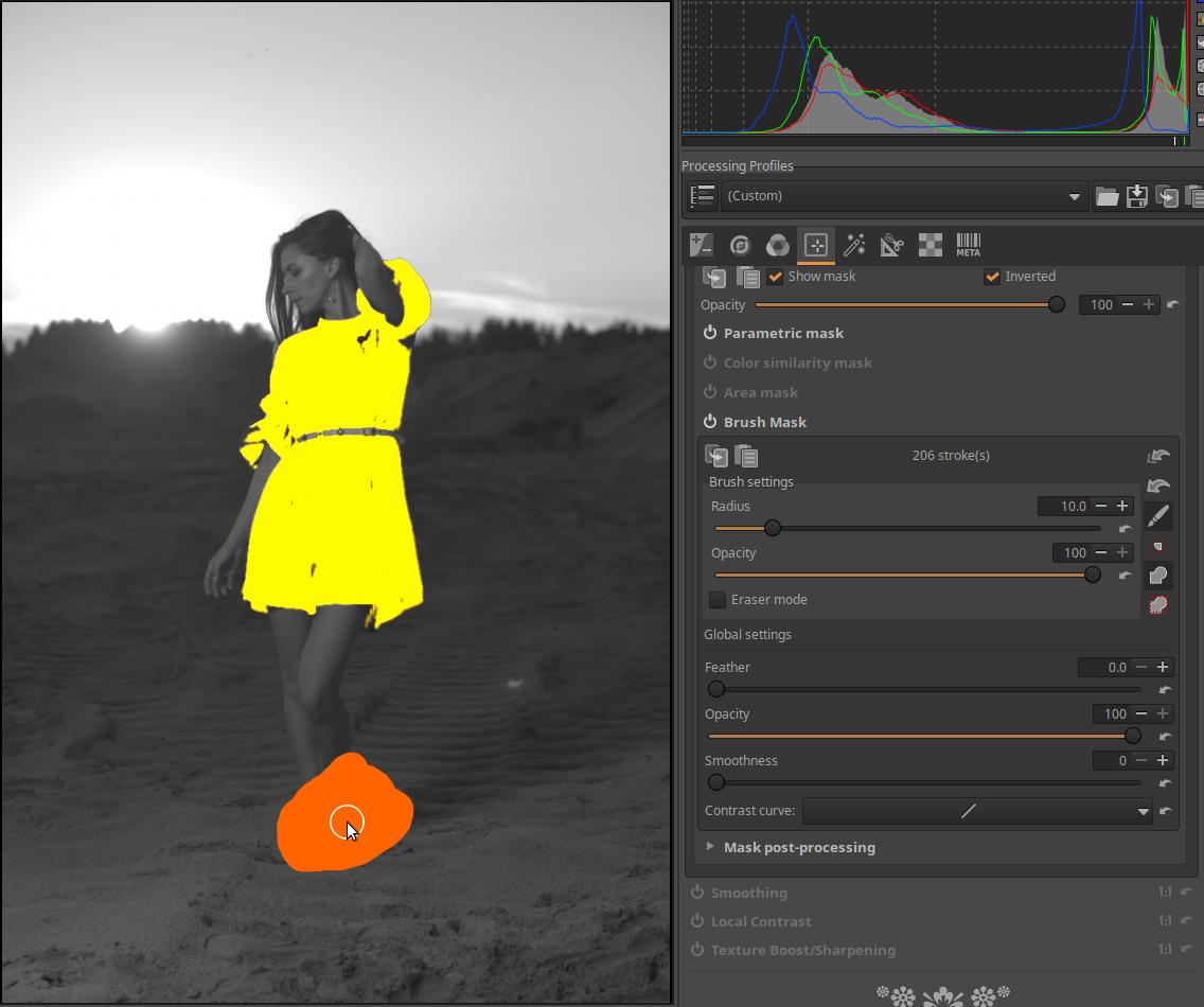
You need to enable the Brush mask, then click the “Add mask above other masks” button at the end of the Opacity slider, which will make our mask appear again. Since our mask is an Inverted mask, we don’t need to enable Eraser mode, but instead paint the part of the mask near the model’s shoes with the brush in normal mode.
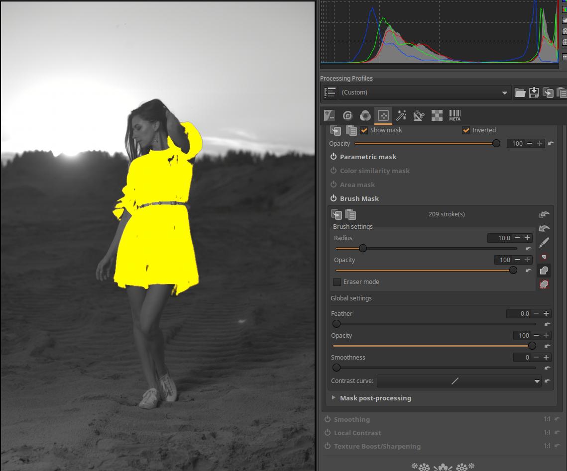
In the image above, we can see that the shoes are no longer part of the mask.
There is also an Invert option within the Color similarity mask. If this is enabled, but Invert is not next to Show mask, then Eraser mode must be enabled to erase.
4.4.1.7 Mask post-processing
At the bottom of the Mask section is the Mask post-processing section. The settings in this section do not modify the image, but the mask itself.
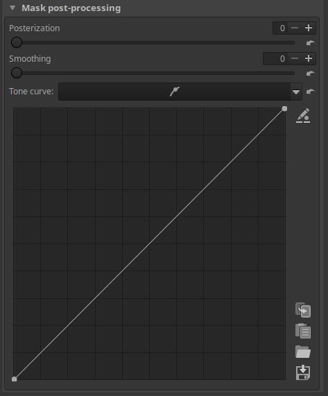
Posterization can be set between 0 and 6. The higher the value, the more it reduces the smoothness of the transition areas of the mask and causes more banding (posterization). At its maximum value, the tonal range is reduced to two values, the minimum and the maximum, with a sharp transition in between.
Increasing the Smoothing slider gradually smooths the transition between tonal ranges created by the Posterization slider. A value of zero for the Posterization slider has no effect.
Tone curve: A simple tone curve can be used to make adjustments to the mask. Its effect is best seen when the mask is not only completely transparent and completely opaque, but also has areas of intermediate opacity.
Applying mask post-processing
Let’s look at the Mask post-processing options. With Mask post-processing, we can change and refine the mask itself.
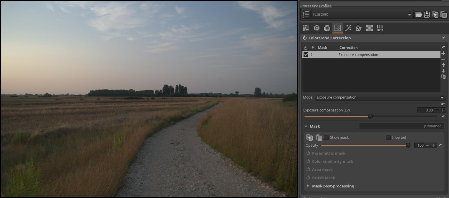
We have opened the image above for editing. We activate the Color/Tone Correction tool in the Local editing group. For Mode, select Exposure Compensation. But we can also choose something else instead, the point is that we can control the brightness of the image.
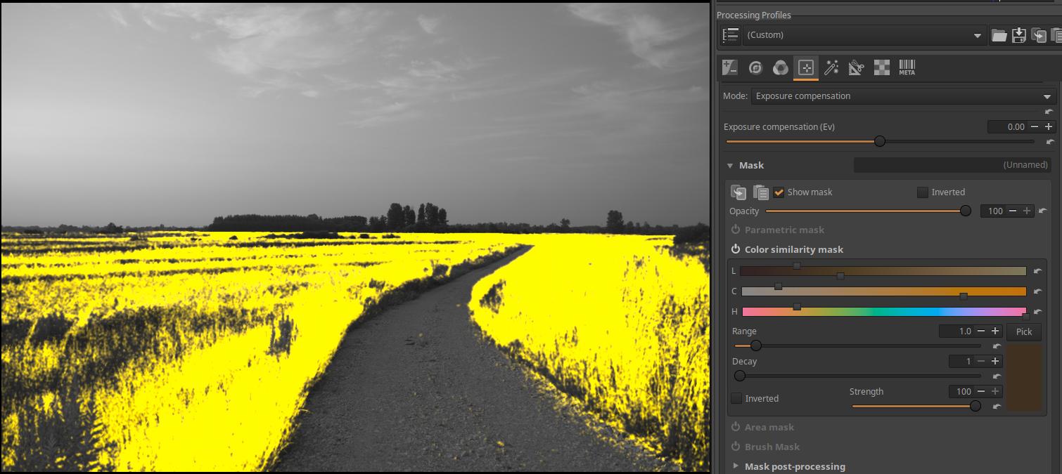
We created the mask shown in the figure using a color similarity mask.
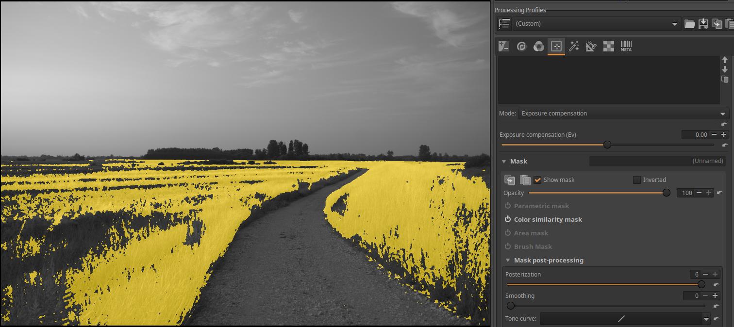
Go to the Mask post-processing section. Set the Posterization slider to its maximum value of 6. Notice that the tones of the mask have disappeared and now there is either a completely yellow (maximum opacity) part or completely transparent, where we only see the black and white preview.
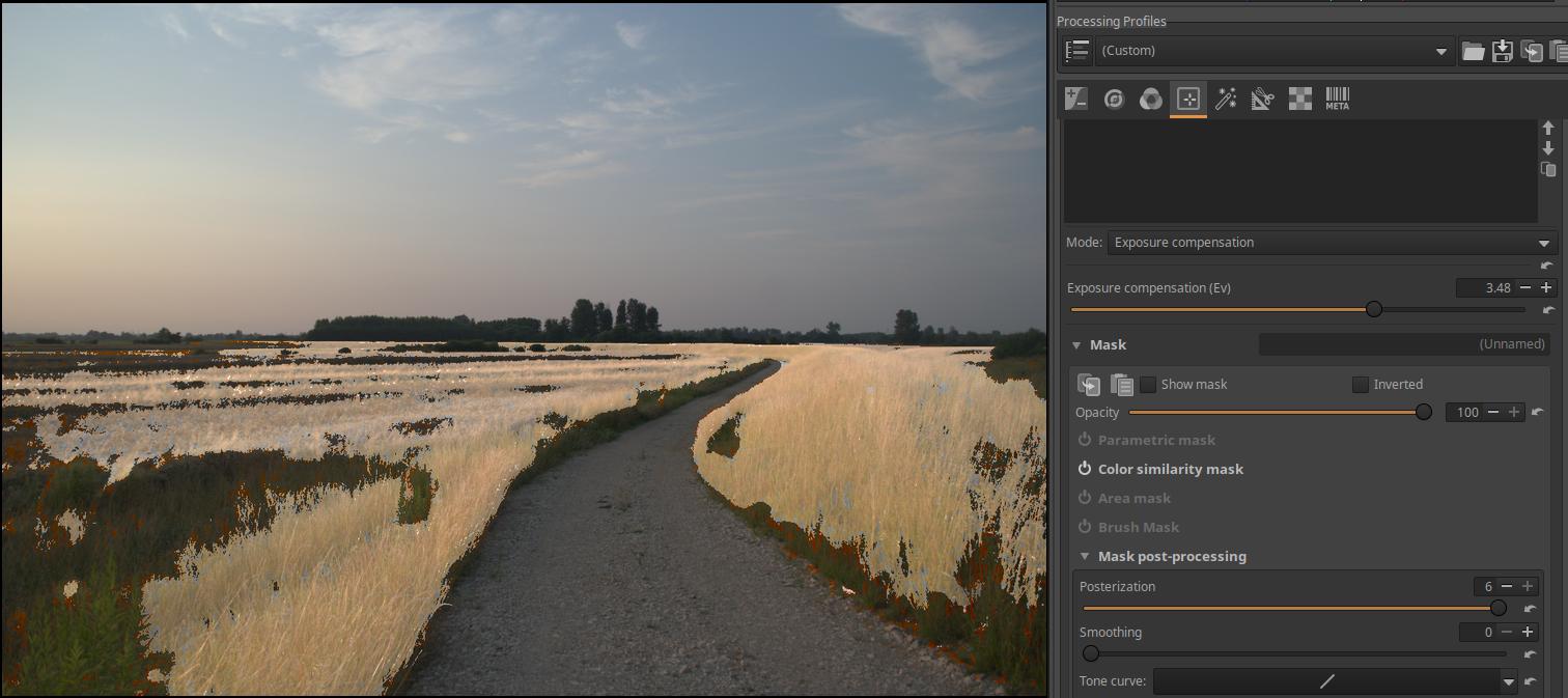
Let’s see the effect, adjust the brightness of the image.
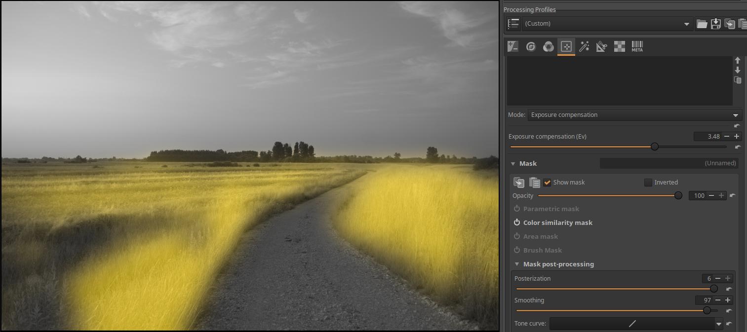
As we increase the Smoothing slider value, the transition between the yellow parts of the mask and its surroundings will become smoother.
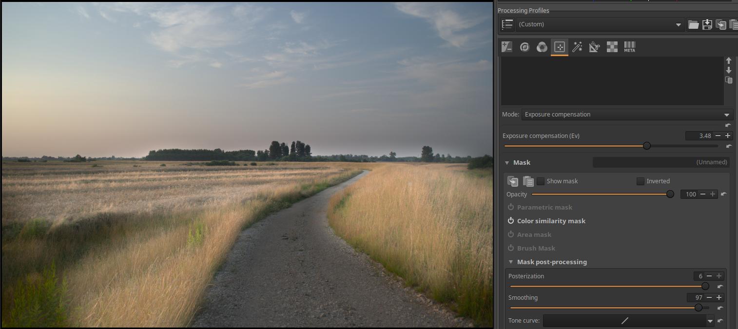
In the figure above, let’s see how the image turned out.
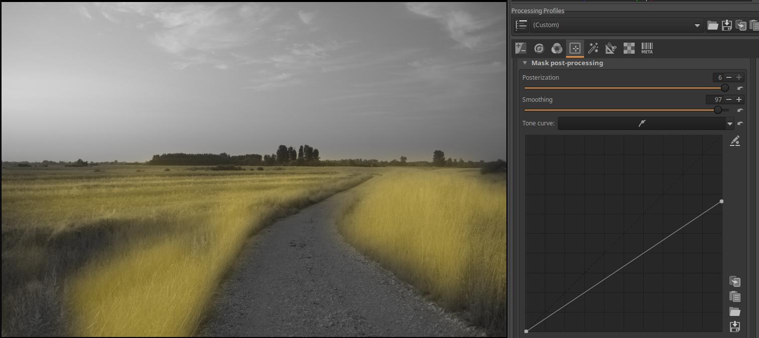
Now let’s work on the tone curve. We can apply a tone curve directly to the mask. In the image above, I’ve dragged the control point in the upper right corner of the curve down. You can see that the opacity has decreased (become more transparent) across the entire mask, with the most opaque areas having their opacity reduced (according to the curve).
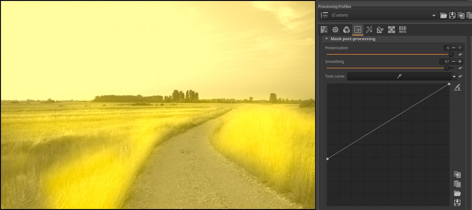
Moving the control point in the lower left corner up increases the opacity of the mask, most strongly in the least opaque (i.e. most transparent) areas.
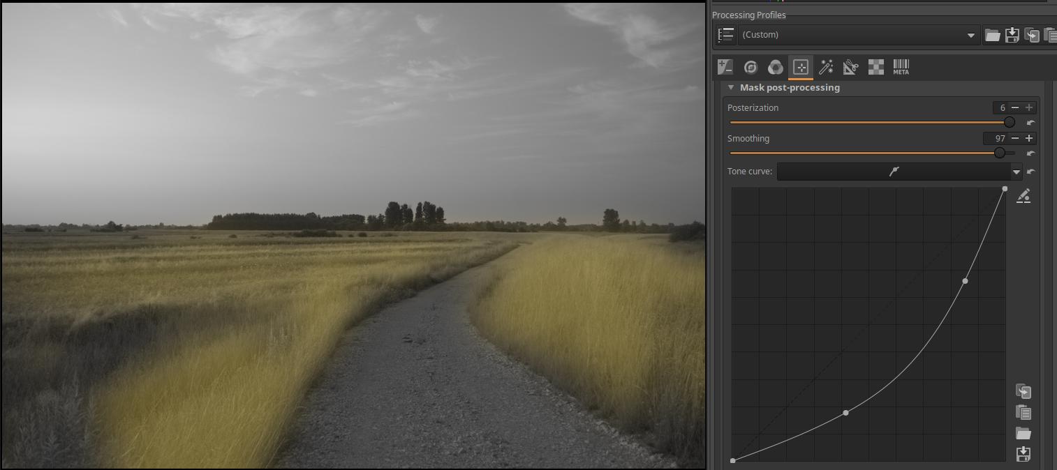
Finally, let’s set a curve.
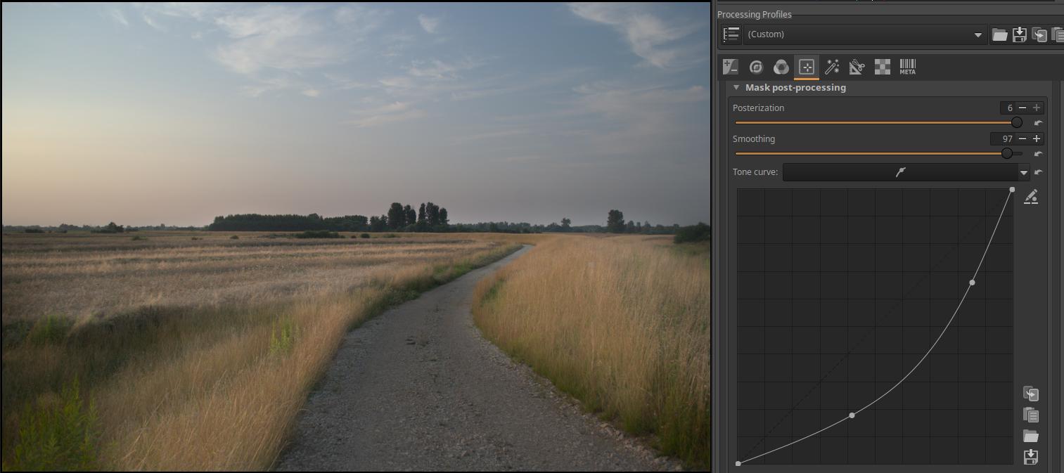
And let’s see the effect. The curve modified the mask, which changed the effect of the editing tool on the image, in this case the effect of exposure compensation.
4.4.1.8 Operations with masks
When creating the resulting mask, ART performs so-called set operations, which are used to generate the resulting mask from the four mask types. Sets are the pixels of the masks created by each mask type. Let’s look at the operations that can be performed with masks using a white image and Area masks. You can perform addition, subtraction, and intersection operations with masks (more precisely, with their pixels). An intersection means the common part of two (or more) masks, the parts that are part of each mask. The factors of the subtraction operation (the masks participating in the operation) are not interchangeable, it does not matter which one is subtracted from which one. Therefore, the order of the shapes in the shape list does not matter either. The operation selected for each shape is performed in the order shown in the shape list.
Open any image for editing. Activate the Color/Tone Correction tool. Activate the Area mask and turn on the Show mask. You will now see a “global” mask covering the entire image. Create a rectangular area mask. The global mask will disappear as soon as it is created.
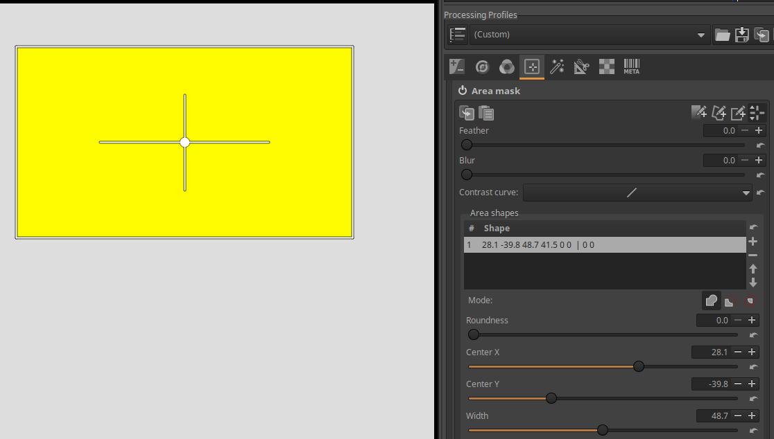
In the figure, under Mode, you can select the actions, which from left to right are:
- Add mode
- Subtract mode
- Intersect mode
You can’t subtract from “nothing” and you can’t intersect with “nothing”, so if we click on these buttons now, we get an empty mask. Now it only makes sense to add to it in order to have an area mask.
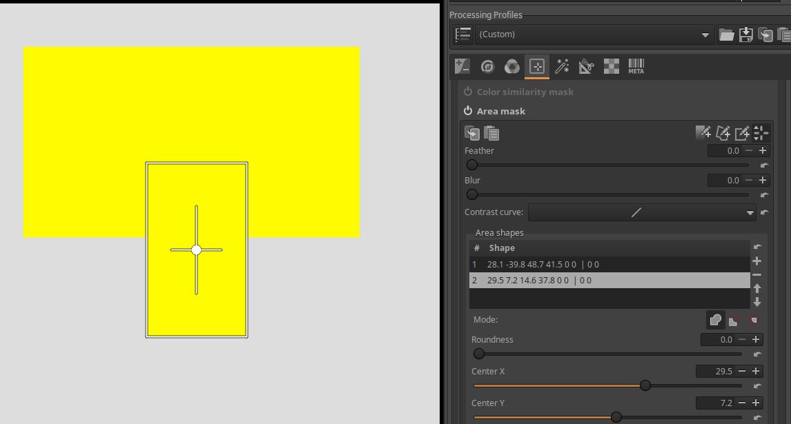
Let’s add another rectangle so that there is an overlap between the two rectangles. In the figure, I have also set the second rectangle to Add mode. The second rectangle has been added to the first.
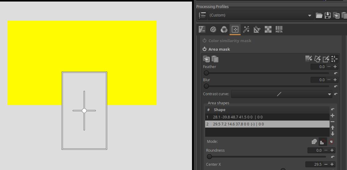
If we set the Subtract mode for the second shape, the second shape will be subtracted from the first.
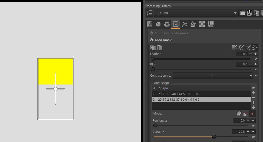
If we click the Intersect button on the second shape, we get the intersection, or common area, of the two shapes. The yellow area of the resulting mask was part of both rectangles.
The Brush mask has the following modes:
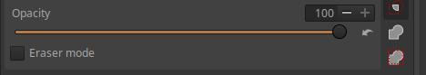
On the right we can see the buttons one below the other. The top one is the Intersection mode, the middle one is the Add mode, and the bottom one is the “Add to other masks, but only within the active area mask” mode button.
4.4.1.9 Creating the resultant mask
ART creates the resulting mask for a given adjustment layer by combining the four types of masks (Parametric mask, Color similarity mask, Area mask, Brush mask) as follows:
- Compute the Parametric mask.
- Compute the Color similarity mask completely independently of the Parametric Mask.
- Compute the Area mask completely independently of the masks created in points 1. and 2. It is created by using operations according to the mode of the various shapes (Add, Subtract, Intersect) as follows:
- Starts with an empty mask and performs the following for each shape in the list of shapes from top to bottom for each pixel in the image:
- If the pixel is inside the current shape, then in Add mode the pixel is added to the mask, in Subtract mode it is subtracted from the mask.
- If the pixel is not inside the current shape and Intersect mode is set, the pixel is removed from the mask.
- Starts with an empty mask and performs the following for each shape in the list of shapes from top to bottom for each pixel in the image:
- Creates an intermediate mask with the Intersect of masks 1, 2, and 3. That is, the intermediate mask contains the common areas of masks 1, 2, and 3.
- Creates the brush mask effect as follows:
- In the case of Intersect mode, it creates an independent brush mask and Intersects it with the mask obtained in point 4.
- In Add mode, it “paints over” the mask obtained in point 4. This “paint” means addition, and in Eraser mode, erasing means subtraction.
- In the case of the “Add to other masks, but only within the active area mask” mode, the “repainting” described in the previous point (subtraction in Eraser mode) only takes place within the area mask obtained according to point 3, and not outside it.
- If the Reverse option is checked, it will produce the reverse of the resulting mask obtained in point 5.
4.4.1.10 Mask precautions
There are a few things to keep in mind when it comes to masks.
Precautions when using Area masks and Brush masks: All of the Local editing tools are placed after geometric image corrections in the pipeline, so if you perform geometric corrections after creating an Area mask or Brush mask, you will mess up these masks. Rotate, Crop, Perspective Correction, Profiled Lens Correction, Distortion Correction should be performed before creating Area masks and Brush masks.
Precautions when using Parametric masks and Color similarity masks: Because the Local editing tools are located near the end of the pipeline, all settings must be made before creating the masks, except for the following, which can be made after the mask is created:
-
Local Contrast editing tool: the Film Simulation, Black-and-White, and Film Grain tool settings.
-
For Color/Tone Correction, Smoothing, and Texture Boost/Sharpening editing tools: settings for the Log Tone Mapping, Saturation/Vibrance, Tone Curves, RGB Curves, L*a*b* Adjustments, Soft Light, Film Simulation, Black-and-White, and Film Grain tools.
4.4.1.11 Pipeline effect on masks
Let’s consider the impact of the tools in the pipeline on the masks.
Based on the above, I make a few conclusions:
- When creating a mask, ART applies the mask parameters to the input image of the given editing tool, thus generating the mask. If something changes the input image of the editing tool, the mask itself changes as well.
- Only the editing tool that is first in the pipeline and therefore executes first can change the input image of another editing tool. The one that executes later will not affect the input image.
- If Show mask is enabled in a local editing tool, this remains the preview even when you switch to another editing tool. This is a very useful feature because it allows you to see the effect of a given editing tool on a given mask.
- If you copy the mask via the clipboard, only the parameters used when creating the mask are copied, not the mask itself pixel by pixel.
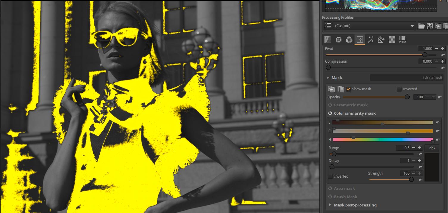
In the image above, I created a Color similarity mask using the Color/Tone Correction tool in the Local editing group. I left the Show mask turned on.
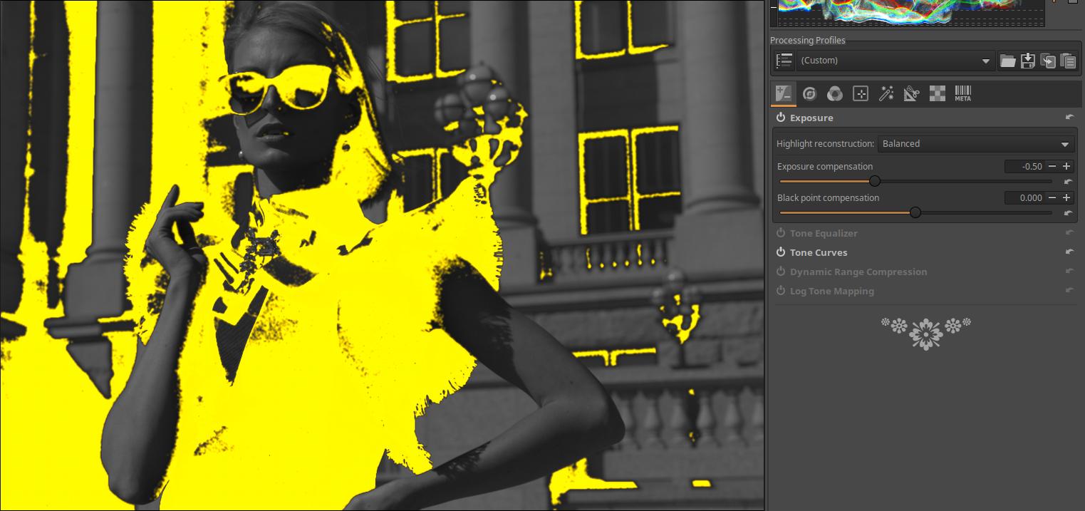
I went to the Exposure group, and within it, the Exposure tool. This tool is located before the Color/Tone correction in the pipeline. The mask is still visible. I applied an exposure compensation of -0.5 Ev. By comparing it to the previous figure, we can see how much the mask has changed. Of course, as the mask changes, the effect of the modification set in the Color/Tone correction tool (for example, Hue shift) also changes, and it will have its effect according to the changed mask.
So we have observed what happens if, after creating the mask, we change the settings of a tool that is located in the pipeline before the tool in which we created the mask. The mask itself changes, and so does its effect.
4.4.1.11.1 Different masks within the same editing tool
Within a local editing tool, each Adjustment layer can have a single resulting mask. Here we will discuss how editing settings made on a given Adjustment layer affect the masks created on Adjustment layers below it in the Adjustment layer list. So, for example, we set the exposure compensation on the first adjustment layer, and we are curious to see if this affects the mask created for the adjustment layer below it in the list. So the mask itself, and because of the change in the mask, the image.
This is very easy to decide. Since each Adjustment layer generates its resulting mask completely independently from the input image of the editing tool, the tool settings applied to each Adjustment layer have no effect on the mask of the other Adjustment layer within an editing tool. Don’t get me wrong. The image itself is of course affected by the change in the parameter (e.g. exposure compensation) made to the first Adjustment layer, and if we switch to the second Adjustment layer, we see the change made to the first Adjustment layer in the preview. However, if we display the yellow masks belonging to each Adjustment layer, they remain unchanged, not changed by the change in exposure compensation.
4.4.1.11.2 Copy masks between Local Editing tools
When copying masks between Local Edit tools, we do not necessarily get the same mask as the original, so they may need to be corrected. This is because the mask itself is not copied, but only the parameters needed to create the mask. Let’s look at the Local Edit tools section of the ART pipeline.
- Color/Tone Correction - Linear RGB
- Smoothing - Linear RGB
- Graduated/Vignetting Filter - Linear RGB
- Texture Boost/Sharpening - Linear RGB
- Log Tone Mapping - Linear RGB
- Saturation/Vibrance - Linear RGB
- Tone Curves - Linear RGB Bounded
- Film Simulation - RGB
- RGB Curves - Linear RGB Bounded
- L*a*b* Adjustments - L*a*b*
- Soft Light - RGB gamma 2.2 limited
- Local Contrast - L*a*b*
I have highlighted the local tools in the list. The copied mask would be the same as the one it was copied from if the input image of the two tools were the same. However, due to the way the pipeline works, this condition cannot be guaranteed. For example, if the mask is copied from the Texture Boost/Sharpening tool to the Local Contrast tool, the input image of the Local Contrast tool can be affected by any tool that is between the two tools in the pipeline (e.g. the frequently used Tone Curves tool).
A mask copied between editing tools would be the same if the mask itself, rather than the parameters that created the mask, were copied pixel by pixel. However, this is not possible in ART.
4.4.2 Color/Tone Correction
It is located in the Local editing group. It is used to correct colors and tones. It is not actually a tool, but a group of tools.
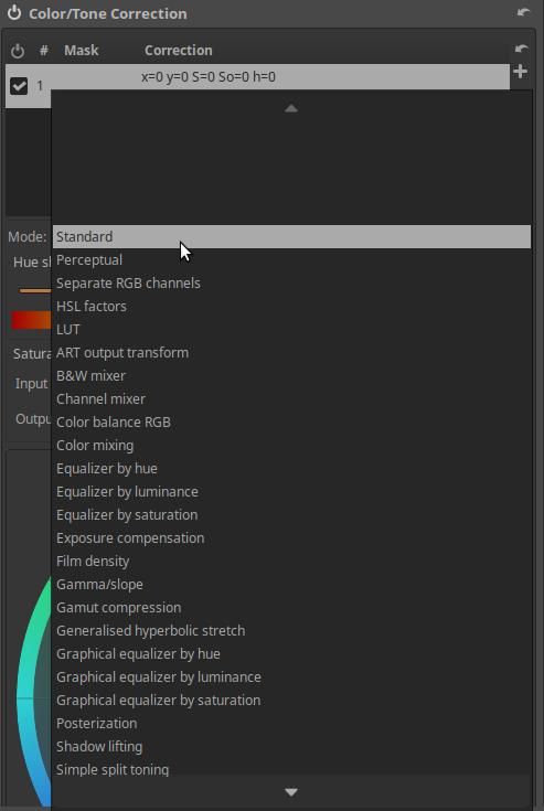
In Mode, we can select the editing tool we want to work with from the group of editing tools. Most of the editing tools are CTL scripts, only the first few (Standard, Perceptual, Separate RGB Channels, HSL Factors, LUT) are not.
Let’s review the editing tools available in Mode.
4.4.2.1 Standard and Perceptual
You can select it under Mode in the Color/Tone Correction tool in the Local editing group.
Standard and Perceptual are two modes of the same tool. Standard operates in linear RGB, while Perceptual operates in perceptual space. They share the same user interface and controls. This means that your settings will be retained when you switch between Standard and Perceptual Modes.
It allows you to adjust the hue, saturation, contrast, and tones.
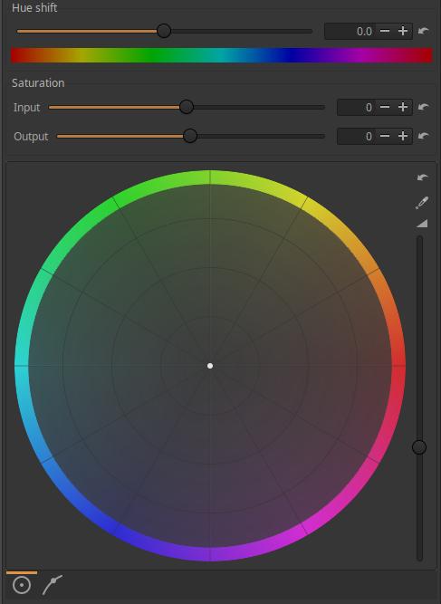
Hue Shift: We can shift the hue of the input image according to the colors of the Color Wheel by the degree set on the slider (-180 … +180).
Saturation - Input: The saturation of the input image can be changed using the slider. The input saturation slider takes effect before the other controls (hue shift, color wheel, etc.).
Saturation - Output: You can change the saturation of the output image using the slider. The output saturation slider takes effect after the other controls.
The Saturation - Input and Saturation - Output sliders are also needed because the results obtained may be different in some cases.
Color Wheel: Shifts the input colors according to the hue set on the color wheel and the saturation set on the color wheel.
Setting the white balance: Next to the Color Wheel, at the top right, you will find the “eyedropper” button, which you can use to set the white balance. If you turn on this function by clicking on the button and placing the mouse pointer over the preview, you can see on the Color Wheel what correction ART will make when you take a sample from the given point with the eyedropper. To set the white balance, you need to click on a neutral white or gray area in the preview while holding down the Ctrl key. You can turn off this function by clicking on the button again without making a selection, or by right-clicking on the preview.
Changing Colors with the Color Wheel: Click on the center point of the Color Wheel and drag the point in the desired direction while holding down the mouse button. This will shift the input colors towards the selected color. The further you drag the point from the center, the higher the saturation.
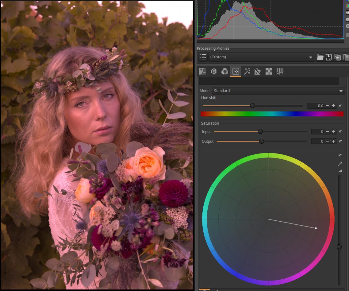
Effect Strength: To the right of the Color Wheel is a vertical slider that controls the strength of the effect.
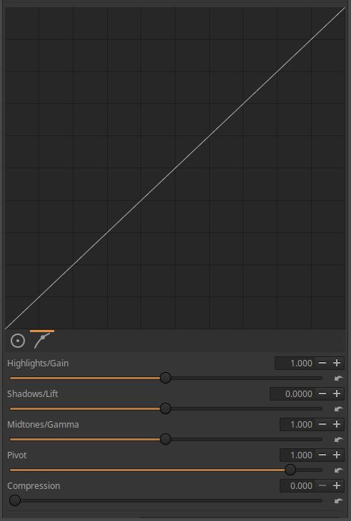
Below the Color Wheel, you can see two buttons that you can click to display either the Color Wheel or the Tone Curve. The Tone Curve works independently of the Color Wheel, and both effects are applied to the image.
The tone curve is applied to the input image. The curve cannot be edited directly, instead, the sliders below it can be used to shape the shape of the tone curve. The curve is initially a diagonal line that has no effect on the image.
The Highlights/Gain, Shadows/Highlight, Midtones/Gamma, Pivot, and Compression sliders can be used to shape the curve.
4.4.2.2 Separate RGB channels
A tool that can be selected under Mode in the Color/Tone Correction tool in the Local editing group.
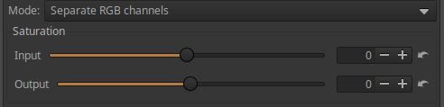
Saturation - Input: You can change the saturation of the input image using the slider. The input saturation slider takes effect before the tone curves.
Saturation - Output: You can change the saturation of the output image using the slider. The output saturation slider takes effect after the tone curves.
The Saturation - Input and Saturation - Output sliders are also needed because the results obtained may be different in some cases.
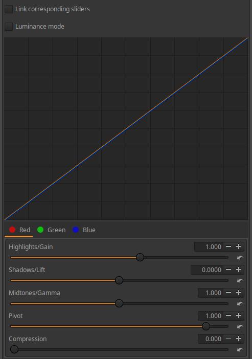
You can create a separate tone curve for each of the three color channels. You can select the color channel below the curve.
Link corresponding sliders: If enabled, the sliders below the curve will change the curve of all three color channels at the same time.
Luminance mode: When turned on, curves are used to change the brightness of pixels by changing the values of each color channel, while the colors do not change.
The tone curve is applied to the input image. The curve cannot be edited directly, instead, the sliders below it can be used to shape the curve. The curve is initially a diagonal line that has no effect on the image.
The Highlights/Gain, Shadows/Highlight, Midtones/Gamma, Pivot, and Compression sliders can be used to shape the curve.
4.4.2.3 HSL factors
A tool that can be selected under Mode in the Color/Tone Correction tool in the Local editing group. It can be used to modify colors, adjust saturation, contrast, and tones.
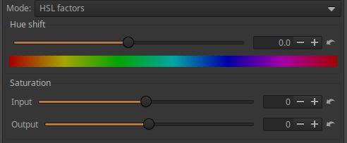
Hue shift: We can shift the colors of the input image according to the colors of the Color Wheel by the degree set on the slider (-180 … +180).
Saturation - Input: The saturation of the input image can be changed using the slider. The input saturation slider takes effect before the other controls.
Saturation - Output: You can change the saturation of the output image using the slider. The output saturation slider takes effect after the other controls.
The Saturation - Input and Saturation - Output sliders are also needed because the results obtained may be different in some cases.
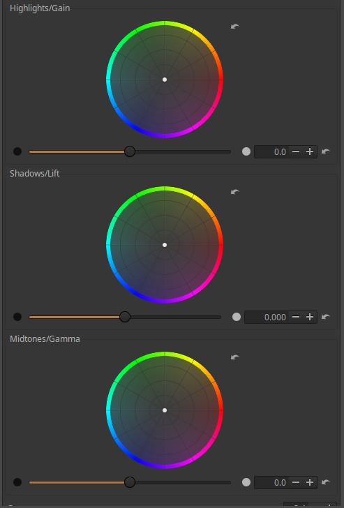
We can see three Color wheels. With their help, we can shift the color of three tonal ranges (Highlights/Gain, Shadows/Lift, Midtones/Gamma). We can grab the center of the color wheel with the mouse and drag it in the desired direction. The further we drag from the center, the greater the saturation will be.
You can change the brightness of the given range using the sliders below the color wheels.
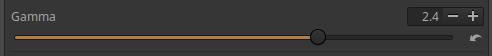
Gamma: You can adjust Gamma using it.
4.4.2.4 LUT
A tool that can be selected under Mode in the Color/Tone Correction tool in the Local editing group.
ART inherited support for 3D LUTs (LUT = Look-Up Table) from RawTherapee. Support for these is available in the Film Simulation tool and is available here. Such 3D LUTs are included in the community-developed Hald CLUT LUT collection, which is suitable for simulating various types of film. A LUT collection must be installed before using this tool.

Before applying it, we need to set up the library containing the LUTs in the Libraries section of the Image Processing tab of the Preferences.
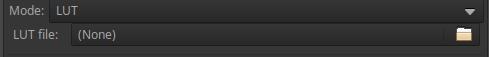
We need to select the LUT file to be used.
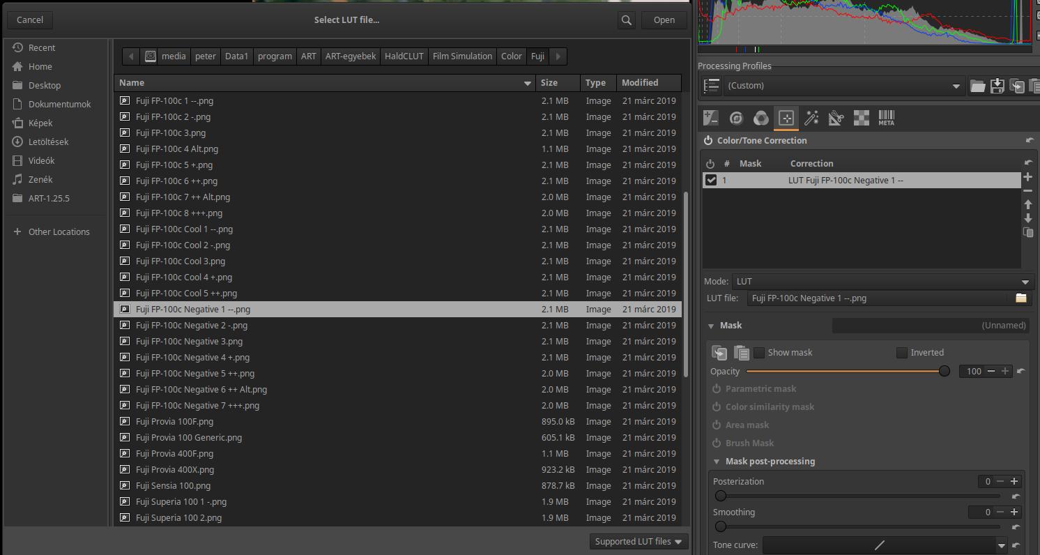
After clicking the Open button, ART immediately applies the LUT.
4.4.2.7 ART output transform CTL script
In the Color/Tone Correction tool in the Local editing group, you can select CTL script under Mode.
This is a tone mapping tool. During editing, we mostly work with linear data with an “infinite” range. This data needs to be transformed into displayable data towards the end of the pipeline. This editing tool is also suitable for this. In this editing tool, we can apply exposure compensation, adjust the contrast of the final image, and also the white point.
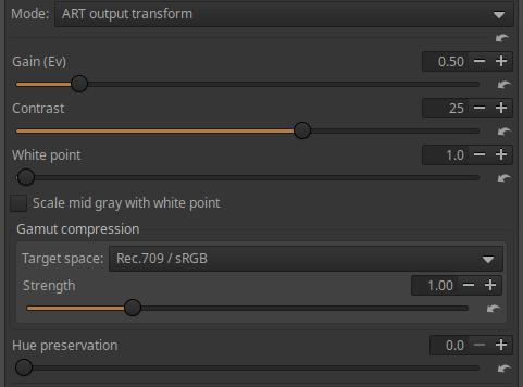
Gain (Ev): Exposure compensation in exposure value to be applied to the input image of the editing tool.
Contrast: You can adjust the contrast of the image.
White point: You can set the white point of the image using this. If the Scale mid gray with white point option is not enabled, it is suitable for SDR (standard dynamic range) images, if it is enabled, you can set the white point to a high value.
Scale mid gray with white point: If you have a high dynamic range display or want to create a high dynamic range image, you should check this. If you want to create a regular SDR image, you should not check this.
Gamut compression, Target space: You can select the color system you want to compress to. This is especially useful if the image was captured with a wide color gamut tool and needs to be compressed to a smaller color space for display. You can choose None for no compression, or Rec.2020, Rec.709/sRGB, DCI-P3, or Adobe RGB. To create a standard SDR image, choose Rec.709/sRGB.
Strength: You can control the strength of the compression.
Hue preservation: The degree of Hue preservation.
4.4.2.12 B&W mixer CTL script
In the Color/Tone Correction tool in the Local editing group, you can select CTL script under Mode.
Converting to black and white is also about what tonal shades of gray should be converted to for subject details of different colors and brightness.
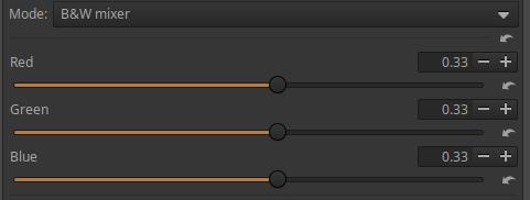
If we select this script, it will convert the image to black and white, and the preview will also be black and white. The Red, Green and Blue sliders can be used to influence how light each color in the color image will appear as a shade of gray in the black and white image.
4.4.2.8 Channel Mixer CTL script
In the Color/Tone Correction tool in the Local editing group, you can select CTL Script under Mode.
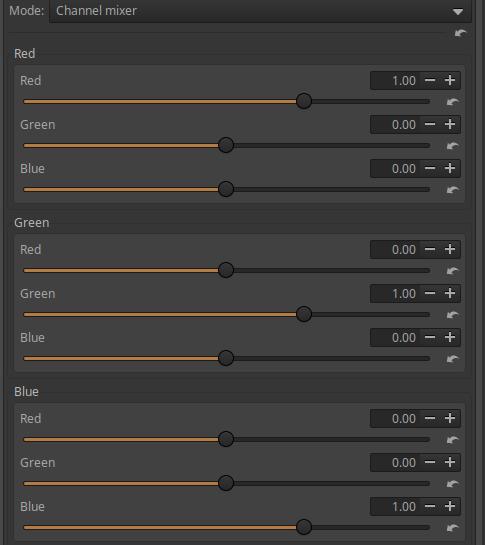
The channel mixer generates new R, G, and B values for each pixel in the image using the pixel’s original R, G, and B channel values and the values set on the sliders.
The Channel Mixer has three sections: Red, Green, and Blue. For example, in the Red section, we can create a new Red (R) channel value for a given pixel from the pixel’s original RGB values. The Red, Green, and Blue sliders control how much of the pixel’s original R, G, and B values contribute to the pixel’s new R value. In the Green and Blue sections, we can create the pixel’s new G, and B values in a similar way.
We can observe that
- if we move the sliders in the Red channel section to the right, the image will become redder, if we move it to the left, it will become more cyan blue,
- if we move the sliders to the right in the Green channel section, the image will become greener, if we move it to the left, it will become more magenta,
- if we move the sliders to the right in the Blue channel section, the image will become bluer, if we move it to the left, it will become yellower.
4.4.2.20 Color balance RGB CTL script
In the Color/Tone Correction tool in the Local editing group, you can select CTL script under Mode.
This is a very useful and popular method. There is also an editor tool of the same name in darktable, which contains three tabs within the tool: master, 4-way, and masks. Of these, only the master tab is included in the CTL script in ART. Maybe someone will make a full version. Let’s take a closer look.
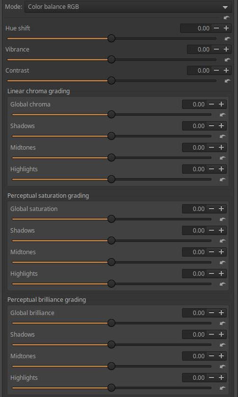
Hue Shift: The slider is used to cause a rotation along the color wheel, which changes the color of all pixels while keeping the brightness and color constant. It can be applied selectively with masks, which is perhaps the most useful use of this slider, because it can change the color of an object, for example.
Vibrance: Use this to add vibrancy to the image or part of it. The slider increases the color intensity by increasing the color intensity more strongly in areas with less color than in areas with more color.
Contrast: Changes the brightness while maintaining constant hue and color. It is best used with masks, other tools may be better for adjusting the global contrast of the image.
Linear chroma grading: Changes the amount of chroma proportional to the input value, while maintaining constant hue and lightness. Can be applied globally, or separately to shadows, midtones, and highlights.
Perceptual saturation grading: Changes the amount of color and lightness in the perceptual color space proportional to the input values, while maintaining a constant hue. It can be applied globally, or separately to shadows, midtones, and highlights.
Perceptual brillance grading: Changes the amount of color and brillance in the perceptual color space proportional to the input values, with constant hue and perpendicular to saturation. Similar to exposure compensation. Can be applied globally, or separately to shadows, midtones, and highlights.
4.4.2.21 Color mixing CTL script
In the Color/Tone Correction tool in the Local editing group, you can select CTL script under Mode.
Implementation of color mixing implemented in various ways.
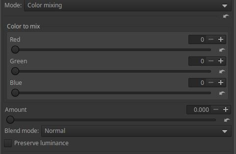
Color to mix: You can set the color to be used for blending by specifying the values of the three color channels. Each channel can have a value in the range 0-255.
You can choose from six Blending Modes as shown in the figure above.
Amount: Essentially controls opacity.
Preserve luminance: Preserves the original luminance of the image during blending.
4.4.2.15 Equalizer CTL scripts
CTL scripts can be selected in the Mode of the Color/Tone Correction tool in the Local editing group.
There are a total of six equalizer scripts that will be discussed here. The scripts implement three types of graphical equalizers and three types of slider-controlled equalizers.
Graphic equalizer scripts:
- Graphical equalizer by hue
- Graphical equalizer by saturation
- Graphical equalizer by luminance
Leveling scripts that can be controlled with sliders:
- Equalizer by hue
- Equalizer by luminance
- Equalizer by saturation
The terms “by hue”, “by saturation”, and “by luminance” in the script names refer to the input property according to which we can change the values of the output properties. In the case of graphic equalizers, the output properties are Hue, Saturation, and Lightness according to the HSL color system. In each of the three types of graphic scripts, we find three flat curve editors according to the three types of output properties, and all three curves can be applied simultaneously.
This may seem complicated at first, but it’s not. For example, we can use a “by saturation” script to change the hue, saturation, or lightness of pixels in an input image that fall within a certain saturation range. Or we can use a “by hue” script to change the hue, saturation, or lightness of pixels in an input image that have a certain hue.
Graphical equalizers are more universal and can be used better than scripts that can be controlled with sliders.
The above figure shows the curve editor for the Graphical Equalizer by Hue script. The other two graphic scripts are completely similar, except for the input property shown below (saturation or luminance instead of hue). The above figure shows the color scale as an input property below the graph, which allows us to select the hue, saturation, and lightness of the pixels we want to change.
These graphic equalizers have three types of curve editors, which you can choose from under Channel. The name of each editor is shown in their header: these are the channels of the HSL color system, i.e. H, S, L. You can choose between the individual curve editors by clicking on their headers. Each curve editor can be opened at its header as shown in the figure, and you can choose between Off (switched off) and Equalizer. You can see that neither is switched off by default.
You can reset the active (visible) curve editor to linear by clicking the reset button on the far right in the Channel caption row.
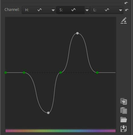
In the image above, you can see the S (saturation) editor (its header is darker). I increased the saturation of the blues and decreased the saturation of the greens.
Of course, we can use all three curve editors, even if one of them is not visible, it still has an effect on the image. In this case, we can use the other two curve editors to change the color or lightness of certain colored areas.
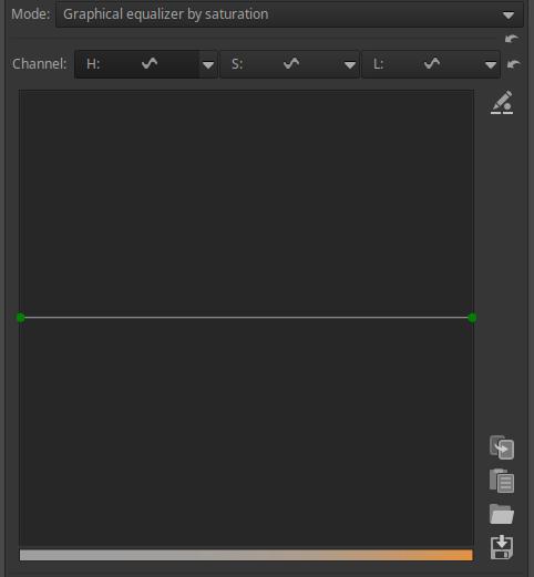
The image above shows the Graphical equalizer by saturation script curve editor. The saturation scale at the bottom allows you to choose the saturation. The bottom orange bar shows the least saturated color on the left and the most saturated color on the right.
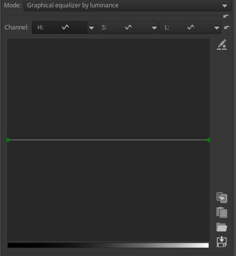
The above image shows the Graphical equalizer by luminance script curve editor. The tone scale below allows you to select a tone. Where the curve is higher than the center horizontal line, the undertone details in the image will be lighter, and where it is lower, they will be darker.
Let’s also briefly look at the equalizers that can be controlled with sliders.
For the Equalizer by hue and Equalizer by saturation scripts, the output properties can be Hue, Saturation, and Lightness, while for the Equalizer by luminance script, the output properties can be Lightness, Saturation, and Vibrance. For each of the scripts, you can only select one output property. If you want to change multiple output properties for the same script, you can do so on multiple adjustment layers.
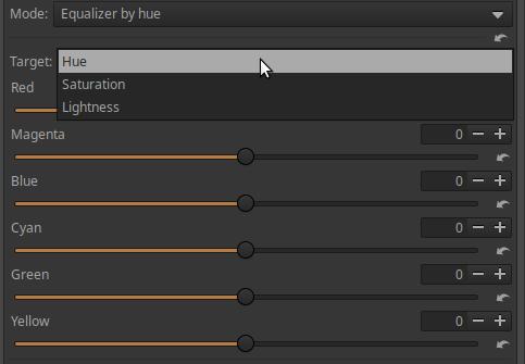
The figure above shows the interface of the Equalizer by hue script.
At the top, we can select the Target, i.e. the output property to be changed, which can be Hue, Saturation, and Lightness.
The color scale is divided into six ranges: Red, Magenta, Blue, Cyan, Green, and Yellow. The sliders change the selected target property of the color areas by the amount you move the slider. For example, if Saturation is selected as the Target, the Blue slider increases the saturation of the blue areas by moving the slider to the right, and decreases it by moving the slider to the left.
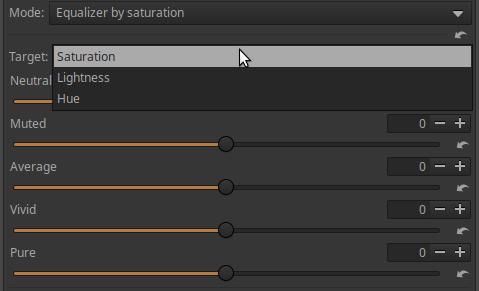
The figure above shows the Equalizer by saturation script interface.
At the top, we can select the Target, i.e. the output property to be changed, which can be Hue, Saturation, and Lightness.
The possible saturation values are divided into five ranges. Neutral represents the least saturated colors, while Pure represents the most saturated colors. The sliders allow you to change the selected target property of the given saturation areas by the amount you move the slider. For example, if you have selected Saturation as the Target, you can use the Average slider to increase the saturation of the moderately saturated color areas by moving the slider to the right, or to decrease it by moving the slider to the left.
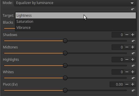
The above image shows the Equalizer by luminance script interface. At the top, you can select the Target, which is the output parameter to be changed, which can be Lightness, Saturation, or Vibrance. Vibrance differs from Saturation in that it changes the saturation of less saturated colors more strongly than saturated colors. The sliders can be used to change the selected target property of areas with a given luminance (lightness) by moving the slider. Blacks represent the darkest areas, and Whites represent the lightest areas. For example, if Saturation was selected as the Target, the Midtones slider can be used to increase the saturation of the midtones by moving the slider to the right, or to decrease it by moving the slider to the left.
The Pivot slider allows you to adjust which lightness range is considered midtone, and which tonal range properties can be adjusted with the Midtones slider. In other words, you can adjust the equalizer to the characteristics of the image. What should be considered midtone in an image that contains mainly dark tones is different from what should be considered midtone in an image that contains mainly light tones.
4.4.2.10 Exposure compensation CTL script
In the Color/Tone Correction tool in the Local editing group, you can select CTL script under Mode.
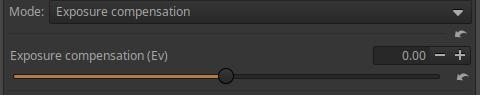
You can adjust the exposure compensation using.
4.4.2.13 Film density CTL script
In the Color/Tone Correction tool in the Local editing group, you can select CTL script under Mode.
Opacity is a concept from analog photography that refers to the opacity or transparency of a film strip. The higher the opacity, the less transparent the film was, the darker it appeared. In digital photography, this opacity refers to the depth and richness of the colors in an image. This script allows you to emulate this traditional film characteristic.
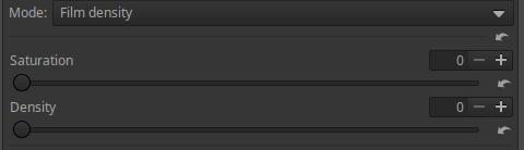
The sliders can be used to adjust Saturation and Density. When Saturation is set to 0, the Density slider has no effect.
4.4.2.14 Gamma/Slope CTL script
In the Color/Tone Correction tool in the Local editing group, you can select the CTL script under Mode. You can use it to adjust the tones of the image.
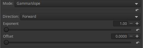
In Forward direction, if we increase the Exponent value, the histogram will shift towards the highlights, and in Reverse direction, towards the shadows.
You need to find the Forward/Reverse selection, Exponent and Offset values that produce the best image. First, choose a direction, then change the Exponent and set the Offset value that best suits your image. Adjust the two sliders until you achieve the best result. Observe the effect of the sliders on the Histogram.
Let’s see its effect using the mid.tif image. First, let’s look at the Forward direction.
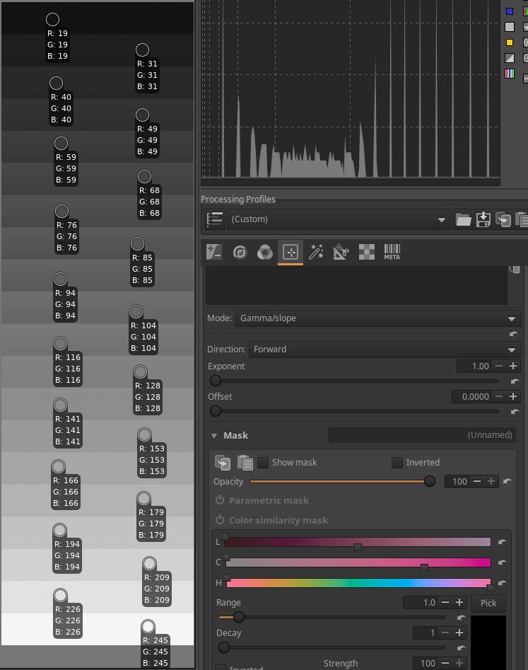
In the figure above we can see the starting position.
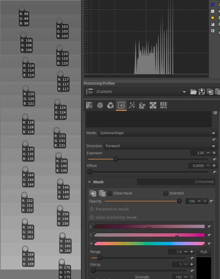
I set the Exponent to 3. The tones are compressed around a certain value. The contrast is greatly reduced. This is clearly visible in the luminance histogram.
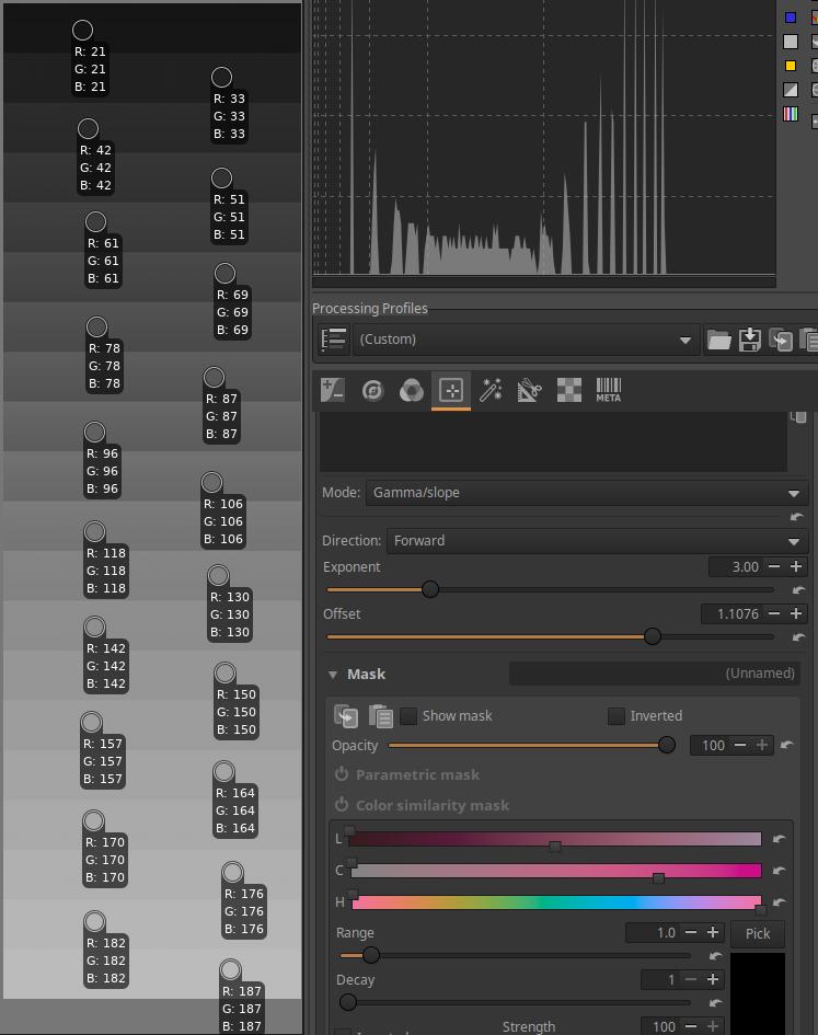
The higher I set the Offset slider, the more the contrast increased (the range of tones on the histogram also widened), stretching occurred. The lightest tones changed little under the influence of the slider.
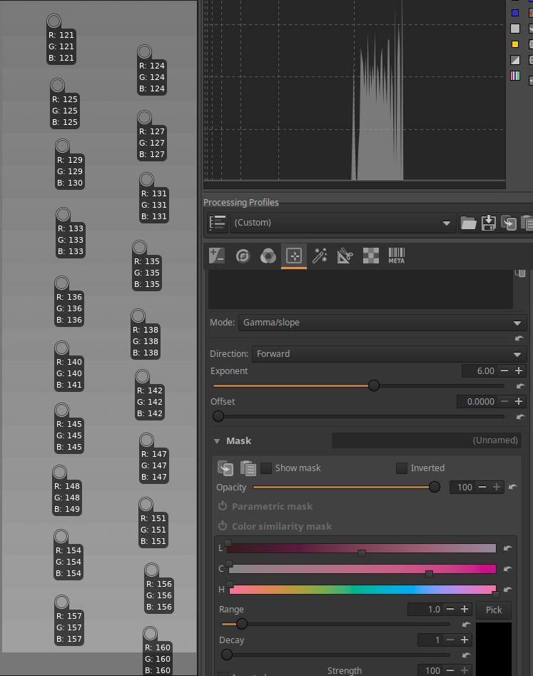
I set the Exponent to 6. The tones are still compressed around the same value, but now the compression is much greater and the contrast is much lower.
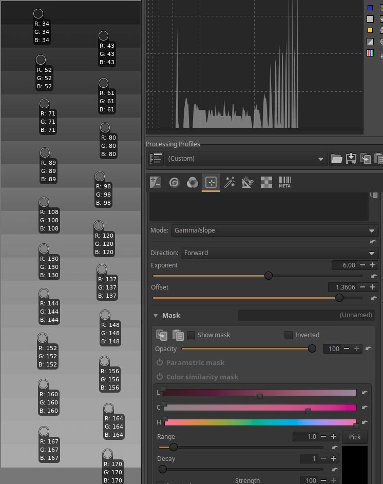
The higher I set the Offset slider, the more the contrast increases (the range of tones on the histogram also widens). The lightest tones changed little with the slider.
Let’s see what happens if we choose the Reverse option.
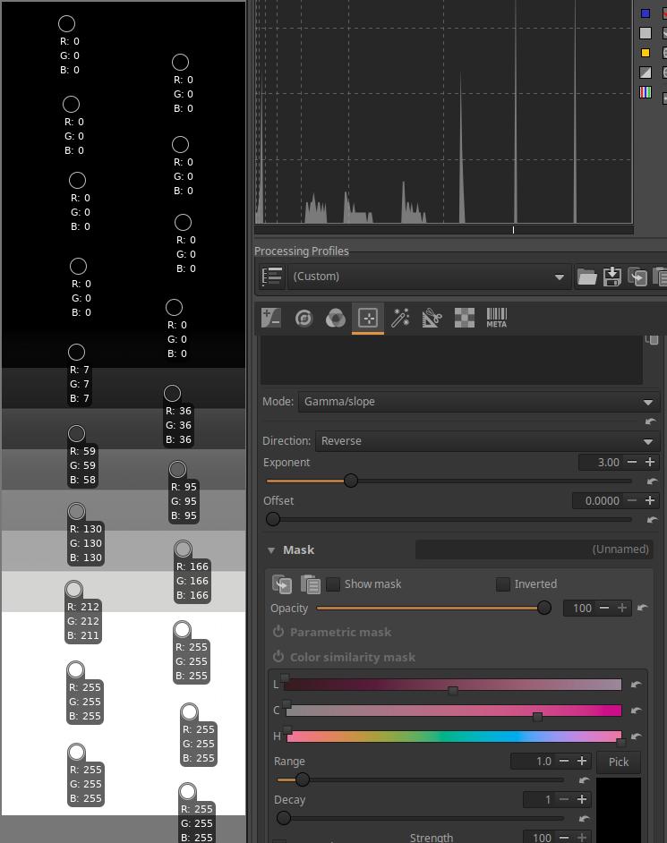
I set the Exponent to 3. The tones are stretched around a certain value. The contrast has increased a lot. This is also clearly visible in the luminance histogram. There has been clipping in both the shadows and highlights (visible in the color pickers).
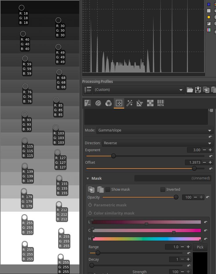
The higher I set the Offset slider, the more the contrast decreases (the range of tones on the histogram also narrows), compression occurs. The lightest tones changed little under the influence of the slider, there is still clipping. There is no clipping for the darkest tones.
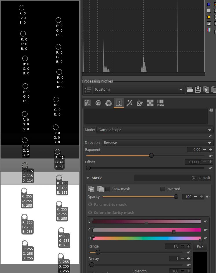
I set the Exponent to 6. The tones are still stretched around a certain value. The contrast has increased even more. This is clearly visible in the luminance histogram. Only 4-5 bands are no longer clipped (visible in the color pickers).
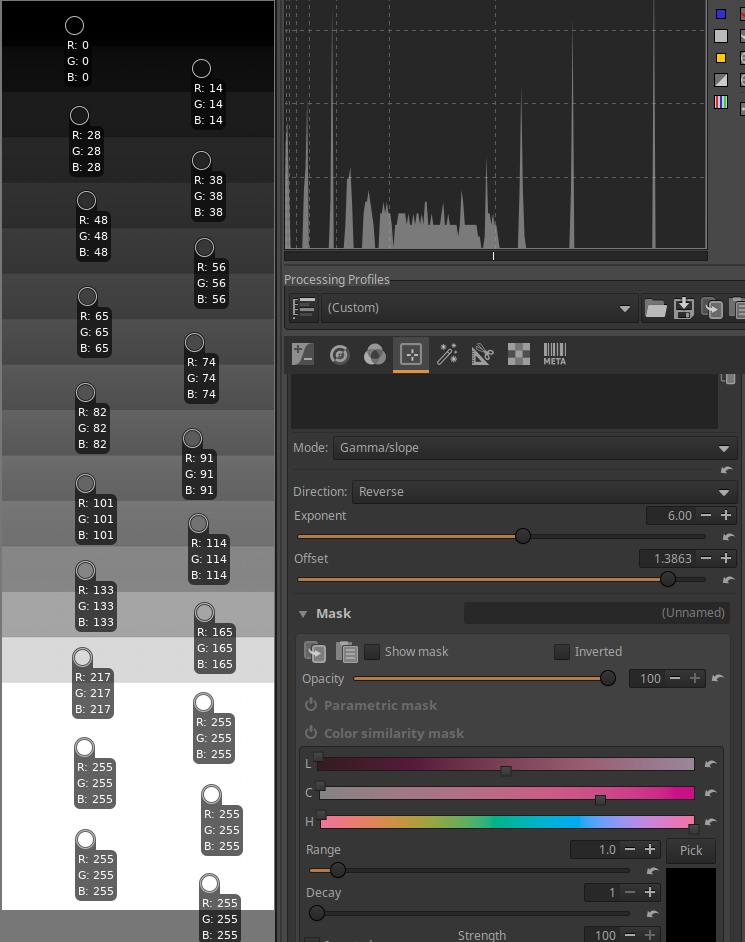
The higher I set the Offset slider, the more the contrast decreases (the range of tones on the histogram also narrows), compression occurs. The lightest tones changed little under the influence of the slider, the last four bands are still clipped. The darkest tones are no longer clipped.
4.4.2.22 Gamut compression CTL script
In the Color/Tone Correction tool in the Local editing group, you can select CTL script under Mode.
Gamut compression is a tool that allows you to compress the range of an image taken with a camera with an extremely wide color gamut to a smaller color gamut.
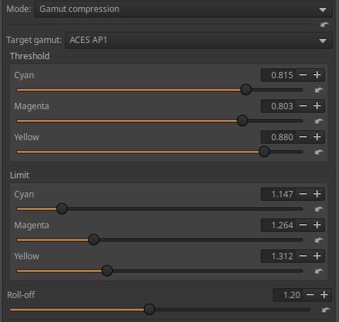
Target gamut: The color system into which we want to compress out-of-gamut colors.
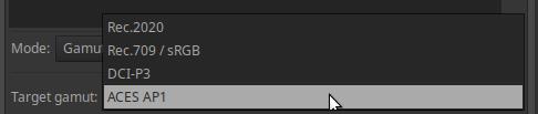
If you want to compress to a display range, choose sRGB or DCI-P3.
If you want to process the output file in another software, choose a wide gamut color system, such as Rec.2020.
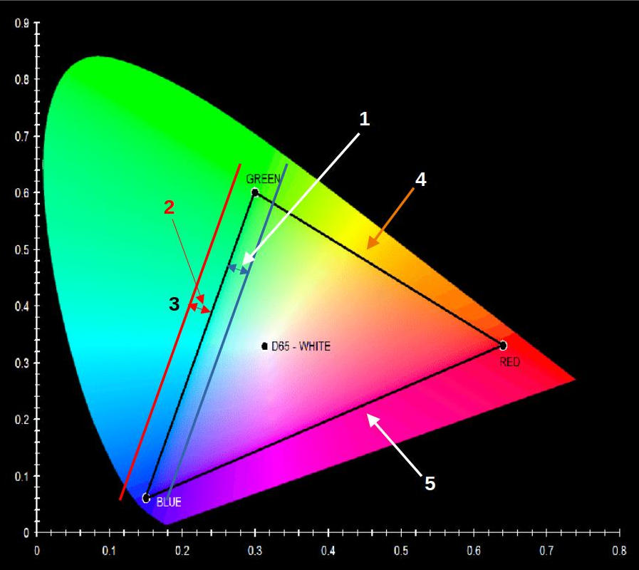
- Threshold
- Limit
- Cyan side
- Yellow side
- Magenta side
Let’s look at the figure above. The black triangle marks the boundaries of the colors that can be represented in the sRGB color system. At the vertices of the triangle, we can see the primary colors, red, green, and blue. Colors outside the triangle defined by the primary colors cannot be displayed in the sRGB color system. Let’s assume that we also have colors outside the triangle, because the photo was taken with a camera with a wide color gamut. The color cyan comes from a mixture of the green and blue primaries, so the side of the triangle connecting the blue and green vertices is the Cyan side. Similarly, the figure shows the Yellow and Magenta sides. I checked the Threshold parameter for the cyan side. Threshold specifies the boundary of the band selected from the edge of the range within the range, into which band the colors from the range (band) selected with the Limit parameter should be compressed. The blue arrow in the figure indicates, and the blue line shows the boundary of the band defined by Threshold along the side of the triangle. In the triangle, the colors from the blue line towards the inside of the triangle remain unchanged. The value of the Threshold parameter is given in hundredths. For example, if its value is 0.8, it can be considered as 80%, and the inner band on the side of the triangle will be 20% wide (so it must be subtracted from 100%). The Limit parameter defines a band outside the triangle, the colors inside of which should be compressed into the band defined by Threshold inside the triangle. The Limit specifies the width of the band measured from the side of the triangle. Colors outside the band will not be compressed.
In the figure, I have only marked the Threshold and Limit on the cyan side, but it could be represented in a completely similar way on the other two sides of the triangle. The Threshold and Limit parameters for the Cyan, Magenta, and Yellow sides can be set separately, so they can have different values. For example, if we want to protect magenta and yellow a little more than cyan, we can set the Threshold a little higher than cyan.
After compression, the work profile will be restored to its original state.
4.4.2.5 Generalised hyperbolic stretch CTL script
In the Color/Tone Correction tool in the Local editing group, you can select CTL script under Mode.
The Generalized Hyperbolic Stretch CTL script allows for better image display. It essentially creates an S-curve-like curve.
Stretching is the opposite of compression. If you apply stretching to certain tones in an image, you will inevitably experience compression elsewhere. For example, if you stretch the midtones, you will experience compression in the shadows and highlights. Stretching increases contrast, compression decreases it.
Mode: Can be RGB, Saturation, or Luminance.
RGB: Affects the R, G, and B color channels.
Saturation: we can influence the saturation of the colors of the image.
Luminance: Affects the luminance of the image.
Stretch factor (D): This parameter controls the amount of stretching. If Stretch factor is set to zero, there is no stretching, meaning the tool has no effect.
Local stretch intensity (b): Controls the extent to which the stretching is concentrated around the Symmetry point. At a value of zero for Local stretch intensity, contrast is taken from tones as far away as possible from the Symmetry point and placed in the neighborhood of the Symmetry point. When Local stretch intensity is 1, the most distant tones are less affected and the contrast increase is added directly at the Symmetry point. Thus, the contrast addition is concentrated directly at the Symmetry point. Negative values for Local stretch intensity are also allowed, which are most useful when an overall increase or decrease in brightness is needed without dramatically changing the contrast distribution of the image.
**Symmetry point (SP): defines the center point around which the stretching is applied. The contrast is distributed symmetrically with respect to the Symmetry point. While the Local stretch intensity determines the degree to which the stretching is concentrated around the Symmetry point, the Symmetry point determines where this concentration is applied. The Symmetry point should generally be placed near the peak(s) of the histogram to broaden this section, reduce the peak(s), and add the most contrast there.
Shadow protection point (LP): You can set a value below which stretching is modified to preserve contrast in shadows and low light conditions while preserving contrast in the rest of the image.
Highlight protection point (HP): You can set a value above which the stretching will be modified to preserve contrast in the highlights while preserving the contrast of the rest of the image.
Use:
Enable the Color scale button on the top toolbar to see the work profile data on the Histogram. Also watch the Histogram while using the tool.
Select the Mode depending on what property of the image you want to change.
If we simplify the operation of the tool to an S-curve, then:
At a Stretch factor value of 0, the tool and the sliders have no effect.
The Symmetry point sets the “center” of the S-curve. A value of 0.5 generates a symmetrical S-curve.
Set the Shadow protection point and the Highlight protection point.
The Local stretch intensity controls the length of the part of the S-curve before the lower curve and after the upper curve. This of course also has an effect on the contrast of the image.
4.4.2.18 Posterization CTL script
In the Color/Tone Correction tool in the Local editing group, you can select CTL script under Mode.
It can be used to create an effect known as posterization. It transforms the continuous transition of tones into multiple ranges so that the transition between each range is not continuous, but rather abrupt, giving a more poster-like appearance.
Bits per channel: The lower the value, the more poster-like the image will be.
4.4.2.6 Shadows lifting CTL script
In the Color/Tone Correction tool in the Local editing group, you can select CTL script under Mode.
Strength: You can adjust the strength of the highlighting using this.
Let’s see the effect of the tool using the mid.tif image.
I opened the mid.tif image for editing, enabled the Log Tone Mapping tool in the Exposure tool group, and clicked the Auto button. This distributes the tones evenly. I placed a Color picker on each band. The mid-gray is in the 11th band from the top, which has an RGB value of [116,116,116].
Then, in the Local Edit group, I turned on the Color/Tone Correction tool, and in the Mode, I selected the Shadow lifting CTL script. With the default setting, the Strength slider increases the level of the shadows even at a value of 0, which can be clearly observed in the Color pickers. The RGB values of the mid-gray and lighter tones change almost nothing, only the RGB values of the darker bands above it change more significantly.
In the image above, we can see the Color pickers at a value of 100 for the Strength slider, which is the maximum highlight. The RGB values of the mid-gray and lighter tones change almost nothing, only the RGB values of the darker bands above it change more significantly.
 In the image above, we can see the Color pickers at their minimum Strength slider value of -100. The RGB values of the Color pickers have not changed compared to the state before the Color/Tone Correction tool was turned on, which can be considered the tool’s off state.
4.4.2.9 Simple split toning CTL script
In the Color/Tone Correction tool in the Local editing group, you can select CTL script under Mode.
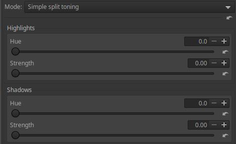
The tonal range of the image is divided into just two areas, Highlights and Shadows. You can select the Hue of the two areas separately, and the Strength of the effect (the opacity). The tint is based on the colors of the color wheel.
4.4.2.17 Softlight CTL script
In the Color/Tone Correction tool in the Local editing group, you can select CTL script under Mode.
The Softlight tool emulates the effect of blending an image with a copy of itself using GIMP’s “soft light” layer blending mode. The resulting image has a little extra contrast and saturation, which is generally visually pleasing.
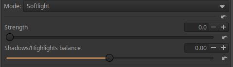
Strength: You can control the strength of the effect with it.
Shadows/Highlights balance: Only has an effect if Strength is greater than zero. It shifts the histogram left/right.
4.4.2.16 Subtractive color mixing CTL script
In the Color/Tone Correction tool in the Local editing group, you can select CTL script under Mode.
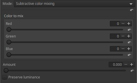
Amount: Essentially controls opacity.
Preserve Luminance: Preserves the original luminance of the image during blending.
4.4.2.23 Tetrahedral color warping (HSL) CTL script
In the Color/Tone Correction tool in the Local editing group, you can select CTL script under Mode.
Tetrahedral color warping script with HSL user interface.
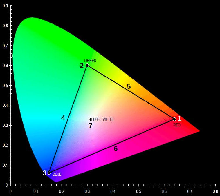
- Red
- Green
- Blue
- Cyan
- Yellow
- Magenta
- D65 (6500 K) white point
The above diagram shows the CIE 1931 YXZ color space, which shows the color range of the sRGB color space, which is the area of the black triangle. The three primary colors, red, green, and blue, as well as the secondary colors cyan, yellow, and magenta, and the white point D65 (6500 K) are marked.
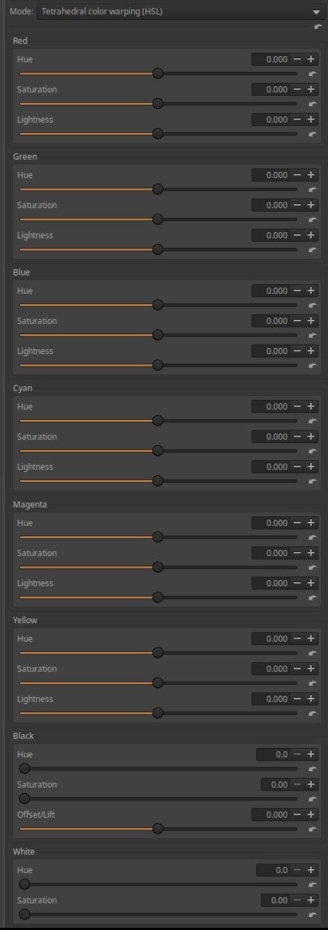
The sliders can be used to modify the HSL parameters of each of the colors listed above, i.e. their Hue, Saturation, and Lightness.
The Black Hue, Saturation can be adjusted, and the Offset/Lift slider can be used to lighten and darken shadows.
The Hue and Saturation of White can be modified.
The Hue can be specified in degrees according to the color wheel.
4.4.2.24 Tetrahedral color warping (RGB) CTL script
In the Color/Tone Correction tool in the Local editing group, you can select CTL script under Mode.
Tetrahedral color warping script with RGB user interface.
- Red
- Green
- Blue
- Cyan
- Yellow
- Magenta
- D65 (6500 K) white point
The above diagram shows the CIE 1931 YXZ color space, which shows the color range of the sRGB color space, which is the area of the black triangle. The three primary colors, red, green, and blue, as well as the secondary colors cyan, yellow, and magenta, and the white point D65 (6500 K) are marked.
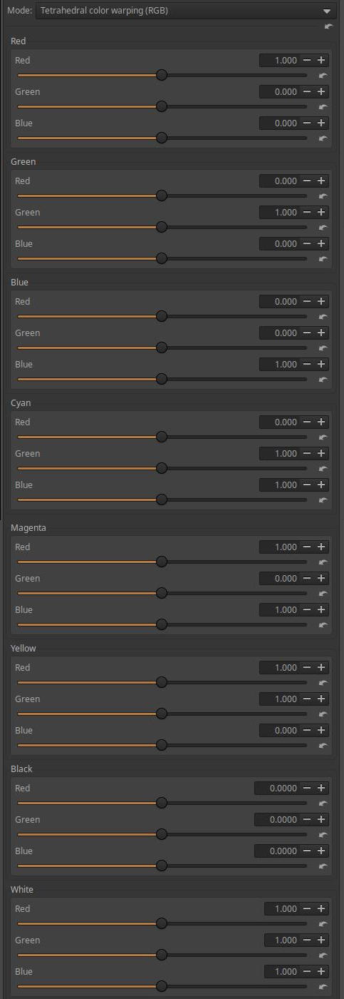
The sliders can be used to adjust each of the hues listed above, as well as the R, G, and B color channels of White and Black.
4.4.2.19 Tint by luminance CTL script
In the Color/Tone Correction tool in the Local editing group, you can select CTL script under Mode.
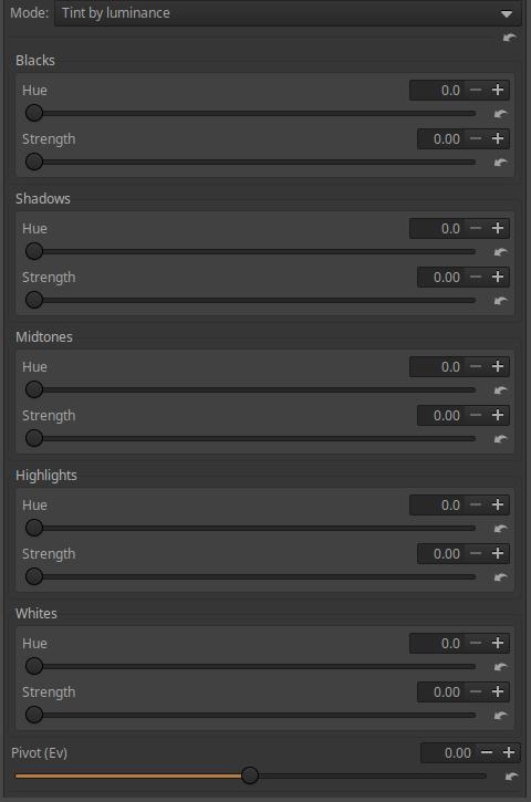
You can use it to adjust the color of each tone range and the strength of the effect.
The entire tonal range is divided into five ranges: Blacks, Shadows, Midtones, Highlights, and Whites. The Hue sliders adjust the hue of each range according to the colors of the color wheel, in degrees. The Strength sliders control the strength of the effect.
Pivot (Ev): You can set what is considered a midtone depending on the nature of the image. A dark-toned image will have a different midtone than an image with light tones.
4.4.2.25 Tone curve CTL script
In the Color/Tone Correction tool in the Local editing group, you can select CTL script under Mode.
The tone curve creates a relationship between the input and output lightness values using a curve.
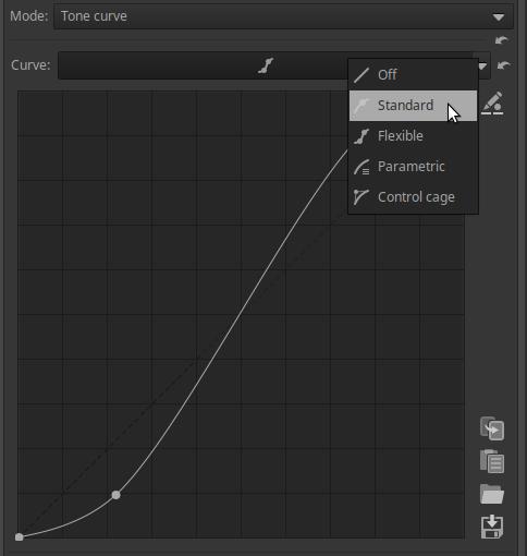
This is a completely normal tone curve.
4.4.2.11 WB and primaries correction CTL script
In the Color/Tone Correction tool in the Local editing group, you can select CTL script under Mode.
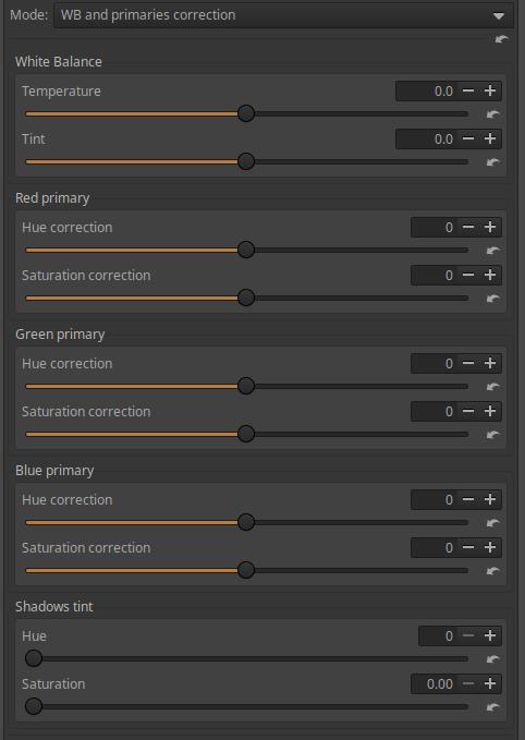
In the Temperature section, you can set the Temperature and Tint.
Below that, you can adjust the Hue correction and Saturation correction of the Red, Green, and Blue primaries. You can change the hue towards the adjacent secondary colors, and you can adjust the saturation for each primary color. This allows you to adjust and modify the colors of the image.
In the Shadow tint section, you can change the Hue and Saturation of the shadows.
4.4.3 Smoothing
It is located in the Local editing group. It is a tool that can be used for many purposes.
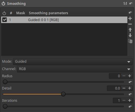
Channel can be one of the following:
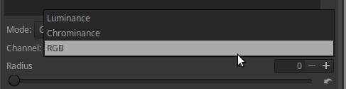
In most Modes, you can choose a channel.
RGB: Applies to RGB components.
Luminance: Applies to the luminance channel (details and edges) while preserving colors.
Chrominance: applies to color information while preserving brightness.
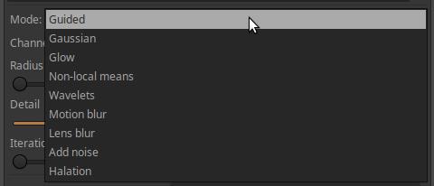
In the figure above we can see the options of Mode.
4.4.3.1 Guided
Edge-preserving blurring operation using a directional filter.
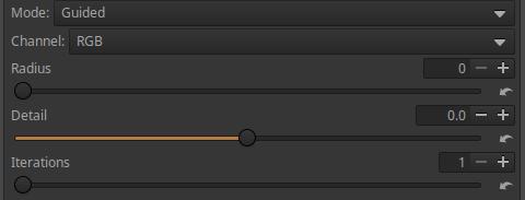
Radius: The amount of blur.
Detail: The level of detail/edge preservation.
Iterations: Number of iterations (executions).
4.4.3.2 Gaussian
Applies Gaussian blur.
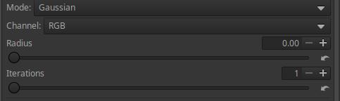
Radius: The amount of blur.
Iterations: Number of iterations (executions).
4.4.3.3 Glow
It implements a method called Glowing effect.
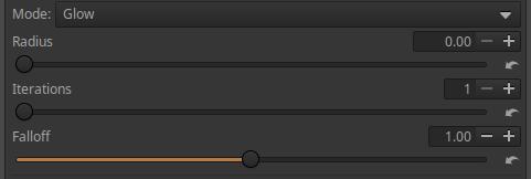
Radius: The amount of radiance.
Iterations: Controls the spread of the glow effect.
Falloff: Controls how suddenly the glow effect fades away.
4.4.3.4 Non-local means
It implements an algorithm called Non-local means, which is used to reduce image noise. Unlike the “local average” method, which takes the average value of a group of pixels surrounding a target pixel to smooth it, the Non-local means method takes the average of all pixels in the image, weighting them by how similar these pixels are to the target pixel. This results in much greater clarity and less loss of detail compared to the local method.
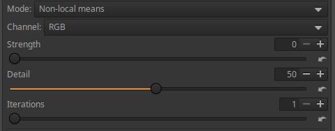
Strength: The amount of noise reduction.
Detail: The degree to which details are preserved.
Iterations: Number of iterations (executions).
4.4.3.5 Wavelets
It uses a wavelet decomposition process, and blurring can be applied at the selected level of detail.
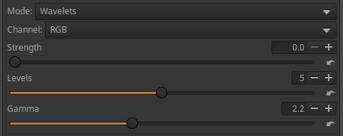
Strength: The degree of blurring.
Levels: Select a Wavelet level (between 1 and 8). Level 1 represents the smallest details in the image, level 8 represents the largest details.
Gamma: You can adjust the Gamma value.
4.4.3.6 Motion blur
It has the effect of moving the camera with the specified parameters while shooting.
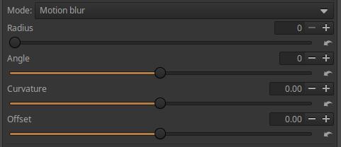
Radius: The amount of blur.
Angle: The angle of the blur.
Curvature: The curvature of the blur. Zero creates a straight line, a negative value creates a concave curvature, and a positive value creates a convex curvature.
Offset: The slider can be used to shift the blur along the path of the movement, following the curve.
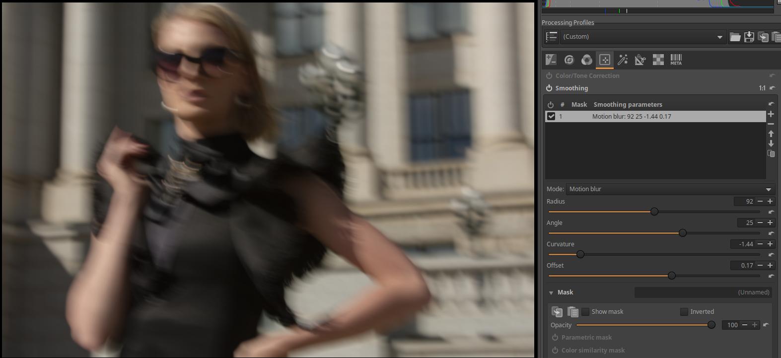
4.4.3.7 Lens blur
It mimics the blur of an idealized lens.
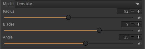
Radius: The amount of blur.
Blades: The number of aperture blades of the simulated, idealized lens. So this is not the lens that was actually used to take the picture.
Angle: Rotate the position of the aperture blades.
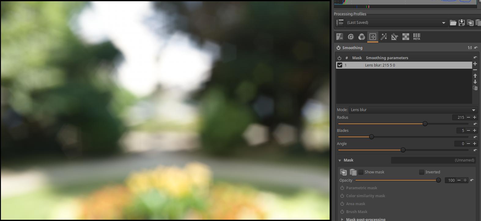
I set a large amount of blur with the Radius slider and a five-bladed aperture with the Blades slider. The image of the pentagonal aperture appeared in the image, in multiple copies. By setting a larger Radius, the image of the aperture will also become larger. The Angle slider can be used to rotate the pentagonal image of the aperture blades.
4.4.3.8 Add noise
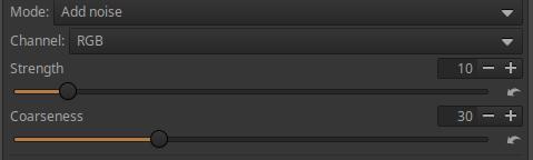
Strength: The amount of noise added.
Coarseness: The roughness of the added noise.
4.4.3.9 Halation
Simulates a halo effect.
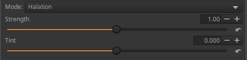
Strength: The strength of the effect.
Tint: The color of the added halo.
4.4.4 Local Contrast
It is located in the Local Editing tool group. It uses a wavelet decomposition process, and the contrast adjustment can be applied at the selected detail level.
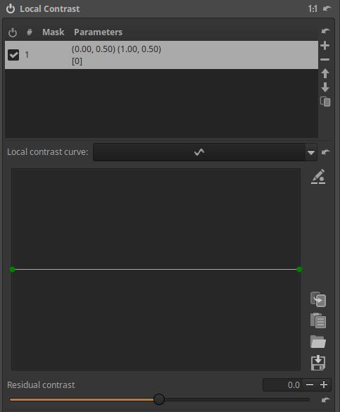
The contrast can be adjusted with the smoothing curve. The middle line in the figure is the neutral state of the curve. To the left, you can change the contrast of the finest details, and the further to the right you move, the larger details are modified. If you drag the curve upwards at the selected fineness of details, the contrast of the selected fineness of details increases, if you drag it downwards, the contrast of the selected fineness of details decreases.
Residual Contrast: The residual image is created by removing the details of the broken levels from the original image, and what remains is the residual image. This will obviously be the “detail level” containing the largest details, since the finer details have been removed. This means that the modifications made using the curve have no effect on the residual image, and the reverse is also true. We can perform operations not only on the individual detail levels, but also on the residual image, in this case we can increase or decrease the contrast of the residual image.
4.4.5 Texture Boost/Sharpening
It is located in the Local Editing tool group. It can be used to highlight texture, sharpen, or create a blur.
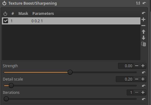
Strength: Controls the strength of the effect. Positive values result in texture enhancement or sharpening, negative values result in blurring. Applies a non-Gaussian blur.
Detail scale: Controls the level of detail the tool’s effect will be applied to.
Iterations: You can set the number of iterations (repetitions) using this. The effect of the tool increases when performed multiple times.
Let’s look at a simple application example:
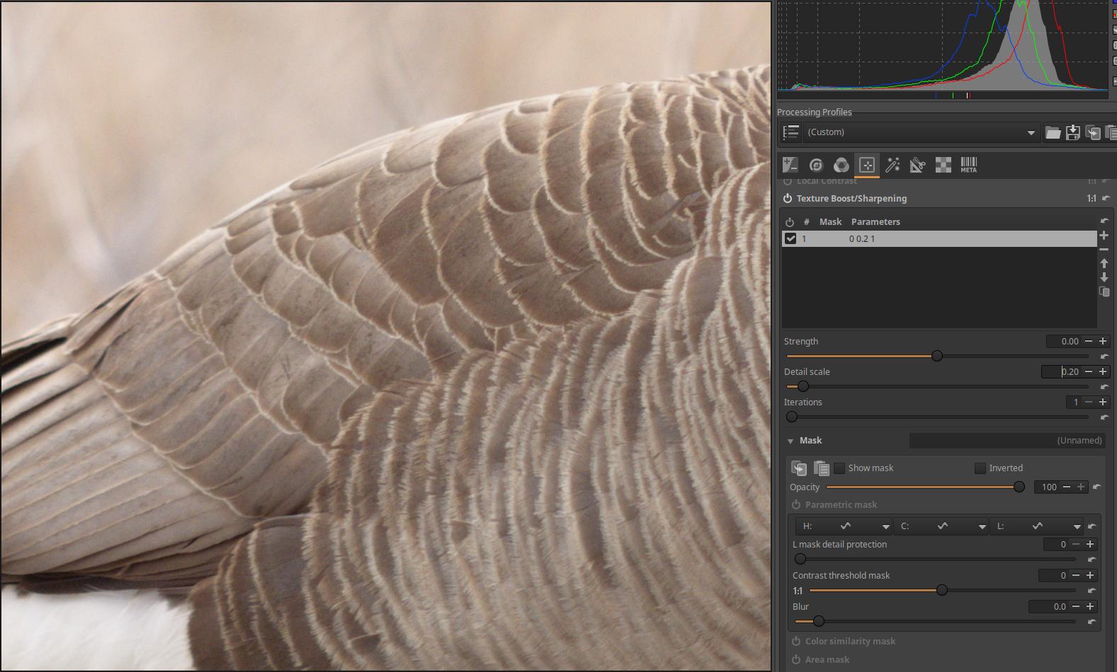
We want to sharpen the image using the Texture Boost/Sharpening editing tool. Let’s turn off the Output Sharpening tool in the Transform tool group and the Capture Sharpening tool in the Details tool group so that they don’t sharpen the image. In the image above, at 100% magnification, we can see that the image is not very sharp without sharpening.
Go to the Local Editing tool group and activate the Texture Boost/Sharpening tool, which we will use as a global tool. Leave all settings at their default values, we only need to deal with the Strength, Detail scale, Iterations sliders. The Strength allows you to set the amount of sharpening, and the Detail scale slider allows you to control the size of the details that the sharpening will cover. If you only want to sharpen small details, set it to a small value. If you perform this procedure several times in a row, its effect will increase. The Iterations slider allows you to set the number of executions. The default, minimum value is 1, the maximum value is 5. Multiple executions require more resources (it takes longer to create the final (JPEG) image after starting the Queue).
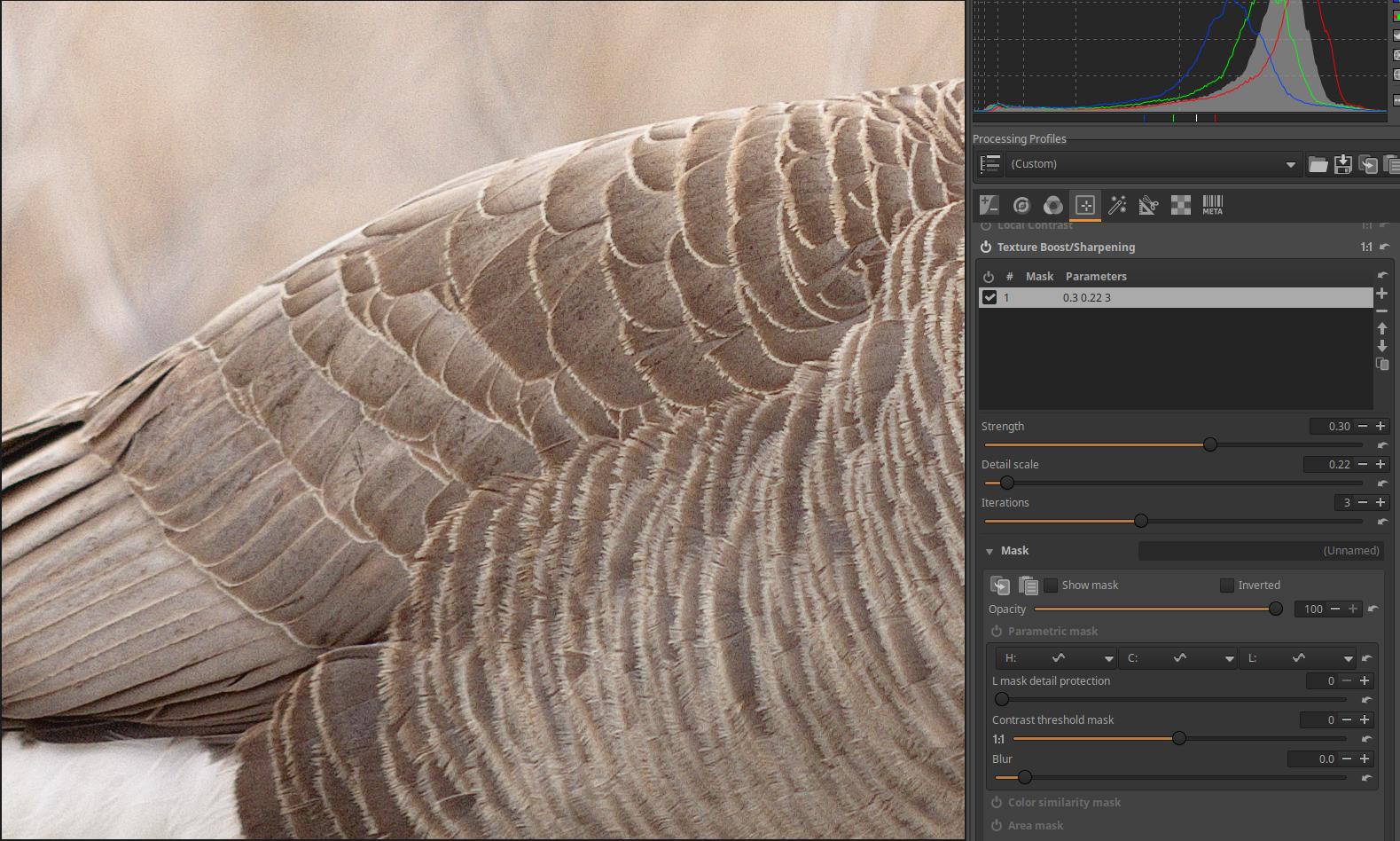
Let’s try adjusting all three sliders and find the best result for us. I set the values shown in the figure above: Strength=0.3, Detail scale=0.22, Iterations=3. This is not necessarily optimal, everyone can adjust the settings according to their own taste.
4.5 Special effects group
Other global editing tools for special purposes can be found in this group.
Group editing tools:
- Black-and-White
- Film Simulation
- Soft Light
- Vignette Filter
- Graduated Filter
- Haze Removal
- Film Grain
- Film Negative
4.5.1 Black-and-White
It is located in the Special effects group. It can be used to convert a color image to black and white.
Black and white conversion is also about color. This was also the case during the time of black and white negative film photography. Negative film was not equally sensitive to different colors, so light rays of certain colors caused much stronger blackening than would have resulted from their actual brightness (especially in the beginning, when they were still only orthochromatic films). Photographers often used color filters when shooting on black and white negative film, which changed the degree of blackening of the film for certain colors. The best-known example of this is the yellow color filter, which filters out blue light, so the blue of the sky became lighter (less blackened) on the negative, and darker on the positive paper image. As a result, light clouds in a blue sky stood out much more.
So converting to black and white is also about what tonal shade of gray the different color and brightness parts of the subject should be converted to.
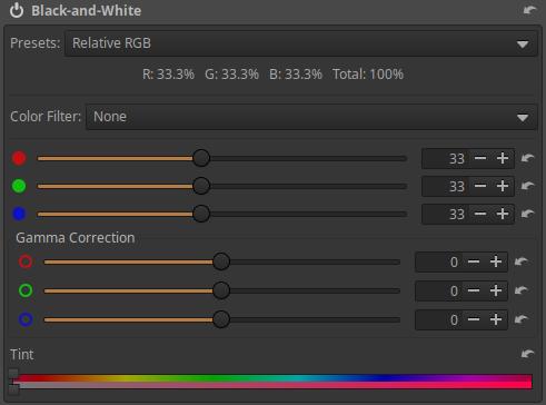
Presets: If you open it, you can choose from a few predefined options and give an initial value to the three sliders under the Color Filter label.
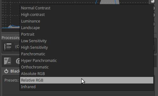
The predefined values are shown in the table below.
| Preset | Red (%) | Green (%) | Blue (%) |
|---|---|---|---|
| Normal Contrast | 40.6 | 31.1 | 28.3 |
| High Contrast | 29.9 | 25.4 | 44.8 |
| Luminance | 30.0 | 59.0 | 11.0 |
| Landscape | 66.0 | 24.0 | 10.0 |
| Portrait | 49.1 | 40.0 | 10.9 |
| Low Sensitivity | 27.0 | 27.0 | 46.0 |
| High Sensitivity | 30.0 | 28.0 | 42.0 |
| Panchromatic | 33.3 | 33.3 | 33.3 |
| Hyper Panchromatic | 41.0 | 25.0 | 34.0 |
| Orthochromatic | 0.0 | 42.0 | 58.0 |
| Absolute RGB | 0.0 | 42.0 | 58.0 |
| Relative RGB | 0.0 | 42.0 | 58.0 |
| Infrared | -28.0 | 139.9 | -11.9 |
The Red, Green, and Blue sliders can be used to make adjustments afterwards, but be careful because negative values can easily cause artifacts or unusual behavior. The sliders are used to change the proportions of the RGB channels used during black-and-white conversion. The sliders have a value range of -100 to +200 percent. To avoid clipped highlights, the sum of the three channels should not exceed 100%, but special effects can be created with the essentially free settings.
Color Filter: You can choose from a drop-down list of different color filters.
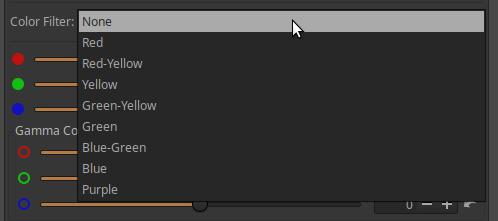
The effect of the selected filter is also displayed in the preview. After selecting the “infrared” Preset option, the option to select a color filter does not appear, but if we modify the value of the slider of one of the color channels, we can select a color filter again.
Gamma Correction: The middle gray point can be adjusted using the sliders if necessary.
Tint: These are two sliders combined. The upper slider adjusts the color of the black and white image, and the lower slider adjusts the saturation of the color. The color bar between the two sliders is also divided into two parts, the top shows the hues associated with the upper slider, and the bottom shows that the color saturation can be adjusted using the lower slider. The image below shows the effect of adjusting the Tint.
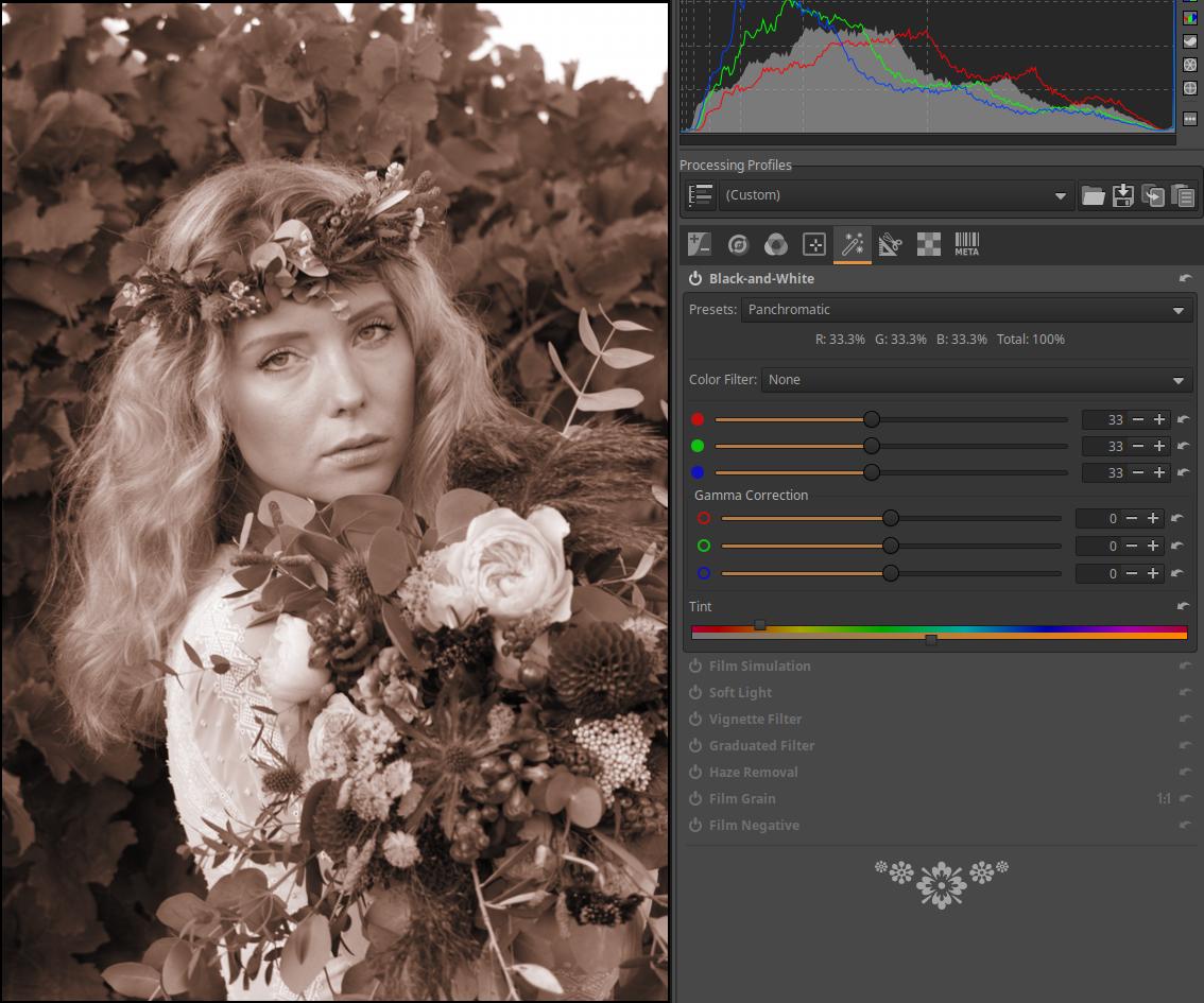
4.5.2 Film Simulation
It is located in the Special effects group. We can transform the image as if it was not taken with a digital camera, but with a film camera using a specific type of film. Here we also have the option to use the Sigmoid tone mapper.
ART inherited support for 3D LUTs (LUT = Look-Up Table) from RawTherapee. Support for these is available in this tool and in the Color/Tone Correction tool in the Local Editing group. The community-developed Hald CLUT collection contains 3D LUTs suitable for simulating various types of film. Before using this tool, you must have a LUT collection installed, otherwise you can only use the Sigmoid tone mapper.
Before applying it, we need to set up the library containing the LUTs in the Libraries section of the Image Processing tab of the Preferences.
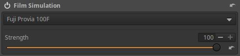
First we need to select the LUT file to be used.
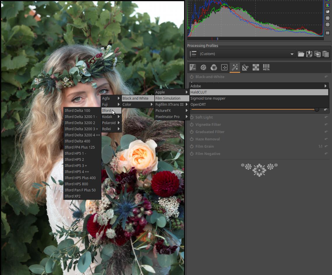
Choose from a variety of black and white and color film types, other creative options (e.g. moonlight shots), and the Sigmoid tone mapper. Apply the LUT immediately after selection.
Strength: The Strength slider allows you to adjust the strength (essentially the opacity) of the selected LUT effect.
4.5.2.1 Sigmoid tone mapper
It is available in the Film Simulation tool. The Sigmoid CTL script is not included here by chance, because Film Simulation is located towards the end of the pipeline (36.), and the Sigmoid CTL script allows us to adjust the final tones of the image. The Sigmoid process performs an S-curve-like tone mapping. We can expand or narrow the dynamic range of the subject to match the dynamic range of the monitor (or other display).
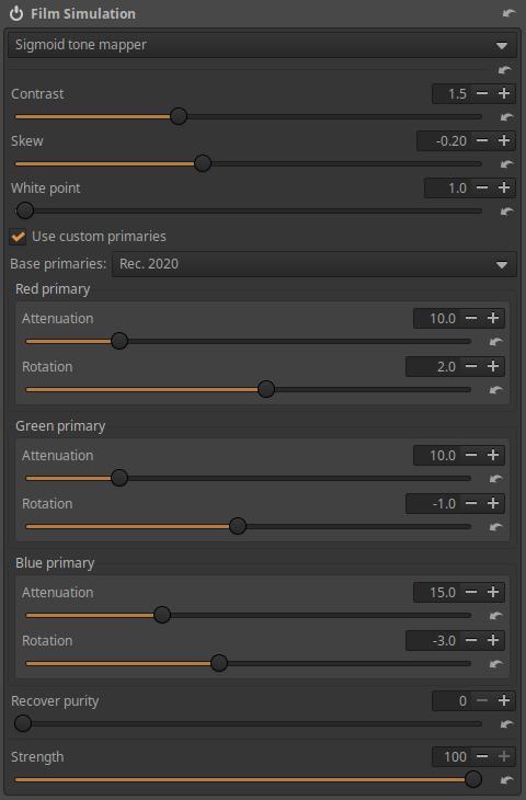
The figure above shows the tool’s controls.
Contrast: Tones are compressed at both ends of the S-curve. Increasing contrast increases the steepness of the curve, but also results in more aggressive, abrupt compression at the ends of the straight section (shadows and highlights). Higher values require less exposure to reach the display’s white level, and shadows become darker. Lower values allow for a greater dynamic range.
Skew: Shifts compression towards shadows or highlights. With Bevel, you can shift contrast from shadows to highlights, or vice versa, without changing the contrast of mid-gray tones. A positive Bevel smooths shadows and compresses highlights. A negative Bevel creates darker shadows and duller highlights.
White point: The white point can be adjusted using.
Use custom primaries: If unchecked, the work profile (scene) is used. If enabled, only then the settings options below it will be activated.
Base primaries: You can select the set of primaries that will be used as the basis for the corrections, i.e. you can choose between Rec. 2020 and Rec. 709/sRGB color spaces. This ensures that if you change the default Rec. 2020 working profile to something else in the Colors/Color Management tool, the correction will still be made using the color space selected here.
The tool applies the sigmoid curve to each RGB channel separately.
Attenuation: The attenuation value can be set separately for the R, G, and B color channels. Attenuation reduces the purity of the Red/Green/Blue primaries before processing with the sigmoid curve. (Purity: The distance of the pixel color from the white point in the xy color plane. Zero purity means that the light is achromatic. High purity means that the light is laser-like, monochrome, i.e. consists of light of a single wavelength.) Attenuation can be used to avoid, for example, posterization.
Rotation: A certain amount of rotation of the primary colors can be set per color channel. This affects the “path” along which the hue changes as it approaches white.
Recover Purity: This allows us to recover some of the original purity after applying the sigmoid curve per color channel. At a value of 100, all attenuation is restored, so that the values in the middle range are close to their original purity. A value of 0 does not restore purity at all, so the more attenuation is applied, the less purity is in the final image. Rotations are always restored, regardless of the slider value. If the slider value is 0, the module output is guaranteed to remain within the selected Base Primary Range.
Strength: You can control the strength of the effect with it.
The sigmoid curve varies around the midtones, so before using it, you must adjust the brightness of the midtones using exposure compensation.
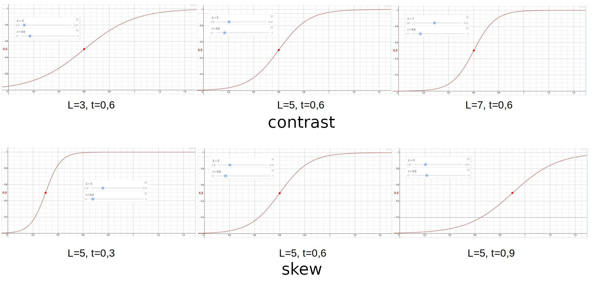
In the figure above, we can observe the effect of the Contrast and Skew sliders. The figures above come from a website that demonstrates the effect of the sigmoid mathematical function. We imagine the curves as tone curves. Changing the L parameter corresponds to changing the Contrast, and the t parameter corresponds to Skew. In the figure, the top row shows the effect of Contrast, and the bottom row shows the effect of Skew.
In the top row, the value of at for each curve is 0.6, so for each graph, the curve changes around the point with coordinates (0.6;0.5) depending on the value of L. I have marked the point with coordinates (0.6;0.5) with a red dot in the top row of the figure. In the bottom row, we can see that changing the value of at shifts the point around which the curve changes, therefore the shape and slope of the curve change.
4.5.3 Soft Light
It is located in the Special effects group. The Soft Light emulates the effect of blending an image with a copy of itself using GIMP’s “soft light” layer blending mode. The resulting image has a little extra contrast and saturation, which is usually visually pleasing.
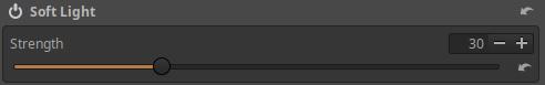
Strength: Controls the strength (essentially the opacity) of the Soft Light effect.
4.5.4 Vignette Filter
It is located in the Special effects group. This tool is used to intentionally add peripheral darkening to an image. To correct lens peripheral darkening, you should not use this tool, but use the tool in the Transform group (or better yet, the Flat-field tool).

Clicking the button below the tool’s header will display the center of the edge darkening filter effect in the preview as a small white circle. Clicking the button again will hide the center from the preview. Right-clicking outside the small circle in the preview will also turn off the center.
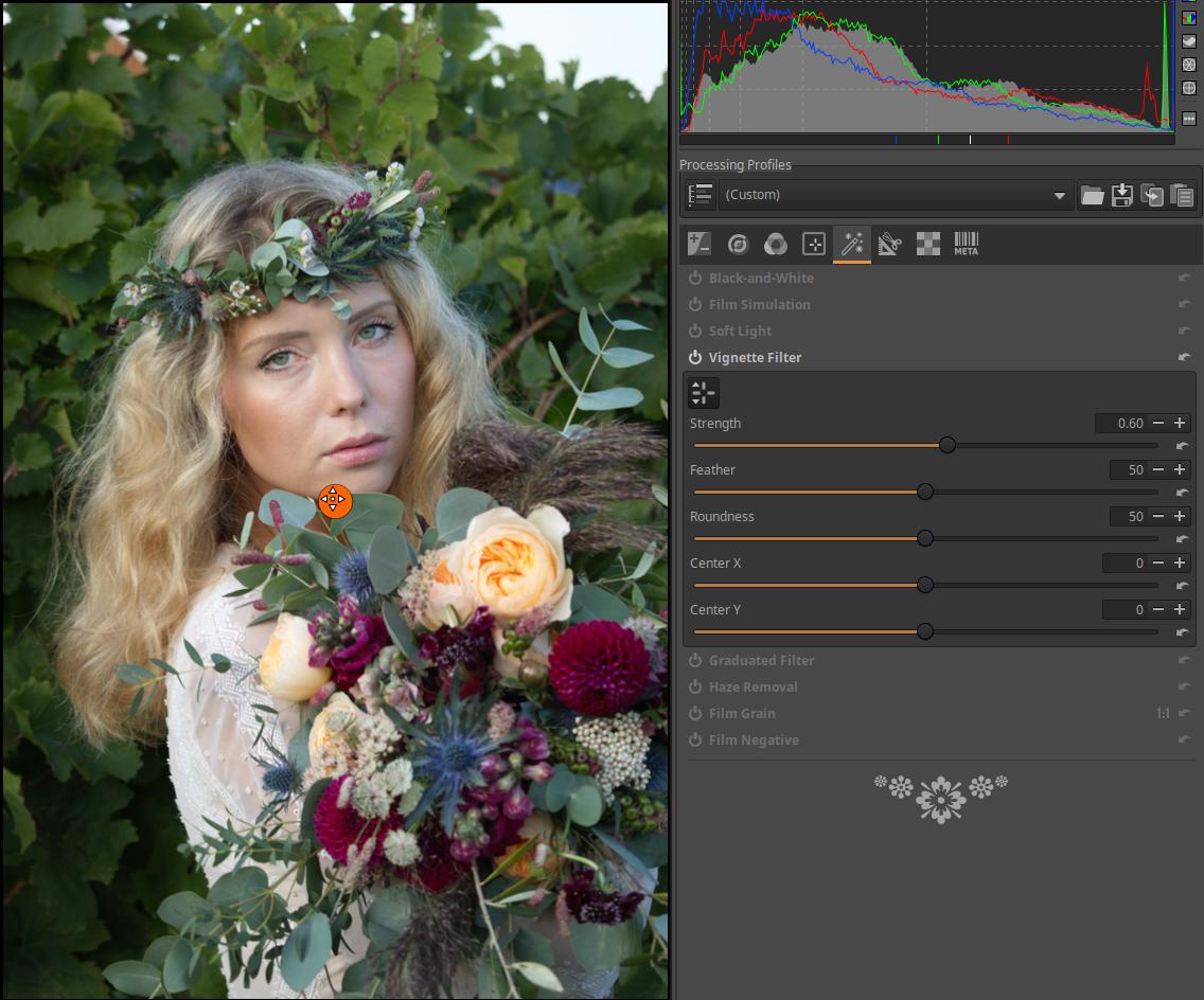
The center of the effect can be dragged to any point on the preview with the mouse. For example, moving the center may be necessary when applying Crop.
Strength: The amount of darkening/lightening caused by the filter in the corners of the image, expressed in exposure value. Positive values darken, negative values lighten the edges of the image field.
Feather: Controls the width of the feather. A slider value of 0 will only add a small amount of feathering to the corners of the image, and the rest of the image will not be affected by the filter. A slider value of 50 will cause the Feather to extend halfway between the corner of the image and the center of the effect, and a slider value of 100 will extend all the way to the center of the effect.
Roundness: Controls the shape of the filter. A slider value of 0 makes the filter rectangular with rounded corners, a value of 50 makes it elliptical, and a value of 100 makes it circular.
Center X: Used to shift the center of the effect in the horizontal direction.
Center Y: Used to shift the center of the effect in the vertical direction.
4.5.5 Graduated Filter
It is located in the Special effects group. With this tool, we can create a gradient neutral gray filter. The effect will be as if we had used such a filter when shooting. The gradient neutral gray filter is used when taking landscapes, its purpose is to darken the sky so that it is not too bright, burnt out in the image. In addition, we can use it for any other purpose.
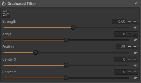
The filter editor can be turned on/off using the button below the tool’s header. You can also turn off the editor by right-clicking on any part of the preview outside the editing tool.
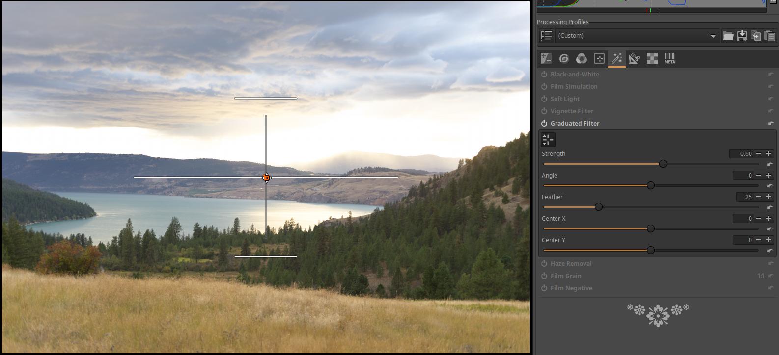
The center of the effect can be dragged with the mouse to the desired location in the preview.
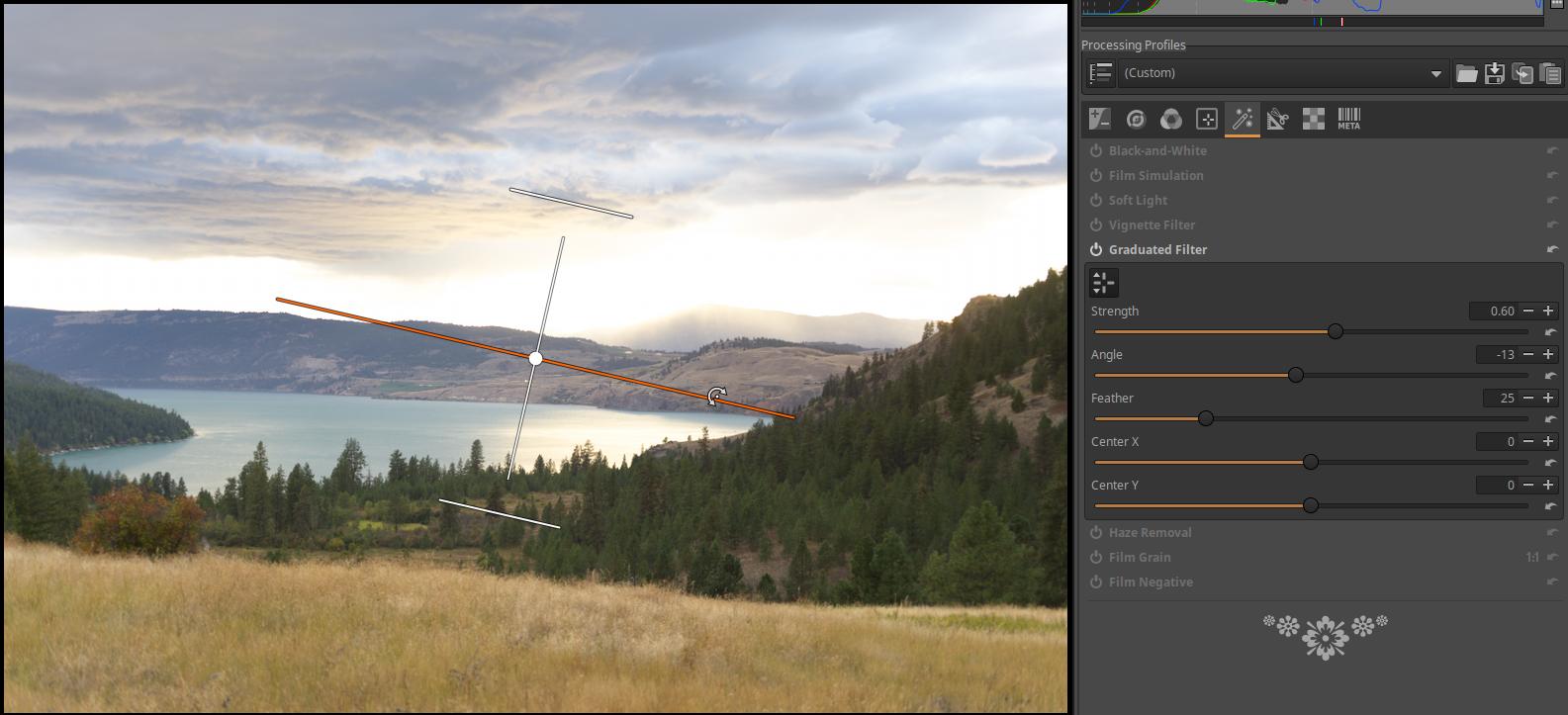
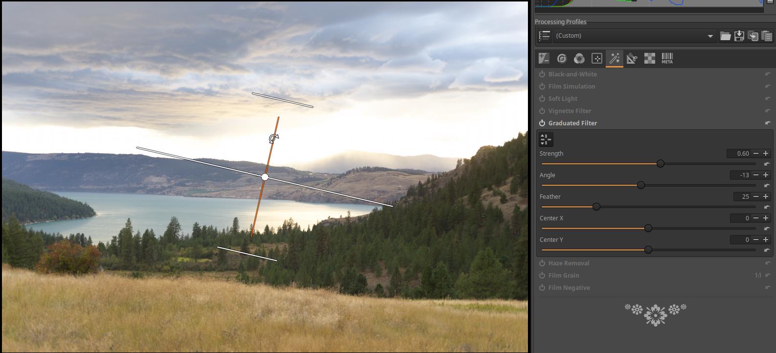
The transition can be rotated by “grabbing” the horizontal or vertical centerline.
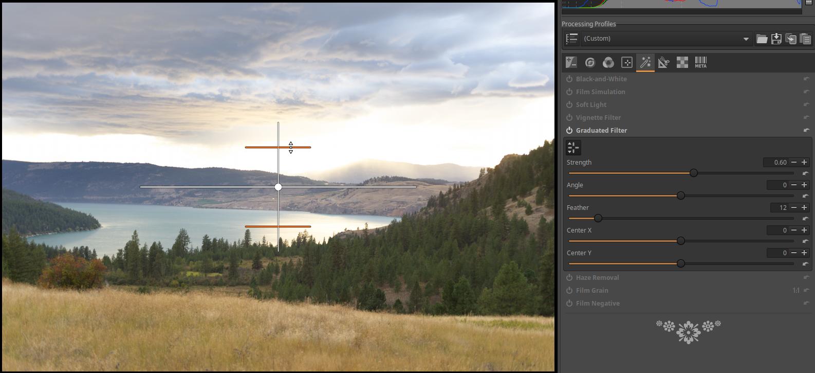
The width of the Feather can be adjusted by dragging the top or bottom boundary line.
Strength: The maximum darkness of the filter in exposure value.
Angle: The angle of rotation of the transition.
Feather: Width of the Feather.
Center X: Used to shift the center of the effect in the horizontal direction.
Center Y: Used to shift the center of the effect in the vertical direction.
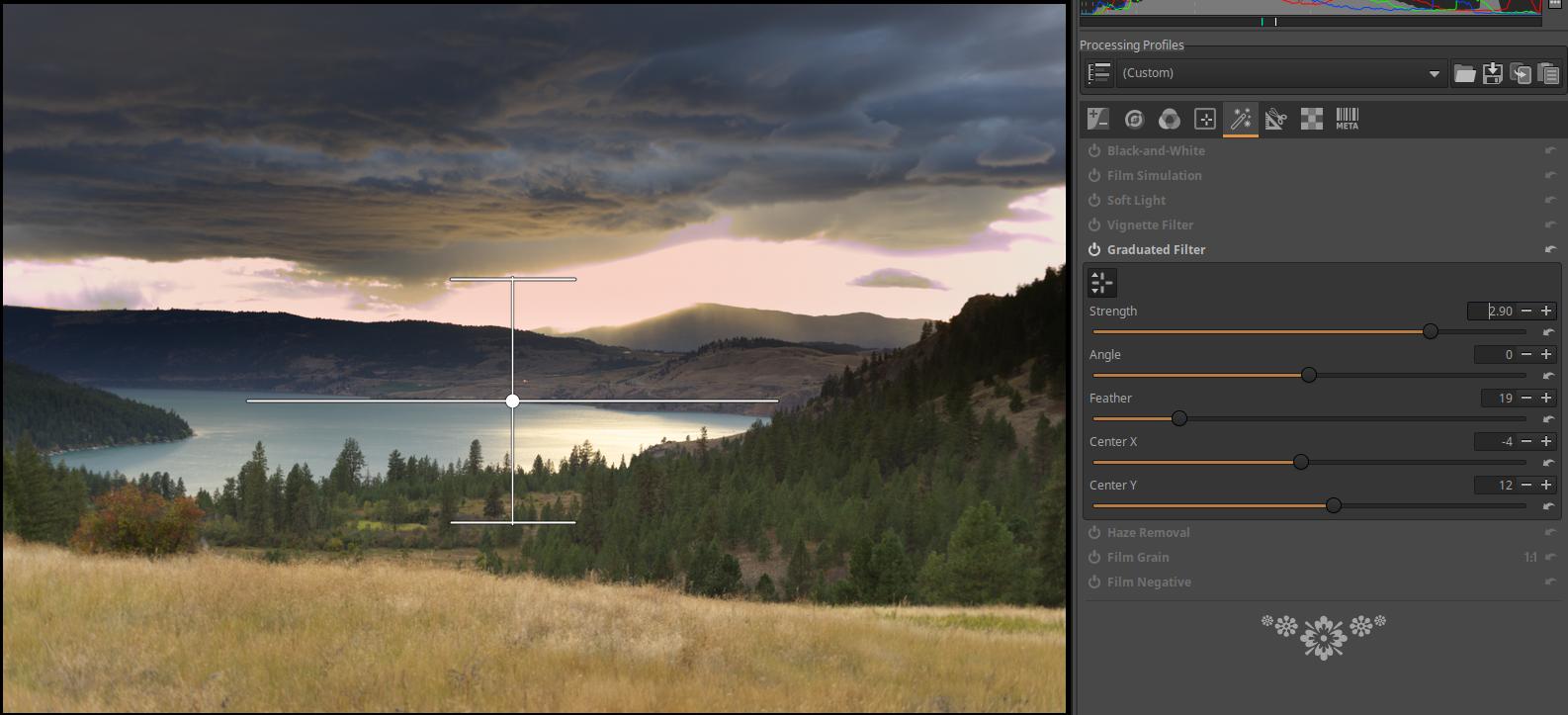
4.5.6 Haze Removal
Located in the Special effects group. Reduces perspective blur.
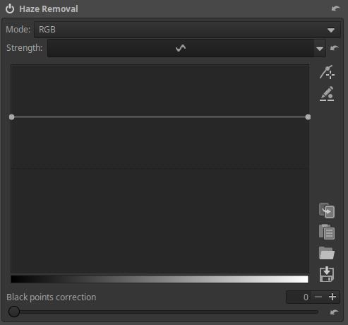
Mode: You can choose between RGB and Luminance. RGB is the default. Mode affects the amount of saturation added. RGB mode adds more saturation than Luminance mode.
Strength: The curve is on by default, but you can also turn it off. If you turn it off, no blur removal occurs, and the Mode state does not matter, but Black points correction works. If you turn it on, the Flat curve editor as shown in the figure appears. Below we see the tone scale. The default state of the curve is a horizontal line located above the center line (as shown in the figure above), which is not a neutral state, but a blur removal occurs. The neutral state would be a horizontal line located on the center line. The location of the center line is indicated by a black horizontal line in the curve editor. According to the figure, due to the horizontal line located above the center line, it removes the blur evenly across the entire tonal range. Dragging the curve up increases the blur removal. If you drag the curve below the center line, you can add blur to the image.
Black point correction: We can correct the position of the black point to a certain extent.
Using the tool:
Haze can occur in an image for a variety of reasons, such as aerial perspective or light fog. In many cases, it is advisable to remove the haze.
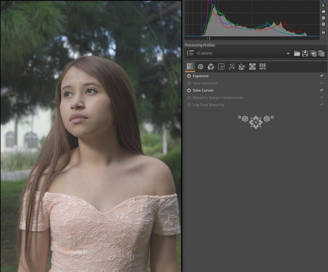
Open the raw file for editing. The blur covers the entire image.
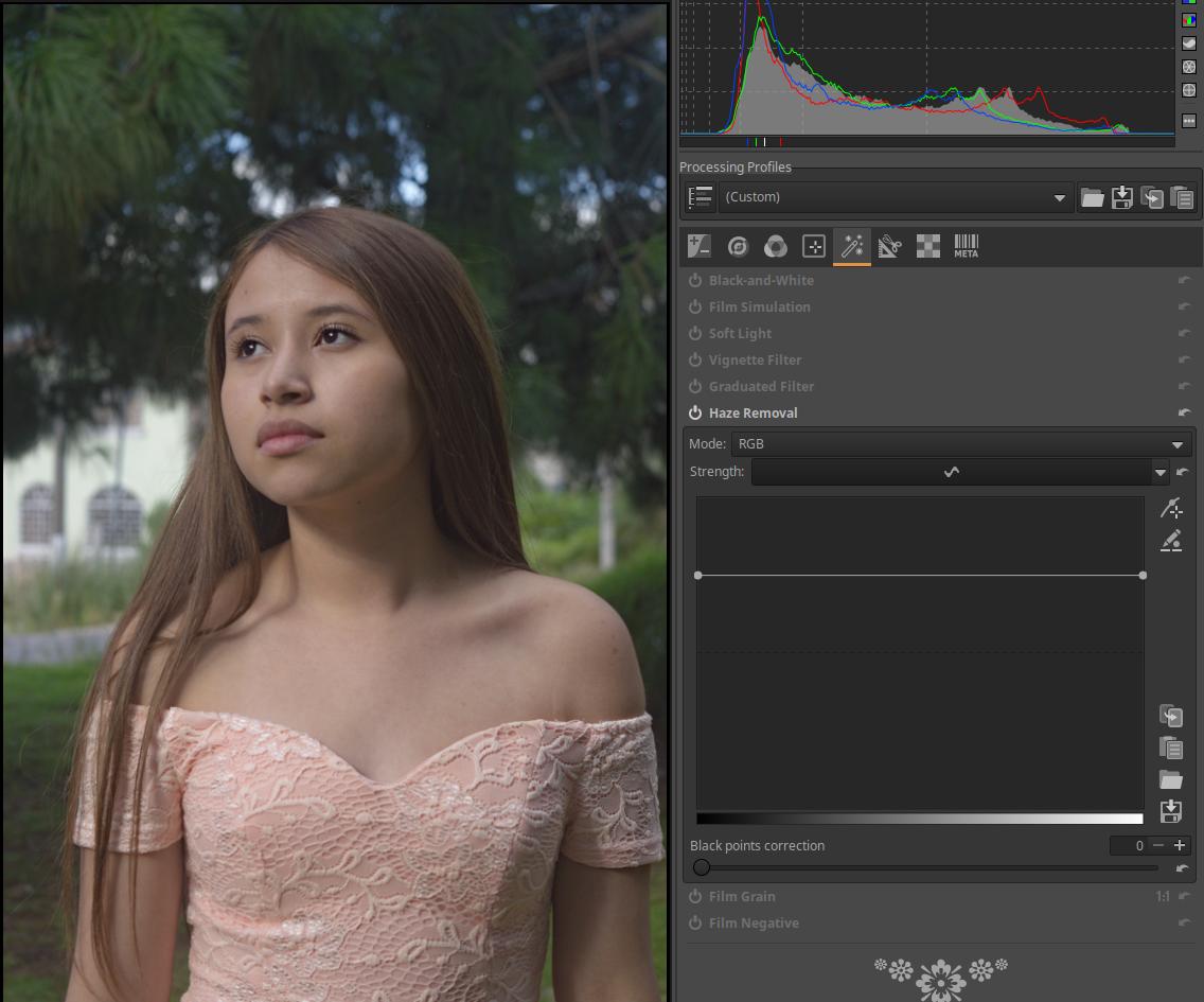
Go to the Special Effects tool group, activate the Haze Removal tool, and there will be less blur in the image.
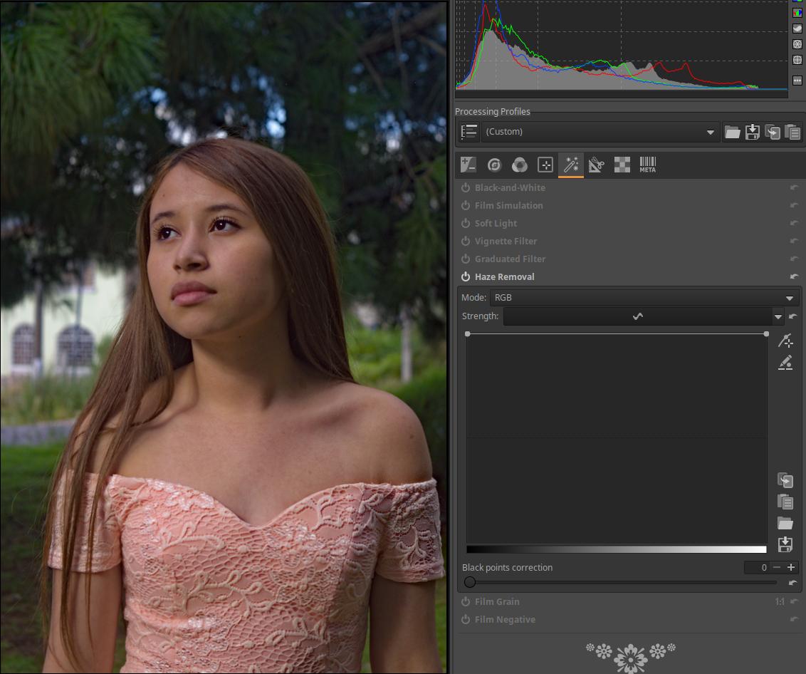
There is a smoothing curve here, which can be used to change the strength of the blur removal depending on the tones of the image. On the left edge, we can control the strength of the blur removal of the darkest image elements, and on the right edge, we can control the strength of the lightest image elements. In the figure above, at the top, set to the maximum value, we can see the straight-shaped “curve”. It has the effect of maximizing the strength of the blur removal in the entire tonal range.

In the figure above, I modified the curve so that the strength of the blur removal decreases for lighter shades, and in fact, for very light shades, blur is added to the image because the curve passes below the center line.
4.5.7 Film Grain
Located in the Special effects group. Adds grainy noise to the image, similar to film grain.
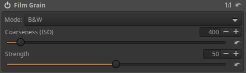
Coarseness (ISO): The grain coarseness (size) can be adjusted in ISO values. Grain coarseness is related to ISO sensitivity because in the film era, the higher the sensitivity of the film, the coarser the grain.
Strength: The strength of the grain. Essentially, we are setting the opacity.
4.5.8 Film Negative
It is located in the Special effects group. It can be used to process photographed color negatives. We can digitize our color negatives and slide films in the traditional way with a film scanner, but good quality film scanners are very expensive and very slow. For our existing frame and lens, we can buy a converter much cheaper, with which we can photograph our negative or positive film frames. This method is cheap, fast, but requires post-processing. For short film, taking into account its information content, a medium (e.g. 12 MP) frame is more than enough, and a macro lens is best for the lens.
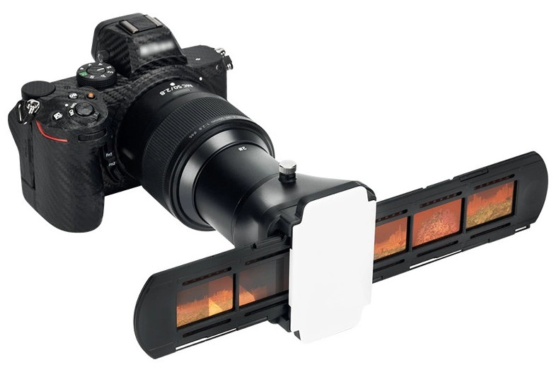
The picture above shows a JJC FDA-K1 type adapter that can be attached to the front of the lens (to the filter thread), with which we can photograph our film strips for digitization. It is also suitable for slides with very thin frames (maximum 2 mm !!!). This kit cannot be used with any lens, only with some types. Many people make their own adapters in front of their lenses.
So, we can edit our color negative film frames digitized by photography using this editing tool.
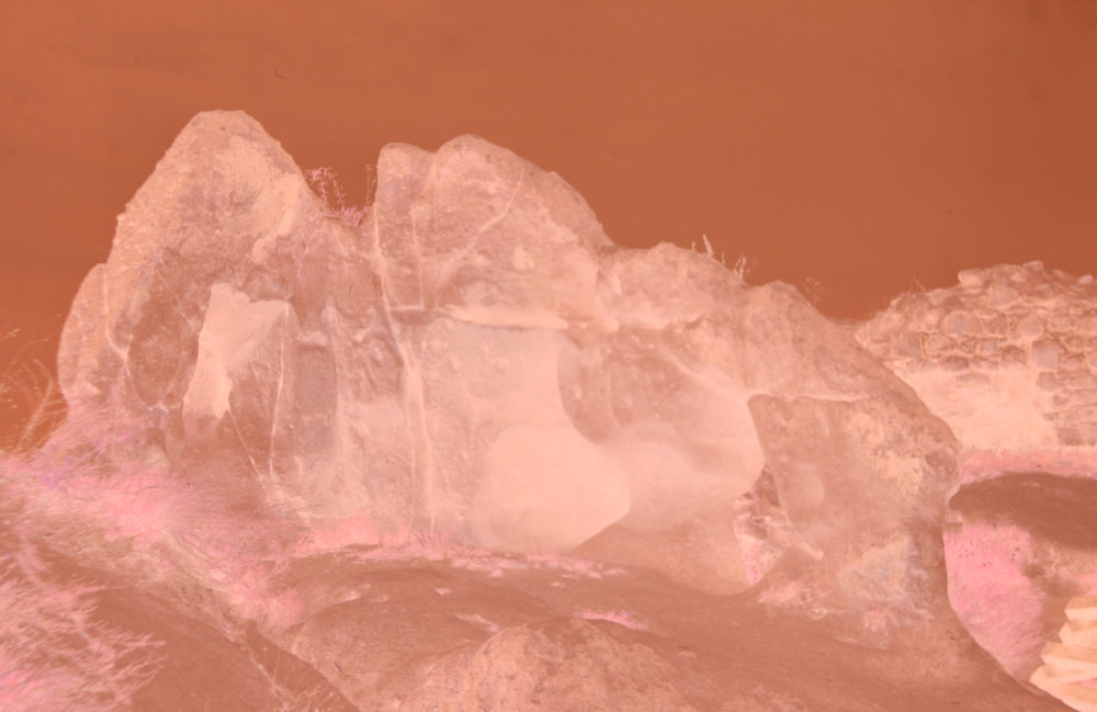
Photo taken by the author
Color negative films have a brownish base color that must be compensated for during processing.
When we turn on (activate) Film Negative tool, the preview changes to a positive image.
Pick neutral spots: By clicking this button, we can use an “eyedropper” to try to find two neutral colored areas of different brightness in the preview. Click on the selected areas, which will change the colors of the image and the values of the Red ratio and Blue ratio sliders will change. We can then refine the colors with the sliders.
Size: We can choose the size of the neutral spots.
Reference exponent: The exponent applied to the green channel. Changing this value changes the overall contrast of the image without changing its colors. The default value is good for a negative with average contrast. For very faint or poorly exposed negatives, this value should be increased. For very high contrast negatives, the converted positive image may experience clipping, so this value should be decreased.
Red ratio: The ratio of the red channel exponent to the reference exponent. This coefficient indicates how “bent” the red channel transfer curve is compared to the green transfer curve. Changing this value changes the color characteristics of the correction while maintaining the overall contrast of the image.
Blue ratio: The ratio of the blue channel exponent to the reference exponent. This coefficient indicates how “bent” the blue channel transfer curve is compared to the green transfer curve. Changing this value changes the color characteristics of the correction while maintaining the overall contrast of the image.
Photo taken by the author
The above steps were used to compensate for the effect of the brownish base color. Next, we need to adjust the white balance.
Pick white balance spot: Use the “eyedropper” to select a neutral white or gray area in the image to adjust the white balance. You can then adjust it with the Cool/Warm and Magenta/Green sliders.
Size: We can choose the size of the white balance spot.
Output level: You can adjust the brightness of the image using it.
Cool/Warm: Used to adjust the white balance.
Magenta/Green: Used to adjust the white balance.
Once these are set, we can then edit the image as usual.
4.6 Transform group
In this group of tools, we can change the geometry of the image and correct various lens errors. Here we find global editing tools.
Group editing tools:
- Crop
- Resize
- Output Sharpening
- Rotate
- Perspective Correction
- Profiled Lens Correction
- Distortion Correction
- Chromatic Aberration Correction
- Vignetting Correction
4.6.1 Crop
It is located in the Transform group. It allows you to cut out any part of the image.
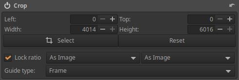
In the Left and Top fields, you can specify the coordinate of the upper left corner of the crop, and in the Width and Height fields, you can specify the width and height of the cropped area. These must be specified in pixels.
Lock ratio: If this is checked, the original or selected aspect ratio will be retained. If this option is not checked, the four sides of the crop can be dragged independently with the mouse in the preview.
Select: If you click this button, you can use the mouse to adjust the crop in the preview. You can drag the sides of the crop with the mouse to adjust it. After clicking, the button will change to Done, and when you are finished adjusting the crop area, you need to click this button again.
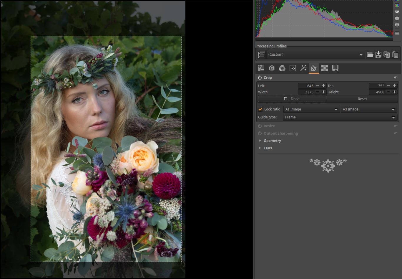
After clicking the Done button, only the cropped image portion will be visible in the preview, and the selected guide line will also disappear. The entire image and the guides can be displayed by clicking the Select button again.
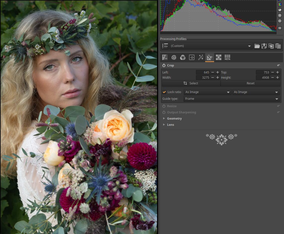
You can select several Aspect ratios from the drop-down list next to Lock ratio.
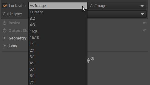
Next to it, you can select the Orientation of the selected aspect ratio from the drop-down list.
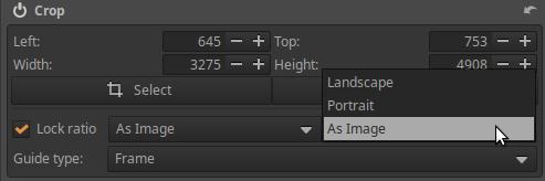
Guide type: You can choose from several guide lines that appear above the preview while you are adjusting the crop, helping you compose the image.
Reset: Clicking this button will delete the previously created crop.
4.6.2 Resize
It is located in the Transform group. It resizes the image at the very end of processing.
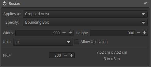
Applies to:
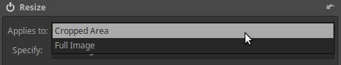
We can resize the Cropped Area or the Full Image.
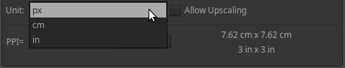
Unit: The unit of measurement for specifying the size can be pixels (px), cm, or inch (1 inch = 25.4 mm).
Allow Upscaling: If this is enabled, the image size can be larger than its original size (resolution), otherwise it can only be resized to a smaller size.
Specify: You can choose from Bounding Box, Height, Width, or Scale.
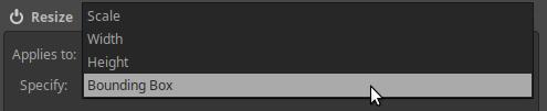
Bounding Box: Resizing is done using a bounding box of the size specified in the Width and Height fields. The aspect ratio of the image is maintained and it is resized to fit the bounding box. For example, if the bounding box size is 900x900 pixels as shown in the figure, the longer side of the image will be 900 pixels long, whether the image is in portrait or landscape orientation. If the Width and Height of the bounding box are not the same length, the resizing will still be done so that the image fills the frame vertically or horizontally so that the entire image is within the frame.
Height or Width: You can specify the desired Height or Width of the final image, whether the image is in portrait or landscape orientation. The other size of the image (Width or Height) will be determined while maintaining the aspect ratio of the image.
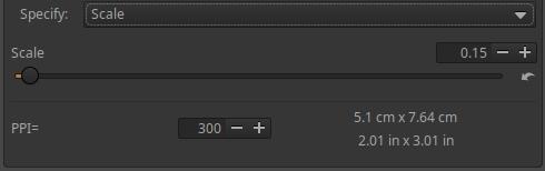
Scale: The slider allows you to set a multiplier between 0.01 and 16. This tells you how many times the image side should be scaled to its original size. If you choose a multiplier of 0.01, the image sides will be one hundredth of their original length, and if you choose a multiplier of 16, the image sides will be sixteen times their original length. The minimum size of the final image can be 32x32 pixels. If you choose a multiplier greater than 1 and Allow Upscaling is not checked, no resizing will occur and no error message will be displayed.
PPI: Pixel Per Inch, i.e. the number of pixels per inch (1 inch = 25.4 mm), this is called pixel density. It specifies how many pixels of the digital image the printer should produce for each inch of the printed page. This can be set in image editing programs when preparing the digital image for printing, and is stored in the image file itself. The printer can automatically take this setting into account and determine the size of the print accordingly. If we reduce the pixel density, the size of the print that can be produced increases, but its image quality decreases.
In addition to the PPI value, the size of the print obtained with the specified data is shown in cm and inches.
Let’s take a brief look at the DPI and PPI values associated with the printer.
Printer DPI: This has absolutely nothing to do with the digital image or its resolution. Printers use tiny dots of ink to create the image on paper. DPI stands for Dot Per Inch, which is the number of dots of ink per inch (25.4 mm) of print. This does not mean digital pixels, but rather how many dots of ink the printer places on each inch of the printed image. So it is about the density of the dots of ink, or we can also say the resolution of the printer. Inkjet printers usually have resolutions between 300 and 720 DPI, while laser printers and special photo printers can have resolutions of up to 2400 DPI. A higher resolution printer means better quality and the ability to reproduce finer details.
There are actually no pixels on the print, i.e. on the paper. In principle, at the location corresponding to a given pixel in the digital image, there is a tiny area on the print that matches the color of the pixel. For this reason, for the sake of simplicity and clarity, we can imagine that the print has square pixels. However, in reality, the pixels on the print are not separated from each other.
PPI (Pixel Per Inch). This term is used in two senses:
- On the one hand, it specifies how many pixels of the digital image the printer should use to produce each inch of the printed page. I described this in more detail above.
- On the other hand, this is usually used to specify the pixel density of the screen of monitors and televisions, the number of physical pixels per unit length of the side of the monitor screen. The pixel density of a monitor screen is a fixed value.
4.6.3 Output Sharpening
It is located in the Transform group. It is located at the very end of the pipeline. Its primary purpose is to sharpen after applying the Crop tool. It is worth sharpening a little after cropping. Of course, it can be used not only after Cropping, everyone can use it as they like. Its effect can be seen clearly in the preview when viewed at at least 100% magnification.

There are two Methods here too, the Unsharp Mask method is a simplified version of the Unsharp Mask method in the Details/Capture Sharpening tool. Everything works similarly to there.
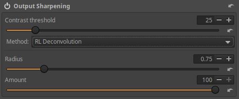
RL Deconvolution is also the same as seen in the Details/Capture Sharpening tool, except that it is not possible to sharpen more strongly towards the corners of the image, and there is no Automatic determination of the appropriate Radius value available.
There are also differences in operation, for example, the Sharpening Contrast Mask mask cannot be used in this tool.
4.6.4 Geometry subgroup
This subgroup includes the Rotation and Perspective Correction tools.
When correcting perspective distortion, the image may also suffer from the distortion shown in the figure above. Something needs to be done about this. There are two options.
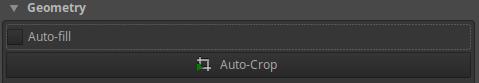
Auto-fill: If enabled, it will enlarge or reduce the image to the extent that the entire image fits within the original image boundaries without any visible black borders. This is the default behavior.
Auto-Crop: This button is only available if Auto-fill is disabled. When activated, it does not cause image interpolation (zooming in or out), but rather crops the image so that the black areas shown in the image above are no longer included in the image.
This setting is taken into account by the tools in the Geometry subgroup.
4.6.4.1 Rotate
It is located in the Transform group, within the Geometry subgroup. It can be used to rotate the image.
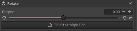
Degree: You can rotate the image by the degree set on the slider. This can be used to correct, for example, the position of the horizon or the tilt of a tower.
Select Straight Line: After pressing the button, we can select a line that is actually horizontal or vertical in the preview, and ART will rotate the image so that the selection is also horizontal or vertical in the image.
Photo taken by the author
Click the Select Straight Line button in the Rotate tool, or the eighth button from the left in the toolbar above the preview in the image above. Place the mouse pointer on a point on the horizon, press and hold the mouse button, drag the line along the horizon, and then release the mouse button when the end is exactly on the horizon. The image will be rotated immediately.
Photo taken by the author
The horizon is now horizontal. It works exactly the same for a vertical object.
4.6.4.2 Perspective Correction
It is located in the Transform group, within the Geometry subgroup. It can be used to correct perspective distortion.
The concept of perspective distortion is mainly associated with architectural photography. It is not a distortion in the optical sense, but rather a deviation from the usual view, which occurs most often when using a wide-angle lens. When photographing a large, tall building, such as a church, we are most often forced to use a wide-angle lens in order to “fit” the church into the frame. If we were to hold the camera horizontally (perpendicular to the church tower), then perspective distortion would not occur. Perspective distortion is a consequence of the point of view, the direction of photography.
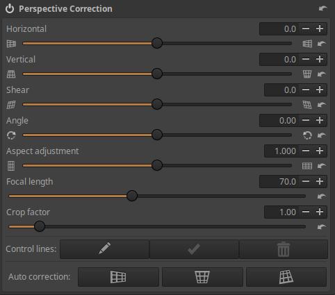
The Perspective Correction tool offers manual correction settings and powerful automatic correction. It’s worth trying Auto Correction first, because when it works, it’s the easiest and most accurate. If necessary, you can use the sliders to correct and refine. If Auto Correction gave unusable results, you can undo (in History) the effect of Auto Correction and correct manually.
Horizontal and Vertical: These sliders allow you to shift the image until the center of the resulting image is aligned with the optical center. This is usually not necessary unless you have used the tilt-shift lens shift function or have previously cropped the image off-center in an image editing program (centered: the center of the original image is the same as the center of the cropped image). You can use the sliders to set the shift as a percentage of the image width/height.
Shear: This slider can be used to correct diagonal distortion.
Angle: This slider allows you to rotate the image so that ART takes into account the Auto Fill/Auto Crop setting.
Aspect adjustment: Adjust the correct aspect ratio of the image.
Focal length: The physical focal length of the lens. If this is included in the metadata, it will be set automatically.
Crop factor: The crop factor of the camera. The crop factor is 1 for full frame, 1.6 for Canon APS-C, 1.5 for other APS-C, and 2 for M4/3. In addition, any other cropping (e.g. digital zoom) must be taken into account. If the program can determine it from the metadata, it will be set automatically.
If the physical focal length of the lens is not known, only its equivalent focal length, then set the equivalent focal length for Focal length and 1 for Crop factor.
Auto Correction:
Auto Correction finds likely parallel lines in the image and automatically corrects the perspective. The camera data (Focal length, Crop factor, and Horizontal/Vertical Shifts) must be set correctly for this to work properly.
Auto Correction - Horizontal: Automatically adjusts Rotation and Horizontal Correction. Vertical Correction must be set correctly for proper operation.
Auto Correction - Vertical: Automatically adjusts Rotation and Vertical correction.
Auto Correction - Horizontal and Vertical: Automatically adjusts Rotation, Vertical, and Horizontal correction.
Control lines:
Horizontal and/or vertical guide lines can be drawn to aid Auto Correction. They may be necessary for some images if the image does not have suitable lines.
To create control lines, first click the Edit (pencil) button. Press and hold the Ctrl key, position the mouse pointer at the start point of the control line, press and hold the mouse button, position the mouse pointer at the end point of the line, and then release the mouse button. You can draw multiple control lines in succession.
You can correct the control point at the ends of the control line by clicking on the line.
You can delete a control line by right-clicking on it.
All control lines can be deleted by clicking the Delete all (trash) button. This only works if editing is enabled with the pencil button.
Clicking the Apply (middle) button will apply the created or modified feature lines. It only works if editing is enabled with the pencil button.
4.6.5 Lens subgroup
In this subgroup we can correct lens errors. The following tools are available:
- Profiled Lens Correction
- Distortion Correction
- Chromatic Aberration Correction
- Vignetting Correction
4.6.5.1 Profiled Lens Correction
It is located in the Transform tool group, within the Lens subgroup. Its purpose is to reduce Distortion and/or Vignetting and/or Chromatic Aberration using so-called lens profiles.
The basic idea is that if we create a database or profile file that contains the data needed to correct distortion, fringe darkening, and chromatic aberration for a given lens, we can use this database or file to correct these lens errors at any time, and we don’t have to manually correct them for each individual photo.
The file containing the lens correction data is called a Lens Correction Profile, hence the file extension .lcp. There is also a community-developed database called Lensfun that contains correction data for a wide variety of lenses. This is included in ART.
If a lens can be used with two sensor sizes (e.g. full frame and APS-C), it does not matter which sensor size the correction data in the Lensfun database or LCP file applies to. In this case, the profile for the appropriate sensor size must be used.
In some cases, the metadata embedded in the raw file may also contain lens correction data. If ART finds correction data in the metadata, it will automatically apply it.
The data required to correct all three issues may not be available. Any that are not available will not be selected in the Issues to correct section.
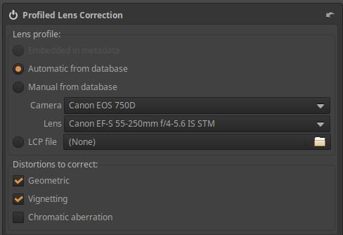
If we check the Automatic from database option, Lensfun will try to find the frame and lens in the database to retrieve the correction data. To do this, it uses the frame name and lens name embedded in the raw file metadata. If it finds it, it will display the frame and lens type as shown in the figure. In the figure, ART did not automatically check Chromatic Aberration Correction, but in this case it is available in the lens profile, so we can check it.
If ART did not automatically find the frame or lens type in the Lensfun database, you can search and select it yourself by selecting the Manually from database option. It will not find it automatically if the frame and/or lens name is different in the metadata and in the database, or if there is no data at all for the frame and/or lens in the Lensfun database.
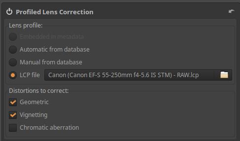
If you want to use a downloaded Adobe LCP profile file, select the LCP file option and browse to the Adobe LCP profile file for the lens or the combination of the body and lens.
4.6.5.2 Distortion Correction
It is located in the Transform group, within the Lens subgroup. It can be used to correct lens distortion.
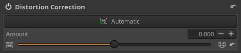
Automatic: When clicked, it automatically corrects distortion by aligning the image with the embedded JPEG image for distortion (if there is an embedded JPEG image). It only has an effect if the camera corrected lens distortion before creating the JPEG image. The automatically applied correction is displayed on the Strength slider, which can be fine-tuned using the slider.
Amount: The Amount slider allows you to make manual corrections. Negative values correct barrel distortion, and positive values correct pincushion distortion.
If you activate the Crop tool in the Transform tool group, select Grid as the Guide type, and press the Select button, you can place a grid in front of the preview, which can help you adjust the distortion correction. You can remove the grid by clicking the Done button in the Crop tool or by turning off the Crop tool.
4.6.5.3 Chromatic Aberration Correction
It is located in the Transform group, within the Lens subgroup. It takes effect after Demosaicing. (The similar tool in the RAW group takes effect before Demosaicing.)
It is used to correct chromatic aberration. Chromatic aberration appears as colored fringes along the dark edges next to bright areas. For example, chromatic aberration can be seen next to tree branches against the sky. This type of chromatic aberration is called lateral chromatic aberration.
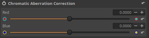
It is recommended to observe the chromatic aberration correction in a preview zoomed to at least 100% or in the Detail window.
A minor color error can be easily corrected, but there is a limit to how much can be corrected. Let’s take this into account.
Depending on the color of the chromatic aberration, you can correct the chromatic aberration with the Red and/or Blue sliders.
The image fragment shown in the figure below is not from a raw file, but from a JPEG image. The magnification is 200%.
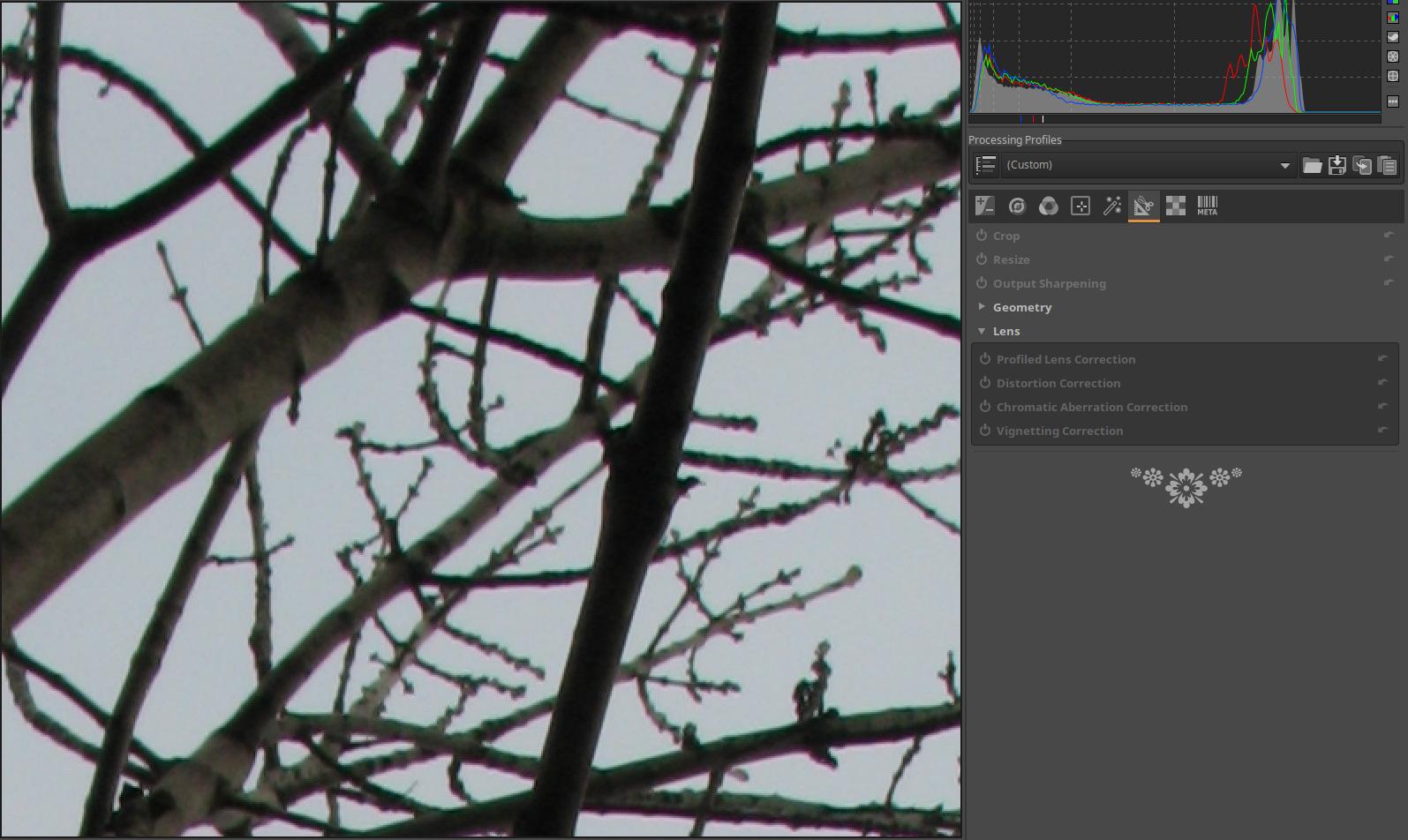
The image shows significant lateral chromatic aberration in reddish and greenish tones.
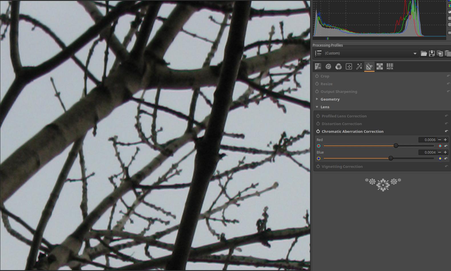
It should be corrected with the Red and Blue sliders, the least chromatic aberration is probably seen with the Red slider at 0.0006 and the Blue slider at 0.0004. It is not possible to completely correct the chromatic aberration, but there is very little chromatic aberration left.
4.6.5.4 Vignetting Correction
It is located in the Transform group, within the Lens subgroup. This tool is specifically designed to correct peripheral darkening caused by the lens; for creative purposes, the Vignetting filter tool located in the Special effects group should be used.
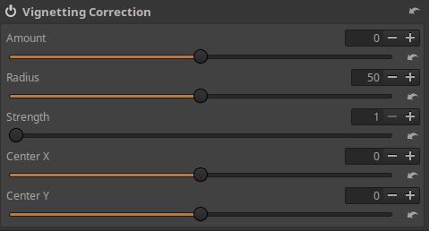
Amount: Positive values of the slider lighten the edges of the image to correct classic vignetting. Negative values of the slider darken the edges.
Radius: Controls how far from the center of the effect the image will lighten or darken towards the corners. Lower values will darken/lighten a larger area, higher values will darken/lighten a smaller area.
Strength: You can adjust the amount of darkening or lightening using it. If you see more darkened corners in the photo, then more lightening is needed to correct it, and vice versa. Set the Amount value to -100, the Radius value to 50, move the Strength slider from 1 to 100, and see how it works.
Center X: You can use it to move the center of the effect horizontally.
Center Y: You can move the center of the effect vertically using it.
4.7 Raw group
This group of tools contains global editing tools that can only be used when editing raw files, not image files. These tools operate on raw data.
ART is capable of processing raw files from image sensors with two types of color matrices: X-Trans matrix (Fujifilm cameras only) and Bayer matrix (other manufacturers).
ART recognizes what color matrix the raw file being edited uses and displays only the appropriate subset of editing tools. One is the Sensor with Bayer Matrix subgroup and the other is the Sensor with X-Trans Matrix subgroup. These have different capabilities.
Group editing tools:
- (Bayer Matrix) Demosaicing
- (Bayer Matrix) Raw Black Points
- (Bayer Matrix) Preprocessing
- (Bayer Matrix) Chromatic Aberration Correction
- (X-Trans Matrix) Demosaicing
- (X-Trans Matrix) Raw Black Points
- Raw Gain/White Point
- Preprocessing
- Dark-Frame
- Flat-Field
4.7.1 Sensor with Bayer Matrix subgroup
This subgroup includes procedures used for raw files from cameras with image sensors equipped with Bayer color filters.
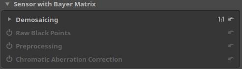
4.7.1.1 Demosaicing
It is located in the Raw group, within the Sensor with Bayer Matrix subgroup.
The effect of this tool is only visible at a magnification of 1:1 or higher. Zoom the preview to 1:1 or place some Detail panes on the preview.
The image sensor does not see colors. The operation (method) of restoring the color information of pixels from incomplete color information is called Demosaicing. In this process, a color image is created from the raw file data, and the editing tools work on this image one after the other.
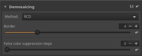
ART offers several Demosaicing algorithms, each with different characteristics.
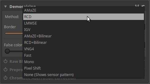
Because the image created by demosaicing is the basis on which the editing tools work, the choice of Demosaicing algorithm can have a significant impact on the final result, especially when viewing the image up close. The difference between different Demosaicing algorithms is most noticeable in the rendering of fine details and the visibility of artifacts in the form of labyrinthine patterns. You should view the preview at at least 100% magnification to see the differences between each algorithm.
The Demosaicing procedures available in ART are as follows:
AMaZE: AMaZE (Aliasing Minimization and Zipper Elimination) is the best method for images taken at low ISO values.
RCD: RCD (Ratio Corrected Demosaicing) does an excellent job of round edges, such as stars in astrophotography, while retaining almost the same level of detail as AMaZE. This is the default method in ART.
LMMSE and IGV: These are recommended for very noisy, high ISO images. They prevent the appearance of false labyrinth patterns and prevent the image from looking blurry due to high noise reduction. IGV is also quite effective at reducing moiré patterns.
AMaZE+Bilinear: It uses two algorithms in sequence, and is certainly better than AMaZE alone. No information can be found on the combined effect of the two algorithms.
RCD+Bilinear: No information can be found on this either, however Andy Astbury, who is considered an authority, recommends the RCD+Bilinear procedure as the default procedure for ART for general purposes.
VNG4: This is recommended for use with a medium format digital technical camera and a wide-angle lens.
Fast: Very fast, but simple and low quality method, not recommended.
Mono: Only useful for users of monochrome cameras or cameras with the color filter removed.
Pixel Shift: Some Pentax and Sony cameras support Pixel Shift photography, which takes four shots with the sensor shifted by one pixel each time to allow for accurate recording of the red, green, and blue levels in each pixel of the resulting image. The four shots are stored in one large raw file. ART can merge the shots into a single image. The biggest problem with Pixel Shift is motion. The camera (and subject) must be completely still while the shots are taken. Because the sensor needs time to move and stabilize, the minimum interval between each exposure is about a second.
None (shows sensor pattern): No demosaicing is performed. This can be useful for diagnostics, but cannot be used for photos.
Let’s look at the function of the two sliders:
Border: Most raw processing programs will trim a few rows and columns at the edges of the image to prevent any artifacts from being visible. Unless you have a good reason to, don’t change the default value.
False color suppression steps: This slider adjusts the number of median filter passes used to suppress artifacts when applying the Demosaicing algorithm. False color suppression is similar to color smoothing. False colors are usually more visible in images from cameras without anti-aliasing filters.
4.7.1.2 Raw Black Points
It is located in the Raw group, within the Sensor with Bayer Matrix subgroup.
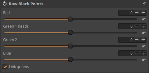
Let’s not bother with it. It is likely to be used for diagnostic purposes at most, not for editing.
4.7.1.3 Preprocessing
It is located in the Raw group, within the Sensor with Bayer Matrix subgroup.
A tool suitable for treating a variety of disorders.
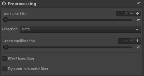
Line noise filter: Line noise appears as horizontal or vertical bands, most visible in noisy images. This is caused by noise in the electronics associated with the element sensors, which read the value of each element sensor row or column by row. This can be reduced using the slider.
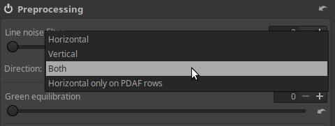
Direction: Select Horizontal, Vertical, or Both according to the direction of the Line Noise you see. Horizontal only on PDAF rows is used to reduce banding error that occurs with some mirrorless cameras with phase detection autofocus.
Green equilibration: This slider removes artifacts caused by the slight color difference between the two green channels on the camera sensor. Set the value high enough to eliminate the maze-like pattern, but no higher. Green equilibration can also be used to compensate for green splits caused by crosstalk.
PDAF lines filter: Phase Detection Autofocus (PDAF) cameras are prone to producing line streaking artifacts when shooting backlit subjects. Enabling the PDAF lines filter will attempt to correct these artifacts.
Dynamic row noise filter: If enabled, it will attempt to correct dynamic row noise. To work correctly, the raw file must contain some invisible columns (which are used to measure “optical black”).
4.7.1.4 Chromatic Aberration Correction
It is located in the Raw group, within the Sensor with Bayer Matrix subgroup. Its characteristic is that the color error reduction is performed before Demosaicing. The Chromatic Aberration Correction tool, located in the Transform group, takes effect after Demosaicing.
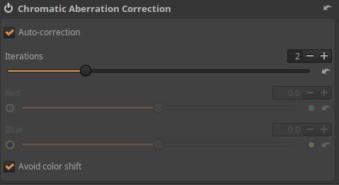
Auto-correction, shown in the image above, is the default method.
Iterations: Auto-correction does not remove all chromatic aberration. However, if we run it again, it will remove some of the remaining chromatic aberrations. The more times we run it, the better the result we get, but the longer it takes. The number of iterations is the number of executions, which can be up to 5.
Avoid color shift: If checked, there will be less color shift.
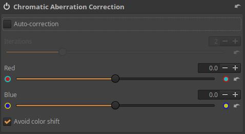
If you do not enable Auto-correction, you can manually correct the chromatic aberration.
Depending on the color of the chromatic aberration, you can correct it with the Red and/or Blue sliders.
4.7.2 Sensor with X-Trans Matrix subgroup
Fujifilm cameras do not use a Bayer color filter in front of the image sensor, but an X-Trans color filter. Images taken with an X-Trans color filter need to be processed differently than those taken with a Bayer color filter sensor.
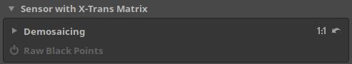
4.7.2.1 Demosaicing
It is located in the Raw group, within the Sensor with X-Trans Matrix subgroup.
The image sensor does not see colors. The operation (method) of restoring the color information of pixels from incomplete color information is called Demosaicing. In this process, a color image is created from the raw file data, and the editing tools work on this image one after the other.
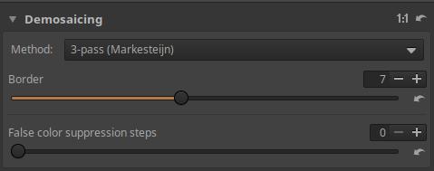
The Method can be one of the following.
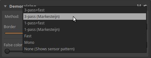
Fast: Very fast, but simple and low quality Demosaicing method, not recommended.
Mono: Only useful for users of monochrome cameras or cameras with the color filter removed.
None (shows sensor pattern): No demosaicing is performed. This can be useful for diagnostics, but cannot be used for photography.
3-pass (Markesteijn): This algorithm runs three passes over the image in succession, resulting in a sharper result, however the difference in quality is only visible in low ISO photos. It is slower than 1-pass.
1-pass (Markesteijn): Faster than 3-pass, but slightly lower quality, however the difference in quality is only noticeable in low ISO photos. If speed is an issue, this method can be used for high ISO shots without a noticeable difference in quality.
3-pass-fast: It uses two algorithms in sequence.
1-pass-fast: It uses two algorithms in sequence.
Among the methods, the 3-pass (Markesteijn) method provides the best quality.
Border: Most raw processing programs will trim a few rows and columns at the edges of the image to prevent any artifacts from being visible. Unless you have a good reason to, don’t change the default value.
False color suppression steps: This slider adjusts the number of median filter passes used to suppress artifacts when applying the Demosaicing algorithm. False color suppression is similar to color smoothing. False colors are usually more visible in images from cameras without anti-aliasing filters.
4.7.2.2 Raw Black Points
It is located in the Raw group, within the Sensor with X-Trans Matrix subgroup.
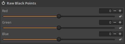
Let’s not bother with it. It is likely to be used for diagnostic purposes at most, not for editing.
4.7.3 Raw Gain/White Point
It is located in the Raw group.
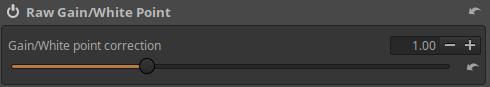
Let’s not bother with it. It is likely to be used for diagnostic purposes at most, not for editing.
4.7.4 Preprocessing
Located in the Raw group. Suppresses Hot and Dead pixels by replacing them with the average of the surrounding pixels.
“Hot pixels” appear as small, bright, saturated dots in the image. They are the result of a single element on the sensor producing a larger signal than it should. Whether a single element on the sensor corresponds to a single pixel in the processed photo depends on the Demosaicing method (and other factors) chosen. With most methods (such as AMaZE), there is no direct connection between the element and the pixel, so hot pixels can appear not only as single-pixel dots, but also as small 3x3 pixel crosses or slightly larger spots. The presence of hot pixels is a completely normal phenomenon in all cameras, but in daylight photography we usually do not encounter them. The longer the exposure, the greater the chance of hot pixels appearing, and the greater their number. This problem usually occurs with shutter speeds longer than two seconds.
“Dead pixels” appear as black dots (or crosses or spots). They are the result of dead (non-functional) pixels on the sensor, and shutter speed has no influence on whether or not they appear. If a pixel is dead, the dead pixel will appear in the same place in every photo.
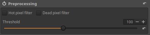
Hot pixel filter: If enabled, it suppresses Hot pixels.
Dead pixel filter: If enabled, it suppresses Dead pixels.
Threshold: Controls the sensitivity of the automatic detection of Hot and Dead pixels. This determines what is considered a Hot/Dead pixel. Gradually increase the threshold until the Hot/Dead pixels disappear.
4.7.5 Dark-Frame
It is located in the Raw group. By extracting a Dark-frame (dark shot), we can reduce noise of various origins (e.g. thermal) that can be seen in shots taken with long shutter speeds. A shutter speed of at least 1 second is considered a long shutter speed. It has no effect on noise caused by high ISO, but it does eliminate Hot Pixels.
The essence of the method is that when we take a picture with a long shutter speed, we take one or more raw pictures (Dark-Frames) with the same settings immediately afterwards, by placing the lens cap on the lens. It is best to take 4-6 Dark-Frame pictures. In this way, we photograph, for example, the unevenness of the image field due to thermal noise, and if we subtract the Dark-Frame(s) from the image, we get a noise-free image. The reason why the Dark-Frame pictures should be taken immediately after the pictures is so that the image sensor and the electronics around it are at the same temperature as when the pictures were taken. When taking Dark-Frame pictures, Manual (M) mode should be used, because this way, even with the lens cap on, we can take the reference picture(s) with the same settings as the “sharp” pictures were taken.

Before using it, we need to specify the directory containing the Dark-Frame recordings in the Libraries section of the Image Processing tab of the Preferences.
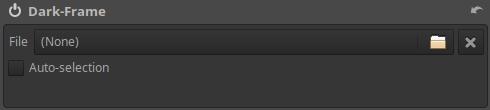
File: we can manually select a Dark-Frame shot to extract from the edited image.
Auto-selection: Automatically selects the best-matching Dark-Frame shot (selects in the order of camera manufacturer > type > ISO > shutter speed > date) based on metadata. If more than one shot with exactly the same characteristics is found, the average of these is used, resulting in much less noise.
4.7.6 Flat-Field
It is located in the Raw group. Flat-field means a flat image field in image processing, so it is a flat image field correction. Its main purpose is to correct uneven brightness and slight discoloration in the image field during raw data processing. These problems can be easily corrected if a so-called flat-field reference file is available. In principle, this is the most accurate method.
Only raw format reference files can be used and the method can only be used when processing raw files.
There are several reasons why the entire image field is not completely uniform:
- Peripheral darkening
- Using a Tilt-Shift lens
- Image sensor temperature unevenness
- Defects/imbalances in the sensor’s reading electronics
- Other reasons
Flat-field reference files are required for correction. Reference files can be created as follows:
The essence of the method is that with a given lens-body pair, we take raw format images at low ISO values at certain focal lengths and certain aperture values of a uniformly illuminated, bright surface. With the help of these raw format images (so-called reference files), ART can determine the brightness difference between individual parts of the image field and any possible color shift.
For example, we will create paired reference files for the Canon EF-S 18-55mm f/3.5-5.6 IS lens and the Canon EOS 350D camera.
Flat-field reference files are created by photographing a uniform, bright surface,
- by camera type,
- by lens type,
- per focal length,
- per aperture value
it is necessary to create a raw format file.
This means that if you have several different types of cameras, you unfortunately have to create reference files with each one. If you have several lenses, you also have to create reference files with each one, even if a given focal length can be set on several different types of lenses. For example, if the 55 mm focal length can be set on two different types of lenses, you still have to create reference files with the 55 mm focal length with both lenses, and use the correct one during correction.
The “per focal length” statement obviously does not mean that you have to create a reference file at every adjustable focal length (e.g. per mm). This is unnecessary. I created a reference file at every focal length that is listed on the lens. The “per aperture” statement meant for me that I created reference files at standard “whole” apertures (f/4, f/5.6, f/8, f/11, f/16 and f/22). I also created a reference file with the 18-55mm lens at a maximum aperture of f/3.5.
To create the flat-field reference files, I used a uniformly white plastic sheet that fits into a Cokin P filter holder. The original function of this sheet is to adjust the white balance, it is made specifically for this purpose.
If you have another uniformly white, frosted glass-like plastic sheet, you can use that too. For example, a milky, semi-transparent poly(methyl methacrylate) sheet would be suitable, or a white opal acrylic sheet.
The uniformity of the sheet is the most important requirement. The sheet should be sufficiently translucent, but not transparent. I placed the sheet in the filter holder, namely in the place closest to the lens, and attached the filter holder to the Canon 18-55 mm lens. The main thing is to place a translucent, uniform white surface a short distance from the lens, or rather directly on the filter holder of the lens. If you do not have a holder, you can even hold the sheet in front of the lens by hand.
To take the picture, you should choose a day when the sky is relatively even, for example uniformly blue or gray. It is preferable if the sky is evenly overcast, cloudy, and there is no sunlight. If the sun is shining, stand with your back to the sun and, if necessary, block the sunlight with your hand so that it does not illuminate the white sheet in the filter holder from behind. We use the following settings:
- Set +1 2/3 EV exposure compensation on your camera; a different value may be appropriate for a different type of white sheet; check this with a test shot and histogram.
- Set your camera to Av or A (aperture priority) mode.
- Set RAW+JPG or RAW in the image quality menu.
- Set the lowest ISO value, for example ISO 100.
- The white balance setting can be any, it doesn’t matter.
- Turn off autofocus and image stabilization on your lens.
- Set the focal length to 18 mm.
- Set the focus to infinity.
- Set the aperture to f/3.5 (maximum).
- Point the camera up to the sky and take the shot.
- Check with a histogram that the image is not overexposed in any way. If it is overexposed, reduce the exposure compensation, or increase it slightly if necessary. Once this is set correctly, we can start creating the reference files.
- Create reference files with all focal length-aperture combinations.
That is, after f/3.5, set the aperture to f/4 and create the reference file, and with all the necessary aperture values in turn. Then set the next focal length, for example 24 mm, and also create a reference file with all the necessary aperture values. And so on until we have a reference file for all the necessary focal length-aperture combinations. I took pictures with the focal lengths marked on the lens (18 mm, 24 mm, 35 mm, 55 mm), as well as with the standard aperture values for each focal length (f/3.5, f/4, f/5.6, f/8, f/11, f/16). F/3.5 is not a standard aperture, but I also took a picture with it at a focal length of 18 mm. Of course, I only shot with the standard aperture value that was available for each focal length. It takes longer to describe than to do. With one lens, you can do it in fifteen minutes.
The figure below shows what a flat-field reference file looks like as an image (the figure shows a JPEG image, of course). The irregularities are clearly visible.
If you have multiple lenses, do the above with them as well. The better the quality of the reference files, the better the expected result will be during the correction.
With a fixed focal length lens, you only need to create a reference file with a few different aperture values.
If there is a small difference between the cases, it is not necessary to create a reference file for each case. For example, with the lens above, the 35mm and 55mm focal length cases are almost identical in terms of peripheral darkening, so perhaps the 55mm images can be omitted and the 35mm series used instead. However, in my opinion, it is not worth saving this time.
If you are using an electronic lens, the file name is irrelevant, as ART will automatically find the correct reference file. However, if you are using a manual lens that does not record the lens type, aperture, and focal length in the metadata, you will have to manually select the correct file yourself. For this reason, you should rename the reference files so that you can identify the shooting conditions later. In my opinion, this is also worth doing for electronic lenses, because if you have to manually select the reference files, you will not know, for example, what lens, focal length, aperture, and camera body the reference file IMG_1258.CR2 was taken with.
For example, we can follow the following naming pattern:
ff_date_frame-type_lens-type_focal-length_aperture.kit
For example:
ff_20200721_canon-750d_canon-18-55-stm_18mm_f5,6.CR2
Do not change the original extension of the file (CR2 in the example above).
The format of the renaming doesn’t really matter, we’re not creating it for ART, we’re creating it for ourselves. We can also come up with a different naming system. The date the recording was taken is useful if we have multiple reference files created under the same conditions.
To use, all reference files must be stored in the same folder, which can be anywhere on your computer.

On the Image Processing tab of the Preferences, in the Libraries section, we need to specify the path to the directory containing the flat-field reference files.
Let’s move on to the Flat-field tool.
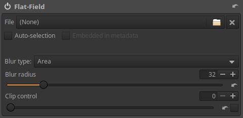
File: We can browse and select the Flat-field raw format reference file to use.
Auto-selection: Automatically selects the reference file that matches or is closest to the shooting conditions based on the raw file to be processed and the metadata of the reference files. If no match is found, a message will be displayed. If more than one exact match is found, the data from these is averaged and then used for smooth field correction.
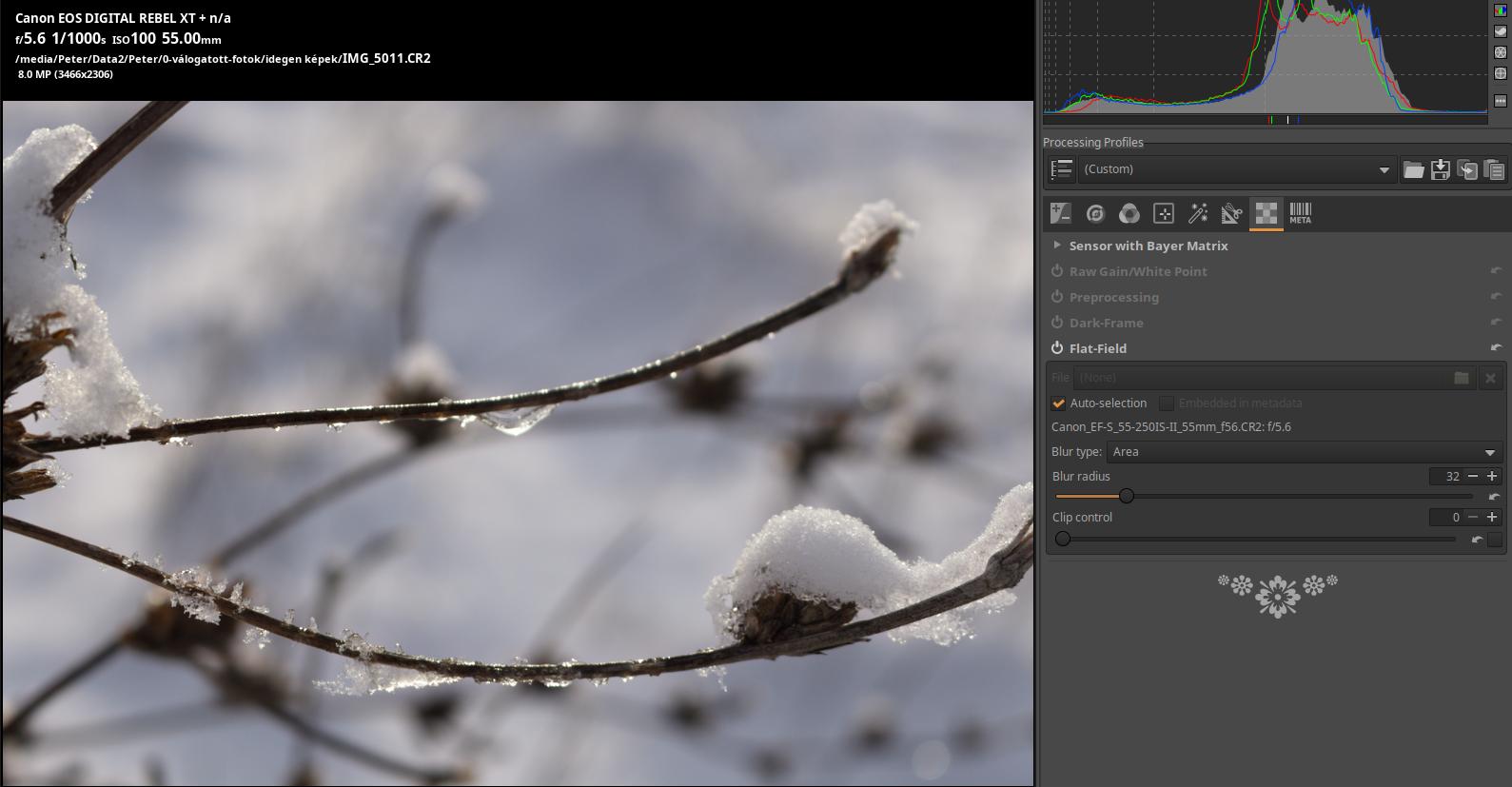
Photo taken by the author
In the image above, you can see that it found an exact match reference file. The lens type, the focal length (55 mm), and the aperture (f/5.6) are all exactly the same.
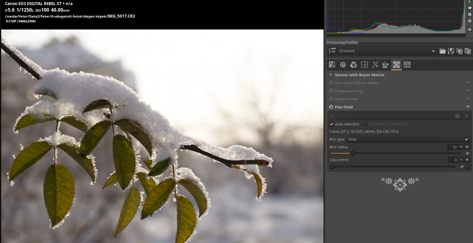
Photo taken by the author
In the image above, you can see that you chose the closest reference file. The lens type, the aperture setting are the same (f/5.6), and the focal length setting is 40mm, but ART chose the reference file for the 35mm focal length. This was the correct choice because only 35mm and 55mm reference files were available, and 35mm is closer to the 40mm setting than 55mm.
Embedded in metadata: If the lens flat-field correction parameters are available from the image metadata, this option can be selected.
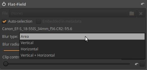
Blurring must be performed on the reference image created from the raw data of the reference file so that the image noise of the reference image and any dust particles that may have accumulated on the image sensor during its creation do not affect the correction result.
Blur Type can be of the following four types:
- Area: This is the default and usually the most useful setting. It applies the blur equally in all directions on the reference image. It is useful for example for correcting edge darkening.
- Vertical: Applies blur only in the vertical direction.
- Horizontal: Apply blur only in the horizontal direction.
- Vertical + Horizontal: Apply blur horizontally and then vertically one after the other to correct both horizontal and vertical irregularities.
The concept of vertical and horizontal in the raw file is related to the orientation of the sensor, which is always the same for a frame, regardless of whether the camera is held horizontally or vertically while shooting. Depending on the camera model, whether the sensor stores data in landscape or portrait format may vary, so if you want to use portrait or landscape mode, you need to check which orientation is appropriate for that frame model.
Blur Radius: This slider controls the amount of blurring that will be applied to the reference image created from the reference file data. The default value of 32 is usually sufficient to get rid of the changes in the raw data due to image noise. If you don’t do this, the unevenness due to the image noise in the reference file may also be visible in the corrected image. Setting the blur radius to 0 skips the blurring process and allows you to correct the effect of dust or other dirt on the sensor in the image you are editing. However, this is only a real option if you create the reference file immediately after taking the “sharp” photos, before turning off the camera. Most cameras try to remove dust from the image sensor when turning the camera on/off, so if you create a reference file later, it would not reflect the condition of your images when you took them.
Clip Control: Applying a reference image may cause overexposure of areas of the image that are almost overexposed due to the correction. The Clip Control slider can be used to prevent the effect of the reference image from causing clipping in the edited image. Areas of the edited image that were already clipped before the uniform field reference image was applied may become discolored. Therefore, if the edited photo contains overexposed areas, it is better not to use the Clip Control slider.
4.8 Metadata group
This is not really a toolkit, but rather a tool for managing metadata. It allows you to control which metadata is copied to the saved image, and you can also modify the metadata. Metadata is embedded in the raw file or image file, so it cannot be lost, and it contains useful information about the conditions under which the image was taken, etc.
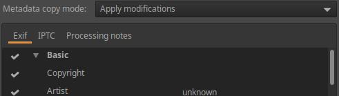
You can modify Exif and IPTC data and add your own comment to the image.
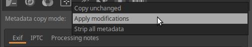
Metadata copy mode:
Copy unchanges: The metadata of the saved image is as close as possible to the metadata of the input image. None of the metadata changes are reflected in the saved image.
Apply modifications: The changes will be included in the saved image.
Strip all metadata: No metadata will be saved to the saved image.
Exif tab:
This tab allows you to control which Exif data is included in the saved (edited) image. Exif data is usually generated by the camera itself and embedded in the raw file. The basic Exif information is visible directly. The extended Exif information and the so-called makernote data are arranged in a tree structure. Click on the arrow on the left side of the desired subtree and you will see its contents.
Only Exif data with a check mark in front of it will be included in the saved image.
Button functions from left to right:
-
Select all tags
-
Unselect all tags
-
Add/Edit
4. Reset the selected tags to their original value
5. Reset all tags to their original value
IPTC sheet:
IPTC metadata contains additional information about the image.
IPTC is usually used to describe an image in detail. There are many image database software that use the information stored in images to fill in description fields, for example. For example, we can use IPTC fields when we are trying to sell our images. Most online image selling companies have software that supports IPTC tags and reads them when we upload our images through their websites.
Button functions from left to right:
-
Reset to profile default
-
Reset to IPTC data embedded in the image file
-
Copy IPTC settings to clipboard
4. Paste IPTC settings from clipboard
Processing notes tab:
You can add any processing notes to the image. The processing notes are stored in the sidecar file (.arp).
5. Final words
Dear Reader, thank you very much for reading my book. I hope you found it useful and helped you get started with processing raw files. In my own modest way, with this book I was able to contribute to the understanding of ART and to making the collected information available to the Readers in a somewhat systematic form.
There are many more things that could have been written about in order for this book to fully present the possibilities and uses of ART. It would be important for someone to present, in the form of training videos or even a book, how to process various images most effectively, which editing tools should be used in what way, and it would also be very important to show why it is advisable to use those tools. We can find a lot of training videos on using darktable, Boris Hajdukovic and Bruce Williams have published a total of 240 such videos, not to mention Andy Astbury and others. This is very much missing in the case of ART. I hope that maybe in the near future there will be someone who feels like doing this and in this way contributes to making ART more popular.
Finally, I wish the Reader good luck and beautiful light for photography!